
When we ask, “What color is California?” we are not merely inquiring about the literal pigment of its soil or the hue of its coastline. In the realm of brand strategy and corporate identity, California is more than a geographic location; it is one of the most powerful “sub-brands” in the world. If California were a corporation, its brand equity would rival that of Apple or Coca-Cola. Its visual identity—the colors it projects to the world—defines global trends in technology, lifestyle, and sustainability.
To understand the brand of California, one must look at the intersection of heritage, innovation, and the curated “California Dream.” The colors of this state are strategic tools used by multi-billion dollar companies to evoke specific emotional responses. From the “Tech Blue” of Silicon Valley to the “Desert Terracotta” of the modern wellness industry, California’s palette is a masterclass in brand storytelling.

The Visual Language of the West: From Gold to Tech-Blue
The foundational layer of California’s brand is built on its nickname: The Golden State. However, the interpretation of “gold” has evolved from a physical mineral to a metaphorical standard of excellence and innovation.
The Golden Foundation: Heritage and Aspiration
Historically, the color of California was the deep, metallic gold of 1849. In brand strategy, gold represents value, optimism, and the “pioneer spirit.” This color is still foundational to the state’s identity, but it has been modernized. Today, “California Gold” appears in the warm, amber-toned lighting of Hollywood films and the high-end, sun-drenched photography used by lifestyle brands. It signals a premium experience—one that is aspirational yet attainable through hard work and creativity.
The Pacific Influence: Teal, Azure, and the Coastal Aesthetic
The second primary pillar of the California palette is the Pacific Ocean. Unlike the deep navy of the Atlantic, the “California Blue” is often lighter, leaning toward teal or bright azure. This color communicates transparency, freedom, and wellness. Brands like Patagonia or even the early imagery of GoPro utilized these coastal tones to associate their products with the “outdoor lifestyle” brand. In corporate identity, these blues are used to soften the image of a company, making it appear more approachable and eco-conscious.
Silicon Valley Minimalism: The Color of Innovation
As the epicenter of global technology, Northern California has dictated the visual language of the 21st century. The brand color of “Innovation” in California isn’t a single pigment; it is a philosophy of light and space.
White Space and Accessibility
If you look at the headquarters of Apple in Cupertino or the interface of Google, the dominant “color” is often white. In branding, white space signifies clarity, efficiency, and a focus on the user. California tech branding moved away from the “Beige Box” era of the 1980s (associated with IBM and the East Coast) toward a clean, minimalist aesthetic. This “California White” tells the consumer that the technology is sophisticated yet simple to use. It removes the “friction” from the brand experience.
The Strategic Use of “Safety Blue”
Silicon Valley also popularized a specific shade of vibrant, “link blue.” From Facebook to LinkedIn and Intel, this color has become synonymous with digital infrastructure and social connection. It is a psychological choice: blue is the most universally liked color and conveys reliability and intelligence. California’s version of blue is brighter and more saturated than traditional “Corporate Navy,” reflecting a brand personality that is forward-thinking rather than stuck in tradition.
Environmental Branding: The Rise of “California Green”
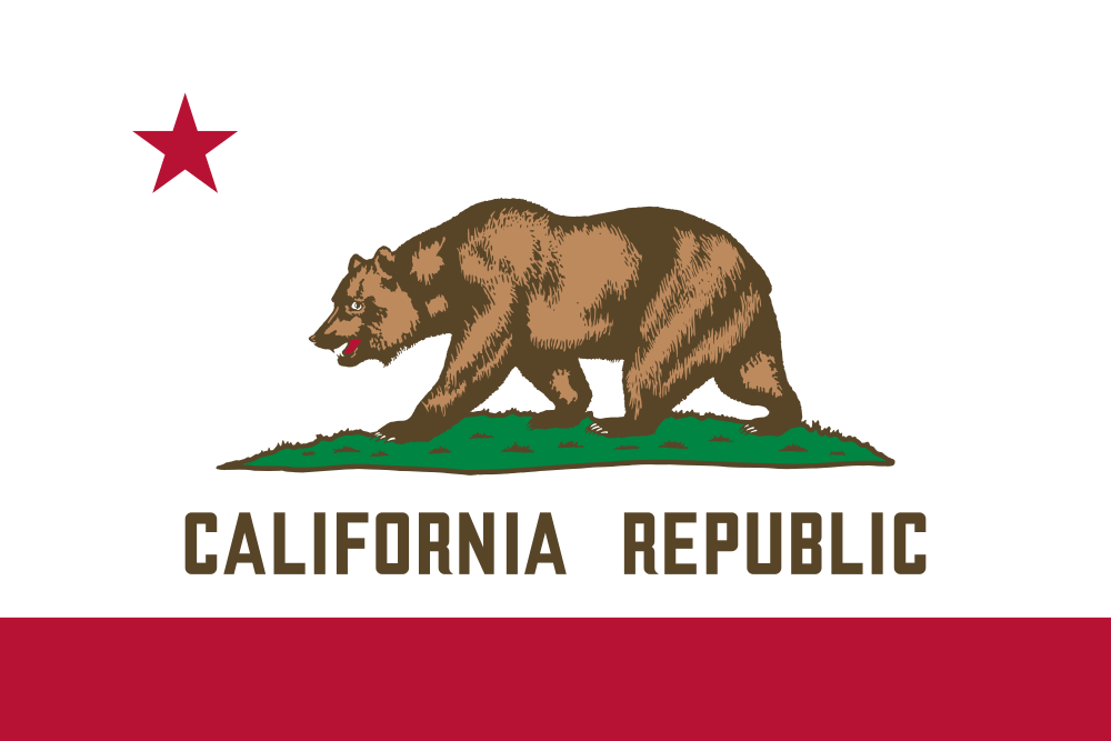
California is a global leader in environmental policy and the “Green Economy.” Consequently, the color green has become a critical component of the state’s corporate identity, but not in the way many expect.
Sustainability as a Brand Pillar
The “California Green” is rarely the neon green of 1990s environmentalism. Instead, it is the muted “Sage” or “Eucalyptus” green found in the hills of Big Sur or the vineyards of Napa. This palette shift is a strategic move toward “Quiet Luxury” and “Organic Authenticity.” Brands that want to align themselves with California’s environmental leadership—such as Allbirds or Tesla—often use these desaturated, earthy greens to signal that they are premium, sustainable, and “in harmony with nature.”
Earth Tones in Modern DTC (Direct-to-Consumer) Brands
A significant trend in modern branding, often dubbed “the California Look,” involves a heavy reliance on earth tones: terracotta, ochre, and sand. This trend reflects the Coachella Valley and the Mojave Desert. Brands like Parachute (bedding) or Jenni Kayne (fashion) have built entire corporate identities around these colors. They evoke a sense of “groundedness” and “slow living.” By using the colors of the California desert, these brands successfully market a lifestyle of curated calm to a global audience.
The “Sunset Palette”: Lifestyle Branding and the Content Creator Economy
Perhaps the most recognizable color profile of California is the “Sunset Palette”—a gradient of pinks, oranges, and purples that characterizes the Los Angeles skyline at dusk. This is the color of the “California Dream” as sold through social media and entertainment.
Instagrammability and the Warm Glow Strategy
In the age of the “Creator Economy,” California’s brand is increasingly defined by the “Golden Hour.” This specific lighting—warm, soft, and flattering—has influenced how products are packaged and marketed. Beauty brands like Glossier or Summer Fridays utilize these “sunset” tones (soft peaches and muted pinks) to create an emotional connection with consumers. The strategy is simple: if the brand looks like a California sunset, it feels like a vacation. It sells an emotion of leisure and success.
Retro-Futurism and Neon Nostalgia
There is also a darker, more vibrant side to California’s brand color: the neon pinks and cyans of “Synthwave” and 80s nostalgia. This aesthetic, rooted in the surf culture of Venice Beach and the neon lights of the Sunset Strip, is used by brands looking to tap into “California Cool.” It’s a high-energy palette that appeals to younger demographics and is frequently used in gaming, streetwear, and beverage branding to signify energy and non-conformity.
Applying the California Palette to Global Brand Strategy
For companies outside of the Golden State, adopting the “colors of California” is a deliberate strategic choice designed to borrow the state’s massive brand equity.
Authenticity vs. Appropriation
When a brand in London or Tokyo uses the “California Palette,” they are performing a “brand transplant.” They are attempting to inject the values of innovation, wellness, and freedom into their own identity. However, for this to be successful, the brand must go beyond the color. Strategy dictates that the visual identity must match the brand’s actions. A “California Green” brand that has a poor environmental record will quickly face a “greenwashing” backlash. Color is the promise; the product is the delivery.

Future-Proofing Through Visual Storytelling
The color of California is constantly shifting. As the state moves toward a more digital, decentralized, and eco-centric future, its brand colors are becoming more “fluid.” We are seeing a move toward iridescent finishes (representing the fusion of tech and nature) and high-contrast palettes (representing the social and economic diversity of the state).
In conclusion, what color is California? It is a complex, strategic gradient. It is the gold of opportunity, the blue of the Pacific, the white of a clean interface, the sage of sustainability, and the pink of a Hollywood sunset. For a brand strategist, California is not a place on a map—it is a visual vocabulary. By understanding these colors, businesses can better navigate the psychology of their consumers and build identities that resonate on a global scale. Whether you are launching a tech startup or a sustainable fashion line, the colors of California offer a blueprint for building a brand that is both timeless and ahead of its time.
aViewFromTheCave is a participant in the Amazon Services LLC Associates Program, an affiliate advertising program designed to provide a means for sites to earn advertising fees by advertising and linking to Amazon.com. Amazon, the Amazon logo, AmazonSupply, and the AmazonSupply logo are trademarks of Amazon.com, Inc. or its affiliates. As an Amazon Associate we earn affiliate commissions from qualifying purchases.