
In the world of branding, a color is rarely just a color. It is a vessel for history, a psychological trigger, and a visual anchor for identity. When we ask, “What color is American flag blue?” we are not simply looking for a coordinate on a color wheel; we are exploring one of the most successful and enduring examples of corporate and national identity in history. Known officially as “Old Glory Blue,” this specific shade is a masterclass in brand standardization, designed to evoke authority, stability, and trust across every medium—from fabric blowing in the wind to digital screens.
For brand strategists and designers, the American flag serves as a foundational case study in how a specific palette can transcend simple aesthetics to become a global symbol. Understanding the technical specifications and the strategic intent behind Old Glory Blue reveals how consistent visual identity builds the “brand equity” of a nation.
The Science of Standardization: Defining Old Glory Blue
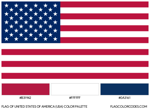
The American flag is not just “red, white, and blue.” To maintain the integrity of the national brand, the colors are strictly defined by the General Services Administration (GSA). The specific blue used in the canton of the flag is officially designated as “Old Glory Blue” (Cable No. 70075 in the Standard Color Reference of America).
The Technical Profile of a National Icon
In the modern branding landscape, a color must be reproducible across diverse platforms without losing its character. Old Glory Blue is a deep, rich navy that carries a specific technical profile:
- Pantone Matching System (PMS): 282 C
- HEX Code: #0A3161
- RGB: (10, 49, 97)
- CMYK: (100, 88, 42, 52)
This level of precision ensures that whether the flag is printed on a business card, rendered on a government website, or woven into heavy-duty nylon for a military installation, the brand remains cohesive. In corporate identity terms, this is the “Brand Style Guide” in action at the highest level.
The Evolution from Natural Dyes to Digital Precision
Historically, the blue of the American flag was determined by the limitations of 18th-century indigo dyes. Darker blues were preferred because they were more resistant to fading under the harsh sun and survived the rigors of maritime use. Strategically, this transitioned from a practical necessity to a brand preference. Today, even though we have access to millions of shades, the “Old Glory Blue” remains dark and saturated. This continuity reinforces the brand’s heritage, suggesting a lineage that is unbreakable and grounded in history.
Color as Corporate Identity: Why the Shade Matters
In brand strategy, color is the first thing a consumer notices and the last thing they forget. Old Glory Blue was chosen (and later codified) to communicate specific values. When designing a corporate identity, the choice of a navy hue over a bright cyan is a strategic decision that shifts the brand’s “voice” from playful and modern to authoritative and established.
The Psychology of Navy Blue in Branding
Old Glory Blue occupies a space in the color spectrum that is associated with intelligence, stability, and unity. Psychological studies in marketing show that darker blues are perceived as more “serious” and “reliable.” This is why financial institutions, law firms, and government agencies often mirror the American flag’s blue in their own corporate palettes.
By utilizing a shade that leans toward the darker end of the spectrum, the American “brand” projects a sense of permanence. It suggests an entity that is not subject to the whims of trends—a critical attribute for a national identity. For a brand strategist, this highlights the importance of choosing colors that align with the brand’s core mission rather than current aesthetic fads.
Maintaining Brand Equity Through Consistency
“Brand equity” refers to the value a brand gains from its recognizability. The American flag has some of the highest brand equity in the world. This is achieved through relentless consistency. If some flags used a sky blue and others a royal blue, the visual impact of the “Stars and Stripes” would be diluted.
By mandating “Old Glory Blue,” the U.S. government ensures that the visual shorthand for the United States remains potent. This is a vital lesson for corporate entities: brand dilution begins when small deviations in visual standards are allowed to persist. The rigor applied to the flag’s blue is exactly what a global corporation should apply to its primary brand assets.

The Strategic Implementation of the National Palette
A brand is more than a logo; it is a system. The way Old Glory Blue interacts with “Old Glory Red” and “White” creates a high-contrast visual identity that is optimized for visibility. In design strategy, this is referred to as “visual hierarchy and legibility.”
Accessibility and Contrast in Design
One of the reasons the American flag blue is so effective is its high contrast ratio against white. In modern web design and brand accessibility standards (such as WCAG), contrast is king. Old Glory Blue (#0A3161) provides a striking background for white elements, ensuring that the 50 stars are visible even from great distances or at low resolutions.
For brand designers, the American flag illustrates the importance of selecting colors that not only look good together but function well together. The deep blue acts as an anchor, allowing the red stripes to provide energy while the white provides “negative space” and clarity.
Cross-Media Application of National Brand Assets
In the age of multi-channel marketing, a brand must look identical on a smartphone screen, a silk tie, and a giant vinyl banner. Old Glory Blue is a “hard-working” color. Because it is so saturated, it holds its integrity well across various materials.
When brand strategists choose a palette, they must consider the “lowest common denominator” of production. A neon green might look great on a backlit LED screen but is nearly impossible to reproduce accurately in standard 4-color offset printing. Old Glory Blue, by contrast, is highly “producible.” Its CMYK and Pantone formulations are stable, making it a dream for supply chain management and brand production.
Legal and Regulatory Standards for Brand Protection
Just as a corporation like Apple or Coca-Cola protects its trademarks, the “brand” of the American flag is protected by specific codes. The U.S. Flag Code provides the “brand guidelines” for how the colors should be displayed and handled.
Defining the “Standard Color Reference of America”
The color standards for the flag are managed by the Color Association of the United States (CAUS). The fact that a textile-based color reference (the “Cable” system) is used alongside digital standards shows the complexity of managing a brand that exists in both the physical and digital worlds.
For a corporate identity to survive decades, it needs more than just a HEX code; it needs a reference point that is independent of technology. By tying Old Glory Blue to a physical standard (Cable No. 70075), the U.S. ensures that even if digital displays change their color-rendering technology, the physical “source of truth” for the brand remains constant.
Case Studies in Brand Cohesion: The Federal Government
The use of Old Glory Blue extends beyond the flag itself. It informs the branding of NASA, the FBI, and various branches of the military. This creates a “Branded House” architecture, where sub-brands all draw from the same primary color palette to signal their affiliation with the parent brand (the United States).
In corporate strategy, this is an efficient way to transfer trust. When a citizen sees the specific shade of Old Glory Blue on a government seal, they immediately associate it with the authority and history of the nation. This “halo effect” is a powerful tool for any organization looking to unify a diverse portfolio of services under one visual umbrella.

Conclusion: The Lasting Impact of a Single Shade
“Old Glory Blue” is far more than a hexadecimal value or a textile dye. It is a strategic asset that has been meticulously maintained to represent the American brand for centuries. Its depth communicates authority, its technical specifications ensure global consistency, and its psychological associations foster a sense of trust and stability.
For designers and brand strategists, the answer to “what color is American flag blue” is a reminder that the most successful brands are those that treat their visual identity with reverence. By choosing a color that is technically viable, psychologically resonant, and consistently applied, the American flag has achieved a level of brand recognition that few corporations will ever match. In the end, Old Glory Blue proves that in the world of identity and marketing, consistency isn’t just a goal—it is the foundation of the brand itself.
aViewFromTheCave is a participant in the Amazon Services LLC Associates Program, an affiliate advertising program designed to provide a means for sites to earn advertising fees by advertising and linking to Amazon.com. Amazon, the Amazon logo, AmazonSupply, and the AmazonSupply logo are trademarks of Amazon.com, Inc. or its affiliates. As an Amazon Associate we earn affiliate commissions from qualifying purchases.