
The question “what color has the most energy?” might initially seem like a simple query, perhaps best answered by a quick glance at a physics textbook. Indeed, the scientific answer is precise and rooted in the fundamental properties of light. However, to truly unpack the concept of “energy” in relation to color, especially within the dynamic realms of technology, branding, and finance, we must journey beyond mere wavelengths and delve into the profound psychological, strategic, and practical implications that different hues carry.
From the shimmering pixels of our latest gadgets to the carefully curated palette of a global brand, and from the intuitive interfaces of financial apps to the subconscious nudges in e-commerce, color is a silent, yet incredibly potent, communicator. It influences our perceptions, drives our decisions, and shapes our environments. Understanding which colors possess the most intrinsic energy, and how that energy is perceived and leveraged, offers a powerful lens through which to view innovation, market strategy, and personal finance alike. Let’s embark on an exploration that bridges the gap between quantum physics and human psychology, revealing the multifaceted “energy” of color in our modern world.
The Scientific Spectrum: Unveiling Light’s Energetic Truth
Before we explore the broader applications of color, it’s essential to establish the scientific bedrock. The energy of a color is not a matter of subjective perception but a quantifiable characteristic tied to the fundamental nature of light itself.
Understanding the Electromagnetic Spectrum
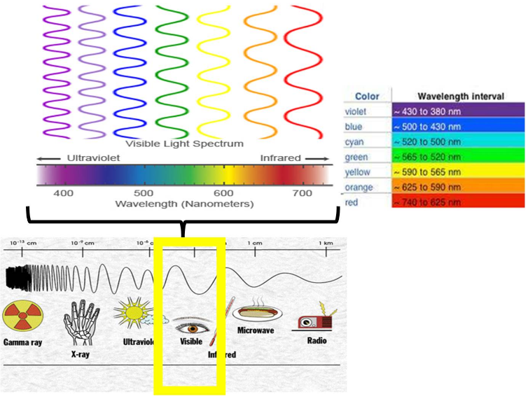
Light, as we perceive it, is merely a tiny segment of the vast electromagnetic spectrum. This spectrum encompasses everything from radio waves to gamma rays, all of which are forms of electromagnetic radiation traveling at the speed of light. What differentiates these forms of radiation are their wavelengths and frequencies. Wavelength refers to the distance between two consecutive peaks of a wave, while frequency is the number of waves that pass a given point per second. These two properties are inversely related: shorter wavelengths correspond to higher frequencies, and vice versa.
Crucially, the energy carried by a photon (the fundamental particle of light) is directly proportional to its frequency and inversely proportional to its wavelength. This relationship is elegantly described by Planck’s equation, E = hf (where E is energy, h is Planck’s constant, and f is frequency). Therefore, the higher the frequency (and shorter the wavelength) of light, the more energy each photon carries.
The Peak Performers: Violet and Blue Light
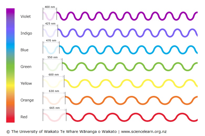
Within the visible spectrum—the range of colors our eyes can perceive—the colors with the shortest wavelengths and highest frequencies are violet and blue. Consequently, violet light possesses the most energy, followed closely by blue.
Think of a rainbow: the colors appear in a specific order based on their wavelengths, from red (longest wavelength, lowest frequency, lowest energy) to violet (shortest wavelength, highest frequency, highest energy). Beyond violet lies ultraviolet (UV) light, which carries even more energy and is invisible to the human eye. Conversely, beyond red is infrared (IR) light, which has even less energy.
This scientific understanding provides the literal answer to our initial question. Violet and blue light are the “high-energy” colors in a purely physical sense, capable of exciting electrons to higher energy states and driving certain photochemical reactions more effectively than their red or orange counterparts. This inherent property has profound implications, not just in scientific research, but increasingly in the design and function of the technology we interact with daily.
Tech’s Palette: Harnessing High-Energy Hues for Innovation and Efficiency
The intrinsic energy of different colors, particularly the high-frequency blue and violet light, plays a significant role in the technological landscape. From optimizing display efficiency to enhancing user experience and even influencing digital security, understanding color energy is paramount in modern tech.
Displays and Power Consumption
In the world of gadgets – smartphones, tablets, laptops, and smart TVs – display technology is a cornerstone. Different screen types respond to color energy in varied ways, impacting power consumption, a critical factor for battery life and environmental sustainability. For instance, OLED (Organic Light-Emitting Diode) displays generate light on a per-pixel basis. When displaying true black, OLED pixels are simply turned off, consuming no power. However, displaying bright white or vibrant, high-energy colors like intense blues and greens requires more power from individual pixels.
This is a key reason why “dark mode” has become so popular across software and apps. By shifting interfaces to predominantly darker palettes, less power is required to illuminate the pixels, particularly on OLED screens. While less pronounced on LCD (Liquid Crystal Display) screens, which use a constant backlight, the overall perceived energy and visual comfort still benefit. Tech developers and hardware manufacturers are constantly balancing visual fidelity with energy efficiency, and the intelligent use of color—understanding its energy demands—is a crucial element in this equation.
Smart Lighting and Environmental Control
The advent of smart lighting systems has opened new frontiers for harnessing color energy. Modern LED lighting, often controllable via apps or AI tools, can produce a vast spectrum of colors and color temperatures. High-energy blue light is known to suppress melatonin production, making it effective for boosting alertness and concentration during daytime hours, a common feature in office or productivity-focused smart environments. Conversely, warm, low-energy reds and oranges are favored for relaxation and evening use, promoting natural sleep cycles.
This strategic deployment of colored light, often managed by sophisticated software, transforms our living and working spaces. It’s not just about aesthetics; it’s about optimizing human performance and well-being through environmental control, tapping into the physiological responses triggered by different light energies. From smart homes adjusting ambiance based on time of day to specialized lighting in healthcare settings, the energetic properties of color are being leveraged for precise functional outcomes.
Data Visualization and AI
In the age of big data, the ability to quickly and intuitively understand complex information is invaluable. Data visualization relies heavily on color to convey meaning, hierarchy, and intensity. High-energy colors like bright blues, greens, or even stark reds are often used to highlight critical data points, indicate urgency, or represent peak performance metrics. When tracking system diagnostics or network traffic, a vibrant red might signal a critical alert, demanding immediate attention, while a cool blue could indicate stable operation.
Furthermore, AI tools are increasingly sophisticated in their understanding and generation of color. Machine learning algorithms can analyze vast image datasets, identifying patterns in color palettes, generating new color schemes for graphic design, or even optimizing visual content based on user engagement predictions. In computer vision, the energy profile of light is critical for tasks like object recognition, medical imaging, and even autonomous navigation, where specific spectral bands reveal different information about the environment.
UI/UX Design for Performance Perception
For software developers and app designers, the strategic use of color in user interface (UI) and user experience (UX) is a potent tool. While a deep understanding of human psychology guides color choices, the perception of energy also plays a role. A sleek, modern app might employ vibrant, high-saturation colors to convey dynamism, speed, and innovation, aligning with technology trends. These “energetic” visual cues can make an app feel faster, more responsive, and more cutting-edge, even if the underlying performance is identical to a more subdued design.
Moreover, color can be used to direct attention to calls to action (CTAs), signal important notifications, or visually represent progress bars in a way that feels empowering or efficient. A progress bar filled with a rapidly advancing blue or green might psychologically convey faster progress than one using a less vibrant hue. In essence, UI/UX designers leverage not just the emotional associations of color, but also its perceived energy to shape how users interact with and feel about digital products.
Branding with Brilliance: The Strategic Power of Color Psychology
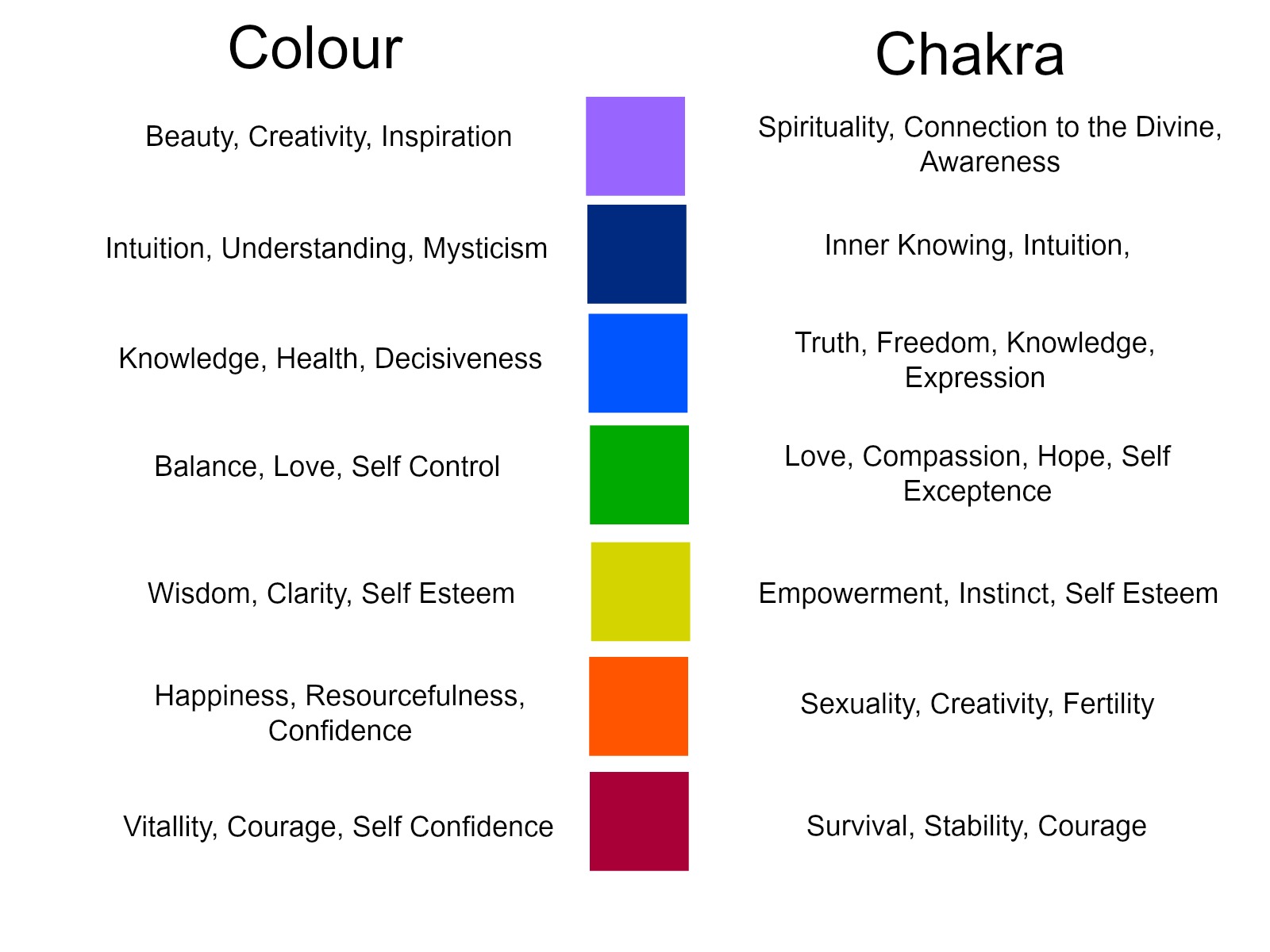
Beyond its scientific properties and technological applications, the “energy” of color translates powerfully into the realm of branding. A brand’s color palette is one of its most immediate and impactful communicators, capable of evoking emotions, signaling intent, and forging connections with consumers.
Crafting Brand Identity with Energetic Colors
Color is fundamental to brand identity. When we think of “high-energy” in a branding context, we often think of colors associated with passion, excitement, urgency, and dynamism. Red, for instance, is a powerful, high-energy color universally associated with passion, danger, excitement, and urgency. Many brands in the automotive, food, or entertainment sectors leverage red to convey speed, zest, or thrilling experiences. Think of Coca-Cola’s iconic red, symbolizing vitality and celebration, or Netflix’s bold red, denoting excitement and captivating content.
Similarly, orange blends the energy of red with the cheerfulness of yellow, often associated with creativity, enthusiasm, and innovation. Brands aiming to project approachability, youthful vigor, or a forward-thinking spirit might lean into orange. Yellow, while scientifically lower in energy than blue, is psychologically perceived as energetic, symbolizing optimism, happiness, and often affordability or speed.
The choice of these “energetic” colors sends a clear message about a brand’s corporate identity. It shapes reputation, influences first impressions, and can even differentiate a brand in a crowded marketplace, allowing it to stand out and capture attention.
Marketing and Conversion: Driving Action with Color
In marketing and advertising, color is a critical tool for influencing consumer behavior and driving conversions. High-energy colors are frequently employed for calls to action (CTAs) – buttons that prompt users to “Buy Now,” “Sign Up,” or “Learn More.” A brightly colored, attention-grabbing button, often in red, orange, or a vibrant green, can significantly increase click-through rates. The perceived urgency or excitement these colors evoke subtly encourages immediate action.
Beyond CTAs, the overall color scheme of marketing materials, websites, and apps for a particular brand plays a huge role in its effectiveness. A tech startup aiming to disrupt a traditional industry might use bold, contrasting, and “energetic” colors to signal its innovative and dynamic approach. Conversely, a luxury brand might opt for more subdued, sophisticated colors to convey exclusivity and timeless elegance. Case studies abound demonstrating how subtle shifts in color palette can lead to measurable changes in user engagement, conversion rates, and ultimately, sales.
Personal Branding and Digital Presence
The principles of brand color psychology extend to personal branding, an increasingly important aspect of professional and online life. For individuals looking to build a strong personal brand, particularly those involved in online income, side hustles, or digital consulting, the choice of colors for their website, social media profiles, and professional materials is crucial.
Someone aiming to be perceived as an energetic innovator might incorporate vibrant blues (linking to the scientific high-energy concept and tech association) or bold oranges (for creativity and enthusiasm) into their personal logo, website design, or presentation slides. A financial influencer might use colors that evoke trustworthiness (blues, greens) but also highlights (like an energetic accent color) for calls to action or to denote positive growth. By consciously selecting colors that align with their desired personal brand attributes, individuals can project a specific image, attract their target audience, and enhance their overall digital reputation.
The Financial Hue: Color’s Role in Money, Investment, and Value
While the core scientific answer to “what color has the most energy” points to violet and blue, the concept of “energy” in financial contexts shifts to symbolic power and influence. Color plays a surprisingly potent role in shaping perceptions, guiding decisions, and even driving transactions within personal finance, investing, and business finance.
Influencing Financial Decisions: Color in Investing and E-commerce
In financial tools and investment platforms, color is used judiciously to convey critical information. The most ubiquitous example is the use of green to signify gains and growth, and red to indicate losses or declines. While scientifically red is lower energy than green or blue, its psychological association with warning and stop signs makes it an “energetic” alert in finance. Conversely, green, associated with nature and growth, represents positive energy. These conventional color codes are deeply ingrained and quickly understood, facilitating rapid decision-making in fast-paced trading environments.
In e-commerce, the “energy” of color translates into its ability to stimulate purchasing decisions. High-energy, vibrant colors—reds, oranges, and bright yellows—are often deployed for flash sales, discount banners, and impulse-buy sections. These colors create a sense of urgency, excitement, and opportunity, tapping into primal psychological responses that encourage quick action. The perceived “energy” of a promotional graphic, heavily influenced by its color scheme, can directly impact a user’s likelihood to engage and convert.
Design for Online Income and Business Growth
For entrepreneurs, side hustlers, and small business owners building an online presence, strategic color use is not just aesthetic; it’s a direct driver of online income and business growth. Websites, landing pages, and marketing funnels designed with an understanding of color psychology can significantly impact user acquisition and conversion rates.
A website for a digital product or service that aims to be perceived as innovative and high-growth might employ a clean design with energetic accent colors, such as a sharp blue or a vibrant teal, to highlight key features or calls to action. A subscription service might use a combination of calming colors for its general interface (to build trust) and more energetic colors for trial offers or premium upgrades. By consciously designing with colors that evoke excitement, trust, and ease of use, online businesses can attract and retain customers, ultimately boosting their financial success. Financial tools for budgeting or tracking investments also use color to differentiate categories, highlight urgent notifications, or celebrate milestones, making complex data more digestible and engaging.
Financial Tools and Productivity
Modern financial tools, from budgeting apps to investment portfolios, leverage color to enhance user productivity and clarify complex information. The judicious application of color can transform a daunting spreadsheet into an intuitive dashboard. For instance, a personal finance app might use a spectrum of colors to categorize spending, with “high-energy” categories like entertainment or dining out often receiving more vibrant hues, making it easier for users to quickly identify where their money is going.
Color coding can also motivate users towards financial goals. Seeing a savings bar fill up with a reassuring green, or a debt repayment progress bar turn from red to blue, provides a powerful visual cue that can encourage consistent effort. These subtle yet effective design choices improve the user experience, making financial management less intimidating and more engaging, directly contributing to financial literacy and responsible money management. The “energy” of color here is its capacity to inform, motivate, and simplify, thereby increasing user productivity and leading to better financial outcomes.
The Multi-Faceted Energy of Color
Our journey through the electromagnetic spectrum and into the intricate worlds of technology, branding, and money reveals that the question “what color has the most energy?” holds far more depth than a simple scientific definition. While violet and blue light undeniably possess the highest intrinsic energy due to their shorter wavelengths and higher frequencies, the concept of “energy” when applied to color expands dramatically.
In technology, this literal energy translates into practical applications, from optimizing the power consumption of displays and shaping the efficiency of smart lighting to informing the algorithms of AI and guiding the design of intuitive user interfaces. Here, color is an engineering parameter, a design choice, and a critical factor in performance and user experience.
In branding, “energy” becomes a psychological force. Red, orange, and yellow, while lower in physical energy than blue or violet, are perceived as highly energetic, capable of stirring emotions, driving action, and defining a brand’s very essence. This perceived energy is a cornerstone of marketing strategy, influencing everything from corporate identity to conversion rates.
And in the realm of money, color’s “energy” manifests as its power to influence financial decisions, guide investments, and drive online income. From the green and red of financial dashboards to the vibrant calls to action in e-commerce, color is a silent partner in our economic interactions, subtly shaping our perceptions of value, urgency, and opportunity.
Ultimately, understanding the energy of color, in both its scientific and metaphorical senses, equips us with a powerful tool. Whether we are developers building the next generation of AI tools, brand strategists crafting compelling narratives, or individuals managing personal finances and exploring online income streams, recognizing the profound impact of color allows for more intentional design, more effective communication, and more informed decision-making in our increasingly colorful world. The energy of color, it turns out, is truly boundless.
aViewFromTheCave is a participant in the Amazon Services LLC Associates Program, an affiliate advertising program designed to provide a means for sites to earn advertising fees by advertising and linking to Amazon.com. Amazon, the Amazon logo, AmazonSupply, and the AmazonSupply logo are trademarks of Amazon.com, Inc. or its affiliates. As an Amazon Associate we earn affiliate commissions from qualifying purchases.