
An orange brick house presents a unique and often warm aesthetic, setting a distinctive tone for its visual identity. Choosing the right accompanying colors is not merely an act of decoration; it’s a strategic decision that significantly impacts the property’s overall brand, its market appeal, and the message it communicates to visitors and passersby. Just as a corporate logo or product packaging conveys specific values and personality, the exterior palette of a brick home shapes its “first impression brand” – a critical factor in how it’s perceived and valued.

Understanding Orange Brick: A Foundation for Your Brand Palette
Before selecting accent colors, a deep understanding of your orange brick’s inherent characteristics is paramount. This forms the foundational element of your property’s visual brand identity.
The Psychology and Heritage of Orange Brick
Orange brick, particularly in its more rustic or traditional forms, often evokes feelings of warmth, stability, and historical charm. It speaks to a legacy of craftsmanship and enduring quality. Psychologically, orange is an inviting and energetic color, symbolizing enthusiasm and hospitality. For a property, this translates into a brand persona that is approachable, grounded, and often perceived as a comforting haven. Modern interpretations of orange brick might lean towards cleaner lines and a more contemporary warmth, shifting the brand messaging towards sophisticated comfort rather than purely historical resonance. Recognizing these inherent psychological and historical associations allows for intentional branding, where chosen accent colors can either amplify these traits or strategically introduce complementary narratives.
Analyzing Your Brick’s Hue and Undertones
Orange brick isn’t monolithic; it exists on a spectrum. Its specific hue can range from a soft, earthy terracotta with pinkish or brown undertones to a vibrant, almost reddish-orange, or even a muted, sun-baked apricot with gray notes. The presence of mortar color also plays a significant role in defining the overall perceived “orange.”
- Undertones: Inspect your brick closely. Does it lean more towards red (warm undertone), brown (earthy undertone), or even a subtle grey (cooler undertone)? These subtle nuances are crucial. A brick with strong brown undertones might pair beautifully with muted greens, reinforcing an organic, natural brand. A brick with reddish undertones could be elevated by cooler greys or even deep blues, creating a more sophisticated contrast.
- Mortar Color: The mortar lines act as a binding element. Light mortar can brighten the overall appearance, while dark mortar can add depth and definition. Consider how the mortar color interacts with the brick hue when planning your accent palette, as it forms an integral part of the property’s visual texture and brand. This integrated perspective ensures a cohesive and well-articulated exterior identity.
Strategic Color Pairings: Elevating Curb Appeal and Property Identity
Once the core characteristics of your orange brick are understood, you can strategically select accent colors that enhance its unique brand and elevate its curb appeal. These choices are not arbitrary; they are deliberate design decisions aimed at reinforcing or diversifying the property’s visual message.
Complementary Contrasts: Bold Statements and Modern Branding
For properties aiming for a dynamic and modern brand identity, complementary contrasts are an excellent strategy. Colors directly opposite orange on the color wheel, primarily blues, provide a striking yet balanced juxtaposition.
- Deep Navy or Charcoal Blue: These colors offer a sophisticated counterpoint to warm orange brick. A navy blue door or shutters, paired with clean white trim, can create a classic, authoritative brand statement. It suggests stability, trustworthiness, and a timeless elegance, transforming a traditional home into a contemporary classic.
- Muted Sage or Olive Green: While not a direct complement on the color wheel, these earthy greens offer a natural, sophisticated contrast. They ground the vibrancy of orange brick, creating a serene and organic brand identity. This pairing works exceptionally well for properties seeking to convey a sense of tranquility, connection to nature, and understated luxury.
- Dark Grey or Black: These deep neutrals provide a strong, contemporary contrast. A glossy black front door or dark grey window frames can instantly modernize an orange brick façade, injecting a sense of urban chic and minimalist sophistication. This approach brands the property as sleek, stylish, and forward-thinking.
Harmonious Blends: Classic Elegance and Timeless Appeal
For properties seeking to amplify their inherent warmth and traditional charm, harmonious blends extend the existing color narrative.
- Cream or Off-White: These soft neutrals are excellent for trim, allowing the orange brick to be the undisputed star while providing a clean, bright edge. They create a welcoming, gentle brand that speaks of comfort and classic appeal. This is a safe yet effective strategy for maintaining a light and airy feel.
- Earthy Browns or Taupes: Drawing from the brown undertones often present in orange brick, these colors create a seamless and cohesive look. A rich brown door or taupe garage can enhance the natural, grounded brand of the property, suggesting reliability and understated strength. This palette creates a harmonious, integrated identity.
- Warm Greys: Unlike cooler greys, warm greys with beige or brown undertones can bridge the gap between orange brick and other neutral elements. They offer a sophisticated, muted balance that enhances warmth without competing, suitable for a brand that is subtly elegant and enduring.
Neutral Foundations: Versatility and Sophisticated Simplicity
Neutrals are the backbone of many successful brand palettes, offering versatility and timelessness. When paired with orange brick, they allow the brick’s character to shine while providing a sophisticated backdrop.
- Crisp White: White trim, soffits, and fascia offer a clean, bright delineation against orange brick. It’s a classic choice that provides a fresh, contemporary edge, making the brick pop. This branding strategy communicates cleanliness, order, and a timeless aesthetic that appeals broadly.
- Charcoal Grey: Dark greys provide a powerful, grounding effect. Used for trim, doors, or even secondary siding elements, charcoal can add a touch of modern sophistication, creating a striking contrast that is both bold and elegant. This elevates the property’s brand to one of confident, contemporary design.
- Warm Beige: For a softer, more integrated look, warm beige can blend seamlessly with many orange brick tones. It creates an inviting and understated brand, perfect for properties aiming for a gentle, approachable warmth without stark contrasts.
Beyond the Walls: Integrating Your Property’s Brand Elements
A cohesive property brand extends beyond the main wall color. Every visible element contributes to the overall narrative, and integrating these elements strategically is crucial for a strong, unified identity.
Trim, Doors, and Shutters: The Accentuated Brand Marks
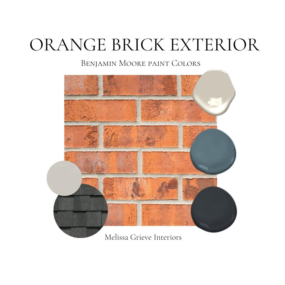
These architectural details are the “accessories” that complete your property’s brand outfit.
- Trim: The trim (window frames, fascia, soffits) outlines the property and defines its form. White, cream, or a soft beige provide a crisp contrast, making the brick color more vibrant. A dark grey or black trim can lend a more modern, architectural feel, giving the property a sharp, defined brand edge.
- Doors: The front door is a powerful focal point, the “welcome mat” of your property’s brand. A bold color (navy, deep green, or even a rich red) can make a strong statement, communicating personality and warmth. Alternatively, a stained wood door can enhance a natural, classic brand.
- Shutters: If present, shutters offer another opportunity for color. They can either match the trim for a unified look or introduce an accent color that complements the door, adding depth and visual interest to the property’s narrative.
Landscaping and Hardscaping: Extending the Visual Narrative
The natural elements surrounding your home are vital components of its overall brand.
- Greenery: Lush green landscaping provides a natural, refreshing contrast to orange brick. Dark green foliage (e.g., boxwoods, evergreens) offers a sophisticated backdrop, while lighter greens can add vibrancy. Strategic planting can soften harsh lines and introduce organic shapes, creating a welcoming and harmonious brand environment.
- Flowering Plants: Judicious use of flowering plants can inject bursts of complementary color. Blues, purples, and even some yellows can beautifully accent orange brick, adding layers of visual interest and seasonal brand freshness.
- Hardscaping: Patios, walkways, and driveways contribute to the property’s foundational brand. Materials like bluestone, grey pavers, or natural wood can provide a neutral or complementary base, ensuring that the ground elements reinforce the desired aesthetic without competing with the brick.
Roofing: The Unseen Yet Crucial Brand Element
Often overlooked, the roof color plays a significant role in the property’s overarching brand identity, tying together the entire visual package.
- Grey or Charcoal: These are popular choices that provide a solid, neutral top to an orange brick house. They offer a contemporary or classic look, depending on the architectural style, ensuring the property’s brand feels grounded and well-constructed.
- Browns: Earthy brown roofs can harmonize with the brick, creating a softer, more traditional brand identity that feels integrated and organic.
- Black: A black roof can create a striking, modern silhouette, especially when paired with dark trim, elevating the property’s brand to one of bold sophistication.
The Brand Perception: How Your Color Choices Communicate
Every color choice, every material selection, contributes to the non-verbal communication of your property’s brand. Understanding these perceptions allows for intentional design that supports your goals.
Communicating Warmth and Welcome
Using softer, harmonious colors like creams, warm greys, and natural wood stains amplifies the inherent warmth of orange brick. This creates a brand identity that is inviting, cozy, and approachable—a home that feels lived-in and loved. It’s a brand message of hospitality and comfort, often appealing to families and those seeking a traditional, nurturing environment.
Projecting Modernity and Sophistication
Pairing orange brick with strong contrasting neutrals like charcoal, navy, or black instantly shifts the brand perception towards modernity and sophistication. This strategy signals a property that is updated, stylish, and has a confident, perhaps even minimalist, aesthetic. It communicates an awareness of contemporary design trends while honoring the classic material, appealing to a discerning market that values sleekness alongside substance.
Enhancing Resale Value and Market Positioning
While direct financial advice is beyond this scope, it’s undeniable that a strong, appealing visual brand significantly impacts a property’s market positioning and perceived value. A well-chosen, cohesive exterior palette enhances curb appeal, making the property more attractive to potential buyers. It communicates attention to detail, good taste, and care—qualities that resonate deeply with anyone looking to invest in a home. Strategic color choices can differentiate a property in a competitive market, effectively branding it as a premium or desirable offering and influencing its ultimate resale potential.
Practical Application and Brand Consistency
Bringing your chosen color strategy to life requires practical steps and a commitment to brand consistency.
Digital Visualization Tools for Brand Previews
Before committing to paint, leverage technology. Many paint companies offer online visualization tools where you can upload a photo of your house and “try on” different colors. This digital preview is invaluable for seeing how various palettes impact the property’s overall brand and how the colors interact with the existing orange brick under different lighting conditions. It’s a low-risk way to test multiple brand identities before physical application.
Testing Swatches for True Brand Representation
Digital visualization is a great start, but real-world conditions vary. Always purchase sample pots and paint large swatches (at least 2×2 feet) directly onto the areas you intend to paint. Observe these swatches throughout the day and in varying weather conditions. Light changes everything, and a color that looks perfect online or in a small chip might appear different in direct sunlight or shade against your specific brick. This ensures the physical manifestation of your property’s brand aligns perfectly with your vision.

Maintaining Your Property’s Brand Over Time
A strong brand is consistent. Once you’ve established your property’s visual identity, maintain it diligently. Regular cleaning, timely repainting of trim and doors, and careful landscaping upkeep ensure that the chosen aesthetic remains fresh and impactful. This ongoing commitment to maintenance reinforces the quality and care associated with the property, preserving its curb appeal and its established brand messaging for years to come.
aViewFromTheCave is a participant in the Amazon Services LLC Associates Program, an affiliate advertising program designed to provide a means for sites to earn advertising fees by advertising and linking to Amazon.com. Amazon, the Amazon logo, AmazonSupply, and the AmazonSupply logo are trademarks of Amazon.com, Inc. or its affiliates. As an Amazon Associate we earn affiliate commissions from qualifying purchases.