
In the intricate world of branding, color is far more than a visual accent; it is a silent language, a powerful psychological trigger, and a cornerstone of corporate identity. The seemingly simple question, “what color goes with chocolate,” opens a fascinating dialogue about strategic design choices, consumer psychology, and the art of crafting a memorable brand narrative. For businesses leveraging the rich, versatile hue of chocolate—whether as a core product, a primary brand color, or a sophisticated accent—understanding its complementary palette is crucial for establishing desired perceptions, enhancing market appeal, and fostering enduring brand loyalty.
The Strategic Role of Color in Branding
Color selection is one of the most impactful decisions in brand development. It transcends mere aesthetics, delving deep into the realms of psychology, cultural association, and immediate recognition. A well-chosen color palette can evoke emotions, communicate values, differentiate a brand from its competitors, and ultimately influence purchasing behavior.
Beyond Aesthetics: Psychological Impact of Color
Each color carries a spectrum of associations and triggers specific emotional responses. Brown, often the base for “chocolate,” typically conveys warmth, reliability, earthiness, and authenticity. It’s a color often associated with comfort, nature, and organic qualities. However, its perceived value and emotional resonance can be dramatically altered by the colors it’s paired with. For instance, brown paired with gold might suggest luxury and heritage, while brown with vibrant green could evoke freshness and natural ingredients. A brand aiming for a premium position will select a different accompanying palette than one focusing on affordability or playful innovation. Understanding these psychological undercurrents allows brands to intentionally steer consumer perception and create an emotional connection that resonates with their target audience.
Establishing Brand Recognition and Recall
Consistent and distinctive color usage is paramount for brand recognition. Think of iconic brands that are instantly identifiable by their signature hues—a particular shade of red, blue, or yellow. When “chocolate” is a central element of a brand’s visual identity, the complementary colors chosen must reinforce its uniqueness while ensuring ease of recall. This consistent application across all brand touchpoints, from product packaging to digital interfaces, cements the brand’s aesthetic in the consumer’s mind, building equity and simplifying identification in a crowded marketplace. A carefully constructed palette ensures that even a fleeting glance conveys the brand’s essence, making it stand out and stick in memory.
Deconstructing “Chocolate”: A Spectrum of Brown Hues
The term “chocolate” itself is not a single color but rather a vast spectrum of rich browns, each with its own nuances and branding implications. Identifying the specific “chocolate” hue a brand embodies is the first step in building a harmonious and impactful color strategy.
Dark Chocolate: Richness and Luxury
Deep, dark chocolate tones—think of bitter ganache or espresso beans—exude sophistication, luxury, and intensity. These profound browns suggest quality, indulgence, and often a more mature or exclusive appeal. Brands aiming for a high-end positioning, such as premium confectioners, gourmet coffee brands, or luxury leather goods, often gravitate towards these darker shades. They convey a sense of gravitas, heritage, and refined taste. When paired correctly, dark chocolate can anchor a brand in opulence.
Milk Chocolate: Warmth and Approachability
Lighter, warmer, and often sweeter browns akin to milk chocolate evoke comfort, nostalgia, and approachability. This shade communicates a sense of gentle indulgence, family-friendliness, and everyday pleasure. Brands targeting a broader consumer base, especially in the confectionery, bakery, or comfort food sectors, might find milk chocolate tones ideal for conveying warmth, familiarity, and a welcoming atmosphere. It’s a softer, more inviting brown that can be easily paired with a wider range of colors without losing its inherent warmth.
White Chocolate: Purity and Modernity
While not brown, “white chocolate” represents a distinct segment within the chocolate family, offering a unique branding opportunity. Its creamy, off-white hue signifies purity, lightness, and often a modern, minimalist aesthetic. Brands seeking to convey innovation, a delicate touch, or a departure from traditional norms might leverage white chocolate as their primary color inspiration. It suggests cleanliness, newness, and a subtle elegance, making it excellent for brands focused on wellness, premium dairy, or contemporary design.
Curating the Perfect Palette: Complementary Colors for Chocolate Brands
Once the specific “chocolate” hue is identified, the strategic task shifts to selecting complementary colors that amplify its strengths and align with the brand’s overall identity and market positioning.

Classic Pairings: Elegance and Tradition
For brands aiming to convey timeless elegance, luxury, and heritage, certain classic pairings with chocolate tones are unparalleled.
- Gold and Copper: These metallic hues instantly elevate chocolate, adding a touch of opulence, wealth, and celebration. Ideal for premium packaging, celebratory products, or brands emphasizing richness and quality.
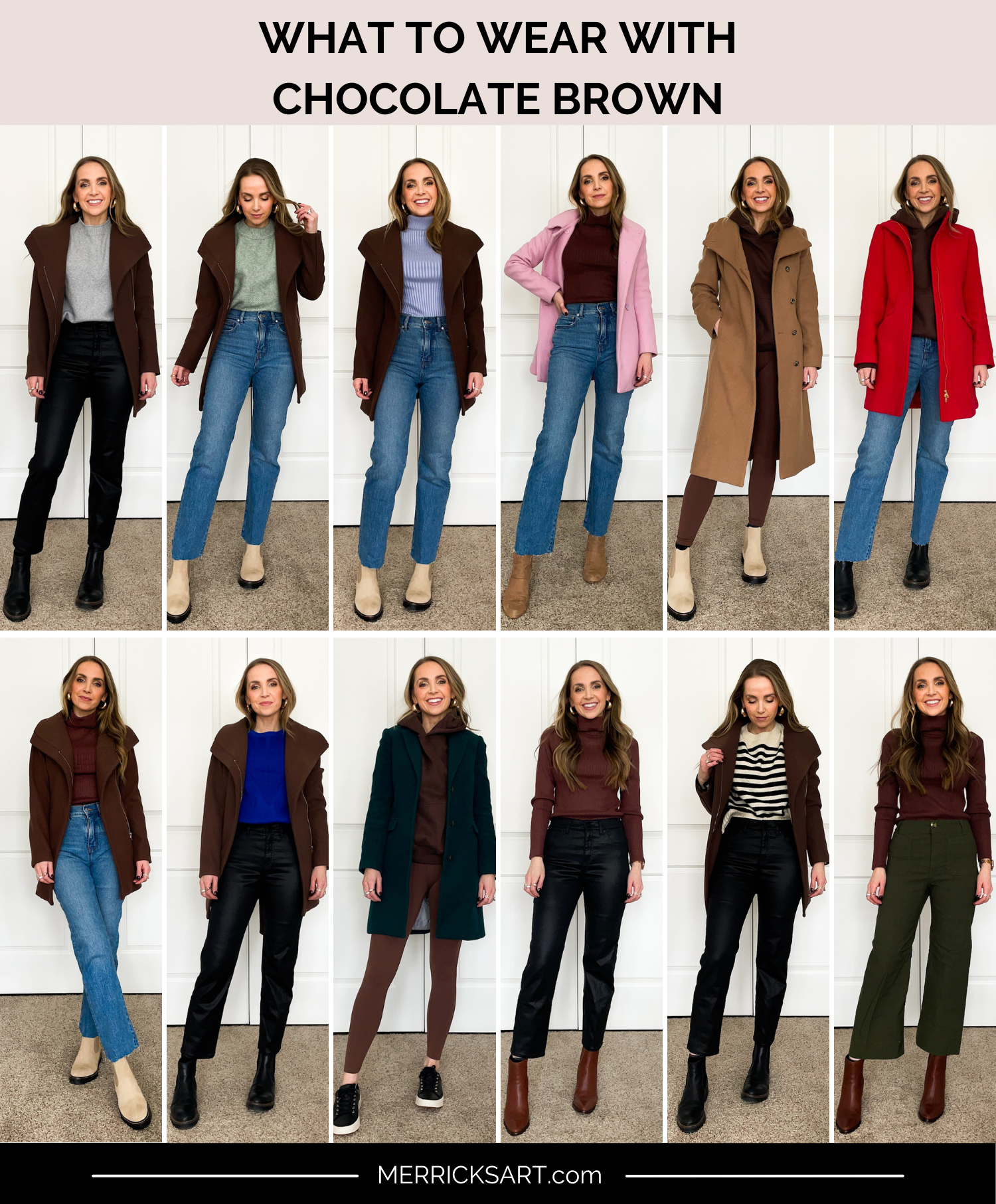
- Cream and Ivory: Soft, understated creams offer a refined contrast, lending an air of sophistication and classic beauty. This pairing often evokes comfort, warmth, and a subtle luxury without being overtly flashy. It works well for artisanal brands or those wanting to project a gentle, welcoming luxury.
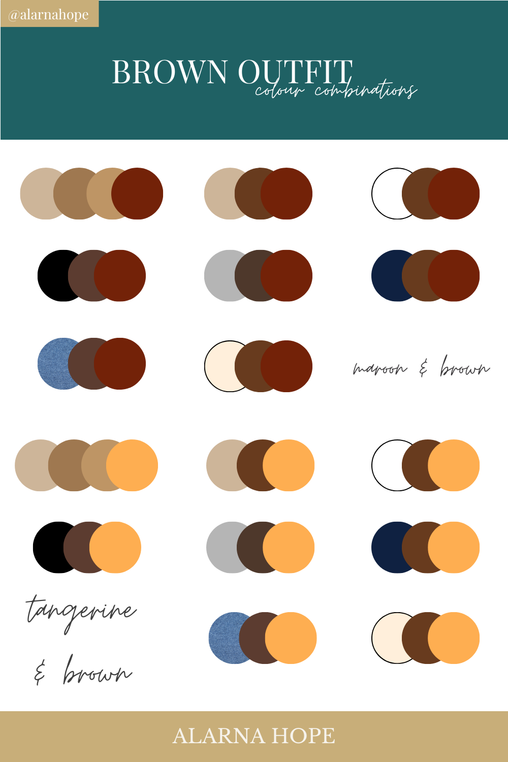
- Deep Reds (Burgundy, Maroon): These rich reds add a layer of passion, intensity, and historical depth to chocolate browns, suggesting a refined indulgence and often appealing to a sophisticated palate.
Vibrant Contrasts: Modernity and Energy
To infuse a chocolate brand with dynamism, modernity, and a youthful energy, contrasting vibrant colors can create an engaging and memorable palette.
- Teal and Aqua: These cool, refreshing blues and greens offer a striking contrast to the warmth of chocolate, suggesting innovation, freshness, and a playful yet sophisticated edge. This can be particularly effective for modern confectionery brands or those with an innovative product line.
- Orange and Coral: Warm, energetic oranges and corals provide a lively counterpoint to chocolate, evoking zest, creativity, and a contemporary appeal. This pairing can be excellent for snack brands, casual cafes, or products aimed at a younger, vibrant demographic.
- Raspberry and Cerise: Bright, vivacious pinks and reds inject a sense of fun, sweetness, and modern indulgence. Often used in dessert branding, this combination signifies playful luxury and an irresistible allure.
Earthy Harmony: Natural and Organic Appeal
Brands rooted in nature, sustainability, or organic principles will find harmony in a palette that reflects the earth’s natural textures and tones.
- Sage Green and Olive: These muted greens intrinsically link chocolate with nature, health, and organic goodness. They suggest freshness, sustainability, and a wholesome quality, perfect for brands emphasizing natural ingredients or eco-friendly practices.
- Terracotta and Rust: Drawing from natural clay and minerals, these warm, earthy tones enhance chocolate’s organic appeal, evoking authenticity, craftsmanship, and a rustic charm.
- Oatmeal and Linen: Neutral, textured whites and beiges provide a calm, natural backdrop that allows the chocolate tones to feel grounded and authentic, reinforcing a sense of purity and artisanal quality.
Unexpected Alliances: Innovation and Differentiation
Sometimes, breaking conventional rules leads to innovative and highly differentiated brand identities.
- Lavender and Mauve: These softer purples can create a unique, almost whimsical pairing with chocolate, suggesting creativity, enchantment, and a departure from the ordinary. This unexpected combination can capture attention for brands seeking to be perceived as artistic, sophisticated, or subtly magical.
- Pale Blue and Powder Blue: While less common, very light blues can introduce a sense of lightness, freshness, and intriguing contrast to chocolate, evoking a sophisticated calmness. This pairing might work for high-end patisseries or brands aiming for a clean, minimalist yet inviting aesthetic.
Implementing Color Strategy Across Brand Touchpoints
A coherent color strategy ensures that the chosen palette resonates consistently across every interaction a consumer has with the brand. This holistic approach builds recognition and reinforces the brand’s message.
Packaging Design: The First Impression
For chocolate products themselves, packaging is arguably the most critical touchpoint. The interplay of chocolate hues with complementary colors must be visually arresting on shelf, communicate the product’s quality and flavor profile, and align with the brand’s overarching identity. A dark chocolate paired with gold foil speaks volumes about luxury, while milk chocolate with a vibrant teal stripe might signal a fun, modern treat. The texture, finish, and font choices within the color scheme further refine the message.
Digital Presence: Websites, Social Media, Apps
In the digital realm, color choices impact user experience, emotional engagement, and accessibility. A website featuring chocolate tones must balance warmth with clarity, ensuring readability and an intuitive flow. Complementary colors should guide the user’s eye, highlight calls to action, and maintain brand consistency. Social media visuals, app interfaces, and email marketing campaigns must all adhere to the established palette to create a cohesive and recognizable digital footprint, reinforcing the brand personality across diverse platforms.
Retail Environments and Experiential Marketing
Physical spaces, whether a boutique chocolate shop, a cafe, or a pop-up experience, are prime opportunities to immerse consumers in the brand’s color story. Wall colors, furniture, lighting, and décor elements should all harmoniously integrate the chocolate palette and its chosen complements. This creates an inviting atmosphere that reinforces the brand’s values, whether it’s the rich warmth of a traditional chocolatier or the clean, modern aesthetic of an artisanal coffee brand. The sensory experience, driven significantly by visual cues, deepens brand engagement.
Corporate Identity and Communication Materials
Beyond consumer-facing elements, the brand’s internal and external communications—business cards, letterheads, presentations, and employee uniforms—must also reflect the chosen color strategy. This consistency fosters a strong corporate identity, projecting professionalism and unity. It ensures that every touchpoint, from an invoice to an annual report, subtly yet powerfully communicates the brand’s essence and its meticulous attention to detail.
In conclusion, the question “what color goes with chocolate” is a gateway to a sophisticated understanding of brand aesthetics. It highlights the strategic imperative of color in shaping perception, conveying values, and fostering an unbreakable bond with consumers. By meticulously selecting and consistently applying a complementary palette, brands can transform the versatile richness of chocolate into a compelling and unforgettable identity that stands the test of time and taste.
aViewFromTheCave is a participant in the Amazon Services LLC Associates Program, an affiliate advertising program designed to provide a means for sites to earn advertising fees by advertising and linking to Amazon.com. Amazon, the Amazon logo, AmazonSupply, and the AmazonSupply logo are trademarks of Amazon.com, Inc. or its affiliates. As an Amazon Associate we earn affiliate commissions from qualifying purchases.