
White, in the realm of branding and design, is far more than just the absence of color; it is a foundational element, a canvas, and a powerful statement in itself. Its inherent versatility and symbolic purity make it an indispensable asset for brands looking to convey clarity, sophistication, and a modern aesthetic. The strategic choice of colors to pair with white can profoundly impact brand perception, influencing everything from consumer trust to purchase intent. Understanding these dynamics is crucial for crafting a compelling corporate identity, designing engaging marketing collateral, and building a memorable brand presence.

The Enduring Power of White in Branding
White serves as an anchor in the complex world of brand design, offering a clean slate that allows other elements to shine. Its psychological associations contribute significantly to its efficacy, making it a go-to choice for companies across diverse industries.
Purity, Simplicity, and Versatility
White is universally associated with purity, cleanliness, and simplicity. For brands, this translates into an image of transparency, honesty, and an uncluttered approach. In a saturated market, a brand that communicates clarity through its color palette can cut through the noise. Its minimalist quality is particularly appealing in an era where consumers often seek authenticity and straightforward communication. Moreover, white’s unparalleled versatility means it can adapt to virtually any brand personality, from high-tech startups to luxury fashion houses, acting as a sophisticated backdrop or a dominant feature itself.
Strategic Use in Logo and Web Design
In logo design, white can provide negative space that defines shapes and enhances readability, making a brand mark feel crisp and modern. When used as the primary background color for a website or application, white improves usability, readability, and user experience. It creates a sense of spaciousness, reducing visual fatigue and directing the user’s focus to key content and calls to action. Brands like Apple and Google leverage white extensively to underscore their commitment to user-friendly design and intuitive interfaces, demonstrating how a minimalist approach can communicate innovation and accessibility.
Classic Pairings: Timeless Combinations
Certain color combinations with white have stood the test of time, proving their efficacy in communicating specific brand attributes. These pairings are often rooted in fundamental design principles and widely understood psychological associations.
Black: The Ultimate Contrast
The monochromatic pairing of black and white is perhaps the most iconic and powerful in design. It exudes sophistication, professionalism, and a timeless elegance that never goes out of style. Black provides a strong contrast against white, ensuring excellent readability and visual impact. Brands aiming for a high-end, exclusive, or authoritative image frequently employ this combination. Think of luxury brands like Chanel or classic media outlets; their reliance on black and white underscores their enduring legacy and premium status, communicating gravitas and refined taste.
Navy Blue: Professionalism and Trust
Navy blue, when paired with white, conveys a sense of trust, stability, and corporate professionalism. It’s a combination frequently seen in finance, legal, and healthcare sectors, where reliability and authority are paramount. White brightens the deep hue of navy, preventing it from appearing too somber, while navy adds a layer of seriousness and gravitas that white alone cannot achieve. This pairing suggests a brand that is dependable, experienced, and committed to high standards, making it an excellent choice for businesses that want to inspire confidence in their clientele.
Gray: Sophistication and Subtlety
Gray offers a more nuanced alternative to black, providing a softer contrast with white that still speaks volumes about sophistication and modernity. This pairing creates a refined, understated aesthetic often favored by tech companies, architectural firms, and contemporary design brands. Gray can range from light silver tones, which add an airy and elegant feel, to dark charcoal, which brings a more grounded and serious tone. White brightens the overall palette, preventing it from becoming too muted, and together they communicate balance, impartiality, and thoughtful design.
Vibrant Pairings: Adding Energy and Personality
While classic combinations convey tradition and professionalism, vibrant colors paired with white can infuse a brand with energy, dynamism, and a distinctive personality, appealing to younger demographics or sectors focused on innovation and creativity.
Red: Boldness and Urgency
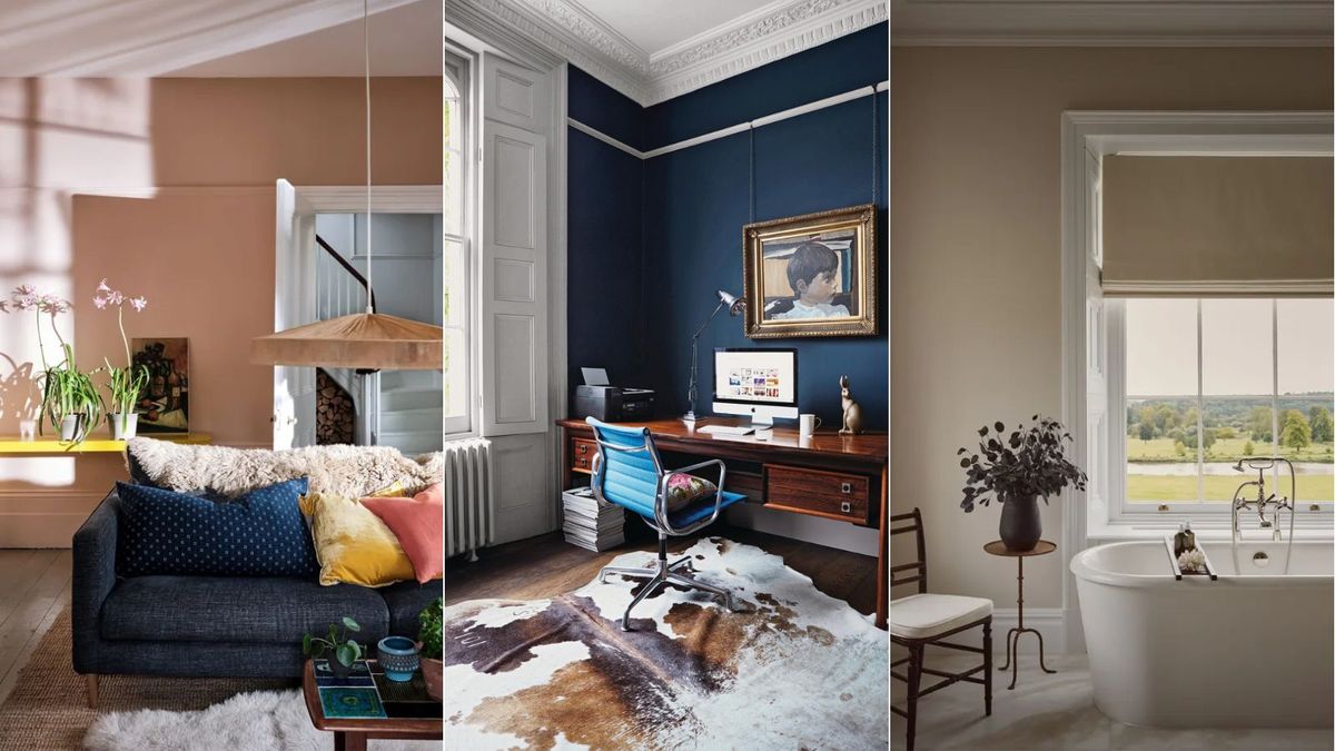
Red, when contrasted with white, creates an incredibly bold and energetic statement. It’s a color associated with passion, excitement, and urgency, making it ideal for brands that want to capture attention and stimulate action. White provides the necessary balance, preventing the red from becoming overwhelming, and allows the vibrancy of red to pop even more effectively. This pairing is often seen in fast food, sports branding, and sales promotions, where the goal is to ignite enthusiasm and drive immediate engagement. The cleanliness of white keeps the intensity of red from appearing chaotic.
Green: Nature, Growth, and Serenity
Pairing green with white evokes feelings of nature, freshness, growth, and tranquility. This combination is highly effective for brands in organic food, eco-friendly products, health and wellness, or any sector wishing to emphasize sustainability and vitality. Light greens against white can feel fresh and invigorating, while deeper forest greens can convey stability and natural elegance. White enhances the natural feeling of green, making the overall brand identity feel clean, healthy, and environmentally conscious, appealing to consumers who prioritize well-being and responsible living.
Yellow: Optimism and Attention
Yellow, when used alongside white, brings a sense of optimism, cheerfulness, and youthful energy. It’s an attention-grabbing color that can make a brand feel approachable and friendly. White mutes some of yellow’s intensity, preventing it from appearing garish, and together they form a bright, inviting palette. This combination is often employed by brands targeting children, creative industries, or those wanting to project innovation and positivity. It suggests a brand that is energetic, forward-thinking, and eager to engage with its audience in a joyful manner.
Modern & Nuanced Pairings: Contemporary Brand Expression
Beyond the classic and vibrant choices, modern branding often explores more subtle, complex, or unconventional pairings with white to create unique and sophisticated brand expressions.
Pastels: Softness and Approachability
Pastel colors, such as mint green, blush pink, lavender, or baby blue, offer a softer, more delicate aesthetic when combined with white. This pairing conveys approachability, gentleness, and modern sophistication. It’s particularly popular in beauty, fashion, lifestyle, and children’s brands, where a light, airy, and inviting feel is desired. White provides a clean backdrop that allows the subtle hues of pastels to stand out without being overpowering, creating an elegant and contemporary visual identity that feels fresh and accessible.
Metallics: Luxury and Innovation
The addition of metallic accents—gold, silver, or rose gold—against a white background instantly elevates a brand’s perceived value and sophistication. This combination is synonymous with luxury, high quality, and technological innovation. White enhances the shimmer and reflectivity of metallics, making them appear even more lustrous and premium. Brands in high-end jewelry, automotive, tech gadgets, or luxury services frequently leverage this pairing to communicate exclusivity, cutting-edge design, and superior craftsmanship, appealing to a discerning clientele.
Earth Tones: Organic and Authentic
Earth tones like terracotta, sage, warm beige, or olive green paired with white create an organic, grounded, and authentic brand identity. This combination is favored by brands that emphasize natural ingredients, craftsmanship, sustainability, or a connection to heritage and tradition. White provides a clean, breathable space that allows the rich, earthy hues to feel natural and inviting without being rustic. It communicates honesty, reliability, and a wholesome approach, resonating with consumers who value genuineness and a connection to the natural world.
The Psychology of Color: Beyond Aesthetics
While identifying visually pleasing color combinations is essential, truly effective branding goes deeper, considering the psychological impact of color choices within specific contexts and for particular audiences.
Context and Target Audience
The “best” color to pair with white is not universally fixed; it is highly dependent on the brand’s industry, target audience, and overarching message. A tech startup might opt for a minimalist white and gray scheme to convey innovation and efficiency, while a children’s toy brand would likely use white with bright, playful colors to communicate fun and safety. Understanding who the brand is trying to reach and what emotional response it seeks to elicit is paramount. Research into cultural color associations is also crucial, as meanings can vary significantly across different regions.

Consistency Across Touchpoints
Once a primary color pairing with white is chosen, maintaining consistency across all brand touchpoints is critical for building strong brand recognition. This includes everything from the logo and website to packaging, social media graphics, and physical storefronts. A consistent color palette, expertly integrated with white, reinforces the brand’s identity, makes it instantly recognizable, and builds trust and familiarity over time. Strategic color usage, anchored by the versatility of white, ensures a cohesive and memorable brand experience that resonates deeply with its intended audience.
aViewFromTheCave is a participant in the Amazon Services LLC Associates Program, an affiliate advertising program designed to provide a means for sites to earn advertising fees by advertising and linking to Amazon.com. Amazon, the Amazon logo, AmazonSupply, and the AmazonSupply logo are trademarks of Amazon.com, Inc. or its affiliates. As an Amazon Associate we earn affiliate commissions from qualifying purchases.