
In the intricate world of brand development, color is far more than mere aesthetics; it is a silent language, a powerful psychological tool that shapes perception, evokes emotion, and fosters connection. Choosing the right color palette can distinguish a brand, convey its values, and resonate deeply with its target audience. Sage green, with its earthy sophistication and calming presence, has emerged as a favored hue for brands aiming to communicate tranquility, growth, natural authenticity, and subtle elegance. Understanding which colors complement sage green is not just about visual harmony; it’s about crafting a cohesive brand narrative and strengthening your corporate identity.
The Brand Power of Sage Green: A Foundation of Serenity and Sophistication
Sage green is a muted, desaturated shade of green, reminiscent of dried sage leaves. Its inherent qualities are deeply rooted in nature, making it a compelling choice for brands that wish to convey:
- Natural & Organic: A strong association with health, wellness, sustainability, and environmental consciousness. Brands in the eco-friendly, organic food, or natural beauty sectors find sage green particularly effective.
- Tranquility & Calm: Its subdued tone evokes a sense of peace, balance, and stability, appealing to wellness services, home decor, or personal development brands.
- Sophistication & Timelessness: Unlike brighter greens, sage possesses a muted elegance that suggests maturity, wisdom, and understated luxury, making it suitable for high-end lifestyle brands or established professional services.
- Growth & Renewal: While subdued, it retains the essence of green, subtly hinting at development, freshness, and new beginnings without being overtly vibrant.
As a primary or secondary brand color, sage green offers remarkable versatility. Its mild temperament allows it to serve as a grounding neutral or a sophisticated accent, always contributing to a brand’s desired persona. The key lies in selecting companion colors that amplify its strengths and align with the overarching brand message.
Harmonious Complements: Building Trust and Serenity
When pairing colors with sage green to build a brand identity that exudes trust, serenity, and approachability, the focus shifts to creating visual harmony and balance. These pairings often leverage analogous or monochromatic principles, or subtle complementary shades that don’t overwhelm sage green’s inherent calm.
Neutrals and Earth Tones: Grounding Your Brand
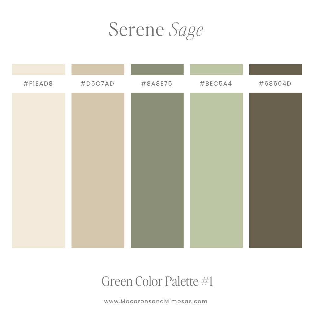
- Warm Whites, Creams, and Off-Whites: These soft neutrals are perhaps the most natural companions for sage green. They lighten the palette, add a sense of airiness, and enhance sage green’s organic feel. For brands in sustainable fashion, minimalist home goods, or artisanal crafts, a sage green and cream palette communicates purity, simplicity, and natural elegance. It feels clean, inviting, and highly approachable without being stark.
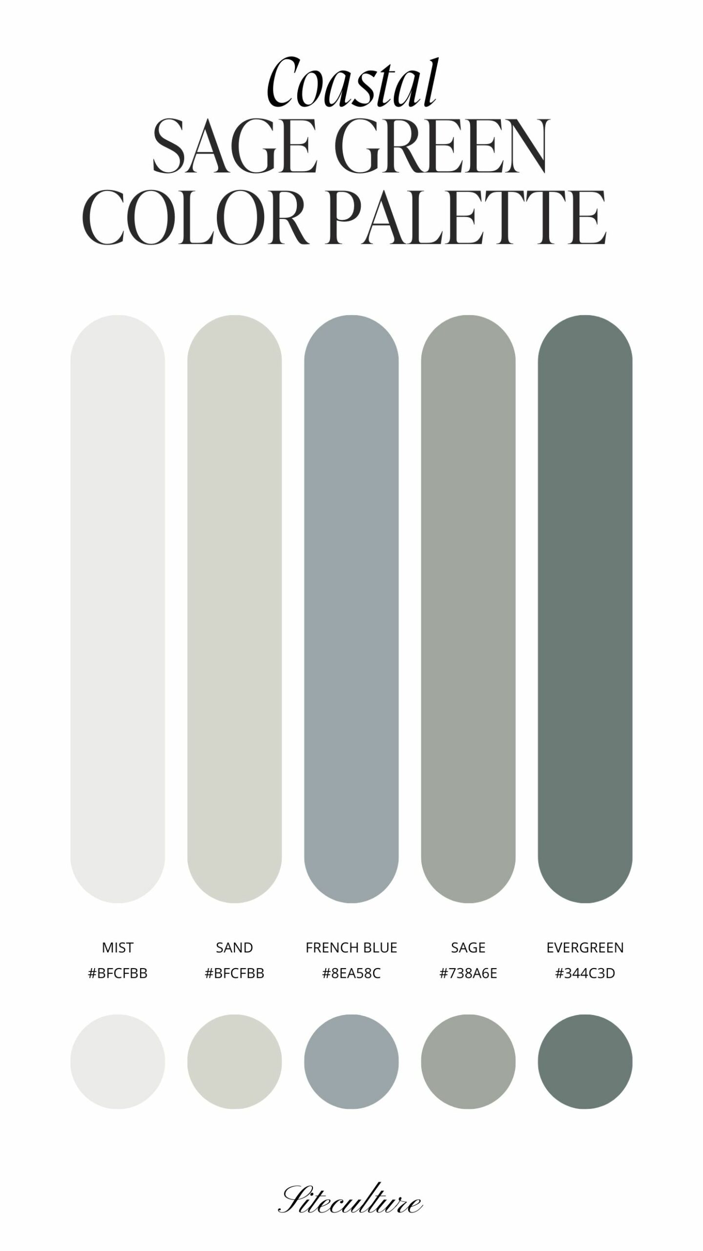
- Light Grays and Greiges: A subtle contrast that maintains sophistication. Light grays, especially those with warm undertones (greige), can provide a modern, refined edge. This combination is excellent for brands seeking a contemporary yet timeless appeal, such as architectural firms, interior design studios, or high-end tech accessories that value understated design.
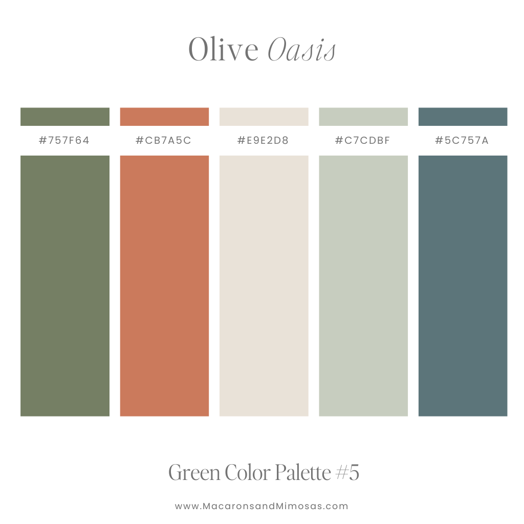
- Muted Browns and Terracotta: Leaning into sage green’s earthy origins, muted browns (like taupe or mushroom) and soft terracotta hues create a deeply grounded and authentic feel. This palette is ideal for brands emphasizing craftsmanship, heritage, and a connection to natural materials – think handcrafted leather goods, ceramic art, or artisanal food products. It evokes warmth, stability, and a rich, natural story.
Serene Accents: Enhancing Calm and Innovation
- Pale Blues and Dusty Lavenders: These soft, cool tones beautifully complement sage green, extending its tranquil and serene qualities. Pale blues, such as sky blue or periwinkle, can add a sense of calm, clarity, and trust, making them suitable for wellness brands, spas, or sustainable technology companies. Dusty lavenders introduce a touch of dreaminess, creativity, and spiritual depth, perfect for mindfulness apps, bespoke fragrance brands, or unique experience providers. These combinations enhance sage green without creating harsh contrasts, maintaining a gentle and inviting brand presence.
Dynamic Contrasts: Making a Statement and Driving Engagement
While harmony builds trust, strategic contrast creates impact and memorability. Introducing bolder or more saturated colors alongside sage green can elevate a brand’s energy, highlight specific attributes, and draw the eye, all while maintaining an underlying sense of sophistication.
Warm Pops: Adding Vitality and Approachability
- Muted Pinks and Corals: These shades introduce a gentle warmth and vibrancy that beautifully offsets sage green’s coolness. Muted rose, blush pink, or soft coral can add a touch of modern femininity, playfulness, or nurturing appeal. This pairing is highly effective for beauty brands, lifestyle blogs, children’s products, or boutique retail, conveying a welcoming, fresh, and approachable brand image that still feels refined. It’s a way to inject personality without sacrificing elegance.
- Soft Golds and Bronzes: For brands aiming for a touch of luxury, exclusivity, or vintage charm, metallic accents in soft gold or bronze are an excellent choice. They catch the light, add visual weight, and convey a sense of premium quality and heritage. This combination works exceptionally well for high-end jewelry, gourmet food packaging, sophisticated event planning, or artisan-made decor, signaling quality and discerning taste.
Deep Tones: Conveying Depth, Authority, and Modernity
- Deep Teals and Navy Blues: These rich, profound colors create a sophisticated and authoritative contrast with sage green. A deep teal can amplify sage green’s natural aspect while adding a layer of mystery and elegance, suitable for innovative tech brands, luxury travel, or creative agencies. Navy blue, a timeless symbol of professionalism and trust, pairs with sage green to convey stability, depth, and corporate reliability. This palette is excellent for financial institutions, consulting firms, or high-end real estate, where a blend of approachability and gravitas is desired.
- Burgundy or Deep Plum: These rich, jewel-toned colors can add a sense of luxury, passion, and artistic flair when used sparingly as an accent. Paired with sage green, they create a sophisticated and slightly dramatic palette, ideal for gourmet food, luxury fashion, or cultural institutions looking to evoke richness and depth.
Strategic Application Across Brand Touchpoints
The effective integration of sage green and its complementary colors extends far beyond a logo; it permeates every aspect of a brand’s visual identity, reinforcing its message and enhancing brand recognition.
Logo Design & Branding Guidelines
For a logo, the chosen palette should be concise and impactful. Sage green as a primary or secondary color, combined with one or two complementary hues, can create a distinctive and memorable mark. Branding guidelines should then define how these colors are used across all assets, ensuring consistency in tone, saturation, and proportion. This includes specifications for print (CMYK), digital (RGB/Hex), and web (CSS) applications.
Website and Digital Presence
On a website, sage green can be used for backgrounds, navigation elements, or hero sections to establish a calming and trustworthy atmosphere. Complementary colors can highlight calls to action, headings, or interactive elements, guiding the user’s eye and creating visual interest. The consistency of this palette across social media profiles, email newsletters, and digital advertising is crucial for a unified online brand experience. A sage green and warm white interface might signify a user-friendly, approachable app, while sage green with deep teal accents could speak to a sophisticated, data-driven platform.
Marketing Materials and Packaging
From brochures and business cards to product packaging, the chosen color palette communicates brand quality and values. A sustainable brand using sage green with kraft paper tones and subtle terracotta accents in its packaging immediately conveys its eco-conscious ethos and artisanal quality. A luxury brand might use sage green with gold foil accents on its packaging to suggest exclusivity and premium status, engaging the customer’s senses even before the product is revealed.
Retail and Office Environments
Extending the brand palette into physical spaces, such as retail stores or corporate offices, creates an immersive brand experience. Sage green walls combined with natural wood tones and cream furnishings can foster a calm and inviting atmosphere in a wellness clinic or a boutique retail space. For a tech startup, sage green accent walls paired with light gray furniture and pops of muted pink or coral in decor can create a vibrant yet serene workspace that inspires creativity and collaboration.
Crafting Your Unique Brand Palette with Sage Green
The ultimate goal in selecting a color palette with sage green is to reflect the unique personality and strategic objectives of your brand. Begin by:
- Defining Your Brand’s Core Values: What emotions and messages do you want to convey? Is it tranquility, innovation, luxury, or sustainability?
- Understanding Your Target Audience: Which colors resonate with them? Do they prefer subtle elegance or vibrant energy?
- Analyzing the Competitive Landscape: How can your palette stand out while remaining relevant to your industry?
- Experimenting and Iterating: Create mood boards, test different combinations, and gather feedback. Observe how the colors interact and what feelings they evoke.
By meticulously selecting complementary colors, brands can harness the inherent charm of sage green to build a distinctive, memorable, and emotionally resonant identity that speaks volumes without uttering a single word. It’s an investment in design strategy that pays dividends in brand recognition, customer loyalty, and market differentiation.
aViewFromTheCave is a participant in the Amazon Services LLC Associates Program, an affiliate advertising program designed to provide a means for sites to earn advertising fees by advertising and linking to Amazon.com. Amazon, the Amazon logo, AmazonSupply, and the AmazonSupply logo are trademarks of Amazon.com, Inc. or its affiliates. As an Amazon Associate we earn affiliate commissions from qualifying purchases.