
In the intricate world of brand strategy and corporate identity, color is far more than an aesthetic choice; it is a potent psychological tool, a silent communicator of values, and a critical component of brand recognition. For businesses aiming to carve a distinct niche, understanding how to harness the power of vibrant hues like magenta is paramount. Magenta, a captivating blend of red and blue, stands out for its bold, energetic, and often unconventional appeal. Its successful integration into a brand’s visual language hinges on selecting companion colors that amplify its strengths, temper its intensity, and resonate with the desired brand narrative. This strategic approach to color pairing ensures that magenta doesn’t just catch the eye, but effectively conveys a brand’s essence, engages its target audience, and solidifies its market position.

The Brand Power of Magenta: A Strategic Starting Point
Before diving into specific color pairings, it’s crucial to understand magenta’s inherent psychological impact and how it aligns with your brand’s overarching message. Magenta is not a timid color; it demands attention and evokes a spectrum of strong emotions. Its strategic use can distinguish a brand in a crowded marketplace, but an ill-considered pairing can lead to confusion or unintended associations.
Decoding Magenta’s Psychological Impact
Magenta, sitting at the intersection of red’s passion and blue’s stability, often embodies a duality that can be leveraged for diverse brand identities. On one hand, it conveys creativity, innovation, and an artistic flair, often associated with out-of-the-box thinking and forward-looking brands. Its intensity can signal excitement, energy, and even a touch of playful rebellion, making it popular among disruptive tech companies, fashion labels, and creative agencies. On the other hand, its inherent connection to purple also imbues it with connotations of luxury, sophistication, and transformation. It suggests ambition, individuality, and a departure from the ordinary, appealing to brands that cater to an exclusive or discerning audience. The challenge, and the opportunity, lies in harnessing these multifaceted associations to serve a specific brand purpose.
Identifying Your Brand’s Core Message
The choice of companion colors for magenta must always emanate from your brand’s core message and target audience. Is your brand about youthful exuberance and accessibility, or sophisticated luxury and exclusivity? Are you disrupting an industry with bold innovation, or offering a creative solution with an artistic touch? For a brand aiming for a high-energy, creative vibe, pairings that enhance magenta’s vibrancy would be ideal. Conversely, if the goal is to project modern luxury or understated confidence, more subdued or sophisticated pairings might be more effective. Understanding your brand’s personality—its mission, vision, values, and the emotions you want to evoke—is the compass that guides all color decisions, ensuring that magenta and its chosen companions work in concert to tell a cohesive and compelling brand story.
Harmonious Pairings: Elevating Magenta’s Brand Presence
The art of pairing magenta effectively lies in understanding color theory principles and applying them with strategic intent. Different color relationships—complementary, analogous, and monochromatic—offer distinct avenues for creating visual harmony, contrast, and depth within a brand’s identity.
Complementary Contrasts: Green and Teal
The most impactful contrast for magenta comes from its complementary colors: greens and teals. Green, being directly opposite magenta on the color wheel, creates a dynamic and high-energy pairing. This combination is inherently attention-grabbing, making it ideal for brands that want to stand out, project boldness, or signal innovation and disruption. Consider an eco-conscious brand that wants to combine the vibrancy of magenta (creativity, individuality) with the organic, growth-oriented feel of green. This pairing offers maximum visual impact and can be incredibly memorable, but must be used judiciously to avoid overwhelming the audience. Teal, a blue-green hue, offers a slightly softer, more sophisticated complementary contrast. It introduces a sense of calm and professionalism, balancing magenta’s intensity with an element of trustworthiness and modernity. This pairing can be particularly effective for tech brands or luxury brands that wish to convey a blend of forward-thinking design and refined elegance. The high contrast ensures visibility, while the nuanced tones maintain a sense of balance.
Analogous Allure: Pinks and Purples
For brands seeking harmony, sophistication, and a cohesive visual flow, analogous color schemes are an excellent choice. Analogous colors are those that sit next to each other on the color wheel, creating a naturally pleasing and smooth transition. When working with magenta, this translates to pairings with various shades of pink and purple. A palette incorporating lighter fuchsia or dusty rose with magenta can evoke a sense of femininity, warmth, and gentleness, often seen in beauty, fashion, or lifestyle brands. Adding deeper purples, from lavender to rich plum, alongside magenta introduces an element of luxury, creativity, and spiritual depth. This creates a rich, sophisticated, and cohesive visual identity that speaks to indulgence, imagination, and refined taste. Analogous schemes are less about striking contrast and more about creating an immersive, aesthetically pleasing experience that subtly communicates elegance and depth.
Monochromatic Mastery: Shades of Magenta
Sometimes, the most powerful statement is made through subtlety and consistency. A monochromatic color scheme utilizes different tints, tones, and shades of a single color. For magenta, this means exploring lighter pastels like lilac or fuchsia, alongside deeper, richer tones that verge on plum or ruby. This approach creates a sophisticated, unified, and contemporary brand aesthetic. It emphasizes the primary color’s inherent qualities, allowing magenta’s personality to shine through without distraction. Brands that opt for monochromatic magenta palettes often seek to convey confidence, focus, and a sleek, minimalist elegance. This scheme offers versatility through varying saturation and lightness, allowing for visual hierarchy while maintaining a strong, singular brand identity. It’s particularly effective for luxury brands, design studios, or any entity wishing to project an image of streamlined professionalism and distinctive taste.
Nuanced Combinations: Sophistication and Specificity
Beyond traditional color theory, certain pairings introduce specific moods or connotations, allowing brands to fine-tune their message with precision. These combinations can ground magenta, elevate its luxury, or imbue it with a modern edge.
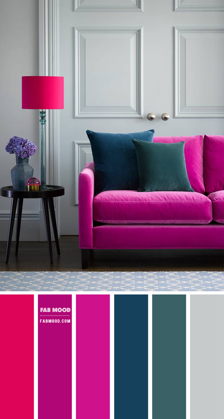
Neutral Grounding: Greys, Whites, and Blacks
Neutrals are the unsung heroes of many color palettes, providing a canvas that allows more vibrant colors to truly pop. Pairing magenta with classic neutrals like grey, white, or black is a highly effective strategy for creating a clean, modern, and sophisticated brand identity.
- White creates a fresh, clean, and airy backdrop, allowing magenta to stand out with pristine clarity. This combination often conveys modernity, simplicity, and a sense of optimism, suitable for contemporary tech, health, or lifestyle brands.
- Black lends an air of drama, luxury, and sophistication. Magenta against black is bold, elegant, and powerful, often chosen by high-end fashion, entertainment, or luxury product brands that want to make a strong, opulent statement.
- Grey, in its various shades, offers versatility. A light silver-grey can imbue a high-tech, minimalist feel, while a deeper charcoal grey provides a sophisticated, corporate grounding for magenta’s vibrancy. Grey can temper magenta’s intensity, creating a balanced and professional aesthetic, ideal for innovative professional services or high-design product companies.
These neutral pairings allow magenta to be the star, directing attention to key brand elements while maintaining an overall sense of refinement and professionalism.
Earthy Undertones: Browns and Beiges
While less common, pairing magenta with earthy tones like browns and beiges can create an unexpected yet grounded and organic aesthetic. This combination often feels warm, inviting, and slightly unconventional, moving away from purely modern or luxurious vibes. A deep, rich chocolate brown can provide a sense of stability and authenticity, making magenta feel more approachable and less overtly ‘loud’. Light beige or tan can offer a soft, natural backdrop, allowing magenta to add a vibrant, creative spark without feeling artificial. This pairing might appeal to ethical brands, artisanal businesses, or those that want to blend creativity with a sense of natural warmth and integrity. It speaks to a more curated, personal, and grounded brand experience.
Metallic Accents: Gold, Silver, and Copper
For brands aiming to convey ultimate luxury, prestige, or a futuristic edge, metallic accents are an invaluable addition to a magenta palette.
- Gold with magenta screams opulence and grandeur. This pairing is synonymous with premium products, high fashion, and exclusive services. It exudes warmth, richness, and a celebratory feel, elevating magenta’s inherent luxury connotations.
- Silver (or chrome) offers a sleek, modern, and often high-tech feel. Paired with magenta, it suggests innovation, precision, and forward-thinking design. This combination is frequently seen in tech gadgets, high-performance products, or modern art-focused brands looking for a sophisticated, polished edge.
- Copper introduces a warm, industrial-chic, or artisanal feel. It grounds magenta with an organic, handcrafted touch while still providing a sense of premium quality and unique design. This could be perfect for boutique distilleries, high-end home goods, or design agencies with a bespoke approach.
Metallic accents add texture, shimmer, and a tangible sense of value, significantly enhancing the perceived quality and exclusivity of a brand featuring magenta.
Implementing Magenta in Brand Design: Practical Applications
Once the ideal color pairings for magenta have been identified, the next step is their practical application across various brand touchpoints. Consistency and strategic placement are key to building a strong, memorable brand identity.
Logo and Visual Identity
The brand logo is often the first and most enduring visual encounter a customer has with a brand. For a magenta-centric brand, the logo should encapsulate the chosen color story. If high contrast is desired, a magenta logo with a complementary green accent could be striking. For sophistication, a monochromatic magenta logo with varied tints or a magenta mark against a neutral grey background works well. The goal is clarity, memorability, and alignment with the brand’s core message. Extending this to stationery, business cards, and brand guides ensures visual cohesion.
Website and Digital Presence
In the digital realm, color choices directly impact user experience and brand perception. A website featuring magenta can utilize it for calls-to-action (CTAs) to leverage its attention-grabbing quality, or as an accent color against a neutral background for a sophisticated look. Strategic use of white space around magenta elements can enhance readability and prevent visual clutter. For social media, consistent application of the magenta palette across profiles, posts, and campaigns reinforces brand identity and recognition across diverse platforms. The vibrancy of magenta translates exceptionally well onto screens, making it a powerful choice for digital-first brands.
Marketing Collateral and Packaging
For physical marketing materials—brochures, flyers, advertisements—and product packaging, the chosen magenta palette must translate effectively across different printing mediums. The tactile experience of packaging, combined with compelling color, can significantly influence purchase decisions. A luxury brand might use a deep magenta alongside gold foil for an opulent feel, while a sustainable brand might pair magenta with earthy browns on recycled packaging to convey both creativity and environmental consciousness. The material, finish, and texture all play a role in how the magenta palette is perceived in the real world, adding another layer to the brand’s sensory experience.

Case Studies and Best Practices for Magenta Branding
Examining brands that successfully employ magenta offers valuable insights. Many innovative tech startups utilize vibrant magenta alongside clean whites and blacks to project a modern, disruptive, and user-friendly image. Fashion and beauty brands frequently pair magenta with analogous pinks and purples, or luxurious golds, to evoke glamour, creativity, and exclusivity. Even established companies in diverse sectors occasionally leverage magenta as an accent color to signal a refresh, inject vitality, or appeal to a younger demographic without overhauling their entire identity.
The best practices center on intentionality. Every color choice, particularly when working with a dominant and expressive hue like magenta, must be deliberate. Test your palettes with target audiences, consider accessibility for color blindness, and ensure consistency across all brand touchpoints. Ultimately, the colors that go “well” with magenta are those that empower your brand to tell its story most effectively, resonate deeply with its audience, and stand distinctively in the competitive landscape.
aViewFromTheCave is a participant in the Amazon Services LLC Associates Program, an affiliate advertising program designed to provide a means for sites to earn advertising fees by advertising and linking to Amazon.com. Amazon, the Amazon logo, AmazonSupply, and the AmazonSupply logo are trademarks of Amazon.com, Inc. or its affiliates. As an Amazon Associate we earn affiliate commissions from qualifying purchases.