
Deep blue stands as a cornerstone in corporate identity and brand strategy, celebrated for its profound ability to convey professionalism, trust, and reliability. However, the true power of this commanding hue is unlocked not in isolation, but through strategic pairings that amplify its inherent strengths and extend its communicative reach. Selecting complementary or contrasting colors is a critical design decision that shapes perception, influences audience engagement, and ultimately, defines the essence of a brand’s visual language. This exploration delves into the art and science of pairing colors with deep blue, dissecting how these combinations build distinct brand narratives, reinforce marketing messages, and cultivate a memorable corporate identity.

The Strategic Power of Deep Blue in Branding
Deep blue is far more than just a color; it’s a strategic asset in the brand toolkit. Its pervasive use across industries, from finance and technology to healthcare and luxury, is no coincidence. This hue inherently possesses a psychological resonance that brands leverage to build formidable identities. Understanding its core attributes is the first step in successful color pairing.
Evoking Trust and Professionalism
Deep blue inherently communicates stability, security, and authority. It’s the color of the ocean’s depth and the expansive sky, suggesting vastness, steadfastness, and calm. For brands aiming to project an image of unwavering reliability, competence, and integrity, deep blue forms an unshakeable foundation. Think of financial institutions, legal firms, or established technology companies; their reliance on deep blue is a deliberate choice to instill confidence and evoke a sense of responsible stewardship. When paired correctly, accent colors can either reinforce this solemnity or introduce nuanced dimensions like innovation or approachability, without diluting the core message of trust.
Target Audience Perception
The perception of deep blue also varies subtly across cultures and demographics, yet its general association with stability and intelligence remains widespread. A brand utilizing deep blue is often perceived as serious, thoughtful, and high-quality. However, without careful consideration of accompanying colors, deep blue alone can sometimes appear distant, overly conservative, or even cold. The selection of secondary and tertiary colors is crucial for fine-tuning this perception. For instance, pairing it with warmer tones can soften its formality, making a brand feel more inviting, while metallic accents can elevate its prestige. Understanding who the brand aims to reach and what emotional response it seeks to elicit is paramount to choosing the optimal palette.
Harmonious Pairings: Classic Companions for Deep Blue
Certain color pairings with deep blue have stood the test of time, becoming go-to choices for brands seeking a sophisticated, balanced, and universally appealing aesthetic. These harmonious combinations rely on subtle contrasts or complementary shades to create visual interest without overwhelming the deep blue’s foundational strength.
White and Off-White: Crisp and Clean
The classic combination of deep blue and white is a paragon of clarity, professionalism, and timeless elegance. White provides a stark, clean backdrop or accent that allows deep blue to command attention, enhancing its depth and richness. This pairing is ubiquitous in corporate branding, particularly where transparency, precision, and modernity are key brand attributes. Off-white shades, such as cream or ecru, offer a softer, more approachable alternative to stark white, lending a subtle warmth and sophistication that can make a brand feel less austere and more inviting, while still maintaining a high level of professionalism. This pairing is excellent for readability in digital interfaces and print collateral, ensuring brand messages are communicated clearly and effectively.
Silver and Grey: Modern Sophistication
For brands aiming for a cutting-edge, technologically advanced, or refined image, pairing deep blue with silver or various shades of grey is exceptionally effective. Silver introduces a metallic sheen that evokes innovation, luxury, and high-tech precision. It suggests polished surfaces and sleek design, often seen in automotive, electronics, or premium service brands. Grey, in its myriad forms from light ash to charcoal, offers a sophisticated neutral that tempers deep blue’s intensity. Light greys can add an airy, contemporary feel, while darker charcoals provide a weighty, understated elegance. This combination is particularly potent for creating a perception of understated power, reliability, and advanced capabilities, without resorting to ostentation.
Gold and Brass: Regal Elegance
When a brand seeks to convey luxury, heritage, prestige, or a premium offering, deep blue combined with gold or brass accents is an unparalleled choice. Gold, with its inherent association with value, success, and grandeur, transforms deep blue into a backdrop of opulence. This pairing suggests exclusivity, high quality, and timeless appeal, often employed by luxury goods, high-end services, or brands with a rich legacy. Brass, a slightly more subdued metallic, offers a similar warmth and classic feel, but with a touch more antique charm and less overt flashiness than pure gold. These metallic accents are best used sparingly, perhaps for logos, key design elements, or subtle detailing, allowing deep blue to maintain its dignified presence while the metallic gleam provides a focal point of lavishness.
Contrasting Dynamics: Making Deep Blue Pop
While harmonious pairings offer balance and sophistication, strategic contrasting colors can inject energy, highlight specific brand aspects, and create a more dynamic visual identity. These combinations are designed to make deep blue stand out, creating a memorable impact and guiding the viewer’s eye.
Bright Yellow or Orange: Energetic Contrast
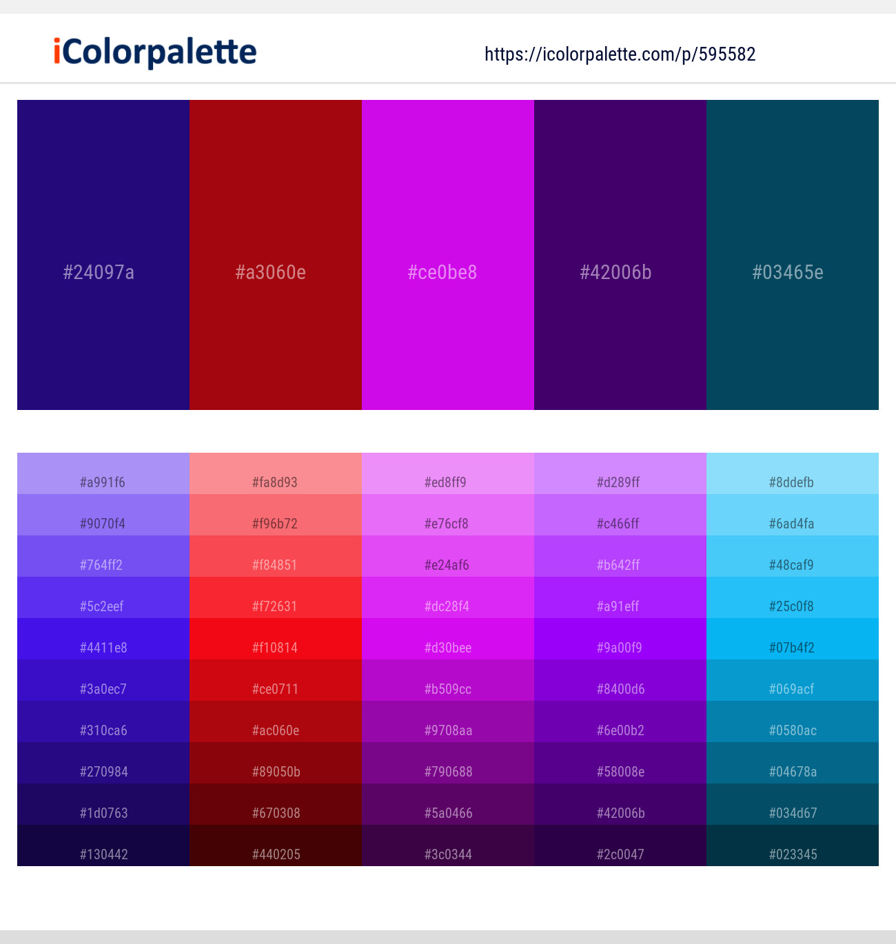
For brands that want to pair deep blue’s stability with a burst of optimism, creativity, or approachability, bright yellow or vibrant orange are excellent choices. Yellow, the color of sunshine, youth, and intellect, offers a high-contrast complement that can make a deep blue brand feel more innovative, friendly, or accessible. It’s an excellent choice for educational platforms, creative agencies, or brands targeting a younger, dynamic audience. Orange, straddling the line between red’s energy and yellow’s cheer, brings warmth, enthusiasm, and a sense of action. When combined with deep blue, orange suggests a brand that is trustworthy yet also pioneering and engaging. Both yellow and orange create a compelling visual tension with deep blue, demanding attention and conveying a vibrant personality.
Teal or Aqua: Subtly Vibrant Complement
While deep blue is often associated with the classic, pairing it with analogous colors like teal or aqua can introduce a refreshing, contemporary twist without losing its inherent sense of calm. Teal, a blend of blue and green, adds a touch of sophistication, creativity, and a connection to nature (water, sea). It’s often used by brands in wellness, travel, or innovative tech sectors looking to convey both reliability and forward-thinking vision. Aqua, a lighter, brighter cousin, evokes freshness, clarity, and youthfulness. These colors work well to soften deep blue’s intensity, making a brand feel more approachable and modern, suggesting a progressive yet grounded identity. They are particularly effective when a brand wants to maintain a “blue” feel but add a vibrant, unique differentiator.
Deep Red or Burgundy: Bold and Authoritative
For brands seeking to combine deep blue’s trustworthiness with passion, urgency, or power, deep red or rich burgundy create a bold and authoritative statement. Red is inherently an attention-grabbing color, symbolizing energy, ambition, and strong emotion. When used as an accent against deep blue, it can signal a brand that is both reliable and dynamic, strong and assertive. Burgundy, a darker, more sophisticated cousin of red, adds a layer of refinement and luxury. This pairing suggests a brand with gravitas, experience, and a decisive approach. It’s often seen in high-end consulting, legal, or automotive brands that want to convey a powerful and confident presence. This combination is about making a strong, memorable declaration.
Considerations for Brand Application
Beyond aesthetic appeal, the practical application of color combinations with deep blue requires strategic thought. The chosen palette must serve the brand’s overarching objectives across all touchpoints.
Industry Context and Competitor Landscape
The most effective color pairings are those that differentiate a brand within its specific industry while resonating with its target audience. Researching competitor palettes is crucial. If every competitor uses deep blue and white, a brand might opt for deep blue with a surprising pop of orange to stand out, or lean into deep blue and gold to convey a premium alternative. Conversely, if an industry is known for bright, chaotic colors, a deep blue and grey palette might signify stability and seriousness, setting the brand apart through understated professionalism. The industry’s conventional color language often dictates what is perceived as trustworthy or innovative.
Digital vs. Print Media
Colors render differently across various media. A vibrant yellow that looks stunning on a digital screen might appear dull or muted in print, and vice versa. Brands must ensure their chosen deep blue palette maintains its integrity and intended impact whether viewed on a smartphone, a billboard, or a business card. This involves understanding color models (RGB for digital, CMYK for print, Pantone for consistency) and testing the palette extensively across all anticipated applications. Consistency in color representation is vital for maintaining a cohesive brand identity and avoiding visual dissonance that can undermine brand recognition and trust.
The Psychology of Color Combinations
The synergy between colors creates a new psychological impact that is greater than the sum of its parts. Deep blue’s core meaning of trust and stability can be nuanced by its companion. Pairing it with green might evoke environmental consciousness or growth, while pairing it with purple could suggest creativity or luxury. Understanding these combined psychological effects allows brands to craft highly specific emotional responses from their audience, ensuring that every color choice actively contributes to the brand narrative and strategic positioning.
Crafting a Cohesive Visual Identity
Ultimately, choosing colors to go well with deep blue is about building a cohesive visual identity that is both impactful and enduring. It’s a fundamental aspect of corporate identity and marketing design.
Consistency Across Touchpoints
A strong brand identity is built on consistency. Once a deep blue palette is established, it must be applied uniformly across all brand touchpoints: logo, website, social media profiles, marketing materials, product packaging, uniforms, and physical spaces. Inconsistencies dilute brand recognition and can confuse the audience. A comprehensive brand style guide detailing exact color codes (Pantone, CMYK, RGB, Hex) for deep blue and its companion colors is indispensable for ensuring this visual harmony.

Scalability and Versatility
The chosen color palette must be versatile enough to adapt to various applications and scales without losing its integrity. A color combination that works beautifully for a small logo might be overwhelming on a large banner, or vice versa. The palette should allow for flexibility in the ratio of deep blue to its accent colors, enabling designers to emphasize different aspects depending on the context. A well-chosen palette for deep blue is not just about aesthetics; it’s about creating a robust, adaptable visual system that can grow and evolve with the brand while retaining its core identity and strategic message.
aViewFromTheCave is a participant in the Amazon Services LLC Associates Program, an affiliate advertising program designed to provide a means for sites to earn advertising fees by advertising and linking to Amazon.com. Amazon, the Amazon logo, AmazonSupply, and the AmazonSupply logo are trademarks of Amazon.com, Inc. or its affiliates. As an Amazon Associate we earn affiliate commissions from qualifying purchases.