
Mint green, with its fresh, cool, and inviting appeal, holds a unique position in the world of brand design and corporate identity. Its nuanced blend of blue and green hues evokes feelings of serenity, health, growth, and nature. However, the true power of mint green in branding is unlocked when strategically paired with complementary or contrasting colors that amplify its inherent qualities and align with a brand’s core message. Understanding these strategic pairings is crucial for any brand aiming to leverage mint green for maximum impact across digital, print, and physical touchpoints.
Understanding Mint Green’s Brand Persona
Before delving into specific color combinations, it’s essential to grasp the psychological and associative underpinnings of mint green itself. This foundational understanding allows for more intentional and effective brand palette development.
The Psychology of Mint Green
Mint green is inherently associated with tranquility and well-being. Its cool undertones often suggest cleanliness, freshness, and purity, making it a popular choice for brands in healthcare, wellness, and organic sectors. The green component links it to nature, sustainability, and vitality, while the blue aspect contributes a sense of calm and trustworthiness. It’s less aggressive than a vibrant green and more approachable than a deep blue, striking a balance that communicates gentle professionalism and modern sensibility. This makes it an excellent primary or secondary color for brands aiming to convey empathy, innovation, and a forward-thinking approach without being overly stark or corporate.
Brand Associations
Brands that successfully utilize mint green often tap into its inherent associations. A dental practice might use mint green to evoke a sense of cleanliness and gentle care. A tech startup might employ it to symbolize fresh ideas, innovation, and user-friendliness. Fashion and beauty brands frequently use mint green to suggest freshness, natural ingredients, and a touch of sophisticated elegance. Even financial institutions seeking to appear more approachable and less intimidating might incorporate a lighter, softer mint green into their branding to convey trust and clarity without the sternness often associated with darker blues or greys. The key is to choose pairings that reinforce these positive associations while mitigating any potential downsides, such as appearing too whimsical or lacking gravitas, depending on the brand’s specific goals.
Strategic Color Pairings for Brand Impact
The selection of companion colors for mint green is not merely an aesthetic choice; it is a strategic decision that directly influences brand perception, target audience engagement, and overall market positioning. Different pairings can dramatically alter mint green’s message, transforming it from playful to sophisticated, or from modern to classic.
Complementary & Harmonious Palettes
Creating a harmonious brand palette often involves selecting colors that naturally coexist with mint green, enhancing its inherent qualities without overshadowing them.
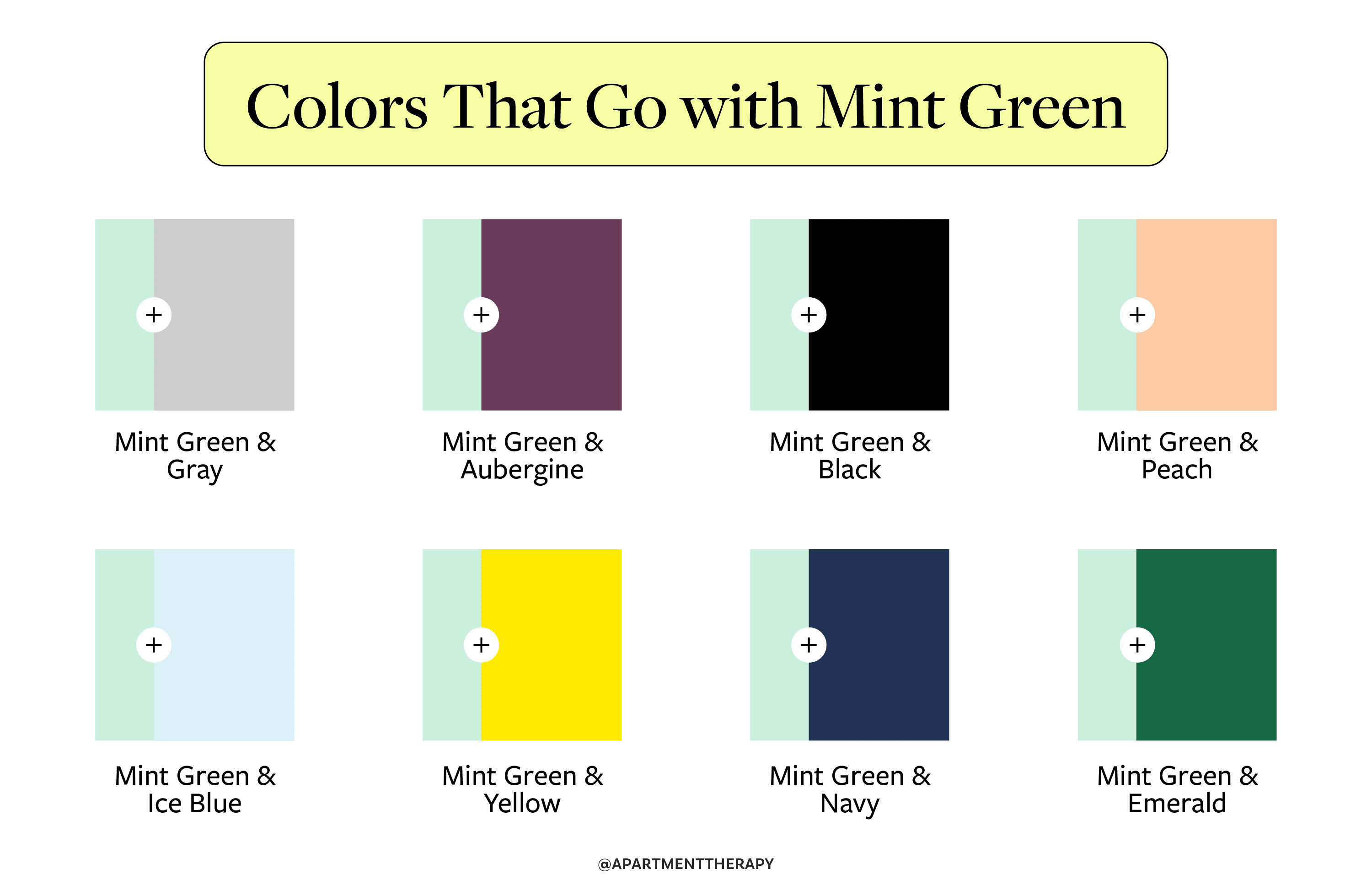
- White and Off-White: This is perhaps the most classic and versatile pairing. White amplifies mint green’s freshness and cleanliness, creating an airy, minimalist, and sophisticated look. It’s perfect for luxury brands, wellness products, and modern tech companies aiming for clarity and purity. An off-white or cream can soften the palette further, adding a touch of warmth and approachability, ideal for eco-friendly brands or those emphasizing natural ingredients.
- Soft Greys and Taupes: These neutral tones offer a sophisticated backdrop for mint green. Light grey provides a clean, contemporary feel, while a warmer taupe adds an earthy, organic dimension. This combination is excellent for professional services, interior design brands, or any corporate identity that wants to be perceived as understated, elegant, and trustworthy, with a hint of natural calm.
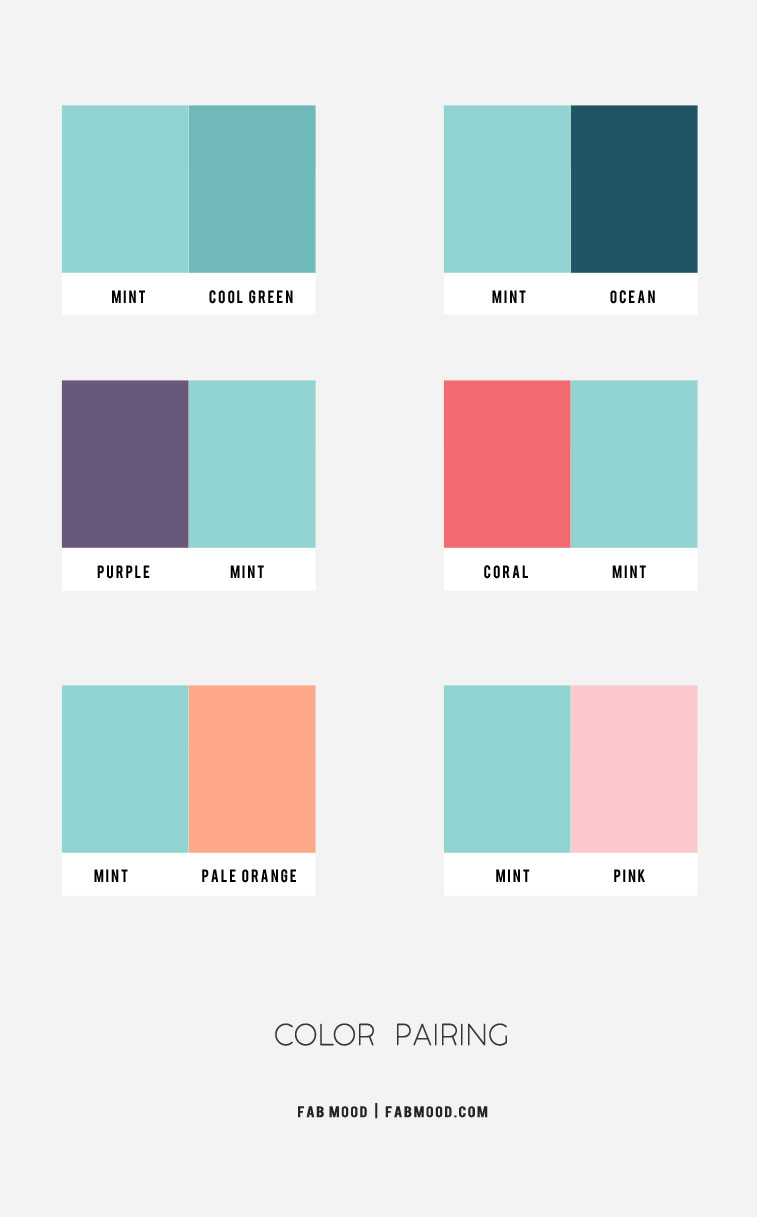
- Other Pastels (Peach, Blush Pink, Lavender): For brands targeting a younger demographic, or those in the beauty, lifestyle, or children’s product sectors, pairing mint green with other pastels creates a soft, inviting, and often playful aesthetic. A blush pink introduces warmth and femininity, while lavender adds a touch of creativity and dreaminess. This palette suggests gentleness, joy, and a lighthearted approach, resonating well with audiences seeking comfort and aesthetic pleasure.
- Light Woods and Earth Tones: When a brand wants to emphasize sustainability, craftsmanship, or organic purity, combining mint green with the natural warmth of light wood textures or earthy browns and beiges can be profoundly effective. This creates a grounded, authentic, and eco-conscious brand identity, ideal for artisanal goods, natural food products, or outdoor lifestyle brands.
Contrasting & Dynamic Combinations
Sometimes, a brand needs to make a bolder statement, create visual hierarchy, or inject energy into its identity. Contrasting colors can achieve this by making mint green pop or by creating a dynamic tension that captures attention.
- Navy Blue or Deep Teal: This is a powerful and sophisticated pairing. Navy blue provides a strong, authoritative anchor that allows mint green to shine as a fresh accent. It conveys reliability, professionalism, and depth, making it suitable for corporate branding, financial services, or premium products. Deep teal, being a darker, richer cousin to mint green, offers a more harmonious yet still contrasting effect, suggesting luxury, introspection, and refined taste.
- Gold or Copper: For brands aiming for luxury, exclusivity, and premium quality, metallic accents like gold or copper paired with mint green are highly effective. Gold lends an opulent, sophisticated, and traditional elegance, while copper offers a warmer, more modern, and artisanal feel. This combination is often seen in high-end fashion, jewelry, and gourmet food packaging, signaling high value and exquisite taste.
- Dark Grey or Charcoal: Similar to navy, dark grey provides a strong, modern contrast that grounds mint green. This pairing is excellent for tech brands, automotive, or industrial design firms that want to convey innovation, precision, and seriousness, while mint green introduces a touch of approachability or forward-thinking design.
- Coral or Terracotta: For a vibrant, energetic, and contemporary feel, consider pairing mint green with warm, earthy hues like coral or terracotta. This creates a lively contrast between cool and warm, suggesting creativity, passion, and a modern, adventurous spirit. This combination can be particularly effective for travel brands, creative agencies, or consumer goods that want to stand out with a fresh, dynamic image.
Monochromatic & Tonal Depth
While not strictly “pairing” with another color in the traditional sense, utilizing various shades, tints, and tones of mint green can create a sophisticated and cohesive brand identity. This approach emphasizes the versatility and depth of mint green itself. By combining a very pale mint with a deeper, richer green or a more desaturated, grey-infused mint, a brand can achieve visual interest and hierarchy without introducing entirely new colors. This strategy is excellent for minimalist brands, those emphasizing natural variations, or companies that want to project a singular, focused message of health, sustainability, or freshness. It creates a sense of refinement and thoroughness, suggesting a brand that is confident in its core identity.
Applying Mint Green in Brand Design
The chosen color palette comes to life through its application across various brand assets. Strategic deployment ensures consistency and reinforces the desired brand message.
Digital Presence & User Experience
For websites, apps, and social media, mint green can be used as an accent color for call-to-action buttons, navigation elements, or subtle background textures to create a calming and user-friendly interface. Paired with white or light grey, it ensures readability and a clean aesthetic. For brands focusing on wellness or sustainability, a dominant mint green background with contrasting text in dark grey or navy can immerse users in the brand’s tranquil environment. The key is to maintain accessibility standards, ensuring sufficient contrast for text, and to consider how the color translates across different screens and lighting conditions.
Product & Packaging Design
In product and packaging design, mint green can evoke freshness for food and beverage items, cleanliness for personal care products, or innovation for electronics. For instance, a skincare brand might use a mint green package with gold foil accents to communicate luxury and natural ingredients. A beverage company might use mint green packaging with vibrant coral typography to signify a refreshing and energetic drink. The choice of finish—matte, glossy, or textured—can further enhance the chosen color palette, adding another layer of sensory brand experience.
Corporate Identity & Interior Spaces
Extending beyond digital and print, mint green can be integrated into physical brand environments such as office interiors, retail spaces, or event booths. A reception area painted in a soft mint green, accented with dark wood furniture and grey upholstery, can create an inviting yet professional atmosphere. For a health clinic, mint green walls with white trim and natural light can promote a sense of calm and healing. The judicious use of mint green in corporate uniforms or branding collateral can also subtly reinforce the brand’s values, making the entire brand ecosystem cohesive and impactful.
Crafting Your Brand’s Distinctive Palette
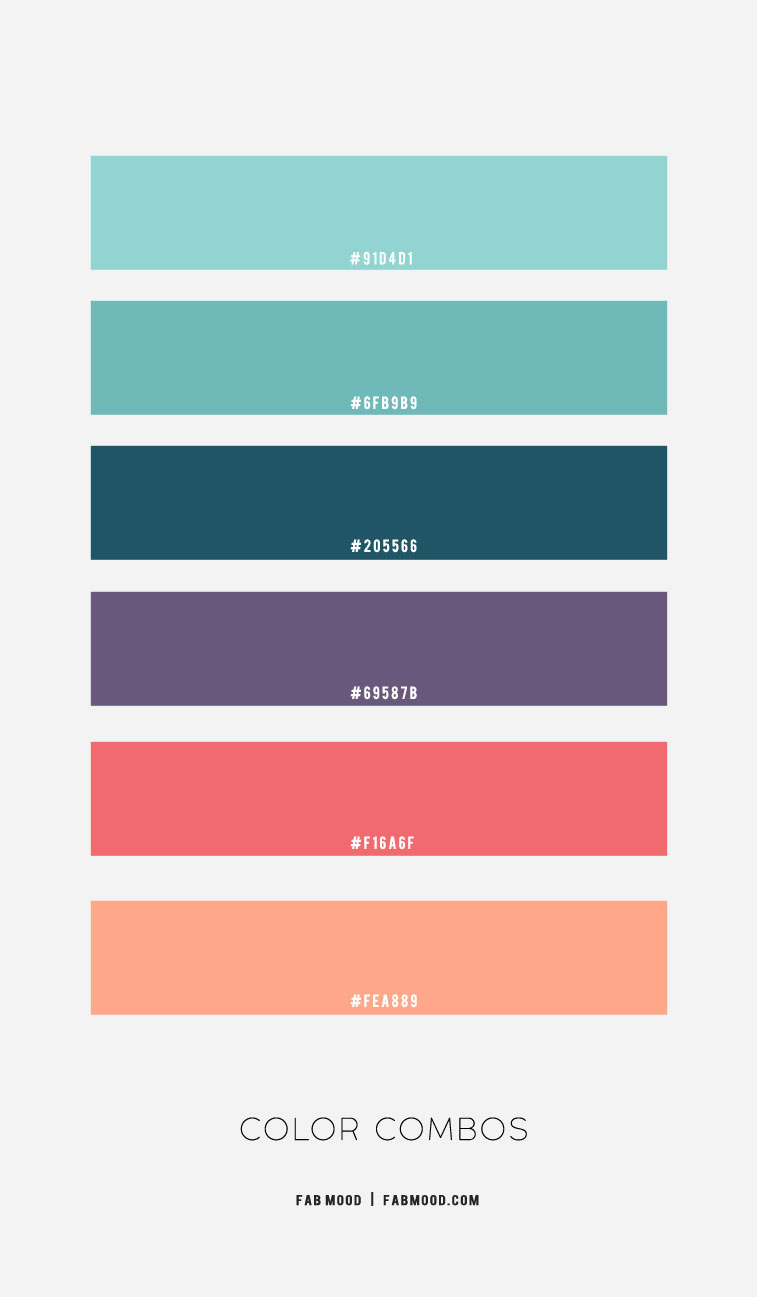
Ultimately, the “best” color to go with mint green is the one that most effectively communicates your brand’s unique story and resonates with your target audience. It’s about strategic alignment, not just aesthetic appeal. Brands should conduct thorough research into their target market’s preferences, analyze competitor palettes, and define their core values and emotional aspirations.
Experimentation with different combinations in mock-ups and A/B testing can provide invaluable insights into how various palettes are perceived. A brand aiming for innovative luxury might choose mint green with metallic accents and deep navy. A wellness brand focused on natural simplicity might opt for mint green with muted earth tones and off-whites. By thoughtfully considering the psychology of color, the dynamics of color interaction, and the overarching brand strategy, any business can harness the refreshing power of mint green to craft a distinctive, memorable, and impactful brand identity.
aViewFromTheCave is a participant in the Amazon Services LLC Associates Program, an affiliate advertising program designed to provide a means for sites to earn advertising fees by advertising and linking to Amazon.com. Amazon, the Amazon logo, AmazonSupply, and the AmazonSupply logo are trademarks of Amazon.com, Inc. or its affiliates. As an Amazon Associate we earn affiliate commissions from qualifying purchases.