
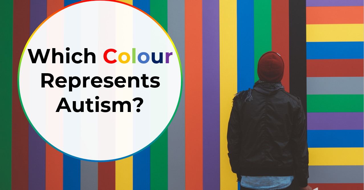
In the landscape of corporate identity and social advocacy, color is rarely a neutral choice. It serves as a visual shorthand, conveying complex values, histories, and emotional cues in a single glance. For the autism community and the brands that seek to support it, the question of “which color” has become a central point of strategic evolution. What began as a simple awareness campaign has transformed into a sophisticated debate over brand perception, semiotics, and the shift from “awareness” to “acceptance.”
Choosing a color to represent autism is no longer just about picking a shade for a logo; it is about choosing a position within a global movement. From the traditional “Autism Blue” to the gold of self-advocacy and the rainbow of neurodiversity, the visual identity of autism is currently undergoing its most significant rebranding in history.
The Legacy of Blue: Corporate Identity and the Awareness Era
For nearly two decades, the color blue dominated the visual landscape of autism. This was largely driven by the “Light It Up Blue” campaign initiated by Autism Speaks, one of the world’s largest and most influential autism organizations. From a branding perspective, the choice of blue was calculated and effective, leveraging color psychology to establish a specific corporate identity.
The Psychology of the Blue Palette
In traditional marketing and brand strategy, blue is often associated with trust, stability, and professionalism. It is the most common color used by financial institutions and healthcare providers because it suggests a sense of calm authority. In the context of autism, blue was strategically selected to evoke a sense of medical legitimacy and to highlight the then-prevalent statistic that autism was diagnosed significantly more often in boys than in girls. By saturating the market with blue, organizations successfully raised “awareness,” making the puzzle piece and the primary blue hue synonymous with the condition in the public consciousness.
The Critique of “Blueswashing”
As brand strategies have evolved to be more inclusive of the communities they represent, the reliance on blue has faced significant pushback. Critics and self-advocates point out that the choice of blue reinforced a “pathology-based” brand identity. By centering the identity on a color traditionally linked to “sadness” or “moodiness” in some cultures, and by focusing exclusively on a male-centric demographic, the blue brand began to feel restrictive.
In contemporary brand strategy, this has led to a phenomenon some call “blueswashing”—where corporations adopt blue logos every April to signal social responsibility without addressing the actual needs of the neurodivergent community. This tension has forced a pivot in how designers and marketers approach autism-related visual assets.
The Gold Standard: Reclaiming Identity Through Chemical Symbols
As the neurodiversity movement gained momentum, a new color emerged as a powerful alternative for brand identity: gold. This shift was not arbitrary; it was a clever exercise in linguistic branding and visual rhetoric.
Why Gold? The “Au” Connection
The choice of gold is rooted in the periodic table. The chemical symbol for gold is “Au,” which mirrors the first two letters of the word “Autism.” For self-advocates, branding the movement with gold represents a shift from being a “puzzle to be solved” to being a “valuable element” of humanity.
From a design perspective, gold offers a drastically different aesthetic than blue. It conveys value, excellence, and a “premium” identity. While blue was associated with a charitable, medicalized view, gold positions autism as an inherent, valuable trait. Brands that adopt gold in their autism-related communications are often signaling a commitment to “acceptance” rather than just “awareness.” They are aligning themselves with the “Nothing About Us Without Us” movement, which prioritizes the voices of autistic individuals over the organizations that claim to represent them.
Strategic Application of Gold in Design
Using gold in digital and print media presents unique challenges and opportunities. Unlike a flat blue, gold often requires gradients or metallic finishes to be effective. In high-end brand strategy, gold is used sparingly to signify prestige. When applied to autism advocacy, it elevates the conversation from a plea for help to a demand for respect and inclusion. For companies looking to update their corporate social responsibility (CSR) profiles, integrating gold accents or “Au” iconography can demonstrate a sophisticated understanding of current neurodiversity trends.
The Rainbow Infinity: Representing the Full Spectrum of Neurodiversity
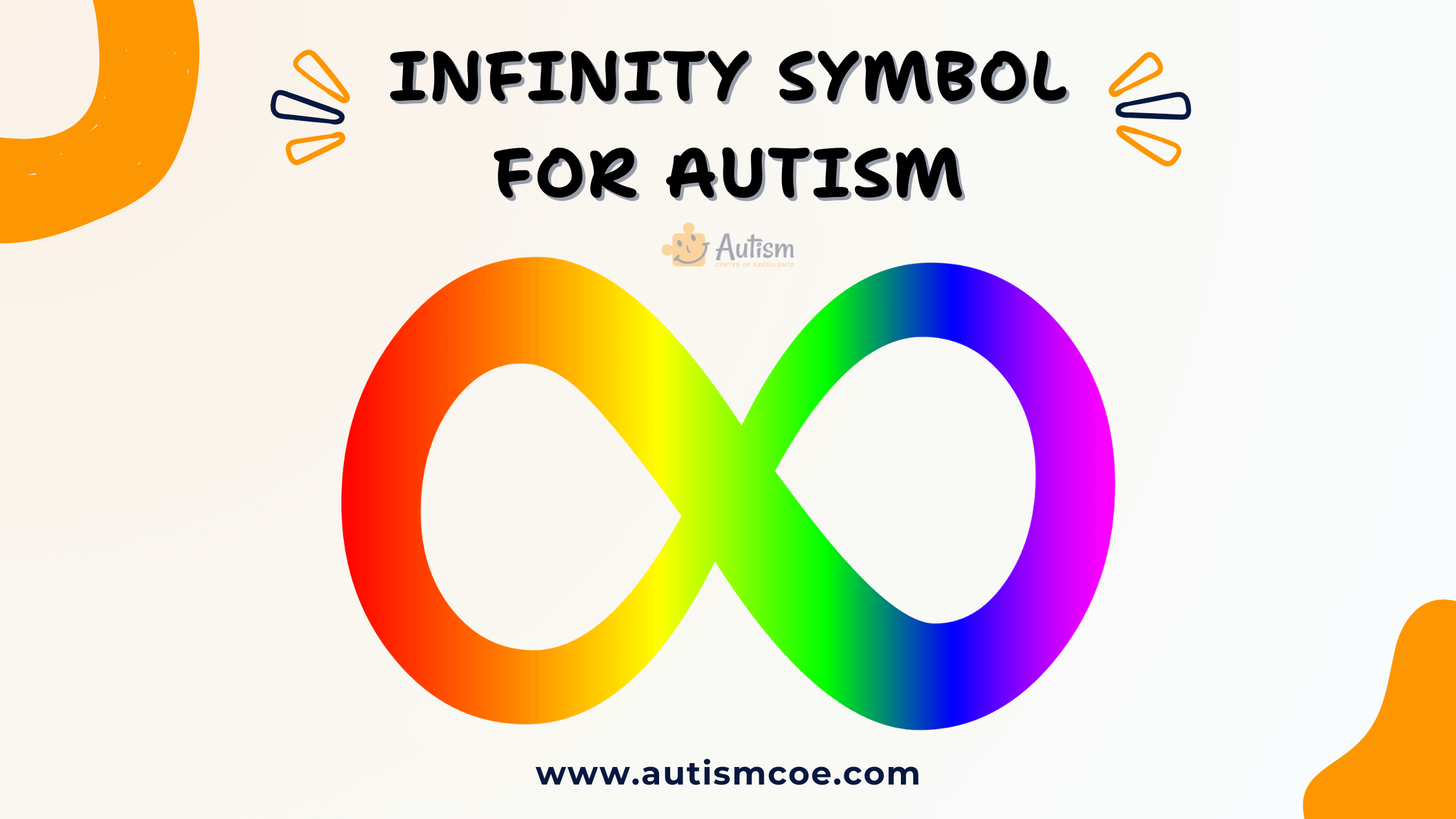
Perhaps the most significant shift in the visual identity of autism is the move away from solid colors toward the rainbow infinity symbol. This represents a fundamental change in the “product” being branded—moving from a monolithic definition of autism to an inclusive “spectrum” model.
The Infinity Loop vs. The Puzzle Piece
The puzzle piece was the primary icon for autism for decades, often rendered in primary colors. However, many in the community found the puzzle piece offensive, suggesting that autistic people are “missing a piece” or are “puzzles” that need to be figured out.
The rainbow infinity symbol replaces this with a continuous loop, representing the infinite variation within the human brain. From a brand strategy standpoint, the infinity loop is a much more versatile and positive icon. It suggests continuity, interconnectedness, and a lack of boundaries. The use of a rainbow gradient within the loop communicates that no two autistic individuals are the same, effectively “branding” the diversity of the community itself.
Design Principles of the Rainbow Palette
Working with a rainbow palette requires careful consideration of color balance and accessibility. In web design and app development, a multi-colored logo can be difficult to place on varied backgrounds. To maintain brand integrity, many organizations use a “controlled rainbow”—a specific set of hex codes that ensure the spectrum remains visually harmonious rather than chaotic.
For brands, adopting the rainbow infinity is a way to signal intersectionality. It acknowledges that neurodivergent people exist across all races, genders, and backgrounds. This is a powerful marketing tool for companies that want to reach a broad, modern audience that values inclusivity and nuanced representation.
Sensory-Friendly Design: Beyond Symbolic Colors
When discussing “what color for autism” within a brand and design context, we must go beyond the symbols and look at how color choices affect the user experience (UX) for neurodivergent consumers. True brand inclusivity involves designing environments—both digital and physical—that are sensory-friendly.
High Contrast and Visual Overload
Many autistic individuals experience sensory sensitivities. This means that a brand’s color palette can actually dictate whether a customer can engage with their product. High-vibrancy “neon” colors or extremely high-contrast combinations (like pure black text on a blinding white background) can be physically overwhelming for some users.
Strategic branding for neurodiversity often involves:
- Muted Tones: Using “soft” versions of brand colors (e.g., sage green instead of lime, or slate blue instead of royal blue) to reduce visual fatigue.
- Off-White Backgrounds: Using cream or light grey backgrounds to soften the visual impact of text.
- Consistent Color Coding: Using color to categorize information logically, which helps with executive functioning and navigation.
The Business Case for Universal Design
Integrating these considerations into a brand’s visual identity system isn’t just about altruism; it’s about “Universal Design.” When a brand makes its website or physical store easier for an autistic person to navigate by choosing a soothing, organized color palette, it makes that space more comfortable for everyone. This approach reduces bounce rates on websites and increases “dwell time” in retail environments, proving that inclusive color strategies are good for the bottom line.
Strategic Recommendations for Brands and Marketers
As the conversation around autism color and symbolism continues to evolve, brands must be cautious about how they participate. Authenticity is the most important currency in modern marketing, and a misstep in visual identity can lead to accusations of “performative activism.”
Move Beyond the Month of April
The most successful brands are those that integrate neurodiversity into their year-round corporate identity. Changing a logo to blue or gold for the month of April is no longer enough. Instead, companies should look at their internal brand guidelines and ask: Is our color palette accessible? Do our visual assets represent the true diversity of the autistic community?
Consult with Neurodivergent Designers
The best way to ensure a brand’s visual identity resonates with the community is to involve that community in the design process. Hiring neurodivergent designers and consultants ensures that the choice of color and symbol is grounded in lived experience. This leads to branding that is not only aesthetically pleasing but also ethically sound and culturally relevant.
Conclusion: The Future of the Spectrum
The question of “what color for autism” does not have a single, static answer. We are witnessing a transition from a centralized, corporate-driven identity (Blue) to a decentralized, community-driven identity (Gold and Rainbow).
For brands, the strategy should be one of flexibility and listening. Whether a company chooses to use gold to signify value or a rainbow to signify diversity, the choice must be backed by a genuine commitment to the neurodivergent community. In the future of design, the “color” of autism will likely be defined by its lack of a single hue—reflecting instead a vibrant, inclusive, and ever-changing spectrum that honors the complexity of the human mind.
aViewFromTheCave is a participant in the Amazon Services LLC Associates Program, an affiliate advertising program designed to provide a means for sites to earn advertising fees by advertising and linking to Amazon.com. Amazon, the Amazon logo, AmazonSupply, and the AmazonSupply logo are trademarks of Amazon.com, Inc. or its affiliates. As an Amazon Associate we earn affiliate commissions from qualifying purchases.