
In the hyper-saturated landscape of modern marketing, where neon gradients and high-contrast digital interfaces often fight for consumer attention, a quieter contender has emerged as the gold standard for luxury, authenticity, and sophisticated design: ecru. While the casual observer might dismiss it as simply “off-white” or “beige,” for brand strategists and visual designers, ecru represents a deliberate departure from the clinical and the mass-produced. To understand what color ecru is, one must look beyond the hex code and explore its deep-seated associations with heritage, sustainability, and “quiet luxury.”

The Anatomy of Ecru: Deconstructing the “Unbleached” Palette
The word “ecru” originates from the French word écru, which literally translates to “raw” or “unbleached.” Historically, it described the natural color of unbleached linen or silk. This historical root is essential to its branding power; ecru is not a manufactured pigment in its purest sense, but rather a representation of a material in its most honest, foundational state.
The Technical Profile: Defining the Hue
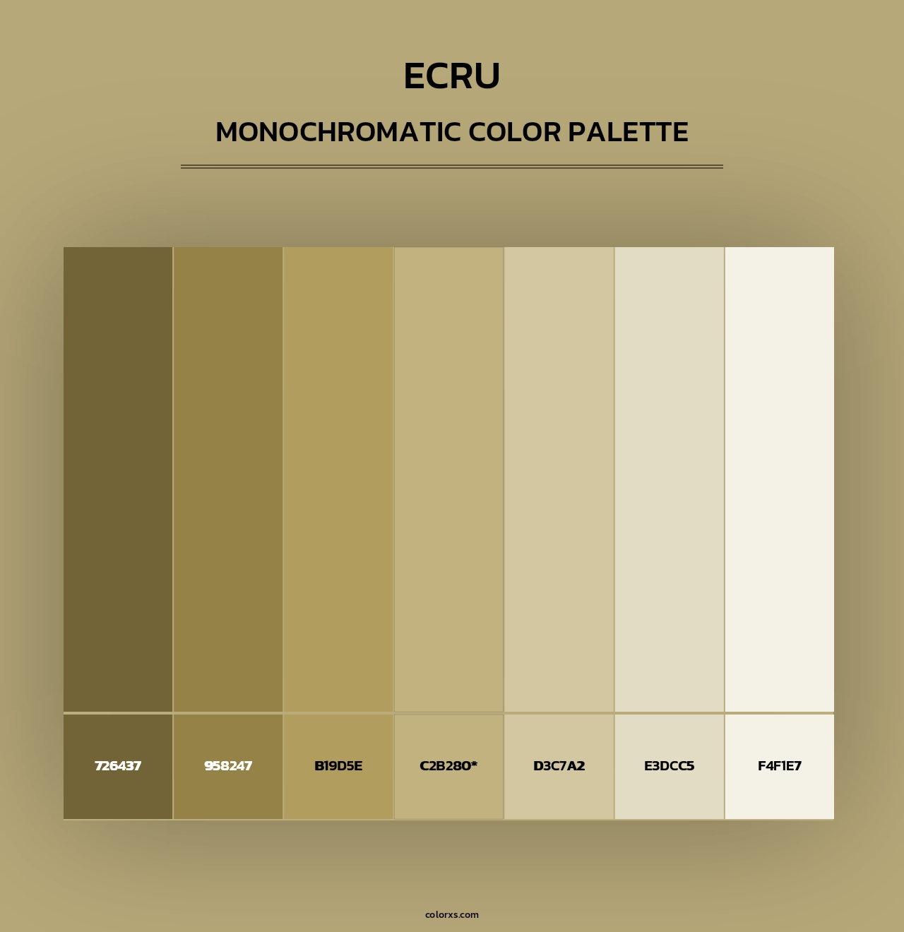
In the digital design space, defining ecru requires precision to distinguish it from its cousins—cream, beige, and ivory. While ivory often leans toward a yellow-white and beige moves toward a deeper tan, ecru sits in a sophisticated middle ground. It possesses a grayish-yellow undertone that provides a “stone-like” or “parchment” quality.
Technically, a standard digital representation of ecru often falls around the Hex code #F5F5DC (frequently referred to as Beige in some CSS systems, though designers often customize this for specific brand identities) or #C2B280 for a more traditional, “raw linen” look. In the CMYK world, ecru is achieved by keeping cyan and magenta low while utilizing a modest amount of yellow and a touch of black to “muddy” the color, giving it its characteristic organic depth. This lack of “brightness” is exactly what makes it a premium choice for high-end brand assets.
Ecru vs. Stark White: The Shift in Corporate Identity
For decades, the default for corporate branding was “Paper White.” It signaled cleanliness, efficiency, and the digital future. However, as the market moved toward a preference for “human-centric” design, stark white began to feel clinical, cold, and impersonal. Ecru offers a “warmth” that white lacks. By utilizing ecru as a primary brand color, companies can immediately lower the visual “noise” of their presence, inviting the consumer into a space that feels more like a curated home or a high-end boutique than a sterile office.
Psychology and Strategy: Why Ecru is the Silent Architect of Brand Trust
Color psychology is a foundational pillar of brand strategy. Every hue communicates a set of subconscious values to the consumer. Ecru, being a neutral that retains a “natural” footprint, communicates three primary values: authenticity, timelessness, and calm.
Evoking Authenticity and Sustainability
In an era of “greenwashing,” brands are desperate to signal their commitment to the environment and ethical sourcing. Ecru is the visual shorthand for sustainability. Because the color is synonymous with unbleached fabrics, it suggests a reduction in chemical processing. Brands in the organic skincare, sustainable fashion, and slow-living sectors use ecru to tell a story of “nature preserved.” When a consumer sees an ecru-colored package, their brain registers “less processing,” which translates to “more natural” and “higher quality.”
The “Quiet Luxury” Factor
Recent trends in luxury branding have pivoted away from loud logos and vibrant colors toward what is now known as “quiet luxury.” This movement values high-quality materials and understated design. Ecru is the quintessential palette for this strategy. It is a color that doesn’t scream for attention but commands it through elegance. It suggests that the brand does not need to use “neon” tactics to prove its worth because its quality is self-evident. This is why ecru is the preferred background for luxury watch brands, bespoke tailoring houses, and premium lifestyle journals.
Reducing Cognitive Load
From a user experience (UX) and brand engagement perspective, ecru is incredibly effective at reducing cognitive load. High-contrast environments (black text on pure white backgrounds) can be taxing on the eyes over long periods. Ecru provides a softer contrast that makes reading long-form brand stories or navigating complex product catalogs more pleasurable. By creating a comfortable visual environment, a brand can increase “dwell time”—the amount of time a consumer spends interacting with their digital or physical presence.
Implementation and Design: Mastering Ecru across Digital and Physical Touchpoints
Applying ecru to a brand system requires more than just swapping a background color. It demands a holistic approach to typography, imagery, and material selection to ensure the color doesn’t look “washed out” or accidental.
Typography and Contrast Ratios
One of the primary challenges of using ecru in branding is maintaining accessibility. Because ecru is a light neutral, designers must be careful with text colors. While pure black text on ecru can sometimes look too harsh, dark charcoal, deep navy, or “espresso” browns create a harmonious and sophisticated contrast. For brands focusing on accessibility (WCAG compliance), ecru provides a versatile base that allows for high-legibility scores while maintaining a softer aesthetic than white.
Pairing Ecru with Complementary Palettes
Ecru acts as a “neutralizer,” making it an exceptional partner for more volatile colors.
- The Earthy Trio: Pairing ecru with olive green and terracotta creates a brand identity that feels grounded and artisanal.
- The Modern Minimalist: Pairing ecru with matte black and brushed gold evokes a sense of high-end, contemporary luxury.
- The Coastal Professional: Combining ecru with slate blue and light grey offers a professional yet relaxed identity, often used in boutique real estate or high-end hospitality.
Materiality in Physical Branding
In the physical world—business cards, packaging, and interior design—ecru truly shines because it can be achieved through the material itself. Using recycled, textured paper stock that is naturally ecru creates a tactile experience that a printed color cannot replicate. For a brand, the “feel” of a textured ecru cardstock communicates a level of intentionality and craft that speaks volumes to a discerning client.
Industry Benchmarks: How Iconic Brands Utilize Ecru for Market Positioning
To see the strategic use of ecru in action, we can look at several industries where it has become the hallmark of market leaders.
The Fashion Powerhouse: The Row and Aritzia
Luxury fashion labels like The Row have built an entire brand identity around a neutral, ecru-heavy palette. By utilizing these tones, they position themselves as “anti-trend.” The message is clear: these clothes are timeless investments. Similarly, retail brands like Aritzia use ecru in their store interiors and online presence to create a cohesive, “elevated” shopping experience that distinguishes them from the chaotic, colorful environments of fast-fashion competitors.
The Wellness Revolution: Organic Skincare
Brands like Aesop or Le Labo often lean into the “apothecary” aesthetic. While they use various neutrals, ecru is frequently used in labeling and secondary packaging. It evokes the history of medicine and botany, suggesting that the products are rooted in science and nature rather than synthetic laboratory creations. This use of ecru builds a bridge of trust between the brand and the health-conscious consumer.
High-End Publishing and Stationery
The world of bespoke stationery, such as Crane & Co., has long utilized “ecru white” as its flagship color. In this context, ecru is associated with the “old world” etiquette of letter writing. When a brand in the digital space uses ecru, it is often attempting to borrow this “legacy” prestige, signaling that they are a serious, established player despite being a modern entity.
The Technical Precision of Neutrals in Modern Brand Systems
As we look toward the future of brand design, the role of ecru is evolving alongside technology. In the world of high-definition displays and OLED screens, the way we perceive neutrals is changing.
Ecru in the Digital-First Era
On an OLED screen, pure white pixels are fully “on,” which can be battery-intensive and visually fatiguing. Ecru offers a way to maintain a bright, clean interface while being “kinder” to both the hardware and the user’s eyes. We are seeing a rise in “Soft Mode” (as an alternative to Dark Mode), where interfaces shift toward ecru and cream tones to provide a relaxing digital environment.

Consistency Across Global Markets
For global brands, ecru is a “safe” yet “stylish” choice. Unlike colors that may have vastly different cultural connotations (such as red or yellow), neutrals like ecru are generally perceived consistently across the globe as sophisticated and foundational. This makes it an ideal “global base color” for multinational corporations looking to maintain a unified identity while navigating diverse cultural landscapes.
In conclusion, ecru is far more than a simple color choice; it is a strategic tool. It allows brands to communicate complex values—authenticity, luxury, sustainability, and calm—without saying a word. By understanding “what color ecru” truly represents in the context of design and psychology, brand architects can craft identities that feel less like a temporary advertisement and more like a permanent, trusted institution. Whether it is through the tactile texture of an unbleached business card or the soft glow of a minimalist website, ecru remains the ultimate shade of sophistication in the modern professional world.
aViewFromTheCave is a participant in the Amazon Services LLC Associates Program, an affiliate advertising program designed to provide a means for sites to earn advertising fees by advertising and linking to Amazon.com. Amazon, the Amazon logo, AmazonSupply, and the AmazonSupply logo are trademarks of Amazon.com, Inc. or its affiliates. As an Amazon Associate we earn affiliate commissions from qualifying purchases.