Purple, a color steeped in history and rich with cultural associations, offers a powerful palette for brands seeking to convey a distinct message. From ancient royalty to modern innovation, its symbolism spans luxury, wisdom, creativity, and even mystique. Understanding “what color purple goes with” is not merely an aesthetic exercise; it’s a strategic decision that can profoundly impact brand perception, target audience engagement, and overall market positioning. For any brand architect, designer, or marketer, mastering the interplay of purple with other hues is essential for crafting a compelling and memorable corporate identity.

The Psychological Resonance and Brand Power of Purple
Purple’s unique position in the color spectrum, blending the fiery passion of red with the calm stability of blue, imbues it with a complex psychological profile. This complexity makes it a versatile yet potent choice for branding. Historically, purple dyes were rare and expensive, leading to its association with royalty, wealth, and exclusivity. Today, while more accessible, it retains an aura of sophistication and premium quality.
Royal Legacy and Modern Mystique
Brands leveraging purple often tap into its inherent sense of luxury and opulence. High-end fashion houses, exclusive service providers, and gourmet product lines frequently incorporate purple to signal premium status and refined taste. Beyond luxury, purple also evokes creativity, imagination, and wisdom. Tech companies seeking to present themselves as innovative and forward-thinking, or educational institutions aiming to convey enlightenment and intellectual depth, might find purple aligns perfectly with their brand narrative. Its mystical quality also appeals to brands in spiritual, wellness, or artistic sectors, suggesting intuition, magic, and transformation. The specific shade of purple — from light lavender to deep eggplant — can dramatically shift these associations, making nuance critical in brand design.
Target Audience and Brand Persona
The choice to feature purple, and subsequently the colors it pairs with, must be deeply aligned with a brand’s target audience and desired persona. A whimsical, playful brand targeting a younger demographic might opt for lighter purples alongside vibrant, contrasting hues. Conversely, a mature, established brand aiming for gravitas and reliability might select a deep, muted purple paired with sophisticated neutrals. Understanding the demographic, psychographic, and cultural context of your audience is paramount. Does your audience associate purple with femininity, spirituality, or luxury? The answers will guide your strategic color pairings to ensure resonance and avoid misinterpretation. Purple’s adaptability means it can be assertive or gentle, traditional or avant-garde, depending entirely on its supporting cast of colors and how it’s applied across brand touchpoints.
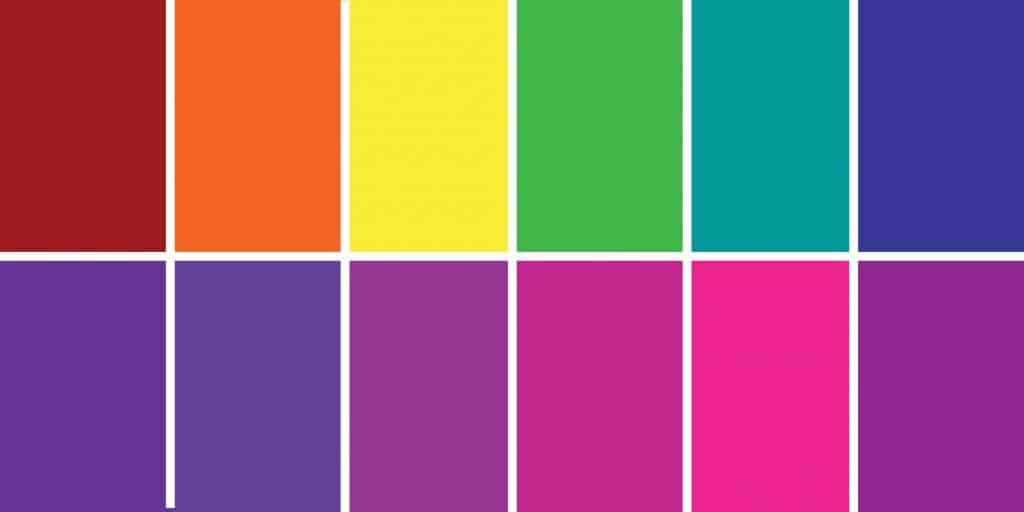
Strategic Color Pairings for Maximum Brand Impact
The true power of purple in branding emerges when it is harmoniously or purposefully contrasted with other colors. Effective color pairing enhances purple’s inherent qualities, shapes the brand’s mood, and optimizes visual communication.
Purple with Neutrals: Sophistication and Clarity
Pairing purple with neutrals like white, cream, grey, black, silver, or gold is a classic strategy for brands aiming for sophistication, elegance, and clarity.
- Purple and White/Cream: This combination exudes freshness, purity, and simplicity. A lighter purple with crisp white can feel modern and approachable, ideal for beauty brands or tech startups wanting to appear clean and innovative. Darker purples with cream can evoke a sense of heritage and warmth.
- Purple and Grey/Silver: Grey offers a sophisticated, contemporary backdrop that allows purple to pop without overwhelming the palette. This pairing signals professionalism, stability, and sleek design, often seen in corporate branding, luxury automotive, or high-tech industries. Silver adds a futuristic, metallic sheen, enhancing the perception of cutting-edge technology or luxury.
- Purple and Black: This is a dramatic and luxurious combination, conveying power, mystery, and deep sophistication. It’s often employed by luxury goods, exclusive event branding, or fashion labels seeking to make a bold, premium statement. Black grounds the purple, adding gravitas and depth.
- Purple and Gold: A historically opulent pairing, purple and gold immediately communicate luxury, prestige, and royalty. This combination is ideal for brands aiming for a lavish, high-end appeal, such as jewelry, premium spirits, or high-status services. Gold adds warmth and a shimmering richness that complements purple’s inherent grandeur.
Purple with Analogous Colors: Harmony and Depth
Analogous color schemes involve colors adjacent to purple on the color wheel, typically blue and pink/magenta. This creates a cohesive, harmonious, and calming aesthetic, offering depth without stark contrast.
- Purple and Blue: Blending purple with blue (especially shades like indigo, navy, or sky blue) creates a serene and trustworthy palette. This combination is often found in brands related to education, healthcare, technology, or finance, where stability, intelligence, and reliability are key messages. It can evoke a sense of calm sophistication.
- Purple and Pink/Magenta: When paired with pink or magenta, purple takes on a more vibrant, feminine, and creative energy. This scheme can be playful, romantic, or artistic, making it suitable for beauty brands, children’s products, creative agencies, or brands targeting a younger, fashion-forward demographic. It speaks to imagination and warmth.
Purple with Complementary Colors: Vibrancy and Impact
Complementary colors are opposite purple on the color wheel – primarily yellow and green (especially chartreuse or lime green). This pairing creates high contrast, leading to energetic, dynamic, and eye-catching branding.
- Purple and Yellow/Gold (as a complement): While gold with purple can be luxurious, a more vibrant yellow (like lemon or sunflower) creates a bold, playful contrast. This combination is highly energetic and noticeable, often used by brands wanting to convey optimism, creativity, and a youthful spirit. It demands attention and can be very memorable, but needs careful balance to avoid visual discord.
- Purple and Green (especially Chartreuse/Lime): This pairing offers a fresh, modern, and often quirky aesthetic. It combines purple’s depth with green’s natural vitality, suggesting innovation, growth, and individuality. It’s a popular choice for brands in sustainable tech, organic products, or creative services looking to stand out with a vibrant, contemporary feel.
Purple with Triadic & Split-Complementary Schemes: Dynamic Balance
- Triadic Schemes (Purple, Green, Orange): While less common due to their complexity, a triadic scheme using purple, green, and orange can be incredibly dynamic and engaging. This bold combination requires masterful balance, but it can make a brand appear sophisticated, energetic, and multi-faceted, often seen in entertainment, sports, or youth-oriented brands.
- Split-Complementary (Purple with Yellow-Orange and Yellow-Green): This scheme offers a rich visual interest with less tension than a direct complementary pairing. It maintains vibrancy and contrast while offering more harmony, making it excellent for brands that want to be eye-catching and dynamic without being overly aggressive. It provides a nuanced complexity that can appeal to creative and forward-thinking brands.
Designing with Purple: Application Across Brand Touchpoints
The choice of purple and its complementary colors must be consistently applied across all brand touchpoints to build a cohesive and strong brand identity.
Logo and Visual Identity
The logo is the cornerstone of visual identity. A purple logo, perhaps accented with a metallic silver or a crisp white, can immediately communicate luxury or innovation. The complementary colors chosen will inform the wider visual language – from typography colors to graphic elements – ensuring every visual asset reinforces the core brand message. Consider the negative space and how purple interacts with the background color to maximize impact and legibility.
Website and Digital Presence
On a website, purple can be used for calls-to-action, headings, or specific design elements. Its pairings will define the overall user experience. A website using deep purple with lighter neutrals might convey professionalism and ease of use, while a vibrant purple with a complementary green could signal a dynamic and interactive platform. Consistency across social media profiles, email templates, and digital advertisements is crucial for brand recognition.
Packaging and Product Design
For physical products, purple packaging can differentiate a brand on crowded shelves. Brands like Cadbury have famously used purple to denote quality and indulgence. The accompanying colors on the packaging – whether it’s gold foil for premium appeal or a contrasting yellow for a playful snack – dictate how the product is perceived and what emotions it triggers at the point of purchase.
Marketing Collateral and Campaigns
Brochures, flyers, business cards, and ad campaigns all serve as touchpoints where purple and its paired colors reinforce the brand message. A marketing campaign for a luxury brand might feature purple prominently with rich gold accents, while a tech startup’s campaign could use a modern purple alongside bright white and a hint of lime green to signify innovation and approachability. The consistent application of the chosen color palette across all communications builds familiarity and trust with the audience.
Case Studies: Brands that Master Purple
Examining brands that have successfully integrated purple into their identity reveals the strategic depth behind these color choices.
Cadbury: Indulgence and Heritage
Cadbury’s iconic deep purple packaging is synonymous with chocolate indulgence and a rich heritage. The brand leverages purple’s association with luxury and quality, often pairing it with gold lettering to further enhance its premium appeal. This long-standing color choice has created an instantly recognizable and deeply ingrained brand identity globally.
Twitch: Modern, Engaging Community
The live-streaming platform Twitch uses a vibrant, electric purple as its primary brand color. This choice signals creativity, energy, and a dynamic online community. Paired with white and black, the purple stands out, conveying a modern, tech-savvy, and engaging personality that resonates strongly with its target audience of gamers and content creators.

Hallmark: Sentiment and Creativity
Hallmark, a leader in greeting cards, frequently incorporates various shades of purple into its branding and product lines. From soft lavenders to rich violets, purple aligns with the brand’s message of sentiment, creativity, and thoughtfulness. It often pairs purple with white, silver, or soft blues and greens, reinforcing a sense of care, warmth, and artistic expression.
Ultimately, choosing “what color purple goes with” is about understanding the narrative your brand wishes to tell and selecting a palette that amplifies that story. By strategically pairing purple, brands can craft a visual identity that is not only aesthetically pleasing but also powerfully communicative, resonating deeply with their audience and standing out in a competitive market.
aViewFromTheCave is a participant in the Amazon Services LLC Associates Program, an affiliate advertising program designed to provide a means for sites to earn advertising fees by advertising and linking to Amazon.com. Amazon, the Amazon logo, AmazonSupply, and the AmazonSupply logo are trademarks of Amazon.com, Inc. or its affiliates. As an Amazon Associate we earn affiliate commissions from qualifying purchases.