
In the world of professional design and brand strategy, color is far more than a visual preference; it is a silent language that communicates values, evokes emotions, and drives consumer behavior. When we ask, “What color does brown and red make?” we are technically inquiring about the physical mixture of pigments. However, from a brand identity perspective, we are exploring the creation of a specific psychological atmosphere.
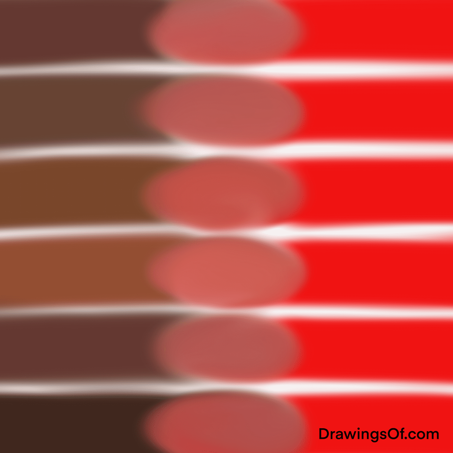
Mixing red and brown typically results in a deep, rich, and warm hue often categorized as burgundy, maroon, or a dark terracotta, depending on the ratios used. In branding, this combination moves away from the high-energy urgency of pure red and the humble simplicity of basic brown, instead settling into a space of sophisticated stability, heritage, and “grounded passion.”
The Science of the Blend: Understanding the Visual Outcome
To understand how red and brown interact, we must first look at their composition. Red is a primary color in the RYB (Red-Yellow-Blue) model, while brown is a composite color, often created by mixing all three primaries or by neutralizing an orange with its complement, blue.
From Terracotta to Maroon: The Spectrum of the Mix
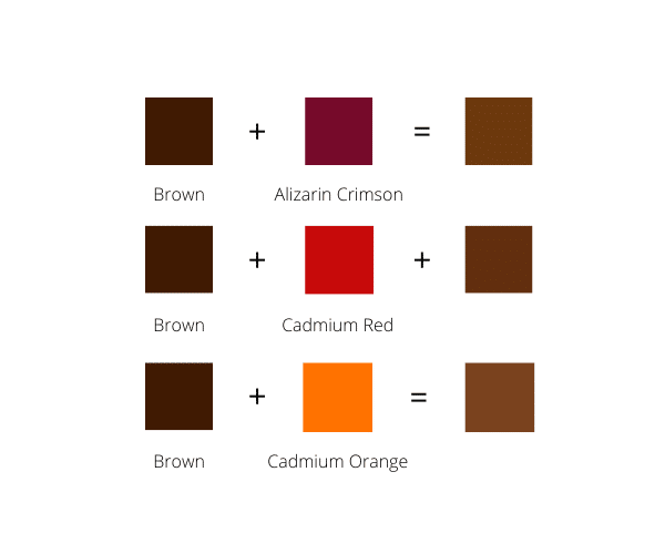
When you introduce red into a brown base, you are essentially “heating up” the brown. If the brown has a heavy yellow undertone (like a tan or sienna), the result will lean toward a burnt orange or terracotta. If the brown is deep and chocolatey, the addition of red produces a luxurious maroon or cordovan. This spectrum allows brand strategists to fine-tune the “temperature” of a brand’s visual identity.
A brand looking for an “organic” or “earth-centric” feel might lean toward the lighter, clay-like end of the spectrum. Conversely, a brand aiming for “prestige” and “exclusivity” will likely opt for the darker, wine-inspired shades created by this mixture.
The Technical Requirements for Cross-Platform Consistency
For a brand strategist, knowing the color is only half the battle; maintaining it across digital and physical touchpoints is the real challenge. In the digital space (RGB), mixing red and brown requires a careful balance of high Red values with moderate Green and low Blue values to ensure the color doesn’t appear “muddy” on screens. In print (CMYK), achieving a crisp red-brown requires a sophisticated mix of Magenta, Yellow, and Black. Professional branding agencies often rely on the Pantone Matching System (PMS) to ensure that the specific “red-brown” seen on a business card matches the one on a storefront sign or a website header.
Psychological Impact: What This Mix Signals to Consumers
Every color choice in a corporate identity sends a subconscious message. By mixing the visceral energy of red with the dependable stability of brown, a brand creates a unique emotional profile that appeals to specific consumer demographics.
The Energy of Red Meets the Stability of Brown
Red is the color of passion, speed, and appetite. It demands attention and can even increase the heart rate. Brown, on the other hand, represents the earth, reliability, and resilience. It is the color of the “Long Game.” When these two are blended, the “aggression” of the red is tempered by the “wisdom” of the brown.
The resulting color—whether it be a deep brick or a rich mahogany—communicates a sense of “Established Energy.” It tells the consumer: “We are passionate about what we do, but we have the experience and foundation to back it up.” This is why this color palette is frequently seen in industries where trust and longevity are paramount.
Evoking Reliability, Warmth, and Sophistication
In the context of personal branding or luxury goods, the red-brown mix is often associated with high-quality materials like mahogany wood, aged leather, or fine wine. This evokes a sense of “Old World” sophistication. Unlike the clinical feel of blue or the youthful vibrancy of yellow, the red-brown palette feels “lived-in” and comfortable. It suggests a brand that values craftsmanship over mass production and durability over fleeting trends.
Strategic Implementation in Corporate Identity
Choosing to use the colors resulting from a red and brown mix is a deliberate move that positions a company within a specific market niche. This palette is not for every brand, but for the right ones, it is an incredibly powerful tool.
Industry Applicability: When to Use Red-Brown Tones
Certain sectors benefit immensely from the psychological cues of red-brown tones:
- Artisanal Food and Beverage: Coffee brands, chocolate manufacturers, and wineries use these tones to reflect the organic nature of their products and the richness of the sensory experience.
- Finance and Heritage Banking: Institutions that want to emphasize their long history and “solid as a rock” reputation often use deep maroons or brick reds to signify strength without the “alarm” of a bright primary red.
- Outdoor and Adventure Gear: Brands emphasizing ruggedness and the “great outdoors” use earthy red-browns to connect with the colors of nature—canyons, trails, and autumn leaves.
- Home and Interior Design: These colors evoke warmth and security, making them ideal for brands centered around the concept of “home” and “comfort.”
Case Studies in Successful Earth-Tone Branding
Consider the branding of companies like UPS (United Parcel Service) or Dr. Pepper. UPS famously “owns” brown, using it to signal reliable, no-nonsense delivery. When they incorporate gold or reddish accents, it adds a layer of premium service.
Another example is the luxury fashion house Hermès. Their signature orange is iconic, but their use of deep, reddish-brown leathers in their product lines and store interiors reinforces their identity as a brand rooted in the tradition of saddlery and craftsmanship. By utilizing these deep, warm tones, they move away from the “disposable” nature of fast fashion and toward the “investment” nature of luxury goods.
Designing the Palette: Complementary Colors and Visual Hierarchy
A brand identity is rarely composed of just one color. To make the red-brown mixture work effectively, a brand strategist must build a supporting palette that enhances its best qualities.
Selecting Accents to Elevate Red-Brown Hues
Because red-brown is a “heavy” color visually, it requires balance.
- Cream and Off-White: Using a soft cream instead of a stark white creates a more harmonious, “organic” look that feels premium.
- Forest Green or Teal: As cool-toned counterparts, these provide a sophisticated contrast that mimics the natural world (earth and foliage), making the brand feel balanced and “full-spectrum.”
- Metallic Gold or Copper: These accents lean into the warmth of the red-brown and elevate it to a level of luxury and prestige.
Mastering Visual Weight and Layout
In digital design and marketing collateral, the “weight” of a red-brown color must be managed carefully. Because it is a dark, saturated tone, using it as a background color for a full website can feel oppressive or “heavy” if not balanced with ample white space. Strategic use of the color for logos, call-to-action buttons, or key headings allows the brand to exert its authority without overwhelming the user’s eye.
The goal is to use the color as an anchor. In a brand’s visual hierarchy, the red-brown element often acts as the “foundation” upon which other, more vibrant information is built.

Conclusion: The Business Case for the Red-Brown Palette
In the competitive landscape of modern branding, standing out is often a matter of nuances. While many brands rush toward the safety of “Tech Blue” or the aggression of “Power Red,” the sophisticated blend of red and brown offers a unique middle ground. It is a color of substance.
By understanding what color brown and red make—and more importantly, what that color means—designers and brand strategists can craft identities that resonate on a deeper, more primal level. It is a palette for brands that aren’t just here for the moment, but are built to last, combining the drive of passion with the stability of the earth. Whether you call it maroon, terracotta, or burnt sienna, this mixture is a testament to the power of grounded, intentional brand strategy.
aViewFromTheCave is a participant in the Amazon Services LLC Associates Program, an affiliate advertising program designed to provide a means for sites to earn advertising fees by advertising and linking to Amazon.com. Amazon, the Amazon logo, AmazonSupply, and the AmazonSupply logo are trademarks of Amazon.com, Inc. or its affiliates. As an Amazon Associate we earn affiliate commissions from qualifying purchases.