
In the complex ecosystem of brand strategy and corporate identity, few elements carry as much weight as color. It is the first thing a consumer perceives, often before a word is read or a logo is fully processed. Among the infinite spectrum of hues available to designers and marketing strategists, blue stands as the undisputed titan. Statistically, blue is the most popular favorite color globally and the most frequently utilized shade in corporate branding. But what color does blue symbolize in the context of professional identity, and why does it remain the foundational pillar for the world’s most successful brands?
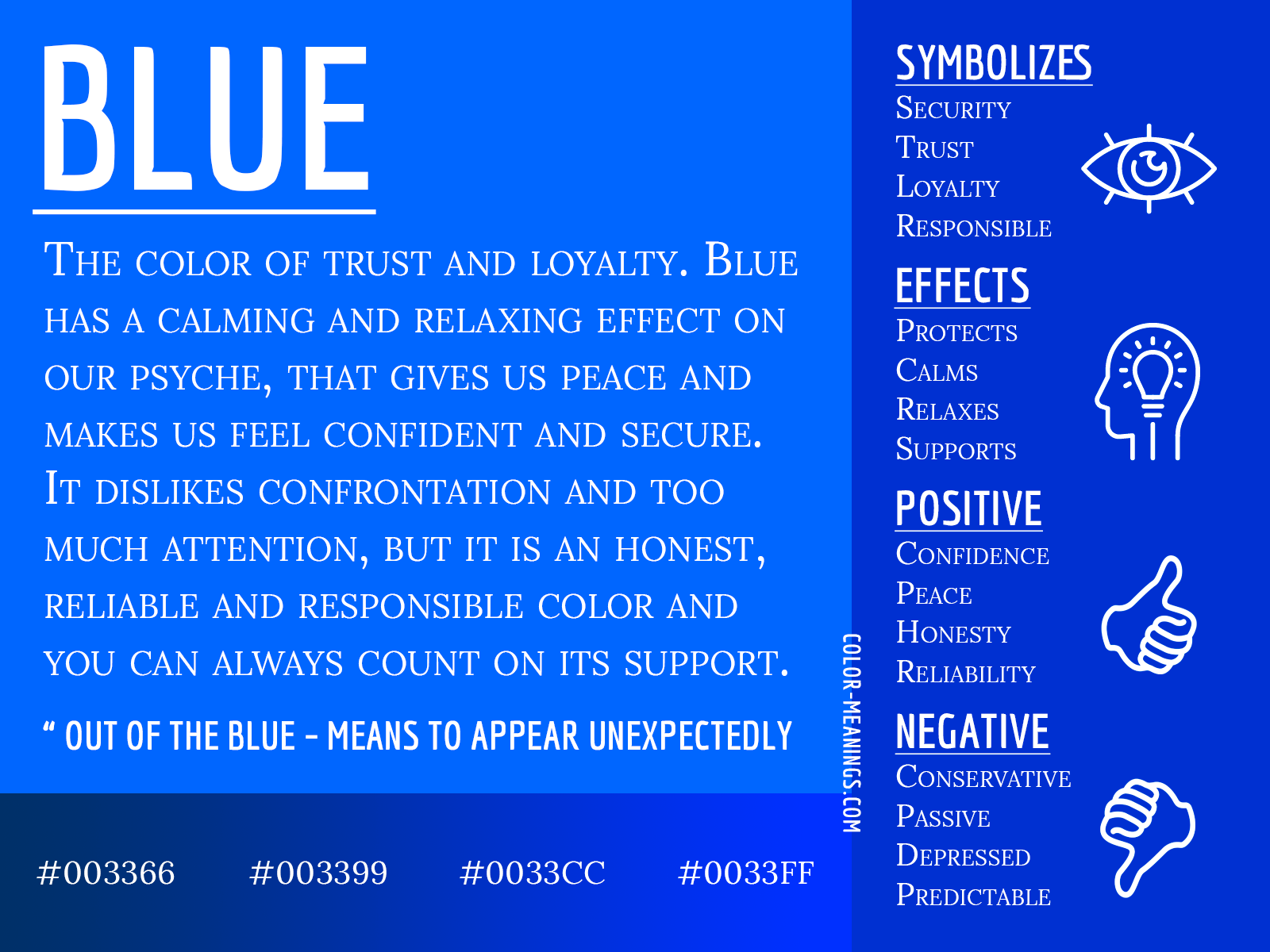
To understand the symbolism of blue is to understand the intersection of human psychology, evolutionary biology, and cultural history. In branding, blue is not merely a visual preference; it is a strategic tool used to evoke specific emotional responses, establish authority, and foster a sense of security.
The Psychological Foundations of Blue in Brand Strategy
The primary reason blue dominates the branding landscape is its profound psychological impact. Unlike aggressive colors like red or high-energy colors like yellow, blue operates on a frequency that promotes physiological and mental calm. In brand strategy, this translates into several key pillars of identity.
Trust and Dependability
Trust is the most valuable currency a brand can possess. Blue is inextricably linked to the sky and the ocean—two constants in the human experience that are perceived as eternal and reliable. When a brand adopts blue, it subconsciously signals that it is stable, dependable, and here to stay. This is why “Blue-Chip” companies—those recognized for their financial reliability—carry the color in their very name. For a consumer, blue minimizes the perceived risk of a transaction. It suggests that the company is an adult in the room, capable of handling responsibility without volatility.
Competence and Intelligence
Blue is often associated with the “mind” rather than the “body.” While red might stimulate appetite or physical excitement, blue stimulates clear thought and logic. In professional branding, blue symbolizes high-level competence. It is the color of the expert, the consultant, and the intellectual. This makes it the default choice for industries where precision and accuracy are non-negotiable, such as engineering, software development, and legal services.
Stability and Order
In an increasingly chaotic digital world, brands that offer a sense of order gain a competitive edge. Blue symbolizes structure. It is perceived as a “safe” color, providing a neutral ground that does not overwhelm the senses. For corporate identities that need to appear organized and systematic, blue serves as the visual anchor that holds disparate brand elements together.
Sector Analysis: Why Blue Dominates Corporate Landscapes
The symbolism of blue shifts slightly depending on the industry in which it is applied. By examining how different sectors leverage blue, we can see how brand strategists manipulate the color to achieve specific market positioning.
Financial Services: Security and Integrity
In the world of finance, blue is almost ubiquitous. From Chase and American Express to Visa and Goldman Sachs, the financial sector relies on blue to project an image of “fortress-like” security. When a customer entrusts their life savings or business capital to an institution, they require a visual assurance of integrity. Blue provides this by suggesting that the institution is conservative, disciplined, and immune to the whims of market frenzy. A bright orange or neon green bank might appear innovative, but it lacks the gravity that blue provides—a gravity that says, “Your money is safe with us.”
The Technology Sector: Connectivity and Innovation
The tech industry has a storied relationship with blue. IBM, famously known as “Big Blue,” set the standard for the industry decades ago. For tech companies, blue symbolizes the “frontier of the future” while maintaining a sense of approachability. Social media giants like Facebook (Meta), LinkedIn, and Twitter (in its original form) utilized blue to facilitate a sense of community and communication. Because blue is perceived as non-threatening and calming, it encourages users to spend long periods interacting with digital interfaces. In tech, blue is the color of the “information age”—clean, efficient, and interconnected.
Healthcare and Pharmaceuticals: Cleanliness and Care
In healthcare, the symbolism of blue shifts toward hygiene and tranquility. It is the color of sterile environments and professional care. Brand identities for hospitals, pharmaceutical companies (like Pfizer), and health insurance providers use blue to lower the heart rate of the observer. It suggests a “bedside manner” that is calm and professional, reducing the anxiety often associated with medical or wellness issues.
The Spectrum of Blue: Navigating Shades for Brand Personality
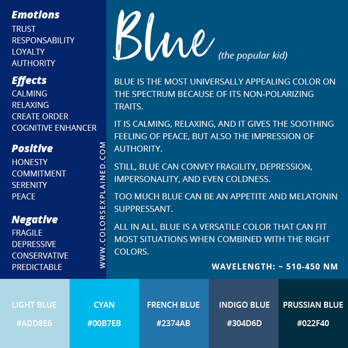
Not all blues are created equal. The specific shade a brand chooses can radically alter the message it sends to the market. Brand strategists must carefully select where on the spectrum their identity falls to ensure their “blue” symbolizes the right values.
Navy and Midnight Blue: Authority and Tradition
Darker shades of blue, such as navy or midnight, are the colors of the establishment. They symbolize power, authority, and tradition. These shades are frequently used by luxury brands, high-end automotive manufacturers, and prestigious academic institutions. A navy blue logo suggests that the brand has a rich heritage and a position of undisputed leadership. It is formal, sophisticated, and commands respect without needing to shout.
Royal and Cobalt Blue: Energy and Modernity
Mid-range blues, like royal or cobalt, are more vibrant and energetic. These shades are common in modern tech brands and consumer goods that want to appear “active” rather than “stodgy.” Royal blue symbolizes a proactive stance; it is the color of a brand that is moving forward. It maintains the trust of blue but adds a layer of excitement and high-performance.
Light Blue and Sky Blue: Approachability and Freedom
Light blue shades move away from the “corporate” feel and toward something more ethereal and friendly. These colors symbolize openness, creativity, and freedom. Brands that use light blue often want to appear more “human” and less institutional. This is why travel brands, creative tools, and environmental organizations lean toward lighter palettes. Light blue suggests a breath of fresh air and a lack of barriers.
Cultural Variations and Global Brand Perception
In an era of global commerce, brand managers must consider how the symbolism of blue travels across borders. While blue is the most “universal” color, its meaning can nuances in different regions.
In Western cultures, blue is the color of “the blues” (sadness) but also the color of “true blue” (loyalty). In the Middle East, blue is often associated with protection and spirituality, frequently used in amulets to ward off evil. In many Eastern cultures, blue symbolizes immortality and advancement.
From a strategic standpoint, blue is the safest color for a global rollout. Unlike white (which can symbolize mourning in parts of Asia) or red (which can symbolize danger or radicalism depending on the political climate), blue rarely carries a negative connotation. It is the diplomatic color of the corporate world, making it the ideal choice for multinational corporations seeking a unified global identity.
The Evolution of Blue in a Digital-First World
As branding moves further into the digital realm, the symbolism of blue has adapted to the requirements of user experience (UX) and user interface (UI) design. In digital environments, blue has become the universal signifier for “action.”
Hyperlinks are traditionally blue, and many call-to-action buttons utilize blue to encourage clicks without triggering the “alert” response that red might cause. In digital brand strategy, blue symbolizes “utility.” It tells the user that the interface is functional and that the brand’s digital tools are reliable. This “Digital Blue” (often a high-saturation, vibrant shade) represents the intersection of technology and human accessibility.

Strategic Implementation: Beyond the Logo
Understanding what blue symbolizes is only the first step. For a brand to truly leverage this color, it must be integrated into a holistic brand experience. This includes:
- Typography and White Space: Blue works exceptionally well with clean, sans-serif typography and generous white space. This combination reinforces the “orderly” and “modern” symbolism of the color.
- Complementary Palettes: While blue is a strong primary color, pairing it with accents can refine its meaning. Blue and silver symbolize high-tech luxury; blue and white symbolize purity and health; blue and orange (complementary colors) symbolize a balance of stability and energy.
- Consistency Across Touchpoints: The symbolism of blue is weakened if the shade varies across print and digital media. A rigorous brand style guide ensures that the “Trust Blue” seen on a business card is the exact same “Trust Blue” seen on a mobile app.
Blue is far more than a safe aesthetic choice. It is a calculated psychological anchor. It symbolizes a promise of quality, a commitment to stability, and a bridge of trust between a corporation and its audience. By understanding the deep-seated meanings behind this primary hue, brands can craft identities that do not just look professional, but feel inherently essential to the consumer’s life. In the competitive theatre of modern business, blue remains the most powerful visual shorthand for excellence and endurance.
aViewFromTheCave is a participant in the Amazon Services LLC Associates Program, an affiliate advertising program designed to provide a means for sites to earn advertising fees by advertising and linking to Amazon.com. Amazon, the Amazon logo, AmazonSupply, and the AmazonSupply logo are trademarks of Amazon.com, Inc. or its affiliates. As an Amazon Associate we earn affiliate commissions from qualifying purchases.