
In the world of professional brand strategy, every visual choice—from the curve of a logo’s serif to the hexadecimal code of its primary hue—is a calculated decision. One of the most common questions designers and brand architects face when conceptualizing a visual identity is how specific colors interact when combined. A prime example is the intersection of purple and green. While a simple question—”what color do purple and green make?”—might seem elementary, the answer carries significant weight for corporate identity, marketing psychology, and the technical execution of a brand’s visual assets.
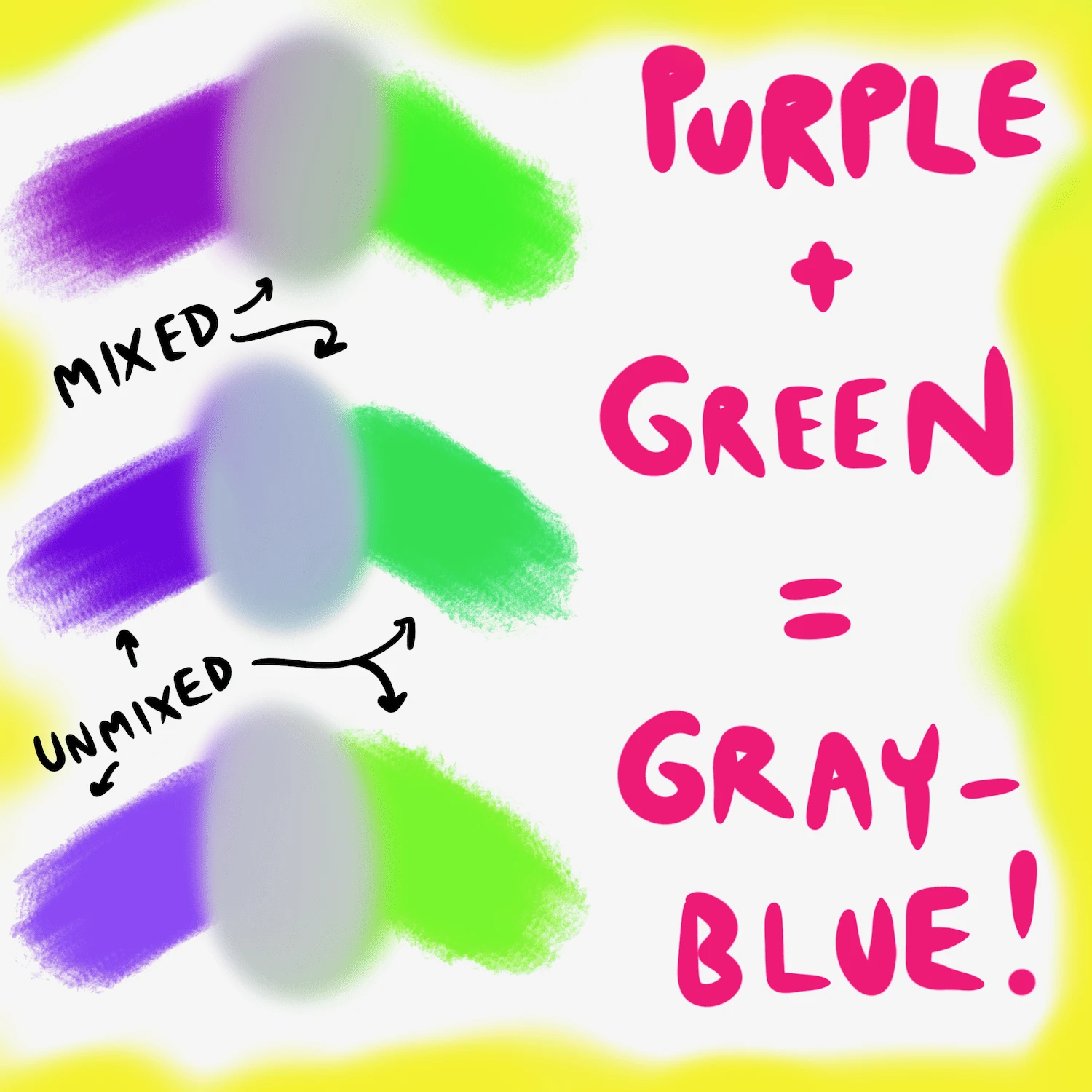
In the realm of brand design, mixing purple and green typically results in a tertiary neutral, often manifesting as a muted, brownish-gray or a deep olive-drab. However, the value of this mixture lies not just in the resulting pigment, but in the strategic implications of why a brand would choose these colors in the first place, how they clash, and how a strategist can navigate the complexities of color theory to build a coherent brand voice.
The Science of Subtractive Mixing in Brand Design
To understand what happens when purple and green collide, we must first look at the mechanics of color mixing. In branding, we primarily deal with two systems: the Subtractive Model (RYB/CMYK) for physical media and the Additive Model (RGB) for digital screens.
The Secondary Color Clash
Purple and green are both secondary colors. Purple is born from the union of red and blue, while green is the child of blue and yellow. When these two are mixed in a physical environment (such as paint or ink), you are essentially combining all three primary colors: red, blue, and yellow.
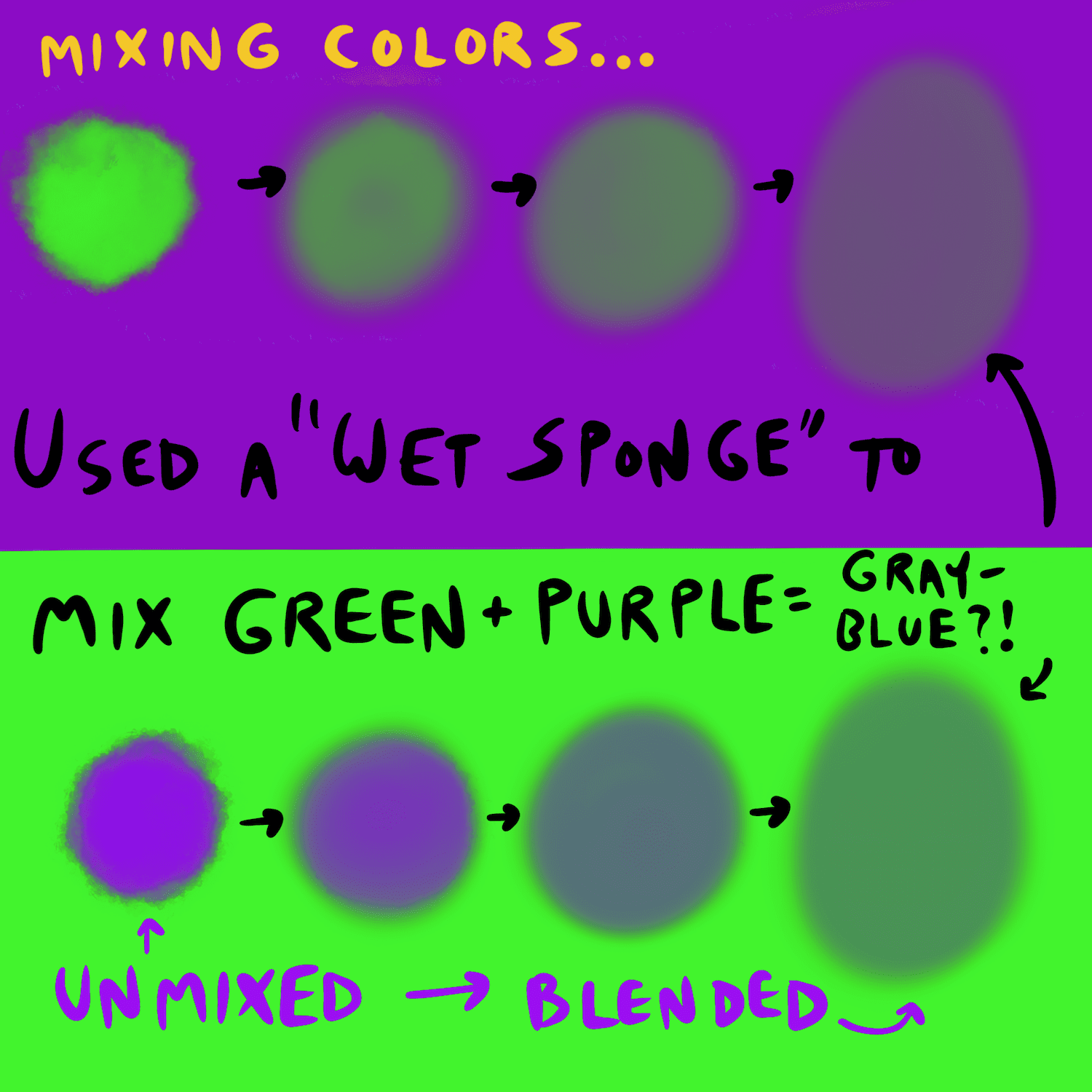
Because green and purple both contain blue, the resulting mixture is heavily saturated with cool undertones, but the presence of all three primaries inevitably leads to “neutralization.” In subtractive mixing, the more colors you add, the closer you get to a dark, desaturated brown or gray. For a brand strategist, this “muddying” effect is a cautionary tale regarding transparency and layering in graphic design.
From Vibrancy to Neutrality: The Resulting Hue
When you blend a standard royal purple with a forest green, you typically achieve a color known in the design world as “burnt umber” or a “chromatic neutral.” This result is often avoided in high-energy retail branding because it lacks the “pop” required for immediate consumer recognition. However, in the niche of luxury branding or heritage-based corporate identities, these muted, complex tones can signify maturity, stability, and an “earthy” sophistication that bright, primary colors cannot convey.
Color Psychology and the Perception of Purple and Green
Brand strategy is as much about psychology as it is about aesthetics. Before we mix the colors, we must understand the individual weight they bring to a brand’s personality. The combination of purple and green is one of the most polarizing pairings in the marketing world.
The Sophistication and Mystery of Purple
Historically, purple has been the color of royalty, luxury, and mystery. In modern branding, it is often utilized by companies that want to project an image of creativity, wisdom, or premium quality. Brands like Cadbury or Hallmark use purple to evoke a sense of heritage and emotional depth. It is a color that stands apart from the commonality of blue or the aggression of red, positioning a brand as something unique and high-end.
The Vitality and Trust of Green
Green, conversely, is the universal symbol of growth, health, and sustainability. It is the most “natural” color on the spectrum. In the corporate world, green is used to build trust and signify safety. From Starbucks to John Deere, green tells the consumer that the brand is grounded, life-giving, or eco-conscious. It is a color of balance and restoration.
When Opposites Meet: Psychological Dissonance or Harmony?
When purple and green are placed side-by-side in a brand palette—rather than mixed—they create a high-contrast relationship. Because they are not direct opposites on the color wheel (that would be purple and yellow, or green and red), their relationship is “sub-complementary.”
This pairing is often used in brands that want to appear “otherworldly” or “alternative.” Think of the classic aesthetic of the “villain” in entertainment branding—purple and green are the hallmark colors of the Joker or Maleficent. For a brand, this can be a double-edged sword: it provides instant differentiation, but it risks appearing “unnatural” or “jarring” if the saturation levels aren’t perfectly balanced.
Avoiding the “Muddy” Brand: Practical Applications for Corporate Identity
One of the greatest challenges in maintaining a corporate identity is ensuring that colors remain consistent across various mediums. When a brand uses a palette that includes both purple and green, the risk of technical “muddying” becomes a serious concern for brand managers.
The Risks of Poor Layering in Graphic Design
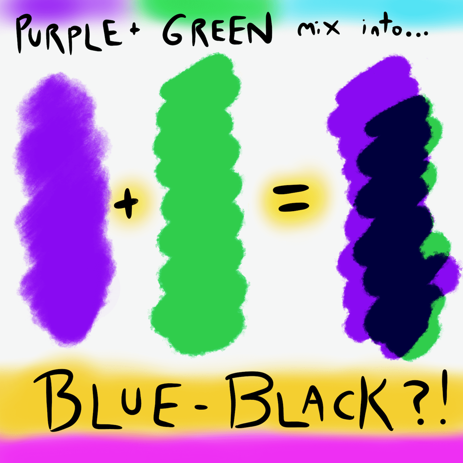
In digital design, transparency and blending modes (like “Multiply” or “Overlay”) are common tools. If a designer overlays a purple element onto a green background without careful consideration of the opacity and color space, the resulting intersection will be that muddy brown we discussed earlier.
From a brand strategy perspective, this is a failure of visual clarity. It can make a logo look “dirty” or “dim,” which subconsciously affects the consumer’s perception of the brand’s quality. Strategic brand guidelines must specify how these colors are to interact, often mandating a “white buffer” or “negative space” between the two hues to maintain their individual integrity.
Managing Brand Guidelines for Consistent Reproduction
A brand strategist must ensure that the purple-green relationship holds up in print. In the CMYK (Cyan, Magenta, Yellow, Black) printing process, purple is notoriously difficult to replicate consistently. It often shifts toward blue or “washes out” when printed on certain stocks.
When you add green into the mix—which requires precise ratios of yellow and cyan—the margin for error increases. Professional brand guidelines will provide specific Pantone Matching System (PMS) codes for both colors to ensure that the “brown” resulting from an accidental overlap never makes it to the final product.
Case Studies: Successes and Failures in Multi-Hue Branding
To see how these theories play out in the real world, we can look at how different industries handle the complex relationship between purple and green.
High-Fashion and the “Muted” Palette
In the fashion industry, the “muddy” result of mixing purple and green is often used intentionally. Luxury brands like Gucci or Bottega Veneta frequently use olive greens and deep plum purples in their seasonal collections. Here, the “muted” tones signify a departure from the “loud” colors of fast fashion. The strategy is to appeal to a sophisticated consumer who appreciates the complexity of tertiary colors—colors that aren’t easily named or identified.
Digital Brands and the Accessibility Factor
In the tech sector, branding is heavily influenced by User Interface (UI) and User Experience (UX) requirements. Purple and green are often used together in apps that focus on “FinTech” or “Creativity Tools” because they provide high contrast for call-to-action buttons. However, brand strategists must be wary of color blindness.
Approximately 8% of men and 0.5% of women have some form of color vision deficiency. Protanopia and deuteranopia can make it difficult to distinguish between certain shades of green and purple. A brand that relies too heavily on the distinction between these two colors without supporting secondary cues (like icons or text) may inadvertently alienate a segment of its audience.
Mastering the Brand Toolkit: Tools for Color Selection
Building a brand is about making choices that align with a long-term vision. If you are considering a purple and green palette, or if you are curious about what their mixture represents for your business, you need the right tools to validate your strategy.
Leveraging the Color Wheel for Strategic Positioning
Modern brand strategists use digital color wheels and AI-driven palette generators to test how colors interact before they ever reach the design phase. By analyzing the “temperature” of the purple (is it a warm violet or a cool indigo?) and the green (is it a minty teal or a lime?), strategists can predict the outcome of their mixture.
The goal is to find the “sweet spot” where the colors enhance each other’s strengths rather than canceling each other out. If the goal is a bold, energetic brand, the strategist will keep the colors at high saturation and high contrast. If the goal is a grounded, organic brand, they may lean into the muted, earthy tones that result from their mixture.
Final Thoughts on the Purple-Green Dynamic
So, what color do purple and green make? Physically, they make a neutral, often earthy brown. But strategically, they represent a complex intersection of luxury and nature, mystery and growth, or sophistication and “alternative” energy.
In the high-stakes world of brand strategy, the goal is never just to mix colors, but to mix meanings. By understanding the technicalities of color mixing and the psychological impact of the resulting hues, brand architects can create visual identities that are not only aesthetically pleasing but also strategically sound, ensuring that the brand’s message remains clear, vibrant, and impactful in a crowded marketplace.
aViewFromTheCave is a participant in the Amazon Services LLC Associates Program, an affiliate advertising program designed to provide a means for sites to earn advertising fees by advertising and linking to Amazon.com. Amazon, the Amazon logo, AmazonSupply, and the AmazonSupply logo are trademarks of Amazon.com, Inc. or its affiliates. As an Amazon Associate we earn affiliate commissions from qualifying purchases.