In the competitive culinary world, a chef’s headshot is more than just a photograph; it’s a crucial element of their personal brand. It’s often the first visual impression a potential employer, client, or diner has of the individual behind the exquisite dishes. As such, every detail of the headshot matters, from the chef’s expression and attire to the background against which they are framed. When considering the impact of a headshot, particularly for professionals in a creative and often visually driven industry like cuisine, the background color plays a surprisingly significant role. This isn’t a matter of mere aesthetic preference; it’s a strategic decision rooted in the principles of personal branding and how visual elements influence perception.
Choosing the right background color for a chef’s headshot is about creating a specific mood, conveying personality, and ensuring the chef stands out while remaining professional and approachable. It’s about optimizing the visual communication to align with the chef’s individual brand identity and the overall message they wish to project. This article will delve into the strategic considerations of background colors for chef headshots, exploring how different hues can impact perception, enhance visibility, and ultimately contribute to a stronger personal brand.
The Psychology of Color in Personal Branding
Color is a powerful, non-verbal communication tool. Our brains are wired to react to colors in specific ways, often eliciting emotional responses and associations. For a chef’s headshot, understanding these psychological underpinnings is paramount to making an informed choice. The goal is to select a background color that complements the chef’s professional persona, reinforces their culinary style, and makes them memorable for the right reasons.
Evoking Emotion and Personality
Different colors evoke distinct emotions and perceptions. For instance, warm colors like reds and oranges are often associated with energy, passion, and excitement. These can be excellent choices for chefs who want to convey a dynamic and vibrant personality, perhaps those known for bold flavors or a fiery kitchen presence. However, an overly aggressive red could be overwhelming. A more muted or sophisticated shade might be more appropriate for a chef aiming for an image of refined expertise.
Cool colors, such as blues and greens, tend to evoke feelings of calmness, trust, and professionalism. A chef who emphasizes fresh, seasonal ingredients, or whose cuisine is known for its elegant simplicity, might find a cool-toned background beneficial. Blues can suggest reliability and expertise, while greens can directly link to nature and health-conscious cooking. These colors can create a sense of approachability and competence.
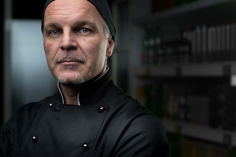
Neutral colors – whites, grays, and blacks – offer a different kind of power: versatility and sophistication. White backgrounds can create a clean, minimalist look, emphasizing the chef and their skills without distraction. This is often a safe and universally appealing choice. Gray backgrounds can add a touch of modern elegance and professionalism, allowing the chef’s features and personality to shine. Black backgrounds, when executed well, can convey a sense of luxury, mystery, and high-end expertise, suitable for chefs aiming for an elite or exclusive brand.
Enhancing Contrast and Visibility
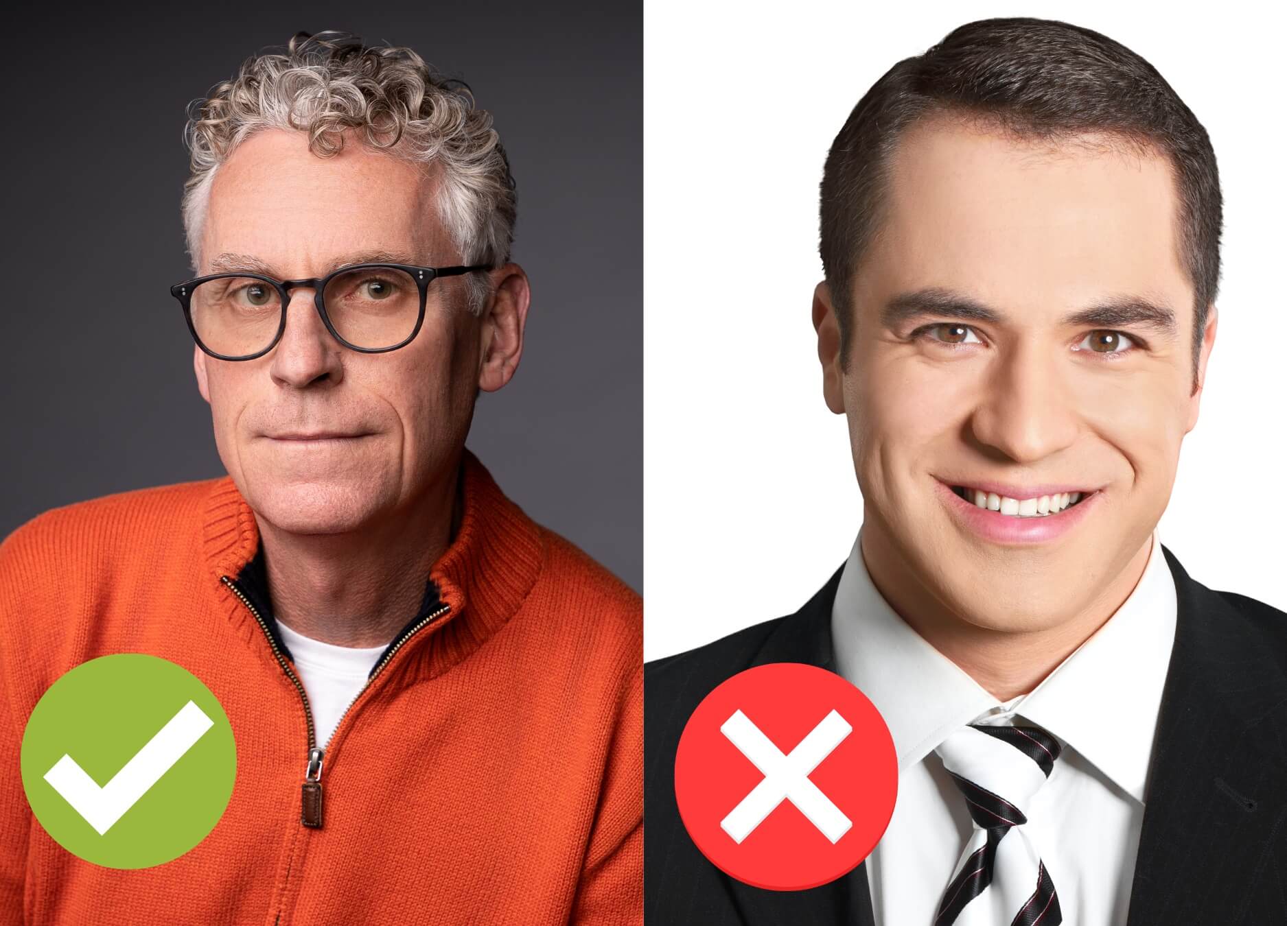
Beyond emotional associations, the practical application of background color is crucial for ensuring the headshot is visually effective. The primary goal of a headshot is to showcase the individual. Therefore, the background must facilitate this by creating sufficient contrast with the subject. A background that is too similar in tone or color to the chef’s hair, skin tone, or clothing can cause them to blend in, making the image less impactful and potentially obscuring important details.
Consider a chef with dark hair and wearing a dark chef’s coat. A very dark or black background might cause their outline to become lost. Conversely, a chef with fair skin and light hair might appear washed out against a stark white background if not lit properly. The aim is to select a background that subtly frames the chef, making them the clear focal point. This doesn’t mean the background needs to be jarringly different, but rather that there’s enough visual separation to make the chef pop.
The contrast should not only be about color but also about tonal value. A medium-toned background is often a safe bet as it provides a good balance, allowing lighter and darker elements of the chef’s appearance to stand out. This strategic use of contrast ensures that the headshot is easily digestible and that the chef’s presence is immediately felt.
Strategic Color Choices for Different Chef Personas
The “best” background color is not a one-size-fits-all answer. It is deeply personal and depends on the chef’s brand, their culinary niche, and the message they want to communicate. By understanding the nuances of color psychology and its application in branding, chefs can make strategic choices that elevate their professional image.
The Classic and Professional Palette
For chefs who aim for an image of timeless expertise, reliability, and classic culinary mastery, certain background colors consistently perform well. These choices are often rooted in a desire for broad appeal and a projection of competence that transcends fleeting trends.
- Soft Grays: Ranging from light dove gray to a medium charcoal, these backgrounds offer a sophisticated and neutral canvas. They are excellent for creating a sense of professionalism without being stark. Soft grays don’t compete with the subject but instead subtly enhance their features, allowing their personality and expression to take center stage. They pair well with traditional chef whites or darker professional attire, offering a balanced contrast. This choice is ideal for established chefs, culinary educators, or those leading established fine-dining establishments.
- Muted Blues: A slate blue or a dusty cerulean can convey a sense of calm, trust, and intelligence. These colors are often associated with depth and stability. For chefs who pride themselves on precision, a well-balanced menu, or a consistent, high-quality dining experience, a muted blue can be an excellent choice. It suggests a thoughtful approach to cooking and a reliable presence in the kitchen. This hue is particularly effective when the chef’s attire incorporates warmer tones, creating a pleasing color harmony.
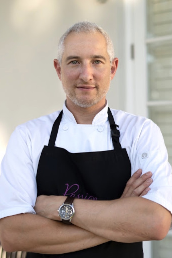
- Off-Whites and Creams: While pure white can sometimes be too stark, off-whites and cream tones offer a softer, warmer, and more inviting alternative. These colors maintain a sense of cleanliness and professionalism but add a touch of approachability. They are a good choice for chefs who want to appear friendly and accessible, perhaps those focused on farm-to-table concepts or comforting, familiar cuisine. This choice also tends to be flattering to a wide range of skin tones.
The Bold and Vibrant Approach
For chefs who are known for their innovative dishes, avant-garde techniques, or a passionate, energetic approach to food, a more dynamic background color might be appropriate. These choices are about making a statement and reflecting the chef’s distinctive culinary voice.
- Deep Reds and Burgundies: These colors are inherently associated with passion, energy, and excitement. A chef who embraces bold flavors, experimental cooking, or a vibrant restaurant atmosphere might find a rich red or burgundy background to be a perfect fit. These colors can create a sense of warmth and intensity. However, it’s crucial to use these shades strategically; an overly bright or neon red could be distracting. Deeper, more sophisticated shades are generally more effective for professional headshots, adding drama and emphasizing the chef’s fiery spirit without overwhelming their presence.
- Earthy Tones (Terracotta, Deep Greens): For chefs who focus on natural, organic, or globally inspired cuisine, earthy tones can be very effective. Terracotta, for example, evokes warmth, rustic charm, and a connection to the land, ideal for chefs specializing in Mediterranean or rustic cooking. Deep forest greens can symbolize freshness, health, and a connection to nature, making them suitable for chefs focused on sustainable, seasonal, or plant-based cuisine. These colors ground the chef, highlighting their connection to ingredients and their culinary philosophy.
- Subtle Gold or Bronze Accents: While a full gold or bronze background might be too ostentatious, incorporating these tones as a subtle hue or an accent within a neutral background can add a touch of luxury and prestige. This is best suited for chefs who operate at the highest echelons of fine dining, have received numerous accolades, or aim to project an image of exclusivity and culinary excellence. It suggests refinement and a discerning palate.
Technical Considerations for Background Selection
Beyond the psychological and branding aspects, the practical execution of the headshot itself plays a crucial role in how the background color is perceived. Lighting, resolution, and the overall quality of the photograph are paramount. Even the most strategically chosen color can be rendered ineffective by poor technical execution.
The Role of Lighting
Lighting is arguably the most critical element in photography, and it works in tandem with the background color to create the desired effect. Proper lighting can make a background color come alive, ensuring it complements rather than competes with the subject.
- Soft, Diffused Light: For most professional headshots, soft, diffused lighting is preferred. This type of lighting minimizes harsh shadows and creates a flattering illumination on the chef’s face. When used with a neutral or subtly colored background, it allows the chef to remain the primary focus, with the background providing a gentle, supportive presence.
- Backlighting and Edge Lighting: In some cases, strategic backlighting can be used to create a subtle halo effect around the chef’s head, further separating them from the background. This can be particularly effective with darker backgrounds, where it helps to define the chef’s silhouette. However, this technique requires skilled execution to avoid overexposure or an unnatural look.
- Color Temperature: The color temperature of the lighting itself can also influence how the background color appears. Warmer lighting might make a blue background feel richer, while cooler lighting could make a gray background appear more sterile. Photographers must consider how their chosen lighting will interact with the background color to achieve the intended mood.
Ensuring Versatility and Adaptability
The chosen background color should also be considered in terms of its versatility. A chef might need their headshot for a variety of platforms, from their personal website and social media profiles to press releases, restaurant menus, and even print advertising. The background color needs to hold up across these different applications.
- Website and Digital Platforms: On a website, a background color needs to complement the overall site design and brand aesthetic. It should also be legible and visually appealing on various screen sizes and resolutions. Highly saturated or very dark backgrounds can sometimes be challenging for on-screen readability if not handled carefully.
- Print Media: For print, the ability of the color to reproduce accurately is important. Some colors can shift significantly when translated from digital to print. A background that is too busy or contains too much detail might also detract from the clarity of the chef’s image in smaller print formats.
- Adaptability for Different Uses: Consider if the headshot might need to be cropped or used in different aspect ratios. A background that is too visually complex might not adapt well to different framing requirements. Simple, well-defined backgrounds generally offer greater flexibility.
The Power of a Clean and Uncluttered Background
Regardless of color, the most crucial aspect of any background for a headshot is that it is clean, uncluttered, and serves to enhance, not distract from, the subject. Busy patterns, distracting objects, or poorly executed gradients can detract from the chef’s professionalism and undermine the impact of their personal brand.
For chefs, who often work in dynamic and sometimes chaotic environments, their headshot should offer a sense of composure and control. A simple, well-chosen background color helps to achieve this, presenting the chef as a focused, skilled, and approachable professional ready to make their mark. Ultimately, the best background color is one that amplifies the chef’s unique strengths and culinary identity, ensuring their headshot is a powerful asset in their personal branding strategy.
aViewFromTheCave is a participant in the Amazon Services LLC Associates Program, an affiliate advertising program designed to provide a means for sites to earn advertising fees by advertising and linking to Amazon.com. Amazon, the Amazon logo, AmazonSupply, and the AmazonSupply logo are trademarks of Amazon.com, Inc. or its affiliates. As an Amazon Associate we earn affiliate commissions from qualifying purchases.