
In the vibrant tapestry of human perception, color plays an undisputed starring role, particularly within the strategic realm of branding. The question of “what color attracts the human eye most” isn’t merely a curiosity; it’s a foundational inquiry for any brand aiming to capture attention, convey meaning, and forge an indelible connection with its audience. While a singular “most attractive” color remains elusive due to the complexities of human psychology, culture, and individual context, understanding the principles behind color attraction is paramount for crafting a compelling brand identity.
The Science of Visual Perception and Brand Recognition
The human eye is an incredibly sophisticated organ, capable of distinguishing millions of colors. This ability is not just for aesthetic appreciation; it’s a survival mechanism that has evolved over millennia. In the modern commercial landscape, brands leverage this innate visual processing to stand out. From the instant a consumer glances at a product, a logo, or an advertisement, color information is processed, triggering a cascade of subconscious associations and emotional responses.
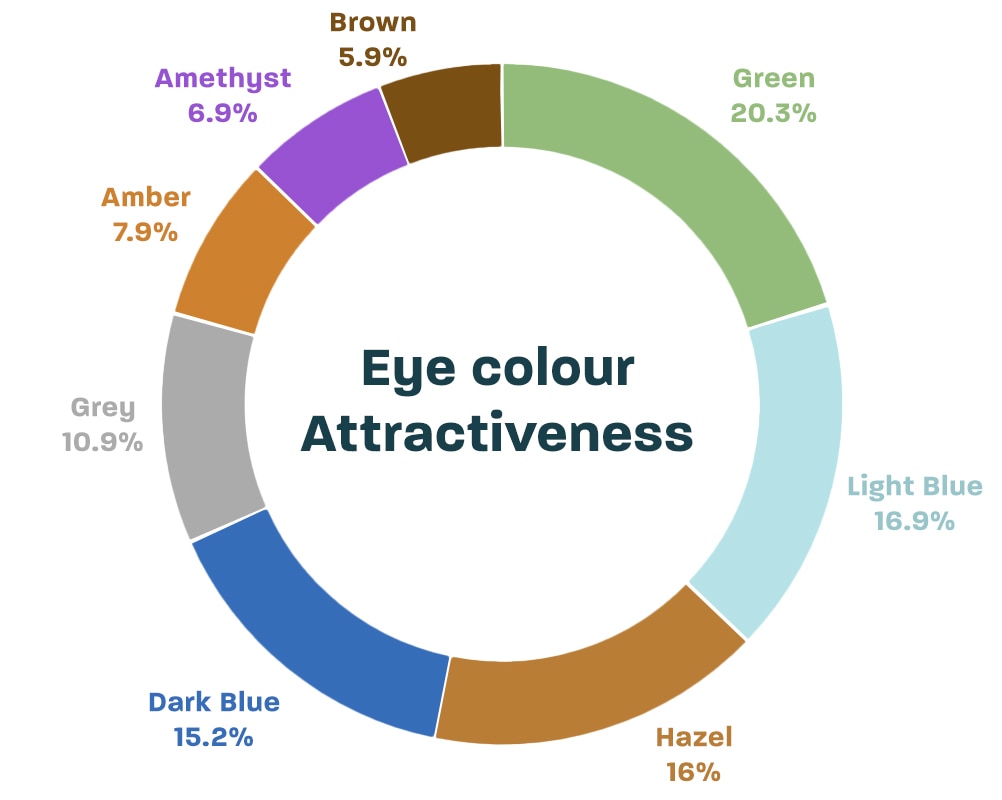
The Primacy of Color in Brand Recognition
Studies consistently show that color is one of the most significant factors in brand recognition, often accounting for 80-90% of a consumer’s initial impression. Before a consumer can read text, process imagery, or understand a message, they perceive color. This rapid processing means that the chosen hues become intrinsically linked to a brand’s identity. Think of the distinctive red of Coca-Cola, the vibrant blue of Facebook, or the golden arches of McDonald’s – these colors are instantly recognizable, often even without the accompanying logo or name. They act as shorthand for an entire brand experience, creating mental shortcuts that drive recall and affinity.
Psychological Impact and Emotional Resonance
Beyond mere recognition, colors evoke powerful psychological and emotional responses. Each hue carries with it a spectrum of inherent meanings and cultural associations that can influence mood, behavior, and perception. A brand’s color palette isn’t just about looking good; it’s about feeling right. For instance, cool colors like blue and green often evoke feelings of calm and trustworthiness, while warm colors such as red and yellow can signify energy, passion, or urgency. Tapping into these deeply ingrained psychological connections allows brands to communicate their values, personality, and promises on a subconscious level, long before a single word is read. This emotional resonance is crucial for building loyalty and differentiating a brand in a crowded market.
Decoding the “Most Attractive” Colors for Brands
While no single color universally dominates, certain colors consistently perform well in specific contexts due to their strong psychological associations and high visibility. Understanding these can help brands make informed choices.
Red: Urgency, Passion, and Attention
Red is arguably the most attention-grabbing color. It’s associated with energy, passion, excitement, and urgency. From a biological perspective, red is the color of blood and fire, signaling both danger and vitality. In branding, red is often used to stimulate appetite (fast food), signify love (Valentine’s Day brands), or command immediate attention (sales, stop signs). Brands like Netflix, CNN, and Coca-Cola effectively use red to convey boldness and dynamism. Its high visibility makes it excellent for calls to action, drawing the eye directly to critical information or buttons.
Blue: Trust, Stability, and Professionalism
Blue is a universally favored color, often associated with the sky and sea, evoking feelings of calm, stability, and reliability. It signifies professionalism, integrity, and trust, making it a popular choice for corporate brands, financial institutions, and tech companies. IBM, Facebook, and PayPal all leverage blue to project an image of dependability and security. However, overuse of blue can sometimes lead to perceptions of coolness or detachment, so balance is key.
Green: Growth, Nature, and Well-being
Green carries strong associations with nature, health, growth, and tranquility. It’s often used by brands promoting environmental sustainability, organic products, finance (money), or health and wellness. Whole Foods, Starbucks, and Animal Planet utilize green to communicate naturalness, freshness, or growth. Different shades of green can evoke distinct feelings, from the vibrant energy of lime green to the sophisticated calm of forest green.
Yellow: Optimism, Energy, and Warning
Yellow is the color of sunshine, often linked to happiness, optimism, and energy. It’s highly visible and can capture attention quickly, making it effective for warnings or highlighting key elements. Brands like McDonald’s, National Geographic, and Best Buy use yellow to convey enthusiasm and friendliness. However, too much yellow can be overwhelming or even perceived as childish or cheap, so it’s often best used as an accent color or in specific, targeted applications.
Orange: Creativity, Enthusiasm, and Warmth
Orange combines the energy of red with the happiness of yellow, resulting in a color often associated with creativity, enthusiasm, warmth, and adventure. It’s less aggressive than red but still highly visible and stimulating. Brands like Nickelodeon, Amazon (in their logo), and Firefox use orange to project an image of innovation, fun, and approachability. It’s an excellent choice for brands looking to appear friendly and dynamic without the intensity of red.

Purple: Luxury, Creativity, and Sophistication
Historically associated with royalty and luxury, purple maintains its connotations of sophistication, creativity, wisdom, and imagination. It’s less common in branding than other primary colors, which can make a brand stand out. Brands like Hallmark and Cadbury often use purple to convey elegance, quality, and a touch of mystique. Its unique blend of blue’s stability and red’s energy makes it versatile for brands seeking to be seen as both authoritative and imaginative.
Black & White: Authority, Elegance, and Simplicity
While technically the absence and presence of all colors, black and white are fundamental to branding. Black conveys sophistication, authority, power, and elegance, often used by luxury brands (Chanel, Nike) or to provide strong contrast. White signifies purity, simplicity, cleanliness, and modernity. Used together, they create a timeless, minimalist aesthetic that speaks volumes. They are the backbone of many brand identities, providing balance and allowing other colors to pop.
Context is King: Cultural Nuances and Target Audience
The notion of a “most attractive” color is further complicated by context. What works for one industry or culture might fail in another. A successful brand color strategy isn’t about finding a universally appealing hue but about selecting the right color for the right purpose and audience.
Geographical and Cultural Interpretations
Color meanings are not universal. Red, for example, signifies love and passion in Western cultures, but prosperity and good fortune in China, and mourning in parts of Africa. White represents purity in Western cultures but is the color of mourning in many Eastern traditions. Brands operating globally must be acutely aware of these cultural nuances to avoid miscommunication or offense. Research into target markets’ color associations is critical for effective international branding.
Industry-Specific Color Palettes
Different industries have established color conventions that consumers implicitly understand. Financial institutions rarely use bright, playful colors; they gravitate towards blues and greens to signify stability and growth. Fast-food restaurants often employ reds and yellows to stimulate appetite and create a sense of urgency. Tech companies frequently opt for blues and grays to denote innovation and reliability. Deviating too far from these conventions can confuse consumers or make a brand seem out of place, although strategic deviation can also be a way to disrupt a market.
The Role of Brand Personality
Ultimately, the most attractive color for a brand is one that authentically reflects its unique personality and values. Is the brand playful and energetic, or serious and sophisticated? Is it traditional or innovative? Environmentally conscious or technologically advanced? The chosen colors must align perfectly with the brand’s core identity, helping to tell its story and resonate with its target audience on an emotional level. A mismatch between color and personality can create cognitive dissonance, undermining brand trust and appeal.
Crafting Your Brand’s Irresistible Color Palette
Selecting a primary color is just the beginning. A complete brand identity relies on a cohesive and harmonious color palette that extends across all brand touchpoints.
Harmonious Combinations and Contrast
A compelling brand palette typically includes a primary color, secondary colors that complement it, and accent colors that provide visual interest and highlight calls to action. The relationships between these colors – whether they are complementary, analogous, or monochromatic – play a significant role in how the overall brand feels. Effective contrast is also vital, ensuring readability and accessibility, making sure your brand messaging stands out clearly against its background. Tools like color theory wheels and online palette generators can assist in creating balanced and visually appealing combinations.
Consistency Across Touchpoints
Once a color palette is established, consistency is non-negotiable. Every instance of the brand’s visual identity – from its logo and website to packaging, social media graphics, and physical signage – must adhere to the chosen colors and their precise specifications (e.g., CMYK, RGB, Hex codes, Pantone). This unwavering consistency builds recognition, reinforces brand identity, and fosters a sense of professionalism and trustworthiness. Inconsistency, conversely, dilutes brand recognition and can make a brand appear unpolished or unreliable.
A/B Testing and Data-Driven Color Choices
While psychological principles and cultural insights provide a strong foundation, the ultimate arbiter of color effectiveness is data. A/B testing various color schemes for website buttons, ad creatives, email calls to action, or even product packaging can provide invaluable insights into what truly resonates with your specific audience. Observing click-through rates, conversion rates, and user engagement metrics can help refine and optimize your color choices, ensuring that your brand’s visual identity isn’t just aesthetically pleasing, but also strategically effective in driving desired outcomes.
In conclusion, there isn’t a single color that universally attracts the human eye “most” in every context. Instead, the most attractive color for a brand is the one that is strategically chosen to align with its purpose, resonate with its target audience’s psychology and culture, and consistently applied to build a powerful, memorable identity. By understanding the profound impact of color on perception and emotion, brands can harness this potent tool to not just capture attention, but to forge lasting connections.
aViewFromTheCave is a participant in the Amazon Services LLC Associates Program, an affiliate advertising program designed to provide a means for sites to earn advertising fees by advertising and linking to Amazon.com. Amazon, the Amazon logo, AmazonSupply, and the AmazonSupply logo are trademarks of Amazon.com, Inc. or its affiliates. As an Amazon Associate we earn affiliate commissions from qualifying purchases.