
In the world of visual communication and brand strategy, the question “what color are hydrangeas?” serves as far more than a botanical inquiry. It is a masterclass in the fluidity of identity and the power of environmental influence on perception. For brand architects and designers, the hydrangea represents a unique phenomenon: a living organism whose visual output is dictated entirely by its surroundings. To understand the colors of a hydrangea is to understand the core principles of adaptability, color psychology, and the strategic deployment of a natural aesthetic in professional design.

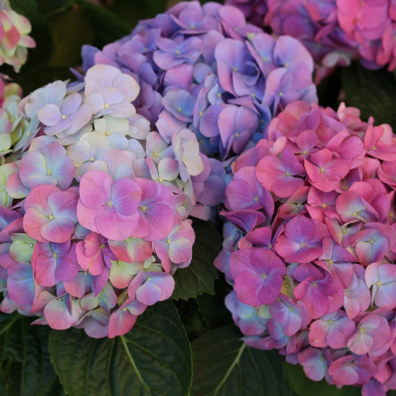
Hydrangeas are most famously known for their ability to shift between shades of sky blue, deep violet, and vibrant pink. However, the spectrum extends much further into creamy whites, lime greens, and even blood-red hues. In branding, these colors are not merely decorative choices; they are communicative tools that evoke specific emotional responses and define a brand’s position in the marketplace.
The Metaphor of the pH Scale: Branding as an Ecosystem
The most fascinating aspect of hydrangea coloration is its dependence on soil pH and the presence of aluminum ions. In acidic soil, the flowers turn blue; in alkaline soil, they turn pink. This biological reality provides a profound metaphor for corporate identity. A brand does not exist in a vacuum; its “color”—the way it is perceived by the public—is often a reaction to the cultural and economic “soil” in which it is planted.
Environmental Adaptability in Visual Identity
Just as a hydrangea changes color based on its environment, a modern brand must remain adaptable. Static branding is increasingly a liability in a globalized market. Forward-thinking companies utilize a “hydrangea strategy,” where the core identity remains consistent (the plant itself), but the visual execution (the color) can shift to resonate with local cultures or specific demographics. This is not about inconsistency; it is about the sophisticated calibration of brand values to meet the needs of the consumer.
The Science of Subtlety
The transition from blue to pink in a hydrangea is rarely instantaneous. It involves a gradient of purples and mauves. In design, these “in-between” colors represent nuance. Brands that master these transitional shades often project a sense of sophistication and complexity. Moving away from primary, high-contrast colors toward the complex, organic hues of the hydrangea allows a brand to feel more human, approachable, and integrated into the natural world.
Color Psychology: Decoding the Hydrangea Spectrum
When choosing a palette based on the hydrangea, a brand designer is tapping into a deep well of psychological associations. Each hue within the hydrangea family carries a specific weight and message that can be leveraged to influence consumer behavior.
The Calm Authority of Hydrangea Blue
Blue hydrangeas are perhaps the most sought-after variety, and in the world of branding, blue is the color of trust, reliability, and intelligence. From financial institutions to technology giants, the use of a cool, hydrangea-inspired blue suggests a brand that is stable and professional. However, unlike the “corporate blue” of the 1990s, the blue of a hydrangea is soft and organic. It suggests a brand that is technically proficient but also environmentally conscious and empathetic.
The Energetic Warmth of Vibrant Pink
On the other side of the pH scale, the pink hydrangea evokes feelings of romance, playfulness, and approachability. In brand strategy, pink is often used to disrupt traditional industries or to signal a brand that prioritizes community and care. When a brand adopts the specific, saturated pink of a late-summer hydrangea, it communicates a sense of abundance and vitality. This color is particularly effective in the wellness, beauty, and lifestyle sectors, where emotional connection is paramount.
The Sophistication of Royal Purple
Purple hydrangeas occur when the soil is in a state of transition, representing a balance between the cool blue and the warm pink. This color has long been associated with luxury, mystery, and creativity. For a brand, a hydrangea purple suggests exclusivity and high-end positioning. It is the color of a company that offers “the best of both worlds”—the reliability of blue and the passion of pink.

Implementing Hydrangea Hues in Corporate Identity
Applying the colors of the hydrangea to a brand’s visual identity requires a keen eye for balance and an understanding of modern design trends. The goal is to capture the essence of the flower—its softness, its depth, and its organic complexity—without becoming overly sentimental or floral in a way that detracts from professional goals.
Utilizing Gradients and Textures
The petals of a hydrangea are rarely a flat, solid color. They are characterized by delicate veins, slight variations in saturation, and a natural gradient. In digital design, this translates to the use of sophisticated gradients and “soft” shadows. Brands like Instagram and various SaaS startups have moved toward these multi-tonal palettes because they feel more dynamic and “alive” on high-resolution screens. By mimicking the natural transition seen in a hydrangea macrophylla, designers can create a sense of depth that a flat color simply cannot achieve.
Digital Accessibility and the Natural Palette
While the soft blues and pinks of the hydrangea are aesthetically pleasing, brands must ensure these choices meet accessibility standards. High contrast is essential for readability in web design. A brand might use a deep “Hydrangea Leaf Green” for primary text to ensure it stands out against a “Creamy White” background, while using the softer “Petal Pink” as an accent or a call-to-action background. The hydrangea provides a full ecosystem of colors—from the dark, waxy green of the leaves to the bright pop of the blossoms—allowing for a cohesive and accessible design system.
Case Studies: Nature-Inspired Brand Success
Several industry leaders have successfully utilized the hydrangea palette to define their market presence, whether intentionally or through the natural evolution of their visual identity.
Luxury and Serenity in High-End Design
Luxury fragrance and skincare brands frequently turn to the hydrangea spectrum to communicate purity and high value. By utilizing the muted “Dusty Blue” or “Soft Lavender” of the flower, these brands create an atmosphere of serenity. The packaging becomes an extension of the product experience—calming the consumer before they even open the bottle. This strategy relies on the hydrangea’s association with lush, well-maintained gardens and an aspirational lifestyle.
Soft Tech and Friendly User Interfaces
In recent years, the technology sector has seen a shift away from “Hard Tech” (blacks, greys, and neons) toward “Soft Tech.” This movement uses the hydrangea’s palette to make complex software feel more user-friendly and less intimidating. Slack, for instance, utilizes a multi-colored logo and interface elements that share the vibrancy and approachability of a blooming hydrangea. This choice helps to lower the barrier to entry for new users and fosters a more collaborative, less sterile digital environment.
The Longevity of the Hydrangea Aesthetic
Why does the hydrangea color palette remain relevant in an ever-changing design landscape? The answer lies in its timeless connection to the natural world. As consumers become increasingly saturated with artificial images and digital noise, they are subconsciously drawn to colors that reflect the organic world.
Sustainability and Brand Image
The hydrangea is a symbol of water and growth (the name itself is derived from the Greek words for “water vessel”). For brands looking to emphasize their commitment to sustainability and environmental social governance (ESG), the hydrangea palette is a powerful tool. It allows a brand to signal its “green” credentials without relying on the cliché of bright grass-green. Instead, it uses the sophisticated, water-rich colors of the flower to suggest a deeper, more nuanced relationship with the planet.
Future-Proofing Through Nature
Trends in branding often move in cycles, but nature-inspired palettes have a unique longevity. The colors of the hydrangea—those specific shades of periwinkle, rose, and seafoam—have been admired for centuries. By anchoring a brand’s visual identity in these timeless hues, a company can avoid looking “dated” as fleeting design fads pass. A hydrangea-inspired brand feels as relevant in a high-end print magazine as it does on a cutting-edge mobile app.
In conclusion, when we ask “what color are hydrangeas?”, we are uncovering a complex system of visual communication that spans biology, psychology, and strategic design. For the brand builder, the hydrangea is a reminder that color is a living, breathing component of identity. It is a call to create brand systems that are as deep, adaptable, and emotionally resonant as the flowers themselves. By leveraging the hydrangea’s unique ability to transform and its inherent psychological power, brands can create a visual identity that is not only beautiful but also strategically sound and enduringly impactful.
aViewFromTheCave is a participant in the Amazon Services LLC Associates Program, an affiliate advertising program designed to provide a means for sites to earn advertising fees by advertising and linking to Amazon.com. Amazon, the Amazon logo, AmazonSupply, and the AmazonSupply logo are trademarks of Amazon.com, Inc. or its affiliates. As an Amazon Associate we earn affiliate commissions from qualifying purchases.