
In the landscape of modern entertainment and corporate identity, few entities have achieved the level of global saturation seen by the Minions. While they began as secondary comedic relief in the 2010 film Despicable Me, these yellow, pill-shaped characters have evolved into a multi-billion dollar brand. At the heart of this brand’s success is a strategic focus on three specific characters who serve as the emotional and commercial anchors of the franchise. Understanding the names and distinct personas of Kevin, Stuart, and Bob is not merely an exercise in pop culture trivia; it is a deep dive into how character branding can create a universal language that transcends borders, age groups, and cultural barriers.
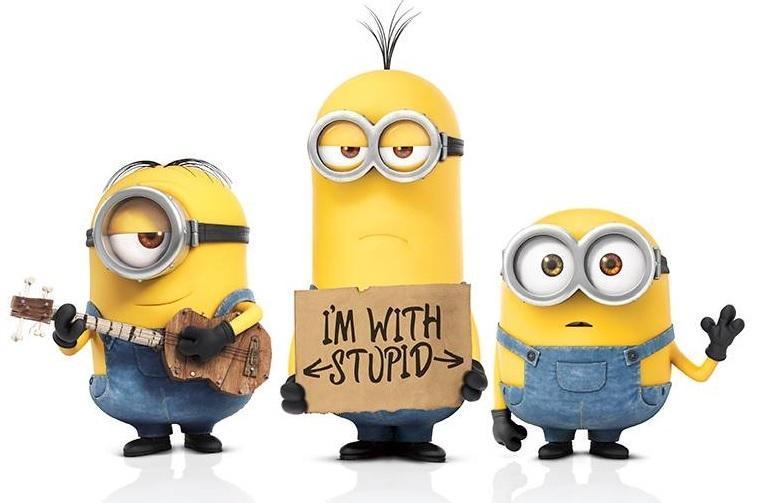
The Iconic Trio: Kevin, Stuart, and Bob as Brand Pillars
The transition of the Minions from a collective, anonymous horde to a focused group of protagonists was a calculated move by Illumination Entertainment. By highlighting three specific individuals, the brand was able to provide the audience with distinct archetypes to latch onto. This strategy is essential in brand management, as it moves a product from a generic commodity to a personalized experience.
Kevin: The Visionary Leader and Brand Architect
Kevin is the eldest and the de facto leader of the trio. In branding terms, Kevin represents the “Architect” or the “Hero.” He is characterized by his height, his sprout of hair, and his sense of responsibility. From a marketing perspective, Kevin provides the narrative drive. He is the one who recognizes that the Minion tribe is in a state of stagnation and takes the initiative to find a new master. For a brand, Kevin represents stability, ambition, and the “parental” figure that ensures the story moves forward. His name is classic, simple, and evokes a sense of traditional reliability.
Stuart: The Relatable Rebel and the “Cool” Factor
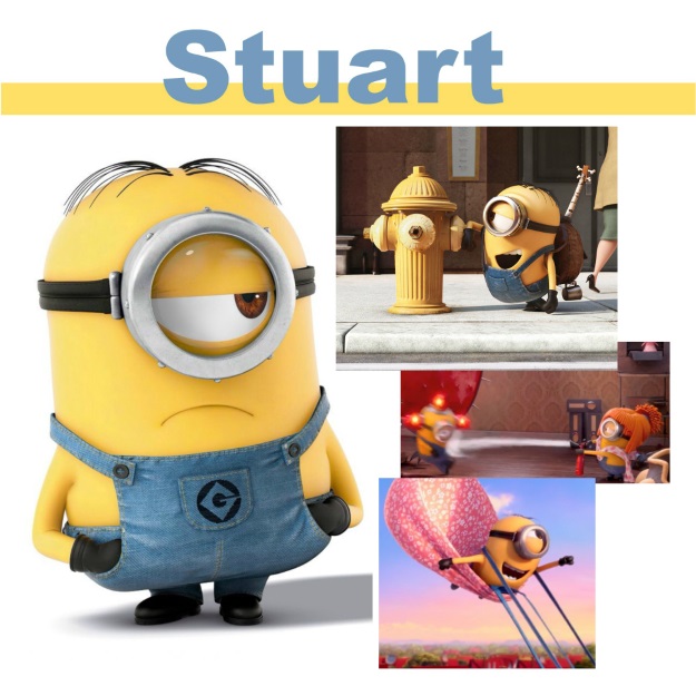
Stuart is the middle Minion, distinguished by his single eye and combed hair. If Kevin is the leader, Stuart is the “Maverick.” He is often portrayed as hungry, lazy, or obsessed with playing the guitar. In the world of brand strategy, Stuart is the character that appeals to the rebellious, individualistic side of the consumer. He is the relatable element—the one who would rather be doing something else but participates nonetheless. By including a character like Stuart, the brand captures a demographic that values authenticity and a bit of non-conformity.
Bob: The Emotional Core and the “Innocent” Archetype
Bob is the shortest of the three, characterized by his bald head and heterochromia (one green eye, one brown eye). He is the “Innocent.” Bob is motivated by love, comfort, and his stuffed bear, Tim. From a psychological branding standpoint, Bob is the most powerful tool for emotional engagement. He triggers a nurturing response in the audience, making him the primary driver for plush toy sales and “cute” viral content. His name, being short and palindromic, is perhaps the most accessible and easiest for young children to remember.
The Architecture of Character Names in Global Marketing
The selection of the names Kevin, Stuart, and Bob was not accidental. In the realm of international brand strategy, naming is a critical component of “Glocalization”—the practice of conducting business according to both local and global considerations.
Simplicity as a Tool for Global Scalability
One of the primary challenges in global branding is linguistic barriers. Complex names can be difficult to pronounce or may carry unintended meanings in different languages. By choosing three-syllable or one-syllable names like Kevin, Stuart, and Bob, Illumination ensured that their primary brand ambassadors could be identified by anyone, anywhere. These names are phonetically simple and are common across many Western cultures, yet they are distinct enough to be recognized even in non-Western markets. This simplicity reduces the “cognitive load” on the consumer, making the brand more approachable.
Phonetic Accessibility and the “Banana” Language
The names work in harmony with the Minions’ own language, often referred to as “Minionese.” This constructed language is a blend of various world languages, including Spanish, French, Italian, and Japanese, mixed with nonsense sounds. By keeping the main characters’ names standard and recognizable, the brand provides a tether of familiarity within a sea of gibberish. This contrast allows the audience to feel connected to the characters even when they cannot understand exactly what they are saying. It is a masterclass in using sound as a branding tool to create an inclusive environment.

Visual Identity and the Psychology of “Minion Yellow”
The names of the Minions are inextricably linked to their visual identity. A brand is not just a name; it is a visual shorthand that triggers an immediate emotional response. The Minions’ design—specifically their color—is a cornerstone of their corporate identity.
The Creation of a Custom Pantone Color
In a rare move for a film franchise, the Pantone Color Institute collaborated with Illumination to create an official color: “Minion Yellow.” This is a significant branding milestone. Color psychology suggests that yellow evokes feelings of happiness, optimism, and energy. By standardizing this color, the brand ensures that any piece of merchandise, advertisement, or digital asset is instantly recognizable. When a consumer hears the names Kevin, Stuart, or Bob, their mind immediately populates that thought with this specific shade of yellow. This creates a powerful sensory loop that reinforces brand loyalty.
Geometric Simplicity and Merchandisability
The physical forms of Kevin (a tall cylinder), Stuart (a medium cylinder), and Bob (a short sphere) follow the principles of geometric simplicity. This makes the characters incredibly easy to replicate in various media, from 2D icons to 3D theme park mascots. For a brand, this “reproducibility” is vital for scaling. Whether it is a small sticker or a massive parade float, the structural integrity of the characters remains intact. This consistency is what allows the Minion brand to maintain its value across diverse industries, including fashion, food, and technology.
Scaling the Brand: From Sidekicks to Primary Intellectual Property
The evolution of Kevin, Stuart, and Bob represents a successful case study in “Brand Extension.” Originally, the Minions were designed to be the henchmen of Gru, the protagonist of Despicable Me. However, the data—ranging from social media engagement to merchandise sales—indicated that the audience was more interested in the sidekicks than the lead.
Navigating the Pivot to Standalone Status
The decision to give the Minions their own spin-off film in 2015 was a pivot that transformed the franchise. It required a shift in brand narrative. Instead of being “the help,” the Minions had to become the “heroes.” This was achieved by centering the narrative on the specific quest of Kevin, Stuart, and Bob. By humanizing these three through clear motivations and names, the studio was able to sustain a full-length feature film without a traditional human lead. This demonstrated the power of strong character branding to support an entire ecosystem of content.
Licensing and Merchandising Synergy
The distinct personalities of the three Minions allow for targeted merchandising. A consumer might buy a “Kevin” backpack for its association with leadership and organization, or a “Bob” plush for its comfort and cuteness. This segmentation within a single brand allows for multiple touchpoints with the consumer. It also facilitates high-value licensing deals. From McDonald’s Happy Meals to high-end fashion collaborations with brands like Moschino, the Minion brand leverages its trio of stars to maintain a presence in almost every consumer category.
Strategic Takeaways for Modern Brand Identity
The success story of Kevin, Stuart, and Bob offers several key lessons for brand managers, marketers, and creators looking to build a lasting identity in a crowded digital marketplace.
- Personification is Key: Even the most abstract brands benefit from having a “face.” By personifying the Minion brand through three distinct characters, Illumination made a global phenomenon feel personal and intimate.
- Consistency Breeds Trust: The unwavering commitment to the characters’ designs, names, and behaviors across a decade of content has built immense brand equity. Consumers know exactly what to expect when they interact with a Minion-branded product.
- Global First Design: By designing characters that do not rely on complex dialogue and have names that are easy to pronounce, the brand removed the friction often associated with international expansion.
- Emotional Resonance Over Logic: The Minions do not have to make sense to be successful. They operate on an emotional level—humor, companionship, and joy. In brand strategy, an emotional connection is often more durable than a rational one.
In conclusion, while the question “What are the 3 Minions’ names?” may seem simple, the answer represents a sophisticated architecture of brand strategy, linguistic planning, and visual psychology. Kevin, Stuart, and Bob are more than just animated characters; they are the anchors of a global corporate identity that continues to set the gold standard for character branding in the 21st century. Through their names and the strategic brilliance behind them, they have transformed from simple sketches into some of the most recognizable and profitable icons in the world.
aViewFromTheCave is a participant in the Amazon Services LLC Associates Program, an affiliate advertising program designed to provide a means for sites to earn advertising fees by advertising and linking to Amazon.com. Amazon, the Amazon logo, AmazonSupply, and the AmazonSupply logo are trademarks of Amazon.com, Inc. or its affiliates. As an Amazon Associate we earn affiliate commissions from qualifying purchases.