
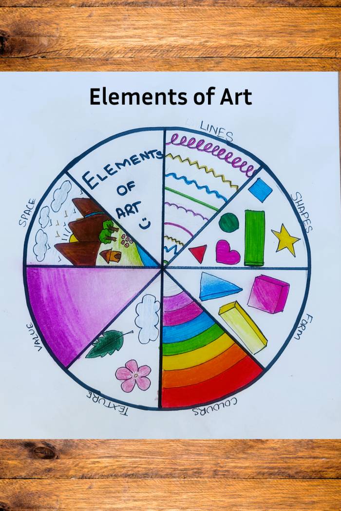
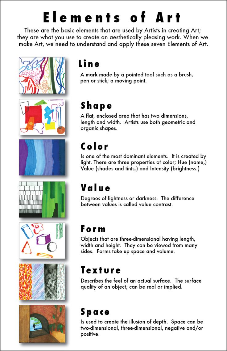
The realm of art often feels abstract, a domain of spontaneous creativity and subjective interpretation. Yet, beneath its surface lies a foundational structure, a universal language understood by creators and consumers alike. These are the seven elements of art: Line, Shape, Form, Space, Color, Value, and Texture. For brands, understanding and strategically deploying these elements is not merely an aesthetic choice; it is a critical differentiator, a powerful tool for forging distinct identity, conveying messages, and eliciting desired emotional responses from target audiences. In the competitive landscape of corporate identity, marketing, and design, mastering these fundamentals transcends mere visual appeal, transforming into a cornerstone of effective brand strategy.
The Foundation of Visual Communication for Brands
Every visual interaction a brand has with its audience—from a logo’s curve to an advertisement’s color palette, a website’s layout, or a product’s packaging—is built upon these fundamental elements. They are the atomic components that, when skillfully combined, create compelling narratives, establish credibility, and foster recognition. Ignoring them is akin to attempting to build a house without understanding the properties of bricks or mortar; the structure will lack stability, appeal, and ultimately, purpose.
Bridging Art Theory to Brand Practice
While historically discussed in the context of painting, sculpture, or drawing, the elements of art find profound relevance in modern brand development. They dictate how a brand communicates its personality, values, and offerings non-verbally. A luxury brand might lean into specific values and textures to evoke exclusivity, while a tech startup might leverage clean lines and vibrant colors to project innovation and dynamism. The intentional application of these elements allows a brand to control perception, ensuring that its visual identity is not only aesthetically pleasing but also strategically aligned with its overarching business objectives and market positioning. This isn’t about making a brand look “arty”; it’s about making it look intelligent, intentional, and impactful.
Unpacking the Seven Elements for Brand Impact
Each element carries its own unique power and implications when translated into brand design and marketing. Understanding these individual strengths enables a more nuanced and effective application.
Line: Defining Boundaries and Direction
A line is the path of a moving point, serving as the most fundamental element. In branding, lines define edges, direct the eye, and create structure. Horizontal lines convey stability and calm; vertical lines suggest strength and formality; diagonal lines imply movement, dynamism, or tension. Curved lines often evoke softness, fluidity, or playfulness.
- Brand Application: Logos frequently utilize lines to create unique symbols (e.g., the swoosh of Nike, the flowing script of Coca-Cola). Website layouts rely on implied lines to guide user navigation. Packaging design uses lines to separate information or highlight product features. A brand might choose sharp, angular lines for a cutting-edge tech product or smooth, flowing lines for a beauty product, instantly communicating its essence.
Shape: Formulating Recognition
Shapes are enclosed lines or outlines, appearing in two dimensions (height and width). They can be geometric (squares, circles, triangles) or organic (irregular, natural forms). Shapes are powerful for creating immediate recognition and conveying inherent meanings.
- Brand Application: A circular logo often suggests community, completeness, or protection (e.g., the Starbucks siren in a circle). Triangles can imply stability, direction, or dynamism (e.g., Adidas logo). Squares and rectangles are often associated with order, reliability, and professionalism. Brands select shapes not just for aesthetics but for the psychological associations they trigger, embedding subtle messages within their visual mark and overall identity.
Form: Adding Depth to Digital and Physical Manifestations
Form refers to three-dimensional objects, possessing height, width, and depth. While primarily associated with physical products or sculptures, the concept of form is crucial in branding for how objects are presented and perceived, even in two-dimensional renderings.
- Brand Application: Product design is the most direct application of form. The tactile feel and ergonomic design of a smartphone, the unique bottle shape of a perfume, or the architectural design of a flagship store all communicate brand values through form. In digital design, designers create the illusion of form through shading, highlights, and perspective to give depth to icons, buttons, or illustrations, making them feel more tangible and interactive.
Space: Guiding Attention and Creating Balance
Space refers to the area around, between, or within elements. It can be positive (the area occupied by an object) or negative (the empty area around an object). Strategic use of space is vital for creating visual hierarchy, balance, and readability.
- Brand Application: In branding, negative space is particularly potent. It can be used to reveal hidden messages or secondary imagery in logos (e.g., the arrow in the FedEx logo). In marketing materials and website design, ample “whitespace” prevents visual clutter, making content easier to digest and guiding the viewer’s eye to key information. A minimalist brand identity often leverages significant negative space to convey sophistication and focus. Conversely, a brand aiming for vibrancy and abundance might fill more space.
Color: Evoking Emotion and Establishing Identity

Color is perhaps the most emotionally resonant of all elements. It has the power to evoke feelings, influence perception, and establish immediate brand recognition. Each color carries cultural and psychological associations.
- Brand Application: A brand’s color palette is one of its most defining characteristics. Blue often signifies trust and professionalism (banks, tech companies). Red suggests passion, urgency, or energy (food, entertainment). Green evokes nature, growth, or health (eco-brands, wellness). Yellow implies optimism or caution. Understanding color psychology is crucial for selecting a palette that aligns with a brand’s message and target audience, ensuring consistency across all touchpoints from advertising to corporate stationary and digital interfaces.
Value: Mastering Contrast and Hierarchy
Value refers to the lightness or darkness of a color or shade. It creates contrast, allowing elements to stand out, and defines visual hierarchy, guiding the viewer’s eye through a composition.
- Brand Application: High contrast (e.g., black text on a white background) ensures readability and strong visual impact, often used in calls to action or bold headlines. Subtle value shifts can create depth and sophistication, often seen in luxury brand aesthetics or complex infographics. In brand identity, value helps distinguish primary elements from secondary ones, ensuring that the most critical information or brand mark receives due attention. It’s essential for accessibility, ensuring designs are legible for all users.
Texture: Engaging the Senses, Real and Perceived
Texture refers to the perceived surface quality of an object—how it feels or looks like it would feel. This can be actual (tactile) or implied (visual).
- Brand Application: For physical products, packaging, and interior design of retail spaces, actual texture is paramount. A rough, organic texture might convey authenticity, while a smooth, glossy finish speaks of modernity or luxury. In digital branding and graphic design, implied texture is created through visual patterns, gradients, or photographic elements. A website background might use a subtle linen texture to feel welcoming, or a metallic sheen to imply high-tech. Texture adds another layer of sensory engagement, enriching the brand experience and reinforcing its unique personality.
Integrating Elements for Cohesive Brand Identity
The true power of these elements emerges not in isolation but through their synergistic application. A cohesive brand identity meticulously weaves together lines, shapes, forms, space, colors, values, and textures to create a unified and resonant visual language.
Crafting Memorable Logos and Visual Marks
A logo, often the first point of visual contact, is a masterclass in elemental integration. It uses specific lines and shapes to create a unique mark, a carefully chosen color palette to evoke emotion, and often leverages negative space for clever double meanings. The perceived texture and form, even in a 2D rendering, contribute to its overall impression of quality and permanence. Each decision about a logo’s components is a strategic one, aimed at encapsulating the brand’s essence in a memorable, scalable, and timeless symbol.
Designing Engaging Marketing Materials
From brochures to social media graphics, marketing materials deploy these elements to capture attention and communicate effectively. A harmonious balance of positive and negative space ensures readability. A consistent color palette reinforces brand recognition. Thoughtful use of value creates visual hierarchy, guiding the reader through the message. The chosen textures and forms, whether implied in print or actual in promotional items, contribute to the overall brand experience, fostering trust and engagement.
Building a Recognizable Digital Presence
In the digital realm, the elements are critical for user experience (UX) and user interface (UI) design. Website layouts leverage lines and space to create intuitive navigation paths. Interactive elements employ specific shapes and forms for visual cues. Color and value are vital for branding, accessibility, and guiding user actions (e.g., call-to-action buttons). Even the subtle textures of backgrounds or hover states contribute to a cohesive and immersive digital brand environment, ensuring that the online experience mirrors the brand’s offline identity.
The Strategic Advantage of Elemental Understanding
For any brand aspiring to stand out in a crowded marketplace, a deep understanding of the seven elements of art is not merely an artistic indulgence; it is a strategic imperative. It empowers brand strategists, marketing teams, and designers to make deliberate, informed choices that resonate with their audience, differentiate their offerings, and build lasting relationships.
Differentiating Through Design Excellence
When brands consciously apply these elements, their designs move beyond mere aesthetics to become powerful communication tools. This elemental literacy allows for the creation of unique, ownable visual identities that cut through the noise. It ensures consistency across all brand touchpoints, solidifying recognition and reinforcing brand values. Ultimately, a brand that masters the elements of art is a brand that understands the nuanced language of visual communication, enabling it to craft compelling narratives, forge emotional connections, and build an enduring legacy in the hearts and minds of its customers.
aViewFromTheCave is a participant in the Amazon Services LLC Associates Program, an affiliate advertising program designed to provide a means for sites to earn advertising fees by advertising and linking to Amazon.com. Amazon, the Amazon logo, AmazonSupply, and the AmazonSupply logo are trademarks of Amazon.com, Inc. or its affiliates. As an Amazon Associate we earn affiliate commissions from qualifying purchases.