
In the world of corporate identity and marketing, the physical medium on which a brand communicates is just as vital as the message itself. While the standard 8.5×11-inch “Letter” size is the workhorse of the modern office, it often lacks the visual “punch” required for high-impact branding. Enter the 11×17-inch format.
If you have ever wondered what 11×17 paper is called, the answer depends on your industry and how you orient the page. Primarily known as Tabloid or Ledger, this format is a powerhouse in the branding and design world. It provides double the real estate of a standard sheet, offering a unique canvas for designers to craft immersive brand experiences.
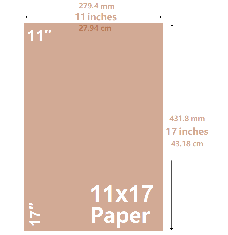
This guide explores the terminology, strategic importance, and practical applications of the 11×17 format within the niche of brand strategy and corporate identity.
1. The Terminology of 11×17: Tabloid vs. Ledger in Corporate Identity
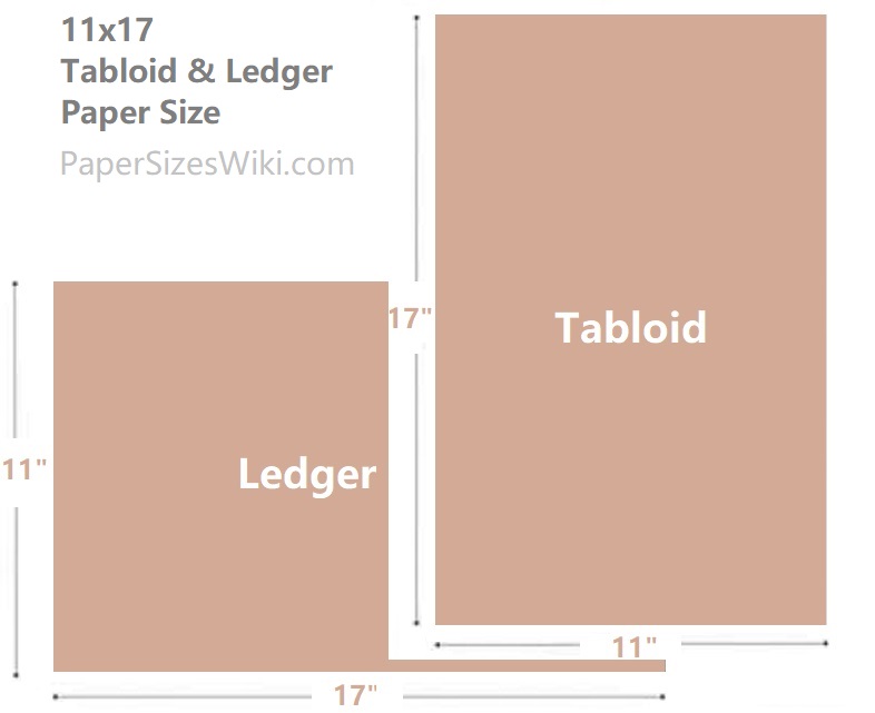
Before a brand can execute a marketing campaign, its stakeholders must speak the same language as their printers and designers. The 11×17-inch size is unique because it carries two distinct names based on its orientation and historical usage.
Understanding “Tabloid” Orientation
When 11×17 paper is used in a vertical (portrait) orientation, it is professionally referred to as Tabloid. In the context of branding, Tabloid is often associated with alternative media, newsletters, and high-impact posters. From a brand strategy perspective, the Tabloid format suggests a sense of urgency and accessibility. It is the size of many independent newspapers and event circulars, making it an ideal choice for brands that want to appear “on the pulse” or community-oriented.
Understanding “Ledger” Orientation
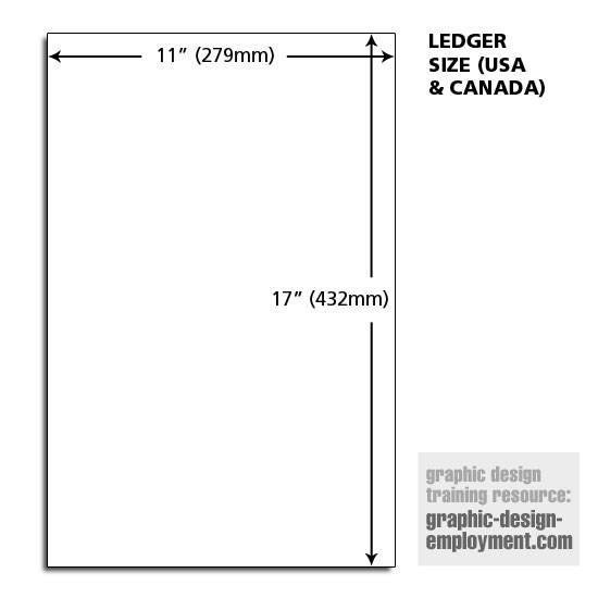
Conversely, when the paper is used in a horizontal (landscape) orientation, it is called Ledger. The name originates from its historical use in accounting and record-keeping. For a brand, the Ledger format communicates stability, transparency, and detail. Architectural firms, engineering brands, and financial consultants often use the Ledger format to present complex diagrams, floor plans, or multi-column financial projections that require a wider field of view than a standard letter sheet allows.
The Technical Classification: ANSI B
In technical branding and industrial design circles, 11×17 is also classified as ANSI B. This follows the American National Standards Institute (ANSI) scaling system, where each subsequent size is exactly double the previous one. Knowing this technical term is essential for brand managers working on industrial packaging, technical manuals, or B2B branding where precision is a core brand value.
2. Strategic Advantages: Why 11×17 Enhances Brand Impact
Choosing 11×17 over 8.5×11 is not merely a logistical decision; it is a strategic branding move. The physical size of brand collateral influences how a consumer perceives the brand’s authority and the value of the information provided.
Creating a “Billboard” Effect
In a cluttered physical environment—such as a retail store, a trade show, or a corporate lobby—size matters. An 11×17 poster provides enough surface area to be legible from a distance while remaining small enough to be placed at eye level. This “billboard effect” allows brands to utilize bold typography and high-resolution imagery that would feel cramped on a smaller sheet. For a brand looking to establish a “premium” feel, the extra space allows for “white space” (negative space), which is a hallmark of luxury brand design.
Narrative Depth and Storytelling
Branding is the art of storytelling. The 11×17 format allows for a more complex narrative arc within a single piece of collateral. For example, a brand’s history, mission, and product line can be laid out in a logical flow that guides the reader’s eye across the page. This is particularly useful for brand infographics or “journey maps” used in internal corporate branding to align employees with the company’s vision.
The Psychological Perception of Value
There is a psychological weight to larger paper. When a prospective client receives a well-designed 11×17 fold-out brochure or a Ledger-sized presentation, the perceived value of the brand increases. It suggests that the company is willing to invest more in its presentation, which translates to a perception of higher quality in its products or services. In brand strategy, this is known as “signaling”—using the quality of your materials to signal the quality of your brand.
3. Practical Applications: Scaling Brand Collateral for Growth
How do successful brands utilize the 11×17 format to maintain a cohesive identity? The versatility of this size makes it a staple for both internal and external brand assets.
The “Double Letter” Folded Brochure
One of the most common uses for 11×17 in branding is the four-page brochure. By folding an 11×17 sheet in half, you create two 8.5×11 panels. This allows a brand to create a professional, multi-page booklet from a single sheet of paper. This format is perfect for:
- Corporate Profiles: Introducing the executive team and company values.
- Product Catalogs: Showcasing a seasonal collection with high-impact visuals.
- Event Programs: Providing schedules and maps for brand-sponsored conferences.
Restaurant and Hospitality Menus
In the hospitality industry, the menu is the most important touchpoint of the brand identity. A 11×17 Tabloid menu allows for a clear hierarchy of information. Luxury brands might use a Ledger (horizontal) orientation to create a sense of expansive choice, while modern “fast-casual” brands might use a Tabloid (vertical) orientation for a sleek, streamlined look. The size allows for large font sizes, which improves readability in the low-light environments often found in upscale dining.
Retail Point-of-Purchase (POP) Displays
For retail brands, 11×17 is the “Golden Ratio” for counter-top displays. It is large enough to grab attention near a cash register but small enough not to obstruct the customer’s view of the products. Brands use this size to promote loyalty programs, seasonal sales, or new product launches, ensuring that the visual identity is consistent from the storefront to the checkout counter.
4. Design Workflow and Maintaining Brand Consistency
When designing for 11×17, brand managers and designers must adhere to specific technical standards to ensure the brand’s visual integrity remains intact when scaled up.
Resolution and Image Integrity
A common mistake in brand execution is using images optimized for small web icons on large-format print. For 11×17 collateral, all brand assets—including logos, photography, and patterns—must be high-resolution (at least 300 DPI). A pixelated logo on a Tabloid poster can instantly damage a brand’s credibility, suggesting a lack of professionalism and attention to detail.
Typography and Hierarchy
The larger canvas of 11×17 requires a different approach to typography than a standard letter. Brand designers must establish a clear visual hierarchy. This usually involves:
- H1 Headlines: Large, bold brand statements that capture attention.
- H2 Subheaders: Contextual information that supports the brand promise.
- Body Copy: Legible blocks of text that provide the “reason to believe.”
On an 11×17 sheet, the scale of these elements must be balanced to ensure the page doesn’t feel “hollow” or, conversely, overly cluttered.
Choosing the Right Stock to Reflect Brand Values
In branding, the tactile experience is just as important as the visual one. The “feel” of the 11×17 paper speaks volumes.
- Uncoated, Recycled Stock: Communicates sustainability, eco-consciousness, and transparency.
- Glossy, Heavyweight Cardstock: Communicates luxury, high-tech sophistication, and durability.
- Matte Finish: Communicates modernism, understated elegance, and high-end design.
When a brand specifies “11×17 Tabloid,” they must also specify the weight and texture to ensure the physical touchpoint aligns with the brand’s core personality.
Conclusion: The 11×17 Format as a Brand Asset
What 11×17 paper is called depends on your perspective—Tabloid for the bold and Ledger for the detailed—but in the realm of brand strategy, it is called an opportunity.
This format bridges the gap between small-scale office documents and large-scale signage. It offers a unique medium for storytelling, a way to signal premium value, and a versatile tool for various marketing collateral. By mastering the use of 11×17 paper, brand managers can ensure their visual identity is not only seen but felt, creating a lasting impression in the minds of their target audience.
Whether you are designing a menu for a new boutique hotel, a technical drawing for an engineering firm, or a promotional poster for a global marketing campaign, the 11×17 format provides the space you need to let your brand breathe and grow.
aViewFromTheCave is a participant in the Amazon Services LLC Associates Program, an affiliate advertising program designed to provide a means for sites to earn advertising fees by advertising and linking to Amazon.com. Amazon, the Amazon logo, AmazonSupply, and the AmazonSupply logo are trademarks of Amazon.com, Inc. or its affiliates. As an Amazon Associate we earn affiliate commissions from qualifying purchases.