
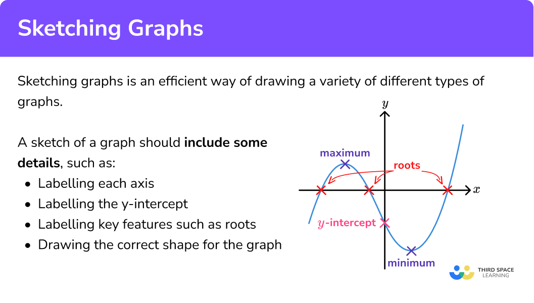
In an age deluged by data, the ability to effectively visualize information is no longer a niche skill but a fundamental literacy. Graphs serve as the universal language for translating complex datasets into comprehensible narratives, making patterns, trends, and outliers immediately apparent. The traditional act of “sketching a graph” has evolved dramatically from humble pen-and-paper beginnings to a sophisticated digital discipline, leveraging an array of technologies that enhance precision, interactivity, and collaborative potential. This article delves into the technological landscape of graph sketching, exploring the indispensable tools, cutting-edge techniques, and future trends that define modern data visualization. For anyone looking to transform raw data into powerful visual stories, understanding this digital ecosystem is paramount.
The Digital Transformation of Data Visualization
The journey of graph sketching has been profoundly shaped by technological advancements, moving from manual artistry to automated precision. This shift has not merely introduced new methods but has fundamentally redefined the possibilities of data interpretation and communication.
From Manual to Machine: Why Digital Reigns Supreme
The limitations of manual graph sketching – potential for inaccuracy, tedious revisions, and difficulty in scaling or sharing – have largely been overcome by digital tools. The advent of personal computers and sophisticated software ushered in an era where graphs could be generated with unparalleled precision and consistency. Digital tools offer dynamic flexibility, allowing users to easily modify data points, switch graph types, and experiment with design elements without starting from scratch. This iterative capability is crucial for exploring data from multiple angles and refining visualizations for maximum impact. Moreover, digital graphs inherently possess the ability to be reproduced flawlessly, ensuring that every viewer sees the exact same, accurate representation of the data. The capacity for animation and interactivity, unique to digital formats, further elevates the user’s engagement, enabling deeper exploration of the data’s nuances.
Democratizing Data: Accessibility and Collaborative Platforms
One of the most significant impacts of digital graph sketching has been the democratization of data visualization. What was once the domain of statisticians and specialized analysts is now accessible to a broader audience, from business professionals to educators and students. User-friendly interfaces, pre-built templates, and intuitive drag-and-drop functionalities in many software platforms have lowered the barrier to entry. Furthermore, the rise of cloud-based platforms has revolutionized how graphs are created and shared. Tools like Google Sheets, Microsoft Excel Online, and various online dashboarding solutions allow multiple users to collaborate on data sets and visualizations in real-time, irrespective of their geographical location. This fosters a collaborative environment where teams can collectively analyze data, share insights, and ensure consistency across reporting, transforming data visualization into a shared, dynamic endeavor. Version control, commentary features, and shared access permissions streamline workflows, making data collaboration more efficient and transparent than ever before.
Essential Tech Tools for Diverse Graphing Needs
The digital toolkit for graph sketching is vast and varied, catering to different levels of expertise, complexity requirements, and specific visualization goals. Understanding the strengths of each category is key to selecting the right technology for the task at hand.
General-Purpose Productivity Suites and Spreadsheets
For many, the journey into digital graph sketching begins with familiar productivity suites. Microsoft Excel and Google Sheets remain the ubiquitous entry points, offering robust spreadsheet functionalities coupled with a wide array of built-in charting options. Their ease of use, extensive template libraries, and seamless integration with other office applications make them ideal for quick analyses, routine reporting, and visualizing moderately complex datasets. Users can effortlessly transform raw data into bar charts, line graphs, pie charts, and scatter plots with just a few clicks. While highly accessible and powerful for foundational tasks, these tools may encounter limitations when dealing with extremely large datasets or requiring highly specialized, interactive, or aesthetically sophisticated visualizations.
Dedicated Data Visualization Software and Libraries
When the need extends beyond basic charting, specialized data visualization software and programming libraries come into play. Platforms like Tableau and Microsoft Power BI are leaders in the business intelligence space, renowned for their interactive dashboards, advanced analytical capabilities, and ability to connect to diverse data sources. They empower users to build intricate, exploratory visualizations that facilitate deep dives into data, uncovering actionable insights with drill-down and filtering functionalities.
For data scientists, researchers, and those requiring maximum customization and algorithmic control, programming libraries are indispensable. Python, with its powerful libraries such such as Matplotlib, Seaborn, and Plotly, and R, with its elegant ggplot2 package, offer unparalleled flexibility. These tools allow users to programmatically generate highly complex, custom graphs, perform statistical analyses, and integrate visualizations directly into data science workflows. Beyond these, specialized educational tools like GeoGebra and Desmos provide interactive environments specifically designed for sketching mathematical functions and exploring geometric concepts, often used in educational settings.
Vector Graphics and Design Software for Refined Visuals
While dedicated data visualization tools excel at generating graphs from data, presenting these visuals in a polished, professional context often requires the touch of vector graphics and design software. Adobe Illustrator, Inkscape (an open-source alternative), and Figma are powerful tools for refining, annotating, and branding graphs. Data visualizations generated in analytical software can be imported into these design platforms for final touches, such as adjusting typography, customizing color palettes, adding intricate annotations, or integrating them into comprehensive infographics or reports. This step is crucial for transforming functional data displays into visually compelling assets that align with corporate identity or publication standards, ensuring clarity, aesthetic appeal, and professional impact.
Harnessing AI and Automation for Smarter Graphing
Artificial intelligence and automation are rapidly transforming the landscape of digital graph sketching, moving beyond manual creation to intelligent assistance and predictive capabilities. These technologies promise to make data visualization more efficient, insightful, and accessible.
AI-Driven Chart Suggestions and Generation
The cognitive load associated with choosing the “right” graph type for a given dataset can be significant. AI is stepping in to alleviate this challenge by offering intelligent chart suggestions. Tools like Tableau’s “Show Me,” Power BI’s Q&A feature, and even advanced functionalities within Excel leverage AI to analyze data characteristics (e.g., data types, cardinality, distributions) and recommend optimal visualization types. Some AI-powered platforms can even generate entire dashboards or reports from a simple prompt, using natural language processing (NLP) to interpret user requests. This capability significantly speeds up the initial creation phase, allowing users to focus more on interpreting the insights rather than the mechanics of visualization.
Predictive Analytics and Dynamic Graphing
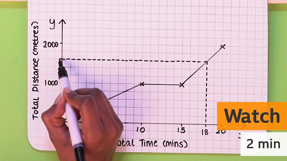
AI’s strength in pattern recognition and predictive modeling extends naturally to dynamic graphing. Machine learning algorithms can analyze historical data to forecast future trends, which are then visualized in real-time. This is particularly valuable in fields like finance (stock market predictions), operations (resource allocation), and marketing (consumer behavior trends). Beyond static predictions, AI-driven graphs can adapt and update dynamically as new data streams in, providing real-time operational intelligence. Imagine a dashboard that not only shows current sales performance but also dynamically projects future sales based on ongoing market changes, highlighting potential risks or opportunities as they emerge. This level of dynamism moves graph sketching from merely descriptive to truly prescriptive.
Enhancing Accessibility and Interpretation with AI
AI also plays a crucial role in making data visualizations more accessible and interpretable for a broader audience. For instance, AI algorithms can automatically generate textual descriptions or summaries of complex graphs, aiding users with visual impairments or those who prefer textual explanations. This capability enhances inclusivity and ensures that insights are not lost due to format limitations. Furthermore, AI can be trained to identify subtle patterns, anomalies, or correlations within graphs that might be overlooked by the human eye, providing augmented insights. By highlighting statistically significant variations or unexpected clusters, AI acts as an intelligent assistant, enriching the interpretive process and accelerating discovery.
Best Practices for Impactful Digital Graph Sketching
The power of digital tools lies not just in their existence but in their judicious application. Effective graph sketching demands adherence to best practices that ensure clarity, accuracy, and maximum impact.
Data Integrity and Pre-processing: The Foundation of Good Graphs
A graph is only as good as the data it represents. The first and most critical step in effective digital graph sketching is ensuring data integrity. This involves thorough data cleaning, validation, and pre-processing. Missing values, outliers, inconsistent formatting, and duplicate entries can severely distort visualizations and lead to erroneous conclusions. Tools and techniques for data cleaning, often involving scripting languages (Python, R) or specialized ETL (Extract, Transform, Load) platforms, are indispensable. Properly structuring data – often in a “tidy” format where each row is an observation and each column is a variable – is equally important for seamless integration with visualization software and for producing meaningful graphs.
Strategic Graph Type Selection: Telling the Right Story
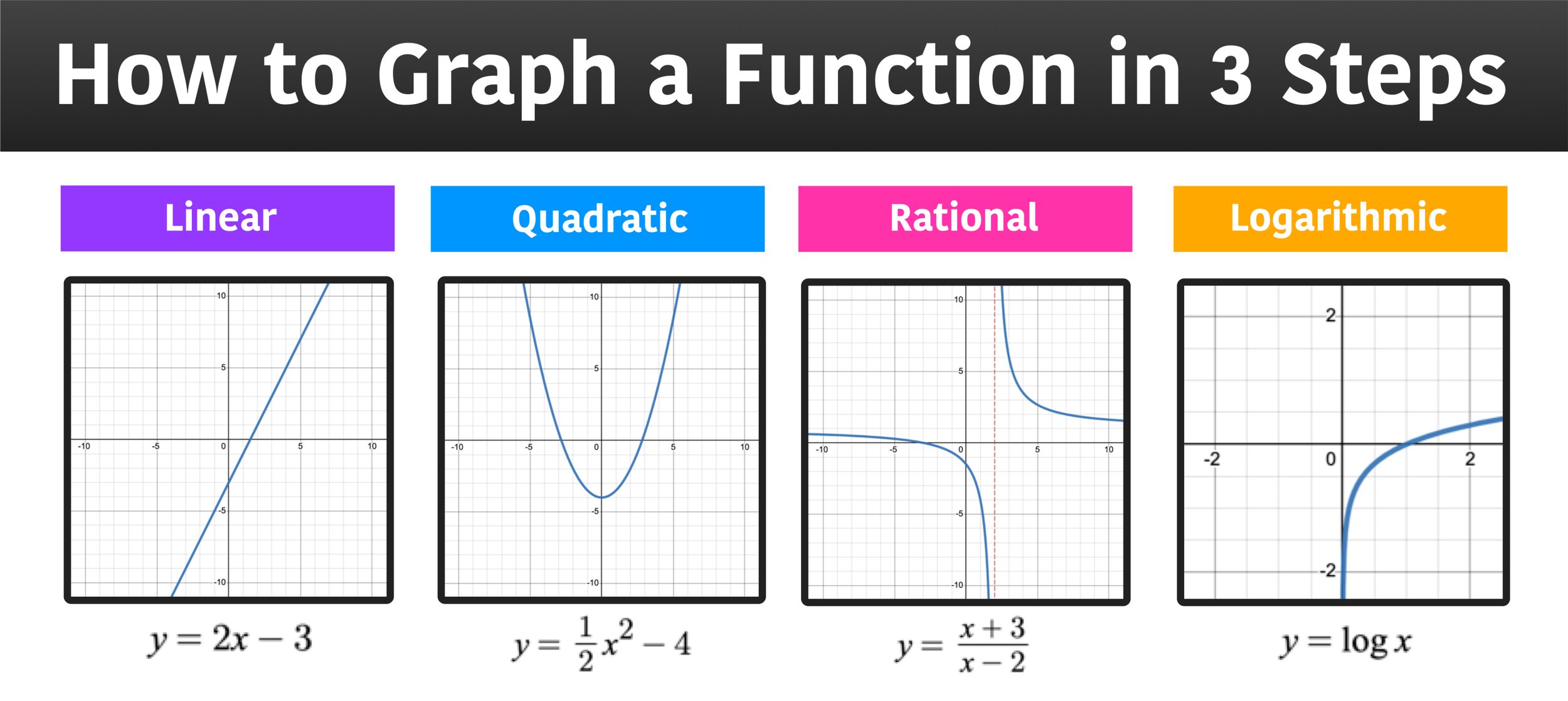
Choosing the correct graph type is paramount to conveying the intended message without ambiguity. Each graph type is best suited for a particular kind of data relationship or story. Bar charts excel at comparisons between discrete categories; line graphs are ideal for showing trends over time; scatter plots reveal relationships between two numerical variables; and histograms display data distribution. Misusing a graph type, such as using a pie chart for too many categories or to compare magnitudes, can lead to confusion or misinterpretation. A strategic choice ensures that the visual story aligns perfectly with the underlying data narrative, making insights immediately apparent and actionable.
Design Principles for Clarity, Readability, and Aesthetics
Beyond data and type selection, the design of a digital graph significantly influences its effectiveness. Clarity and readability should always be the guiding principles. This involves minimizing “chart junk”—superfluous elements that distract from the data. Key design considerations include:
-
Appropriate use of color: Employing color palettes strategically to highlight key data points or distinguish categories, while being mindful of colorblindness accessibility.
-
Clear labeling: Ensuring axes, data points, and legends are clearly and concisely labeled.
-
Legible typography: Selecting fonts that are easy to read and appropriately sized.
-
Consistent styling: Maintaining a consistent visual style across multiple graphs within a report or dashboard enhances professionalism and coherence.
-
Thoughtful layout: Arranging elements to guide the viewer’s eye logically and reduce cognitive load. The goal is to make the graph effortless to understand.
Interactive Elements and Storytelling Through Data
Digital graphs offer the powerful advantage of interactivity, transforming static images into dynamic exploration tools. Incorporating interactive elements like filters, drill-downs, tooltips, and sliders allows users to customize their view of the data, explore specific segments, and uncover deeper insights on demand. This interactivity fosters a more engaging and personalized data exploration experience. Furthermore, modern data visualization goes beyond single graphs to embrace data storytelling. This involves curating a sequence of related graphs, perhaps with accompanying text or annotations, to guide the audience through a narrative arc, building a compelling case or explaining a complex phenomenon step by step. Tools that support dashboarding and slide-based storytelling facilitate this sophisticated approach.
The Horizon of Graph Sketching: Immersive and Intelligent Visualizations
The trajectory of digital graph sketching points towards even more immersive, intelligent, and integrated experiences, driven by advancements in cutting-edge technologies.
Virtual and Augmented Reality: Stepping Into Data
Imagine not just looking at a graph, but stepping inside it. Virtual Reality (VR) and Augmented Reality (AR) are poised to revolutionize data visualization by offering immersive, three-dimensional environments for data exploration. VR could allow researchers to navigate complex scientific datasets, architectural models, or urban planning simulations as if they were physically present, offering new perspectives on spatial relationships and multi-dimensional data. AR, on the other hand, could overlay real-time data visualizations onto the physical world—think of a technician seeing live performance metrics of machinery through a smart visor, or an urban planner visualizing traffic flows on a real city street. This promises a more intuitive and context-rich understanding of data.
Real-time Data Streaming and Adaptive Dashboards
The proliferation of IoT devices, real-time financial markets, and constant social media feeds generates an unprecedented volume of streaming data. The future of graph sketching will heavily feature tools capable of visualizing this data instantaneously. Real-time dashboards will become even more sophisticated, dynamically updating not just every second, but intelligently adapting to highlight critical events, anomalies, or trends as they unfold. These adaptive dashboards will prioritize information based on user roles, current objectives, or even predictive insights, ensuring that users always have the most relevant and timely visual information at their fingertips, moving beyond reactive monitoring to proactive decision support.
Personalized and Predictive Visual Experiences
Building on AI’s capabilities, future graph sketching systems will offer increasingly personalized and predictive visual experiences. These intelligent systems could learn user preferences, anticipate questions, and automatically generate relevant visualizations tailored to individual needs and contexts. For instance, a business executive might receive a personalized daily dashboard highlighting KPIs most relevant to their responsibilities, complete with AI-generated interpretations and recommended actions. The graphs themselves might evolve based on user interaction, offering dynamic suggestions for exploration paths or providing predictive insights based on the user’s current line of inquiry. This bespoke approach will make data visualization an even more powerful extension of human cognition, anticipating needs and accelerating the path to insight.
The journey of “how to sketch a graph” has transformed from a manual art into a cornerstone of digital literacy, empowered by a rich ecosystem of technological tools and techniques. As data continues to grow in volume and complexity, the ability to leverage these digital advancements for clear, insightful, and engaging data visualization will be indispensable. From mastering current software to embracing the immersive and intelligent future of graphing, continuous engagement with these technological frontiers is key to unlocking the full potential of data-driven discovery.
aViewFromTheCave is a participant in the Amazon Services LLC Associates Program, an affiliate advertising program designed to provide a means for sites to earn advertising fees by advertising and linking to Amazon.com. Amazon, the Amazon logo, AmazonSupply, and the AmazonSupply logo are trademarks of Amazon.com, Inc. or its affiliates. As an Amazon Associate we earn affiliate commissions from qualifying purchases.