
In the vast landscape of data and mathematics, ‘x’ holds a ubiquitous and foundational position. From elementary algebra to advanced statistical modeling, ‘x’ commonly represents an independent variable, an input, or a data point along a horizontal axis. The ability to effectively graph ‘x’ – whether as a standalone value, part of an equation, or within a dataset – is a crucial skill for anyone interacting with quantitative information. This isn’t just about plotting points; it’s about transforming abstract numbers into intuitive visual representations that reveal patterns, trends, and relationships. In an increasingly data-driven world, mastering the technological tools to graph ‘x’ efficiently and accurately is paramount for students, educators, researchers, engineers, and business analysts alike.
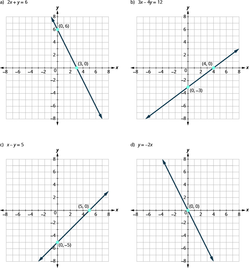
This guide delves into the tech-driven methods of graphing ‘x’, moving beyond pencil and paper to leverage powerful software and online platforms. We’ll explore the underlying principles, the array of digital tools at your disposal, practical step-by-step approaches, and advanced considerations that will empower you to visualize ‘x’ with precision, insight, and impact.
The Fundamental Role of ‘X’ in Data Visualization
Before diving into the mechanics of graphing, it’s essential to appreciate why ‘x’ is such a cornerstone of graphical representation and data analysis. Understanding its conceptual significance forms the bedrock for effective visualization.
Understanding ‘X’ in Mathematical and Data Contexts
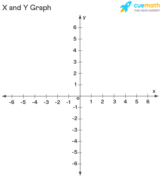
At its core, ‘x’ typically denotes an independent variable. In a two-dimensional Cartesian coordinate system, ‘x’ values are plotted along the horizontal axis, often representing a quantity that can be manipulated or observed, and whose change potentially influences another variable, ‘y’ (the dependent variable). For instance, in an equation like y = 2x + 1, ‘x’ is the input we choose, and ‘y’ is the resulting output. Similarly, in a scatter plot analyzing sales data, ‘x’ might represent advertising spend, while ‘y’ represents revenue.
In more complex scenarios, ‘x’ can also denote a specific data point within a larger dataset, the position along a single axis in a one-dimensional plot, or a component of a multi-dimensional vector. Regardless of its specific role, ‘x’ serves as a critical reference point for understanding location, magnitude, and relationship within a visual framework. Its clear definition and consistent placement are vital for creating unambiguous and interpretable graphs.
Why Visualizing ‘X’ Matters: Applications Across Disciplines
The act of graphing ‘x’ transforms raw data or abstract mathematical relationships into tangible insights. This visual translation is indispensable across virtually every field that deals with quantitative information:
- Mathematics and Science: Graphing functions of ‘x’ helps visualize slopes, intercepts, curves, and asymptotes, making complex equations comprehensible. Scientists use graphs of ‘x’ (e.g., time, temperature, concentration) versus ‘y’ (e.g., reaction rate, population size) to identify experimental relationships and validate theories.
- Engineering: Engineers graph ‘x’ (e.g., stress, load, time) to analyze material properties, system performance, and design tolerances. Visualizing these relationships is crucial for identifying failure points and optimizing designs.
- Business and Economics: Business analysts plot ‘x’ (e.g., month, advertising spend, production cost) against ‘y’ (e.g., revenue, profit, customer acquisition) to identify market trends, forecast future performance, and make strategic decisions. Economists use graphs of ‘x’ (e.g., price, income) to illustrate supply and demand curves, economic growth, and inflation patterns.
- Data Science and Analytics: In data science, ‘x’ often represents a feature or predictor variable. Graphing ‘x’ helps in exploratory data analysis (EDA), identifying outliers, understanding data distributions, and preparing data for machine learning models. Visualization is key to communicating complex analytical findings to non-technical stakeholders.
In essence, graphing ‘x’ provides a universal language for understanding and communicating quantitative information, making complex concepts accessible and actionable.
Essential Digital Tools for Graphing ‘X’
The days of laborious manual plotting are largely behind us. Modern technology offers an impressive array of tools that can graph ‘x’ with speed, accuracy, and sophisticated customization. The choice of tool often depends on the complexity of the task, the user’s technical proficiency, and the desired output.
Spreadsheet Software: The Everyday Workhorse (Excel, Google Sheets)
Spreadsheet programs are perhaps the most common and accessible tools for graphing ‘x’. They excel at organizing data in rows and columns and generating a variety of charts from that data.
- Microsoft Excel: A industry standard, Excel offers robust charting capabilities. Users can input ‘x’ and ‘y’ values (or a series of ‘x’ values with corresponding function calculations), select the data, and insert various chart types like scatter plots, line graphs, bar charts, and more. Excel’s strength lies in its widespread use, formulaic power, and extensive customization options for labels, axes, colors, and trends.
- Google Sheets: As a cloud-based alternative, Google Sheets provides similar functionality with the added benefit of real-time collaboration. It’s excellent for quick visualizations, shared projects, and leveraging Google’s integrated ecosystem. While slightly less feature-rich than Excel for highly complex charts, it’s more than sufficient for most common graphing needs involving ‘x’.
These tools are ideal for graphing discrete data points, linear and basic non-linear functions, and simple data series where ‘x’ is an independent variable.
Online Graphing Calculators: Interactive Simplicity (Desmos, GeoGebra)
For interactive graphing of mathematical functions, online calculators have revolutionized the process. They offer intuitive interfaces and dynamic visualization.
- Desmos: Renowned for its user-friendly interface and real-time graphing, Desmos allows users to simply type in equations (e.g.,
y = x,y = x^2,y = sin(x)) and instantly see the graph appear. It supports sliders for variable parameters, inequalities, polar graphs, and even 3D graphing. Desmos is particularly excellent for educational purposes, exploration of function transformations, and quick visualization of mathematical concepts. - GeoGebra: A more comprehensive dynamic mathematics software, GeoGebra combines geometry, algebra, spreadsheets, graphing, statistics, and calculus into a single easy-to-use package. It’s powerful for creating interactive constructions and exploring mathematical relationships, including those involving ‘x’ in various contexts.
These platforms are invaluable for instantly visualizing how changes to ‘x’ or its coefficients impact a function’s graph.
Programming Languages: Power and Customization (Python, R)
For advanced graphing, particularly with large datasets, complex functions, or programmatic automation, scripting languages offer unparalleled power and flexibility.
- Python with Matplotlib/Seaborn: Python, a popular general-purpose programming language, becomes a formidable graphing tool with libraries like Matplotlib and Seaborn.
- Matplotlib: The foundational plotting library, Matplotlib allows for granular control over every aspect of a plot, from axis labels and ticks to line styles and annotations. It’s suitable for creating static, publication-quality graphs of ‘x’ from data arrays or mathematical functions.
- Seaborn: Built on top of Matplotlib, Seaborn provides a higher-level interface for drawing attractive and informative statistical graphics. It simplifies the creation of complex plots like scatter plots, line plots, and distribution plots, making it easier to visualize relationships where ‘x’ is a key variable within statistical data.
- R with ggplot2: R is a language and environment specifically designed for statistical computing and graphics.
- ggplot2: A powerful and elegant data visualization package for R, ggplot2 implements the “grammar of graphics.” This systematic approach allows users to build plots layer by layer, providing immense control and flexibility over the aesthetic mapping of ‘x’ (and other variables) to visual elements. It’s a favorite among statisticians and data scientists for creating sophisticated, highly customizable graphs.
These programming tools are best suited for data scientists, researchers, and anyone needing to automate graphing tasks, process large datasets, or create highly specific and custom visualizations.
Specialized Mathematical Software: Precision and Advanced Analysis (MATLAB, Mathematica)
For highly technical applications, especially in engineering, scientific research, and advanced mathematics, specialized software offers integrated computational and visualization capabilities.
- MATLAB: A proprietary programming platform optimized for numerical computation and visualization, MATLAB provides extensive tools for plotting functions of ‘x’, statistical data, and complex mathematical models. Its
plot()function and related commands allow for powerful 2D and 3D graphing, making it indispensable for engineering simulations and data analysis. - Mathematica: Known for its symbolic and numerical computation prowess, Mathematica (Wolfram Language) offers incredibly powerful visualization capabilities. It can graph virtually any function of ‘x’, generate interactive plots, and integrate complex mathematical analyses directly into the graphics. It’s often used in advanced physics, mathematics, and research contexts.
These tools are tailored for professionals working with complex mathematical models, simulations, and large-scale data where computational power and precision are paramount.
Step-by-Step Guide: Graphing ‘X’ with Technology
Let’s walk through practical examples of how to graph ‘x’ using some of the commonly used tools, moving from basic linear functions to more complex data visualizations.
Basic Linear Functions: y = x and y = mx + b (Using Spreadsheets/Calculators)
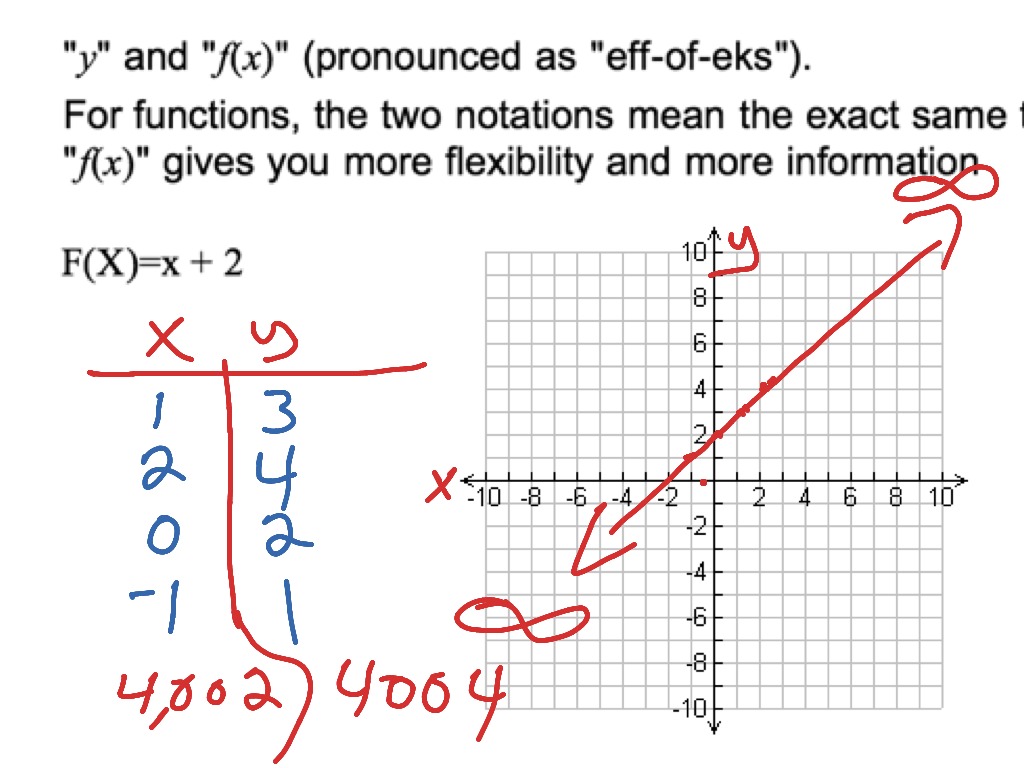
Graphing a simple linear function like y = x or y = 2x + 3 is an excellent starting point.
Using a Spreadsheet (Excel/Google Sheets):
- Set up columns: In Column A, label it “X” and enter a range of values (e.g., -5, -4, …, 0, …, 4, 5).
- Calculate Y: In Column B, label it “Y”. For
y = 2x + 3, enter the formula=2*A2+3in cell B2 (assuming A2 contains your first ‘x’ value). Drag this formula down to apply it to all ‘x’ values. - Create the graph: Select both columns of data. Go to “Insert” -> “Charts” and choose “Scatter” (specifically “Scatter with Smooth Lines” or “Scatter with Straight Lines” for functions).
- Customize: Add axis titles (X-axis: “X”, Y-axis: “Y”), a chart title (e.g., “Graph of y = 2x + 3”), and adjust formatting as needed.
Using an Online Graphing Calculator (Desmos):
- Navigate: Go to desmos.com/calculator.
- Enter equation: In the input box on the left, simply type
y = 2x + 3. - Observe: The graph will instantly appear on the coordinate plane. You can click and drag the graph to pan, and scroll to zoom.
- Explore: Add another equation like
y = -x + 5to see how multiple lines interact. Use sliders (e.g.,y = mx + bby typingm=1, b=0first) to dynamically change parameters.
Non-Linear Functions: Quadratics and Exponentials (Using Calculators/Programming)
Graphing non-linear functions like y = x^2 or y = e^x reveals curves and more complex behaviors.
Using an Online Graphing Calculator (GeoGebra):
- Navigate: Go to geogebra.org/graphing.
- Enter equation: In the input bar, type
y = x^2orf(x) = exp(x). - Analyze: GeoGebra will display the parabolic or exponential curve. You can interact with the graph, find specific points, or zoom into areas of interest. GeoGebra’s strength is also in its ability to show intersections, tangents, and other analytical features.
Using Python with Matplotlib:
- Install (if needed):
pip install matplotlib numpy - Write code:
“`python
import matplotlib.pyplot as plt
import numpy as np
# Define a range for x
x = np.linspace(-5, 5, 100) # 100 points between -5 and 5

# Define the non-linear function
y_quadratic = x**2
y_exponential = np.exp(x)

# Plotting
plt.figure(figsize=(10, 5))

plt.subplot(1, 2, 1) # 1 row, 2 columns, first plot
plt.plot(x, y_quadratic, label='y = x^2', color='blue')
plt.title('Graph of y = x^2')
plt.xlabel('X-axis')
plt.ylabel('Y-axis')
plt.grid(True)
plt.legend()

plt.subplot(1, 2, 2) # 1 row, 2 columns, second plot
plt.plot(x, y_exponential, label='y = e^x', color='red')
plt.title('Graph of y = e^x')
plt.xlabel('X-axis')
plt.ylabel('Y-axis')
plt.grid(True)
plt.legend()

plt.tight_layout() # Adjust layout to prevent overlapping
plt.show()
```
- Run: Save as a
.pyfile and run from your terminal. This will generate two plots, side-by-side.
Plotting Data Series Where ‘X’ is an Independent Variable (Using Spreadsheets/Programming)
Often, ‘x’ isn’t part of a known mathematical function but represents observed data points (e.g., time, age, distance) in relation to another observed variable.
Using Google Sheets for Scatter Plot:
- Input Data: Create two columns: “Time (X)” and “Temperature (Y)”. Populate with sample data (e.g., X: 1, 2, 3, 4, 5; Y: 10, 12, 15, 13, 18).
- Select Data: Highlight both columns.
- Insert Chart: Go to “Insert” -> “Chart”. In the Chart editor, choose “Scatter chart” under “Chart type”.
- Customize: Ensure X-axis and Y-axis are correctly identified. Add titles and labels. You can also add a trendline (regression line) to visualize the relationship between ‘x’ and ‘y’.
Using R with ggplot2:
-
Install (if needed):
install.packages("ggplot2") -
Write code:
library(ggplot2) # Create sample data frame data <- data.frame( time_x = c(1, 2, 3, 4, 5, 6, 7), temp_y = c(10.2, 11.5, 13.0, 12.8, 14.5, 16.0, 17.2) ) # Create the scatter plot ggplot(data, aes(x = time_x, y = temp_y)) + geom_point(color = "darkblue", size = 3) + # Add points geom_smooth(method = "lm", se = FALSE, color = "red") + # Add a linear trendline labs( title = "Temperature Over Time", x = "Time (Minutes)", y = "Temperature (°C)" ) + theme_minimal() # Use a clean theme -
Run: Execute the code in an R environment (like RStudio). This will generate a scatter plot showing temperature over time, with a linear trendline to highlight the general relationship.
These step-by-step examples demonstrate the versatility of modern tools in graphing ‘x’ across different contexts, from theoretical functions to empirical data.
Beyond the Basics: Advanced Techniques and Interpretation
Graphing ‘x’ is not merely about generating a visual; it’s about conveying information effectively and extracting meaningful insights. Advanced techniques and thoughtful interpretation elevate a basic plot into a powerful analytical tool.
Customizing Your Graphs for Clarity and Impact
A well-customized graph is far more effective than a default output. Modern graphing tools provide extensive options for enhancement:
- Axis Labels and Units: Always clearly label your X-axis (and Y-axis) with descriptive names and units (e.g., “Time (seconds)”, “Distance (meters)”). This prevents ambiguity regarding what ‘x’ represents.
- Titles and Subtitles: A concise title provides context. Subtitles can offer additional details or highlight key findings.
- Legends: When plotting multiple series or functions of ‘x’ on the same graph, a clear legend is crucial to differentiate them.
- Colors and Line Styles: Use distinct colors, line thicknesses, and marker styles to differentiate data series, especially for categorical ‘x’ values or multiple functions. Be mindful of colorblind accessibility.
- Annotations: Add text annotations, arrows, or shaded regions to highlight specific points, trends, or critical areas within the graph related to ‘x’.
- Scaling and Limits: Adjust the range of your X-axis (and Y-axis) to focus on relevant data, avoid misleading empty space, or zoom into specific features. Logarithmic scales for ‘x’ can be useful when dealing with data that spans several orders of magnitude.
- Gridlines: Use subtle gridlines to help readers estimate values, but avoid overly busy grids that detract from the data.
Thoughtful customization ensures your graph of ‘x’ is not only aesthetically pleasing but also maximally informative and easy to understand.
Interpreting Trends and Relationships from ‘X’ on a Graph
The primary purpose of graphing ‘x’ is to gain insight. Effective interpretation involves recognizing patterns, anomalies, and relationships.
- Trends: Is there a general upward or downward movement as ‘x’ increases? Is the trend linear, exponential, or periodic? For instance, an increasing ‘x’ value (e.g., time) might correlate with an increasing ‘y’ value (e.g., population growth).
- Correlations: How strongly does ‘y’ change in response to changes in ‘x’? A tight cluster of points around a line suggests a strong correlation.
- Outliers: Are there data points where ‘x’ or ‘y’ behave unexpectedly compared to the general trend? Outliers can indicate errors, unusual events, or interesting phenomena.
- Extrema and Inflection Points: Identify maximums, minimums, or points where the curve changes direction (inflection points). These are critical for understanding the behavior of functions of ‘x’.
- Comparisons: When graphing multiple functions or data series against ‘x’, how do they compare? Do they converge, diverge, or cross at significant points?
- Slope: For linear graphs, the slope indicates the rate of change of ‘y’ with respect to ‘x’. For non-linear graphs, the instantaneous slope (derivative) provides similar insights into localized rates of change.
Interpreting these visual cues transforms a static image into a dynamic source of knowledge, guiding further analysis or decision-making.
Interactive Graphs and Dynamic Visualization of ‘X’
The future of graphing ‘x’ is increasingly interactive and dynamic. Tools like Desmos, GeoGebra, and libraries like Plotly (for Python/R) enable users to create graphs that can be manipulated in real-time.
- Zoom and Pan: Users can explore different sections of the graph without recreating it.
- Tooltips: Hovering over data points reveals specific ‘x’ and ‘y’ values or other relevant information.
- Sliders and Filters: Dynamically change parameters or filter data based on specific ‘x’ ranges or categories, instantly updating the visualization.
- Animation: For ‘x’ representing time, animating the graph can show evolution and trends more vividly.
Interactive graphs are particularly powerful for complex datasets, educational demonstrations, and exploratory data analysis, allowing users to delve deeper into the data and uncover nuances related to ‘x’ that might be missed in static plots.
Choosing the Right Tool and Best Practices
With a plethora of tools available, making the right choice and adhering to best practices ensures efficient, accurate, and impactful graphing of ‘x’.
Matching the Tool to Your Specific Graphing Needs
The “best” tool isn’t universal; it depends on your specific requirements:
- Quick Visualizations & Education: Desmos or GeoGebra for instant function graphing and mathematical exploration.
- Basic Data Plotting & Reporting: Excel or Google Sheets for business data, simple trends, and general-purpose charts.
- Advanced Statistical Graphics & Automation: Python (Matplotlib, Seaborn, Plotly) or R (ggplot2) for data scientists, researchers, and complex analysis.
- High-Precision Engineering & Research: MATLAB or Mathematica for specialized scientific and computational tasks.
- Interactive Web Visualizations: Libraries like Plotly.js, D3.js, or even dashboards built with Python/R (e.g., Dash, Shiny) for sharing dynamic insights.
Consider your technical comfort level, the volume and complexity of your data, the need for customization, and the intended audience for your graph of ‘x’.
Ensuring Accuracy and Data Integrity
The old adage “garbage in, garbage out” applies emphatically to graphing.
- Validate Data: Before plotting, ensure your ‘x’ values (and ‘y’ values) are accurate, complete, and free from errors. Incorrect data will lead to misleading graphs.
- Understand Data Types: Be aware of whether ‘x’ is continuous, discrete, categorical, or temporal. This influences the appropriate chart type.
- Source Citation: If using external data, cite your sources to maintain credibility.
- Avoid Misleading Scales: Manipulating axis scales can distort the perception of trends or differences. Always present ‘x’ on an appropriate and honest scale, starting at zero when possible for quantitative comparisons unless a specific reason dictates otherwise.
- Choose Appropriate Chart Types: A line graph is good for showing trends over continuous ‘x’, while a bar chart is better for categorical ‘x’ comparisons. A scatter plot is ideal for showing relationships between two continuous variables where ‘x’ is one of them.
Future Trends in Graphing and Data Visualization
The field of data visualization is constantly evolving, impacting how we graph ‘x’:
- AI-Powered Visualization: Tools are emerging that can suggest optimal chart types, identify trends, and even generate natural language descriptions of graphs, reducing the manual effort in understanding ‘x’.
- Real-time Data Streaming: As IoT and real-time analytics grow, tools will increasingly need to graph ‘x’ values as they arrive, enabling immediate monitoring and response.
- Enhanced Interactivity and Immersive Experiences: Virtual reality (VR) and augmented reality (AR) could offer new ways to interact with 3D graphs and multi-dimensional ‘x’ data, providing more immersive exploratory experiences.
- Low-Code/No-Code Platforms: Greater accessibility to sophisticated graphing capabilities will be offered through platforms that require minimal programming, democratizing advanced visualization.
By understanding the foundational role of ‘x’, leveraging the right technological tools, and adhering to best practices, anyone can transform raw data and mathematical concepts into clear, insightful, and impactful visual narratives. The ability to graph ‘x’ effectively is no longer just a technical skill; it’s a critical competency for navigating and contributing to our increasingly data-rich world.
aViewFromTheCave is a participant in the Amazon Services LLC Associates Program, an affiliate advertising program designed to provide a means for sites to earn advertising fees by advertising and linking to Amazon.com. Amazon, the Amazon logo, AmazonSupply, and the AmazonSupply logo are trademarks of Amazon.com, Inc. or its affiliates. As an Amazon Associate we earn affiliate commissions from qualifying purchases.