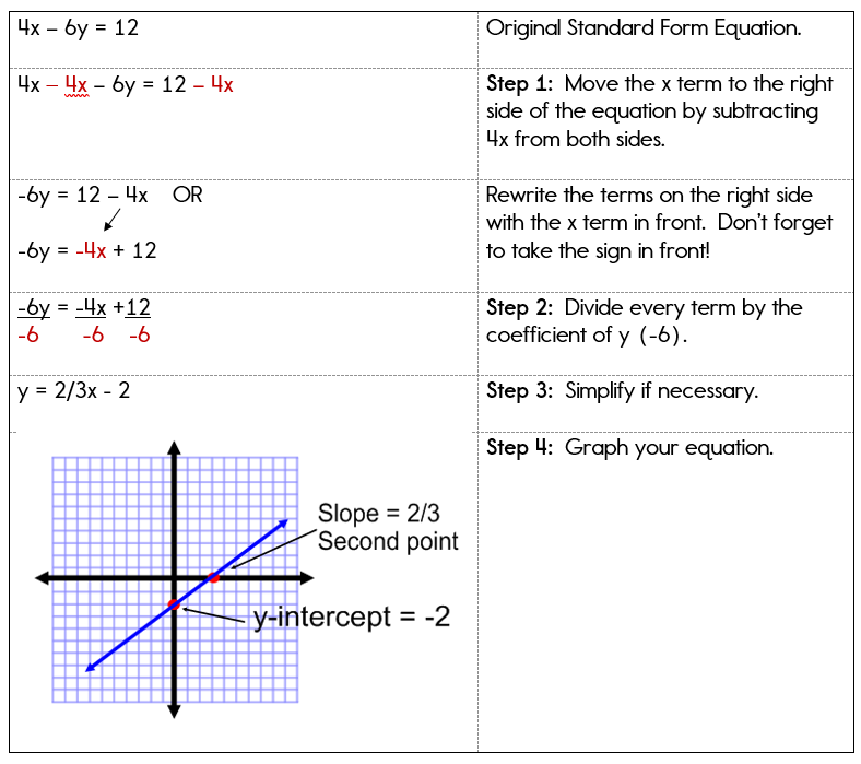
In the contemporary technological landscape, the ability to translate abstract mathematical concepts into visual data is more than just an academic exercise; it is a fundamental pillar of data science, engineering, and software development. Gone are the days when graphing equations was strictly limited to graph paper and a steady hand. Today, the intersection of mathematics and technology has birthed a sophisticated ecosystem of software, programming libraries, and artificial intelligence tools designed to render complex functions with precision and aesthetic clarity.
Understanding how to graph equations in the modern era requires a deep dive into specialized software suites and coding environments. Whether you are a developer looking to integrate dynamic charts into an application or a researcher visualizing high-dimensional data, the tools you choose define the accuracy and impact of your visual output. This guide explores the premier technological methods for graphing equations, moving from user-friendly SaaS platforms to powerful programmatic frameworks and the emerging frontier of AI-driven visualization.
1. The Rise of SaaS Graphing Platforms: Beyond the Handheld Calculator
For decades, the handheld graphing calculator was the gold standard for equation visualization. However, the tech industry has pivoted toward Cloud-based Software as a Service (SaaS) platforms that offer far more processing power, collaborative features, and high-resolution rendering than any standalone hardware could provide.
The Dominance of Desmos and GeoGebra
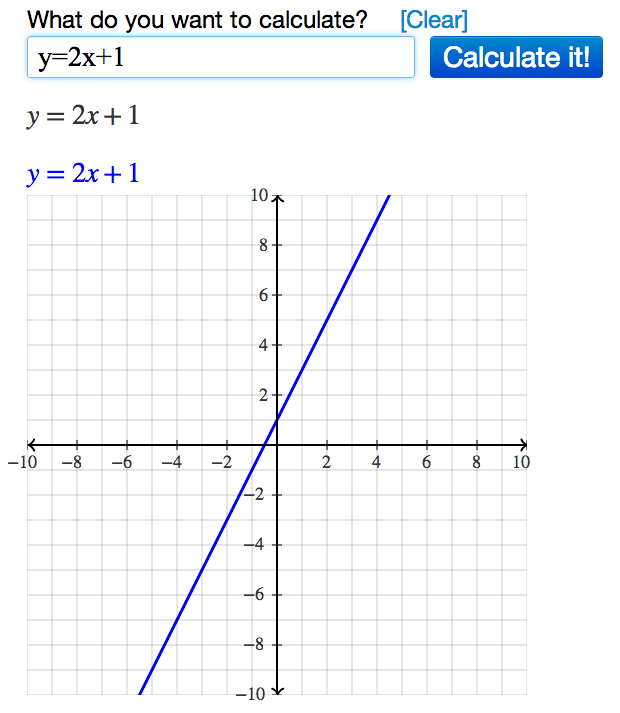
Desmos has revolutionized the way we interact with functions. As a web-based suite, it utilizes a high-performance JavaScript engine to render equations in real-time. The primary advantage of Desmos is its intuitive UI, which allows users to input equations in standard mathematical notation while offering “sliders” that manipulate variables dynamically. This immediate feedback loop is essential for understanding how coefficients affect the curvature or slope of a graph.
GeoGebra, on the other hand, serves as a more robust tool for those needing to merge algebra with geometry. It excels in 3D graphing, allowing users to plot multivariable equations that represent surfaces and complex spatial structures. For tech professionals, GeoGebra’s ability to export to LaTeX or embed interactive applets via HTML5 makes it a versatile choice for digital documentation and web-based educational tools.
WolframAlpha and Computational Intelligence
WolframAlpha occupies a unique niche in the tech world. Unlike a standard plotter, it is a “computational knowledge engine.” When you input an equation into WolframAlpha, it doesn’t just draw a line; it interprets the mathematical intent. It provides derivatives, integrals, alternate forms, and global extrema alongside the graph. For developers, the Wolfram Cloud API allows these graphing capabilities to be integrated into third-party applications, providing a level of mathematical “intelligence” that standard plotting libraries often lack.
2. Programmatic Visualization: Graphing with Python and R
In the world of professional software development and data engineering, graphing is rarely done through a GUI (Graphical User Interface). Instead, it is executed through code, allowing for automation, scalability, and integration into larger tech stacks.
Matplotlib and the Python Ecosystem
Python has become the de facto language for technical computing, largely due to its rich library ecosystem. At the heart of Pythonic graphing is Matplotlib. This library provides a MATLAB-like interface for plotting equations. By using NumPy to generate a range of values (an “array” of x-coordinates) and applying a function to that array to get y-coordinates, developers can render static, animated, or interactive plots.
For more aesthetically pleasing and statistically oriented visualizations, Seaborn and Plotly are the industry standards. Plotly is particularly significant in the “Tech” category because it generates JSON-based graphs that are natively interactive in web browsers. This allows a user to hover over a curve and see exact coordinates, zoom into specific intervals of a function, or toggle different equation layers on and off.
Statistical Graphing with R and ggplot2
While Python is a general-purpose language, R was built specifically for statistics. The ggplot2 package is perhaps the most sophisticated implementation of the “Grammar of Graphics.” It allows users to build graphs in layers—starting with the raw data, adding geometric objects (lines, points, surfaces), and then applying statistical transformations. For tech professionals dealing with financial modeling or biological data, R provides a level of mathematical rigor that ensures the visual representation of an equation is as accurate as the underlying data.
3. The Integration of AI and Machine Learning in Graphing
The most recent shift in how we graph equations involves the integration of Artificial Intelligence. Large Language Models (LLMs) and specialized neural networks are changing the workflow from manual input to natural language processing.
Generative AI as a Code Interpreter
Tools like ChatGPT (specifically its Advanced Data Analysis features) and Claude have changed the barrier to entry for graphing complex equations. A user can now describe an equation in plain English—for example, “Graph a 3D Lorentz Attractor with standard parameters”—and the AI will generate the Python code, execute it in a sandboxed environment, and present the high-resolution image. This marks a transition from “how to graph” to “how to describe a graph,” shifting the focus toward conceptual design rather than syntax.
Automated Insights and Pattern Recognition
AI isn’t just drawing lines; it’s helping users understand what those lines mean. Modern AI-integrated graphing tools can perform “symbolic regression,” where the tool looks at a set of data points and suggests the most likely equation that fits those points. This is the reverse of traditional graphing. Furthermore, AI tools can now identify anomalies in a graphed function—such as discontinuities or non-differentiable points—that might be missed by a human observer using a standard plotting tool.
4. Best Practices for Technical Graphing and UI Integration
Graphing an equation is only half the battle; the other half is ensuring the visualization is functional, accessible, and high-performance within a digital environment.
Optimization and Vector vs. Raster Graphics
When integrating graphs into tech products (websites, apps, or software), choosing the right format is critical. For most mathematical graphing, Scalable Vector Graphics (SVG) is preferred over raster formats like PNG or JPEG. SVGs are defined by mathematical paths, meaning they can be zoomed infinitely without losing clarity—a perfect mirror for the infinite precision of mathematical equations.
From a performance standpoint, developers must be mindful of “over-plotting.” If you are graphing a high-frequency function, rendering a million data points in a web browser can lead to significant latency. Tech professionals often use “downsampling” algorithms or WebGL-based rendering engines to maintain high frame rates in interactive visualizations.
Accessibility and Data Integrity
In the tech industry, inclusivity is a core design principle. Modern graphing tools are increasingly incorporating features for color-blind users and screen-reader compatibility. Using high-contrast color palettes and providing “Alt-text” descriptions generated by AI ensure that the visual data is accessible to all.
Furthermore, maintaining data integrity involves the proper scaling of axes. A common pitfall in digital graphing is the “liar’s graph,” where truncated y-axes or logarithmic scales are used without proper disclosure, leading to a visual misinterpretation of the equation’s growth rate. Professional tools now often include “auto-scaling” logic that prioritizes the most significant features of a function while maintaining a truthful representation of the data.

The Future of Mathematical Visualization
As we look toward the future, the technology behind graphing equations continues to evolve. We are moving toward Augmented Reality (AR) environments where engineers can walk through a 3D representation of a complex multivariable equation, and “Observable” notebooks where live data feeds directly into reactive equations.
The transition from manual calculation to AI-assisted, programmatic visualization has empowered tech professionals to solve more complex problems faster. Whether you are utilizing the cloud-based simplicity of Desmos, the programmatic power of Python, or the generative capabilities of AI, graphing equations is no longer just a math skill—it is a vital tech competency. By mastering these tools, you gain the ability to turn abstract logic into actionable, visual intelligence, bridging the gap between pure mathematics and real-world technological application.
aViewFromTheCave is a participant in the Amazon Services LLC Associates Program, an affiliate advertising program designed to provide a means for sites to earn advertising fees by advertising and linking to Amazon.com. Amazon, the Amazon logo, AmazonSupply, and the AmazonSupply logo are trademarks of Amazon.com, Inc. or its affiliates. As an Amazon Associate we earn affiliate commissions from qualifying purchases.