
The Unseen Giant: Helvetica’s Ubiquitous Influence
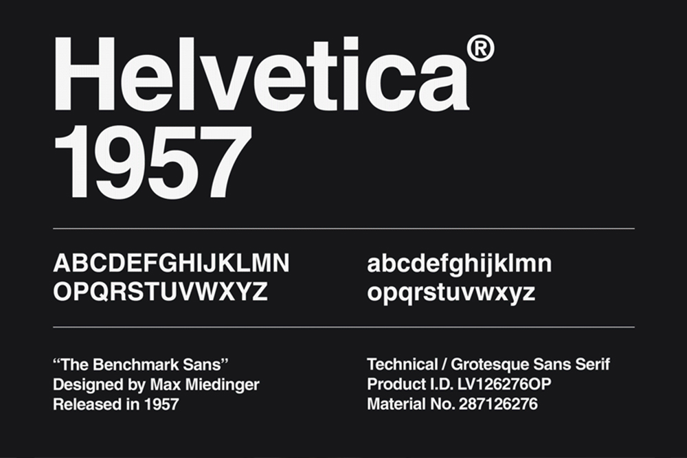
The phrase “What the Helvetica” playfully alludes to a typeface that has permeated nearly every facet of modern visual culture, often without conscious recognition. Helvetica, born in 1957 in Switzerland as “Neue Haas Grotesk” before its international renaming, is more than just a font; it is a foundational pillar of corporate identity and graphic design, a silent workhorse that has shaped how brands communicate clarity and authority for decades. Its very design principles, rooted in Swiss modernism, aimed for neutrality, legibility, and a timeless elegance that transcended passing fads. This quest for an unadorned, universal typeface made it an immediate favorite among designers seeking a clean, rational aesthetic.

A Legacy Etched in Simplicity
Helvetica’s design philosophy eschews decorative flourishes in favor of straightforward, geometrically inspired letterforms. Its tall x-height, tight spacing, and uniform stroke weights contribute to its remarkable legibility even at small sizes and across diverse mediums. This inherent simplicity was its strength, allowing the content it presented to take center stage, rather than the typeface itself. It was engineered to be unobtrusive, a transparent vehicle for information. This neutrality was revolutionary in an era often dominated by more ornate or highly stylized typefaces. Designers appreciated its ability to adapt to almost any context without imposing a specific mood, making it incredibly versatile for everything from road signs to corporate logos.
The Silent Language of Brands
The impact of Helvetica on global branding is profound and undeniable. From the minimalist elegance of American Airlines’ legacy branding to the precision of BMW’s visual identity, and from the ubiquitous presence of 3M to the approachable professionalism of Target, Helvetica or its close derivatives have been the backbone of countless corporate logos and extensive brand guidelines. The New York City subway system’s signage, renowned for its clarity and efficiency, is another iconic example of Helvetica’s practical application in public information design. Brands gravitated towards Helvetica not merely for its aesthetics but for the powerful, subconscious message it conveyed: trustworthiness, reliability, efficiency, and an international appeal. In a competitive marketplace, these attributes were invaluable for building lasting brand equity and fostering consumer confidence. Its perceived timelessness meant a brand’s visual identity wouldn’t quickly become dated, offering a solid foundation for long-term recognition.
More Than Just a Font: A Cultural Phenomenon
Beyond its commercial applications, Helvetica transcended its functional role to become a cultural icon. It has been celebrated in art installations, immortalized in documentaries like Gary Hustwit’s eponymous film, and recognized as a symbol of modern design principles. Its pervasive presence in print, on screen, and in the urban landscape underscores its status as a fundamental element of our visual lexicon. It’s a testament to its enduring power that even in an era of bespoke typography, discussions around Helvetica’s role continue to spark debate and admiration, proving its indelible mark on the collective consciousness. It speaks a universal design language that, for many, simply is modern communication.
The Double-Edged Sword: When Ubiquity Becomes a Question
While Helvetica’s widespread adoption cemented its status as a design classic, its very ubiquity has, for some, become its Achilles’ heel. In a branding landscape increasingly focused on unique storytelling and distinctive visual identities, a typeface known for its neutrality and omnipresence can present a dilemma. The challenge for modern brands isn’t merely to communicate clearly, but to do so in a way that resonates emotionally and stands apart from the noise. This has led to a re-evaluation of Helvetica’s role, prompting brands and designers to question whether a universally adopted font can truly encapsulate a brand’s unique essence in a saturated market.
The Argument for Overuse
Critics of Helvetica often point to its perceived blandness and lack of personality as a drawback. While its neutrality was once lauded, in an era where brands strive for authentic connection, a “safe” choice can sometimes feel like a “boring” one. The argument posits that if everyone uses Helvetica, then no one truly stands out. For a brand aiming to convey a disruptive spirit, a quirky personality, or a highly specialized niche, a typeface designed for universal application might feel too generic, failing to capture the nuance of its particular message. This can dilute a brand’s unique voice, making it harder to differentiate from competitors who might be employing the exact same visual language. The comfort of its familiarity can sometimes lead to a visual sameness that stifles distinct brand expression.
The Search for Distinction
This pushback against genericism has fueled a significant trend towards custom typography. Brands are increasingly investing in proprietary typefaces designed exclusively for their identity, allowing them to craft a truly unique visual signature that is legally protected and intrinsically linked to their brand story. Companies like Google, Apple, and Netflix, among many others, have developed their own custom fonts, not just for aesthetic differentiation, but for practical reasons such as improved legibility across various digital platforms, file size optimization, and a cohesive global brand experience. This move signifies a strategic shift: typography is no longer just a functional choice but a potent brand asset, capable of conveying specific values and emotions that a widely available typeface might struggle to articulate. It’s about owning a part of the visual language itself, making it an unmistakable extension of the brand.
Beyond the Hype: Strategic Application vs. Blind Adoption
It’s crucial to understand that the debate isn’t about Helvetica’s inherent quality—its design principles remain impeccable for clarity and legibility. Instead, it’s about strategic application. The problem arises when brands adopt Helvetica blindly, simply because it’s a default or a widely accepted “good” font, without considering whether it genuinely aligns with their brand’s specific personality, message, and target audience. For certain brands, particularly those focused on reliability, traditional authority, or universal service, Helvetica (or its carefully selected derivatives) can still be an incredibly powerful and appropriate choice. The key lies in intentionality: understanding why a particular typeface is chosen and how it contributes to the overarching brand narrative. A well-designed brand identity understands that typography is part of a larger ecosystem of visual elements, and its effectiveness depends on its synergy with color, imagery, layout, and tone of voice.
Redefining Readability: Modern Typeface Trends in Branding
The evolution of digital platforms and the increasing demand for unique brand experiences have ushered in a new era for typography in branding. While Helvetica’s foundational principles of clarity and legibility remain paramount, the tools and approaches to achieving these, alongside distinct brand personality, have diversified dramatically. Modern trends move beyond a one-size-fits-all solution, embracing technology and design innovation to create typefaces that are not only readable but also expressive, adaptive, and accessible. This shift reflects a more sophisticated understanding of typography as a dynamic and integral component of a comprehensive brand strategy.
The Rise of Variable Fonts and Custom Typefaces
Technological advancements have revolutionized typeface design, giving rise to concepts like variable fonts. These innovative font files contain an entire range of design variations (e.g., weight, width, slant) within a single file, allowing designers unprecedented control and flexibility. This means a brand can maintain a consistent typographic identity across different applications and screen sizes, dynamically adjusting for optimal legibility and aesthetic impact without loading multiple font files. For brands, this translates to leaner web performance, greater creative freedom, and a highly responsive visual language. Coupled with the continued investment in custom typefaces, brands can now craft unique typographic systems that are precisely tailored to their specific needs, ensuring that every character speaks their brand’s distinct voice. These bespoke solutions become powerful differentiators, impossible for competitors to replicate without significant investment.
Personality vs. Professionalism: Striking the Right Balance
Modern branding seeks to bridge the gap between conveying a professional, trustworthy image and expressing a unique, engaging personality. Typefaces are now carefully selected not just for their legibility but for the emotional resonance they carry. A tech startup might opt for a minimalist, geometric sans-serif to project innovation and future-forward thinking, while a luxury brand might commission a bespoke serif font that embodies heritage and exclusivity. The challenge lies in finding the balance: a typeface that is memorable and distinct without sacrificing clarity or becoming a barrier to communication. Brands are increasingly making bold typographic choices, integrating expressive display fonts for headlines while maintaining highly legible body text fonts, creating a rich and layered visual narrative that captures attention and reinforces brand values. This nuanced approach allows brands to communicate both their core message and their distinctive flair.
Accessibility and Inclusivity in Type Selection
Beyond aesthetics and personality, a critical consideration in modern brand typography is accessibility. In an increasingly digital-first world, brands have a responsibility to ensure their content is legible and understandable for all users, including those with visual impairments or cognitive differences. This means selecting typefaces with generous x-heights, distinct letterforms, ample character spacing, and robust weight families. Accessibility guidelines (such as WCAG) now influence font choices and usage, pushing brands to prioritize inclusivity in their design systems. The readability of a font on diverse screen sizes, resolutions, and devices is also paramount. A beautiful font that becomes illegible on a mobile screen fails its fundamental purpose. This focus on inclusive design not only broadens a brand’s reach but also reinforces its commitment to user-centricity and social responsibility, enhancing its reputation and connection with a wider audience.
The Future of Brand Typography: Beyond “Just a Font”
The journey of Helvetica, from its humble origins to its current iconic status and the debates surrounding its use, underscores a fundamental truth about brand identity: typography is far more than a decorative element. It is a strategic tool, a silent ambassador, and a crucial component of a brand’s narrative. As the digital landscape continues to evolve and consumer expectations for authentic brand experiences heighten, the role of typeface selection will only become more nuanced and integral to corporate identity.
Typography as a Core Brand Asset
In today’s competitive environment, every element of a brand’s visual identity must work synergistically to communicate its unique value proposition. Typography, therefore, must be recognized as a core brand asset, on par with a logo, color palette, or imagery. It affects immediate perception, influences readability, and contributes significantly to the overall user experience. A thoughtfully chosen and consistently applied typographic system can convey trustworthiness, innovation, luxury, playfulness, or any other desired brand attribute, often more subtly and powerfully than explicit messaging. It shapes how consumers feel about a brand before they even process the words themselves, making it an invaluable investment in long-term brand equity and differentiation. Brands that understand this leverage typography not just as a design choice, but as a strategic communication tool.
The Evolving Role of the Type Designer
The complexity and strategic importance of brand typography have elevated the role of the type designer. No longer confined to purely aesthetic creation, type designers are increasingly becoming strategic partners in brand development. They work closely with brand strategists, marketing teams, and UX designers to craft bespoke typographic solutions that are not only visually compelling but also functionally robust and aligned with overarching business objectives. This involves understanding brand values, target audiences, technical constraints, and future growth trajectories. The modern type designer is a specialist in visual language, capable of translating abstract brand concepts into tangible, legible, and evocative letterforms that resonate across all touchpoints. Their expertise is crucial in navigating the intricate balance between tradition and innovation, ensuring a brand’s visual voice is both distinct and enduring.

The Enduring Legacy of Clarity
As brands continue to explore new frontiers in visual communication, the fundamental principles that made Helvetica so successful—clarity, legibility, and versatility—remain paramount. While the specific aesthetic may shift, and bespoke solutions gain prominence, the core need for effective communication through type will never diminish. The question for contemporary brands isn’t whether to use Helvetica, but how to ensure their chosen typeface, whatever its origin or style, authentically communicates their unique story, values, and purpose. It’s about leveraging the power of typography to connect, inform, and inspire, ensuring that every word, every headline, and every piece of content strengthens the brand’s identity in a meaningful and memorable way. The legacy of Helvetica is not just a specific font, but the enduring commitment to clarity and precision in visual brand communication.
aViewFromTheCave is a participant in the Amazon Services LLC Associates Program, an affiliate advertising program designed to provide a means for sites to earn advertising fees by advertising and linking to Amazon.com. Amazon, the Amazon logo, AmazonSupply, and the AmazonSupply logo are trademarks of Amazon.com, Inc. or its affiliates. As an Amazon Associate we earn affiliate commissions from qualifying purchases.