
In the vast landscape of digital tools and data management, the ability to quickly discern patterns, outliers, and critical information is paramount. Conditional formatting stands out as a powerful, yet often underutilized, feature designed to transform raw data into actionable insights. At its core, conditional formatting is an automated process that applies specific visual styles—such as colors, fonts, borders, or icons—to data based on predefined conditions or rules. Instead of manually scanning countless rows and columns, this technology intelligently highlights the information that matters most, making data analysis intuitive and efficient.
Imagine a spreadsheet with thousands of entries. Without conditional formatting, extracting meaningful trends or identifying problem areas can be a tedious and error-prone task. Conditional formatting acts as a visual filter, bringing specific data points to the forefront, allowing users to instantly grasp the narrative hidden within the numbers. It’s not merely about making data look pretty; it’s about empowering users to make quicker, more informed decisions by creating a dynamic, self-interpreting data environment. This functionality is a cornerstone of productivity in various software applications, from spreadsheet programs to business intelligence tools, serving as a critical bridge between data and understanding.
The Core Concept: Enhancing Data Visibility
The primary objective of conditional formatting is to dramatically improve data visibility. By leveraging visual cues, it makes complex datasets more approachable and understandable. This goes far beyond simple sorting or filtering; it’s about adding a dynamic layer of intelligence directly onto the data itself.
Beyond Static Spreadsheets: Dynamic Insights
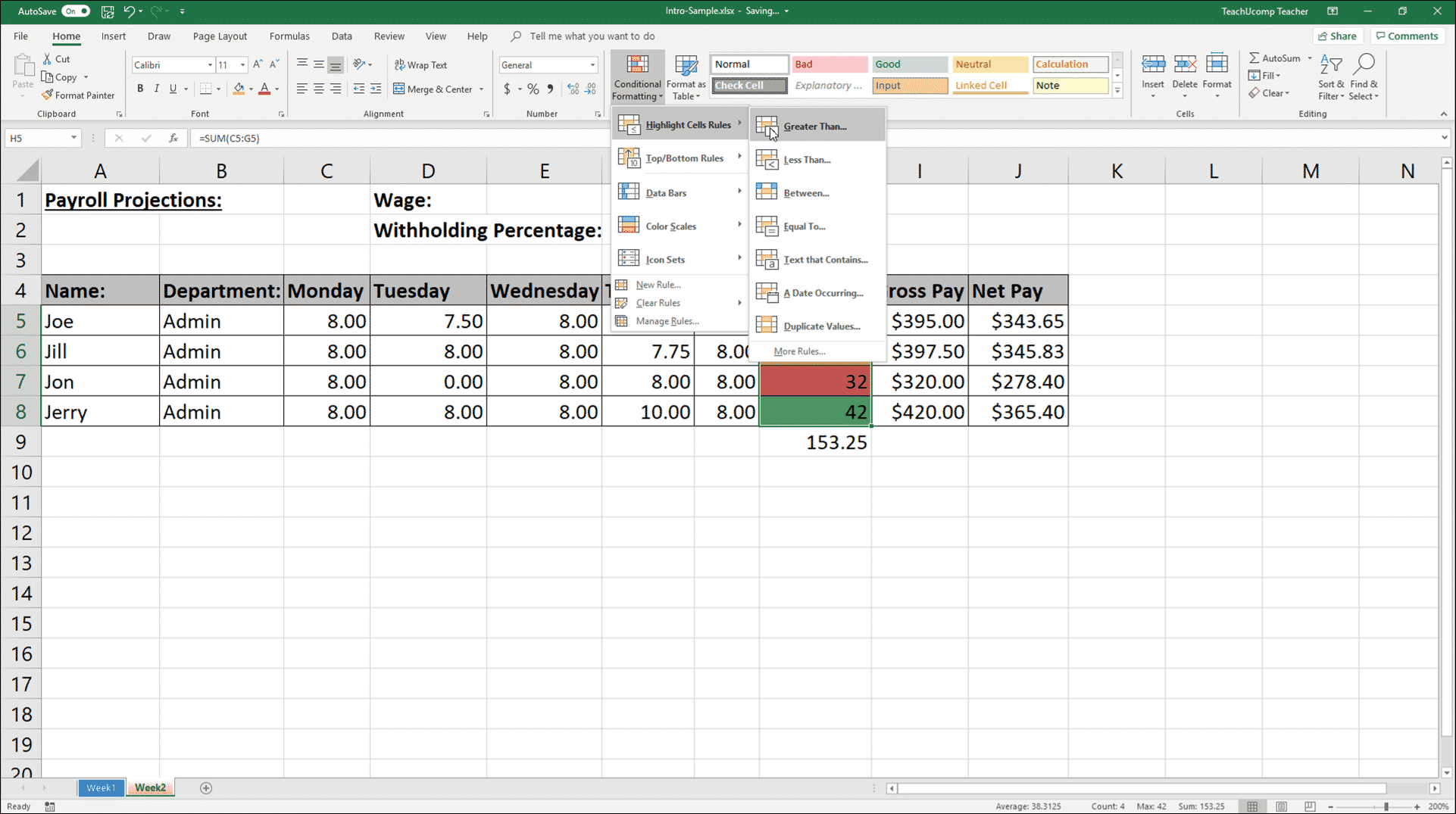
Historically, spreadsheets were static grids of numbers and text. Any analysis required manual computation, re-sorting, or the creation of separate charts and graphs. Conditional formatting revolutionizes this by embedding analytical capabilities directly into the data display. For example, in a sales report, cells containing sales figures below a certain target could automatically turn red, while those exceeding a target could turn green. This instant visual feedback transforms a static report into a dynamic dashboard where performance metrics jump out at the user without requiring any manual intervention or complex formula auditing. The data itself begins to tell a story, indicating areas of success, potential concern, or exceptional performance, all updated in real-time as data changes. This dynamism is crucial in fast-paced environments where data freshness and quick interpretation are essential for competitive advantage.
The Power of Rule-Based Automation
The true power of conditional formatting lies in its rule-based automation. Instead of manually applying formatting to individual cells or ranges, users define a set of rules that the software then applies consistently and automatically across the selected data. These rules can be simple, such as “highlight all values greater than X,” or complex, involving formulas that compare values across different cells, check for duplicates, or identify specific text strings.
Once a rule is established, it continuously monitors the data. If the data changes and a cell meets a specified condition, the formatting is automatically applied or removed. This automation saves immense amounts of time and eliminates human error associated with manual formatting. It ensures consistency in data presentation across large datasets and multiple users, fostering a standardized approach to data interpretation. This adherence to rules makes data easier to digest and prevents misinterpretations that might arise from inconsistent visual cues.
How Conditional Formatting Works: Setting Up Rules
Implementing conditional formatting involves a straightforward process of defining what conditions trigger what visual changes. While the specifics might vary slightly between different software applications, the underlying logic remains consistent.
Defining Conditions: What Triggers Formatting?
The first step in setting up conditional formatting is to specify the condition(s) that must be met for the formatting to apply. These conditions can be incredibly diverse and are usually selected from a predefined list or crafted using custom formulas. Common types of conditions include:
- Value-based: Cells containing values greater than, less than, equal to, or between specific numbers.
- Text-based: Cells containing specific text, starting with/ending with certain characters, or containing specific substrings.
- Date-based: Cells containing dates in the past day, week, month, or within a specific range.
- Ranking-based: Top N items, bottom N items, above/below average values.
- Duplicate/Unique values: Highlighting recurring entries or singular instances.
- Formula-based: The most flexible option, allowing users to write custom formulas (e.g.,
=A1>B1to compare a cell to another cell’s value, or=ISBLANK(A1)to highlight empty cells). This advanced capability allows for highly specific and intricate conditions, bridging the gap between basic filtering and full-fledged data validation.
The selection of the right condition is critical as it dictates the relevance and accuracy of the visual insights generated. A well-defined condition ensures that only the truly significant data points are highlighted, avoiding visual clutter.
Choosing Formats: The Visual Language of Data
Once the condition is defined, the next step is to choose the formatting that will be applied when the condition is met. This is where users leverage visual language to communicate insights. Available formats typically include:
- Fill Color: Changing the background color of a cell (e.g., red for critical, green for good).
- Font Color and Style: Altering the text color, making it bold, italic, or underlined.
- Borders: Adding or changing cell borders to group or separate data visually.
- Data Bars: Visual bars within cells that represent the value relative to others in the selected range, providing a quick visual magnitude comparison.
- Color Scales: A gradient of colors applied across a range, where different shades represent different values (e.g., a scale from red to green, with red indicating low values and green indicating high values).
- Icon Sets: Applying graphical icons (e.g., arrows, traffic lights, stars) to cells based on their values, providing quick visual cues for trends or statuses.
The choice of formatting should be intentional and consistent. Overusing too many different colors or icons can lead to visual chaos, defeating the purpose of clarity. Effective use of formatting aligns with principles of data visualization, ensuring that the chosen styles enhance readability and understanding without causing distraction.
Rule Precedence and Management
In scenarios where multiple conditional formatting rules are applied to the same range of cells, the software needs a mechanism to determine which rule takes precedence. This is handled through rule order. Rules are typically applied in the order they appear in a “Conditional Formatting Rules Manager.” If a cell meets the conditions of more than one rule, the formatting of the higher-priority rule (usually the one listed first) will apply. Many applications also offer an option to “Stop If True,” which prevents lower-priority rules from being applied to a cell once a higher-priority rule’s condition is met. Efficient rule management is crucial for maintaining clear and accurate data visualization, especially in complex spreadsheets with numerous formatting requirements. This manager allows users to reorder, edit, delete, and add new rules, providing comprehensive control over the visual dynamics of their data.
Common Applications Across Software
The utility of conditional formatting extends across a wide spectrum of software applications, proving indispensable in diverse professional contexts.
Spreadsheet Software (Excel, Google Sheets): Highlighting Trends and Outliers
Spreadsheet programs are perhaps the most common domain for conditional formatting. Users leverage it to:
- Monitor budgets: Highlight expenses that exceed budget allocations.
- Track sales performance: Visually identify top-performing products or regions, or sales figures below target.
- Manage inventory: Flag items that are low in stock or overstocked.
- Analyze financial statements: Emphasize positive or negative growth, or key financial ratios.
- Identify duplicates: Quickly spot redundant entries in large datasets, which is crucial for data cleaning.
- Project timelines: Color-code tasks based on their due dates (e.g., red for overdue, yellow for nearing deadline).
These applications make spreadsheets not just data repositories, but active analytical tools, enabling users to react swiftly to changes and deviations.
Project Management Tools: Tracking Deadlines and Progress
Many modern project management platforms (e.g., Monday.com, Smartsheet) integrate conditional formatting-like features to enhance project oversight. Users can:
- Color-code tasks: Based on status (e.g., “In Progress,” “Completed,” “Blocked”).
- Highlight overdue tasks: Automatically turn red when a deadline is missed.
- Visualize progress: Use data bars or color scales to show percentage completion of tasks or projects.
- Identify resource allocation issues: Flag resources that are over-allocated or under-utilized.
This visual feedback helps project managers and teams maintain a clear, real-time understanding of project health, facilitating proactive problem-solving.
Business Intelligence Dashboards: At-a-Glance Performance Monitoring

BI tools like Tableau, Power BI, and Qlik Sense heavily rely on conditional formatting to make complex data dashboards immediately digestible. Here, it is used to:
- Emphasize KPIs: Highlight key performance indicators (KPIs) that are above or below target thresholds.
- Spot trends: Use color gradients to show performance evolution over time.
- Alert to anomalies: Flag unusual data points that might require further investigation.
- Compare categories: Visually differentiate performance across product lines, customer segments, or geographic regions.
Conditional formatting transforms static reports into interactive, intelligent dashboards that guide decision-makers directly to areas of interest or concern, enabling faster and more strategic responses.
CRM Systems: Prioritizing Customer Interactions
Customer Relationship Management (CRM) platforms also benefit from intelligent formatting to prioritize and manage customer interactions. Examples include:
- Highlighting high-value leads: Assign different colors to leads based on their potential revenue or engagement score.
- Flagging urgent support tickets: Turn support cases red if they exceed response time SLAs.
- Tracking sales pipeline stages: Use color coding to visually represent the progression of deals through the sales funnel.
- Identifying dormant accounts: Highlight customer accounts that haven’t had recent activity.
These applications help sales and support teams focus their efforts on the most critical or promising interactions, improving efficiency and customer satisfaction.
Advanced Techniques and Best Practices
While basic conditional formatting is intuitive, mastering advanced techniques can unlock even greater analytical power.
Using Formulas for Custom Conditions
The most potent aspect of conditional formatting is the ability to use custom formulas. This allows for conditions that go beyond simple cell values. For example:
- Highlighting an entire row based on a cell’s value: A formula like
=$B2="Overdue"applied to a range of rows will highlight an entire row if the value in column B for that row is “Overdue”. - Comparing values across different columns: Highlighting a cell if its value is greater than the corresponding cell in another column (e.g.,
=$C2>$D2). - Identifying weekend dates: Using a formula like
=WEEKDAY(A2,2)>5to highlight Saturdays and Sundays in a date column. - Highlighting unique combinations: If you need to identify unique pairs of values across two columns.
Understanding absolute and relative references in formulas ($ signs) is crucial for applying these custom rules correctly across ranges.
Data Bars, Color Scales, and Icon Sets
These are specialized types of conditional formatting that offer rich visual representations:
- Data Bars: Provide an instant visual comparison of values within a range. A longer bar signifies a higher value. They are excellent for quickly comparing magnitudes, like sales figures across different quarters or project progress percentages.
- Color Scales: Apply a gradient of two or three colors across a range, where the color intensity changes based on the cell’s value relative to others. For instance, a red-yellow-green scale can show a spectrum from low (red) to medium (yellow) to high (green) performance.
- Icon Sets: Place specific icons (e.g., up/down arrows, traffic lights, ratings) next to values to indicate trends, status, or thresholds. These are particularly useful for dashboards where quick status checks are vital. For example, a green arrow for positive growth, a red arrow for decline.
These visual tools transform quantitative data into qualitative insights, making it easier for the human eye to process and interpret information at a glance.
Managing Multiple Rules and Complex Scenarios
When dealing with large datasets and intricate analysis needs, a single cell might need to respond to several conditions. The “Conditional Formatting Rules Manager” is essential here. It allows users to:
- View all rules applied to a specific range or worksheet.
- Change the order of rules to establish precedence.
- Edit or delete existing rules.
- Set “Stop If True” for rules where subsequent rules should not apply if the current one is met.
Effective management prevents conflicting formats and ensures that the most critical information is highlighted according to a defined hierarchy. Planning the rule hierarchy is a best practice, always placing the most critical or overriding conditions at the top.
Performance Considerations and Scalability
While incredibly useful, it’s important to be mindful of performance, especially in very large datasets (tens of thousands or hundreds of thousands of rows). Overly complex formulas or a vast number of rules applied to an entire sheet can sometimes impact the responsiveness of the software. Best practices include:
- Applying rules to specific ranges rather than entire columns or sheets unless absolutely necessary.
- Keeping formulas efficient and avoiding volatile functions where possible.
- Regularly reviewing and optimizing rules to remove unnecessary or redundant formatting.
For truly massive datasets requiring advanced visual analytics, dedicated BI tools are often more appropriate than relying solely on spreadsheet-based conditional formatting.
The Strategic Advantage of Conditional Formatting
Ultimately, conditional formatting is more than just a convenience feature; it’s a strategic asset for individuals and organizations striving for data-driven excellence.
Improved Decision-Making
By instantly highlighting key data points, conditional formatting reduces the cognitive load required to understand data. This immediate insight empowers users to identify opportunities, mitigate risks, and make faster, more informed decisions. Whether it’s a sales manager spotting underperforming territories or a finance analyst identifying budget overruns, the clarity provided by visual cues translates directly into better strategic choices.
Time Savings and Efficiency
The automation inherent in conditional formatting saves countless hours that would otherwise be spent manually reviewing and formatting data. This efficiency allows professionals to allocate their time to higher-value analytical tasks rather than mundane data preparation. It also significantly reduces the potential for human error in data interpretation, leading to more reliable outcomes.

Enhanced Communication and Collaboration
Well-applied conditional formatting makes data reports and dashboards universally easier to understand. This common visual language facilitates clearer communication within teams and across departments. When everyone can quickly grasp the meaning behind the numbers, collaboration improves, and discussions become more productive, focusing on solutions rather than deciphering data. It provides a shared understanding, reducing ambiguity and fostering a more cohesive analytical environment.
In conclusion, conditional formatting is an essential technical capability in modern software that transforms raw data into dynamic, insightful, and actionable information. By mastering its principles and applications, users can unlock a new level of data comprehension, streamline workflows, and ultimately drive superior outcomes in a data-rich world.
aViewFromTheCave is a participant in the Amazon Services LLC Associates Program, an affiliate advertising program designed to provide a means for sites to earn advertising fees by advertising and linking to Amazon.com. Amazon, the Amazon logo, AmazonSupply, and the AmazonSupply logo are trademarks of Amazon.com, Inc. or its affiliates. As an Amazon Associate we earn affiliate commissions from qualifying purchases.