
The ubiquitous presence of the color blue in our visual landscape, from the vastness of the sky and ocean to the intricate branding of global corporations, is no accident. In the realm of brand strategy and corporate identity, understanding the psychological and cultural implications of color is paramount. Blue, in particular, carries a weight of meaning that brand managers, marketers, and designers meticulously leverage to sculpt perceptions, evoke emotions, and establish lasting connections with their audiences. Its strategic deployment is a masterclass in non-verbal communication, influencing everything from consumer trust to perceived innovation.
The Psychology of Blue in Branding
Blue’s profound impact on human psychology makes it an invaluable asset in a brand’s visual lexicon. Its associations are deeply ingrained, often linked to fundamental aspects of human experience and societal values. When a brand chooses blue, it consciously taps into these established psychological pathways, aiming to elicit specific responses and reinforce particular brand attributes.
Trust, Reliability, and Security
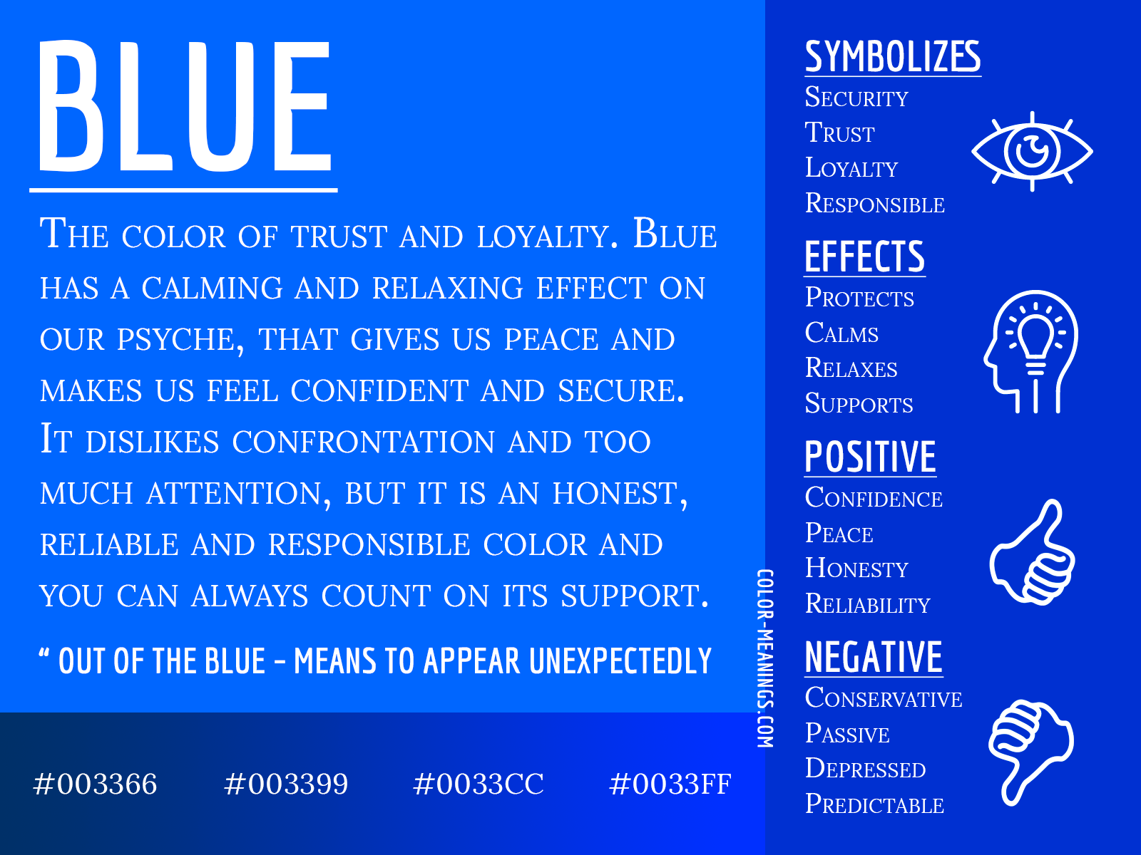
Perhaps blue’s most compelling psychological attribute is its strong association with trust and reliability. This stems from its connection to the stable elements of nature – the unwavering sky and the dependable sea. For brands, especially those operating in sensitive sectors, projecting an image of trustworthiness is critical. Consumers are inherently drawn to brands that exude stability and integrity, and blue serves as a visual shorthand for these qualities. Financial institutions, insurance companies, and even many governmental organizations frequently adopt blue in their logos and branding to convey a sense of security and steadfastness, reassuring their clients that their assets or well-being are in capable hands.
Calm, Serenity, and Professionalism
Beyond trust, blue also evokes feelings of calm and serenity. It is often perceived as a tranquil color, capable of reducing stress and fostering a sense of peace. This calming effect makes blue a favored choice for brands that wish to present a professional yet approachable demeanor. In corporate environments, blue suits are a classic symbol of professionalism, mirroring the psychological comfort it provides. For service-oriented businesses, healthcare providers, or any brand aiming to create a soothing customer experience, blue can be instrumental in creating an atmosphere of calm and reassurance, making interactions feel less stressful and more productive.
Innovation, Logic, and Intellect
While often associated with tradition and stability, blue also possesses a modern edge, particularly lighter and brighter shades. It is frequently linked with intellect, logic, and analytical thought. This association makes blue a natural fit for technology companies, software developers, and research institutions seeking to convey innovation and cutting-edge intelligence. The clear, expansive quality of blue can symbolize clarity of thought and forward-thinking vision. Brands that position themselves as problem-solvers or pioneers in their field often utilize blue to subtly communicate their intellectual rigor and commitment to smart, effective solutions.
Strategic Application of Blue Across Industries
The versatility of blue allows it to be strategically deployed across a multitude of industries, each leveraging its specific psychological implications to achieve distinct branding objectives. Its widespread adoption is a testament to its effectiveness as a communication tool.
Financial Services and Healthcare
The financial sector, perhaps more than any other, leans heavily on blue. Banks, investment firms, and insurance providers routinely feature blue in their branding to underscore their commitment to security, stability, and trustworthiness. A blue logo immediately signals a serious, reliable entity that customers can depend on with their most valuable assets. Similarly, in healthcare, blue is prevalent. Hospitals, pharmaceutical companies, and medical device manufacturers use blue to project cleanliness, serenity, and professional competence. It helps to alleviate patient anxiety and foster a sense of sterile yet caring professionalism, which is crucial in environments dedicated to well-being.
Technology and Social Media
In the fast-paced world of technology, blue takes on a slightly different, yet equally critical, role. Tech giants frequently use blue to convey innovation, reliability, and global reach. Think of the dominant colors of major social media platforms, software companies, and hardware manufacturers. Here, blue often symbolizes the vast, interconnected nature of the digital world, the logic of programming, and the promise of future advancements. It helps these brands appear modern, efficient, and forward-thinking, while also retaining an underlying sense of trust that is vital for user adoption and data security. The choice of blue here reflects a desire to be perceived as both cutting-edge and dependable.
Consumer Goods and Lifestyle
Even in consumer goods and lifestyle brands, blue plays a significant role. Brands selling cleaning products often use blue to symbolize cleanliness, freshness, and efficacy. Food and beverage companies might use lighter blues to suggest coolness, refreshment, or natural purity. For apparel and lifestyle brands, blue denim is a cultural icon, symbolizing ruggedness, versatility, and casual comfort. Beyond denim, fashion brands use blue to convey sophistication, tranquility, or a maritime aesthetic, depending on the shade and context. Its ability to evoke a range of emotions, from refreshing to luxurious, makes it a highly adaptable color in a competitive market.
Shades of Blue: Nuance in Perception
Not all blues are created equal. The specific shade, intensity, and saturation of blue can significantly alter its perceived meaning and the emotions it evokes. Understanding these nuances is critical for brand strategists in crafting a precise visual message.

Light Blue: Openness and Friendliness
Lighter shades of blue, such as sky blue or baby blue, tend to convey openness, friendliness, and a sense of lightness. They are often associated with youth, idealism, and creativity. Brands that wish to appear approachable, innovative, and less formal often opt for lighter blues. Think of tech startups aiming for a fresh, user-friendly image, or social platforms emphasizing connection and community. These hues suggest spaciousness and imagination, inviting interaction without the formality of darker shades.
Dark Blue: Authority and Conservatism
At the other end of the spectrum, dark blues, like navy or sapphire, carry a strong sense of authority, seriousness, and conservatism. They are often linked to stability, professionalism, and wisdom. This is why dark blue is a staple for established corporations, legal firms, and luxury brands that aim to project prestige and enduring quality. It commands respect and conveys a sense of reliability that is often associated with tradition and experience. Brands using dark blue are signaling their steadfastness and unwavering commitment to excellence.
Bright Blue: Dynamism and Energy
Vibrant, bright blues, such as electric blue or royal blue, inject an element of dynamism and energy into a brand’s palette. These shades are associated with excitement, innovation, and a lively spirit. They are often used by sports brands, entertainment companies, or modern tech brands that want to stand out and convey a sense of forward momentum and enthusiasm. Bright blues capture attention and communicate a brand’s vibrant personality, making them effective for brands that thrive on being perceived as current and engaging.
Pitfalls and Considerations When Using Blue
Despite its many advantages, the strategic use of blue is not without its challenges. Brand managers must navigate potential pitfalls to ensure their blue branding effectively differentiates them and resonates with their target audience.
Overuse and Lack of Differentiation
Blue’s popularity is a double-edged sword. Its widespread adoption across so many industries, particularly in finance and tech, can lead to a lack of differentiation. If every competitor uses blue, a brand risks blending into the background rather than standing out. To counteract this, brands must consider unique shades of blue, combine it effectively with complementary colors, or incorporate distinctive design elements that give their blue a unique identity. Simply choosing blue is not enough; the application of blue must be strategic and original.
Cultural Interpretations
Color meanings are not universally uniform. While blue generally holds positive connotations in Western cultures, its interpretation can vary significantly across different global markets. In some cultures, blue might be associated with mourning, protection from evil, or even divinity, which could subtly alter a brand’s intended message. Therefore, brands operating internationally must conduct thorough cultural research to ensure their blue branding is perceived as intended and avoids any unintended negative associations in specific regions. A global brand strategy requires sensitivity to these cultural nuances.
Balancing with Complementary Hues
Effective brand palettes rarely rely on a single color. Blue often achieves its full potential when paired thoughtfully with complementary or contrasting hues. For instance, pairing blue with a touch of orange can create a vibrant, energetic contrast that makes both colors pop. Combining it with neutrals like grey, white, or silver can enhance its professionalism and sophistication. The overall color scheme of a brand needs to be harmonious and purposeful, with blue playing a specific role within a broader visual narrative. The secondary colors help to define the brand’s personality, adding layers of meaning that blue alone cannot achieve.
Crafting a Powerful Brand Identity with Blue
Ultimately, the power of blue in branding lies in its ability to communicate complex ideas and emotions swiftly and effectively. It allows brands to forge powerful, almost subconscious, connections with their audiences, building trust, establishing authority, and conveying innovation without uttering a single word.
Consistency Across Touchpoints
For blue to truly work its magic, its application must be consistent across every single brand touchpoint. From the logo and website to packaging, social media graphics, and even employee uniforms, the chosen shade and its accompanying palette must be applied uniformly. This consistency reinforces the brand’s identity, making it instantly recognizable and strengthening the psychological associations embedded within the blue. Inconsistency dilutes the message and weakens the brand’s overall impact, making it harder for consumers to form a clear and lasting impression.
Evoking Emotional Connections
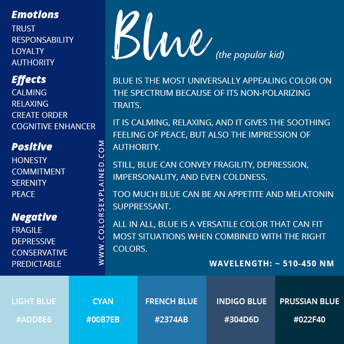
The ultimate goal of using blue, or any color, in branding is to evoke an emotional connection. Blue’s diverse psychological portfolio allows brands to tap into feelings of safety, calm, aspiration, or intelligence. When a consumer sees a brand’s blue, they should not just recognize the brand; they should feel something about it. This emotional resonance is what transforms a mere product or service into a beloved brand, fostering loyalty and advocacy. By understanding “what color blue means” in its myriad applications, brands can wield this powerful hue to craft identities that are not only visually appealing but deeply resonant and strategically effective in a crowded marketplace.
aViewFromTheCave is a participant in the Amazon Services LLC Associates Program, an affiliate advertising program designed to provide a means for sites to earn advertising fees by advertising and linking to Amazon.com. Amazon, the Amazon logo, AmazonSupply, and the AmazonSupply logo are trademarks of Amazon.com, Inc. or its affiliates. As an Amazon Associate we earn affiliate commissions from qualifying purchases.