
Dark blue stands as a cornerstone in the world of brand design, celebrated for its profound depth, authority, and widespread appeal. As a color, it evokes trust, stability, and professionalism, making it a powerful choice for corporate identities, digital platforms, and marketing collateral across numerous industries. However, the true artistry in leveraging dark blue lies not just in its individual strength, but in its harmonious pairing with complementary and contrasting hues. Mastering these combinations is crucial for brands looking to create compelling visual narratives, differentiate themselves, and communicate specific messages to their target audience. This exploration delves into the strategic selection of colors that not only “go well” with dark blue but also amplify its inherent qualities, shaping a more impactful and memorable brand presence.

The Strategic Power of Dark Blue in Branding
Dark blue is far more than just a color; it’s a strategic asset in a brand’s visual arsenal. Its pervasive use across financial institutions, technology companies, healthcare providers, and luxury brands is no coincidence. Understanding its psychological underpinnings and versatility is key to appreciating its role as a primary brand color.
Psychological Associations of Dark Blue
Psychology plays a critical role in color selection for branding. Dark blue is consistently associated with a range of positive attributes that resonate deeply with consumers:
- Trust and Reliability: Its resemblance to the vastness of the sky and ocean gives it an inherent sense of permanence and dependability. Brands aiming to build long-term relationships with customers often gravitate towards dark blue to project trustworthiness.
- Authority and Professionalism: Dark blue conveys seriousness and gravitas, making it ideal for brands that need to establish themselves as experts or leaders in their field. It’s a color often seen in corporate environments and government agencies.
- Intelligence and Serenity: The color can stimulate introspection and calmness, suggesting a brand that is thoughtful, secure, and measured in its approach. This makes it suitable for educational institutions or consulting firms.
- Sophistication and Elegance: When paired correctly, dark blue can exude a sense of understated luxury and timeless elegance, appealing to discerning audiences.
Versatility Across Industries
The adaptability of dark blue is another reason for its widespread adoption. From the crispness of a tech startup’s logo to the stately appeal of a bank’s website, dark blue can be styled to fit diverse brand personalities. It serves as an excellent foundation for a brand palette because it is perceived as serious without being overly somber, and classic without being dated. Its neutrality allows it to support a wide range of accent colors, enabling brands to infuse personality without sacrificing their core message of reliability.
Complementary Hues for Harmonious Palettes
Creating a harmonious brand palette often begins with understanding complementary colors – those that sit opposite on the color wheel, offering a natural contrast. However, the concept extends to colors that simply provide a balanced visual dynamic. For dark blue, these pairings establish a sense of order, elegance, and readability.
The Classic Contrast: White and Off-White
The combination of dark blue and white is a timeless classic for a reason. White provides crispness, clarity, and breathability, allowing dark blue to truly pop. This pairing is foundational for many brands, ensuring high readability for text, clean design on websites, and a professional appearance in print materials. Off-white shades, like cream or ivory, can soften the contrast slightly, introducing a touch of warmth and approachability while retaining elegance. This is particularly effective for brands seeking a luxurious yet welcoming feel.
Ethereal and Calming: Light Blues and Grays
To create a more monochromatic or analogous scheme, light blues work beautifully with dark blue. Shades like sky blue, powder blue, or even a soft cerulean can add depth and variation without disrupting the sense of calm. This palette is often seen in brands that want to emphasize serenity, innovation, or open communication.
Similarly, various shades of gray—from a pale silver to a charcoal—offer sophisticated and modern companions. Gray introduces a contemporary edge, providing a neutral backdrop that allows dark blue to anchor the design, while preventing the overall palette from becoming too stark. This combination is particularly strong for tech brands or those focused on minimalist aesthetics.
Earthy Sophistication: Browns and Neutrals
For a palette that evokes warmth, nature, or understated luxury, consider pairing dark blue with earthy browns and other natural neutrals. A rich tan, a deep mocha, or even a soft beige can temper the coolness of dark blue, adding a layer of grounded sophistication. This combination is less common but highly effective for brands in hospitality, natural products, or high-end craftsmanship, suggesting authenticity, comfort, and timeless quality.
Striking Accents and Dynamic Pairings
While complementary hues provide harmony, accent colors inject personality, draw attention, and can be used strategically to highlight key messages or calls to action. With dark blue as a stable base, a diverse range of vibrant and metallic accents can create memorable and dynamic brand identities.
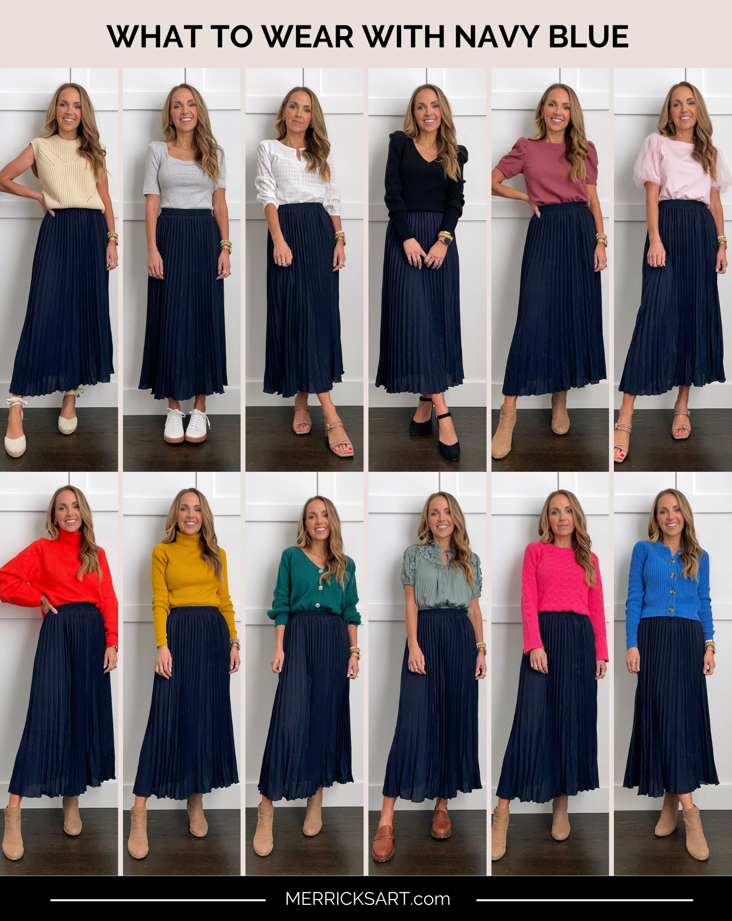
Energetic Pops: Yellows and Oranges
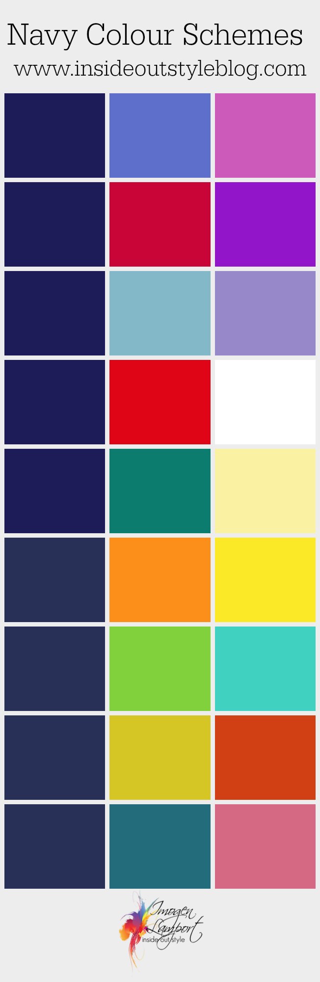
Opposite blue on the color wheel, yellow offers a vivid and energetic contrast. A bright, sunny yellow or a muted gold can bring a sense of optimism, creativity, and enthusiasm when paired with dark blue. Similarly, orange, with its warmth and vibrancy, can create a powerful, stimulating contrast. These pairings are often seen in brands that want to convey innovation, youthful energy, or a friendly, approachable demeanor, using the accent color sparingly for elements like buttons, headlines, or small graphical details.
Regal and Refined: Golds and Silvers
For brands aiming for opulence, prestige, or a touch of luxury, metallic accents like gold and silver are unparalleled. Gold pairs particularly well with dark blue, evoking royalty, high quality, and a sense of achievement. Silver, on the other hand, offers a more modern, technological, and sleek feel, suggesting precision and innovation. These pairings are frequently utilized by luxury goods, high-end services, or premium tech brands to elevate their visual identity.
Nature-Inspired Vibrancy: Greens
Deep greens, such as forest green or emerald, can create a rich, natural, and sophisticated palette when combined with dark blue. This combination often suggests growth, environmental consciousness, health, and stability. Lighter, more vibrant greens can inject a fresh, dynamic energy, suitable for brands in wellness, sustainability, or outdoor adventure. The interplay between the coolness of blue and the organic feel of green can create a beautifully balanced and refreshing brand image.
Bold Statements: Pinks and Corals
Less conventional but incredibly impactful, pairing dark blue with shades of pink or coral can create a strikingly modern and confident brand presence. A soft blush pink can introduce femininity and approachability, while a vibrant coral can add a playful, energetic, and contemporary twist. This unexpected combination can help a brand stand out, signaling creativity, warmth, and a willingness to break from tradition. It’s often embraced by fashion brands, creative agencies, or businesses targeting a younger, more design-conscious demographic.
Crafting a Cohesive Brand Identity with Dark Blue
Beyond simply choosing colors, the true challenge lies in integrating them into a cohesive brand identity that speaks volumes without uttering a single word. The application of color theory, an understanding of context, and careful consideration of ratios are paramount.
Considering Context and Audience
The effectiveness of any color palette is deeply tied to its context and the target audience. A dark blue paired with vibrant orange might be perfect for a youth-focused tech brand, while dark blue with gold might suit a high-end financial advisory firm. Consider what emotions and associations your brand needs to evoke, and how your chosen color combinations will be perceived by your specific demographic. A brand aiming for trust and stability might lean heavily on dark blue with white accents, whereas a brand wanting to appear innovative and approachable might use dark blue as a backdrop for a more adventurous accent color.
The Role of Color Ratios
It’s not just which colors you use, but how much of each. A dominant dark blue paired with a subtle accent color creates a vastly different impression than an equal distribution of two strong colors. Typically, a primary brand color (like dark blue) should constitute the largest percentage of the visual real estate, providing consistency and brand recognition. Secondary colors offer support, and accent colors are used sparingly to draw attention to crucial elements. A common ratio is 60-30-10, where 60% is the dominant color, 30% is a secondary color, and 10% is an accent. This structured approach ensures balance and prevents visual chaos.
Practical Application: Logos, Web, and Print
The chosen palette must translate effectively across all brand touchpoints.
- Logos: The primary colors should work well in both full color and monochrome versions. Dark blue is an excellent base for a logo, often paired with white, silver, or a contrasting accent within the logomark.
- Website Design: High contrast between dark blue backgrounds and text is essential for accessibility and readability. Consider how accent colors will be used for interactive elements like buttons and links.
- Marketing Materials & Print: Ensure color consistency across digital and print. Dark blue can appear differently on screen versus paper, so color matching (e.g., using Pantone references) is critical for maintaining brand integrity. Think about how the colors will look on business cards, brochures, packaging, and advertising.
Avoiding Common Pitfalls
While dark blue is highly versatile, certain pitfalls can undermine its effectiveness. Overusing dark blue without sufficient contrast can make a design feel heavy or uninviting. Conversely, pairing it with too many disparate, clashing colors can dilute its authority and create a visually incoherent brand. Relying solely on a dark blue and black combination can also result in a lack of vibrancy and poor readability. The key is balance, thoughtful contrast, and a clear understanding of the emotional impact of each chosen hue.
Ultimately, the choice of colors to pair with dark blue is a strategic decision that shapes a brand’s identity and perception. By understanding the psychological impact of dark blue and exploring a diverse range of complementary and contrasting colors, brands can craft visual palettes that are not only aesthetically pleasing but also powerfully communicate their core values and connect deeply with their audience.
aViewFromTheCave is a participant in the Amazon Services LLC Associates Program, an affiliate advertising program designed to provide a means for sites to earn advertising fees by advertising and linking to Amazon.com. Amazon, the Amazon logo, AmazonSupply, and the AmazonSupply logo are trademarks of Amazon.com, Inc. or its affiliates. As an Amazon Associate we earn affiliate commissions from qualifying purchases.