
The Strategic Power of Charcoal Grey in Branding
Charcoal grey stands as a cornerstone in the world of brand aesthetics, a sophisticated and remarkably versatile hue that communicates volumes without uttering a single word. Far from being merely a ‘safe’ choice, its strategic deployment in a brand’s visual identity signals maturity, stability, and understated luxury. At its core, charcoal grey embodies professionalism and timelessness, making it an ideal foundation for brands aiming to project authority, reliability, and an enduring presence in the market.
This deep, rich shade of grey possesses an inherent ability to anchor a design, providing a solid, neutral backdrop against which other colors can truly shine. It offers the gravitas of black without its occasional harshness, and the subtlety of grey without any perception of weakness. For brands, this translates into a visual identity that is both strong and adaptable, capable of supporting a diverse range of marketing messages and product lines. From high-tech startups seeking to convey innovation with reliability to established luxury brands emphasizing heritage and quality, charcoal grey provides a compelling narrative of trust and competence. Its psychological impact is profound: it suggests order, structure, and seriousness, qualities that resonate deeply with discerning audiences and foster long-term brand loyalty.

Crafting Harmonious Palettes: Complementary Color Strategies
The true genius of charcoal grey in branding lies in its incredible versatility when paired with other colors. Its neutrality makes it an exceptional partner, allowing brands to sculpt specific emotional responses and distinct visual identities. The choice of complementary colors transforms charcoal grey from a mere background into a dynamic element, shaping how a brand is perceived.
The Classic Contrast: White, Cream, and Light Greys
For brands aiming for a clean, minimalist, and undeniably elegant aesthetic, pairing charcoal grey with stark white, warm cream, or various shades of light grey is a masterstroke. This combination speaks volumes of sophistication, clarity, and precision. White, in particular, offers a sharp, crisp contrast that enhances legibility and creates a sense of spaciousness and purity. Cream introduces a softer, warmer touch, suggesting approachability and classic refinement without losing the overall luxurious feel. Light greys, when used alongside charcoal, create a harmonious, monochromatic gradient that exudes understated elegance and modernity.
This palette is frequently adopted by high-end fashion labels, architectural firms, financial institutions, and consulting services. It conveys meticulous attention to detail, a commitment to quality, and a confident, uncluttered brand message. The stark contrasts ensure readability in typography and design elements, making it an excellent choice for corporate identity systems, clean website layouts, and sophisticated packaging.
Adding Warmth and Approachability: Earth Tones and Naturals
To inject warmth, authenticity, and a connection to nature, charcoal grey can be beautifully complemented by a range of earth tones and natural hues. Think olive green, terracotta, muted mustard, warm beige, and various shades of brown. These colors soften charcoal grey’s inherent seriousness, imbuing the brand with a sense of organic elegance and approachability.
This strategy is particularly effective for eco-conscious brands, artisanal product lines, lifestyle brands, or businesses in the hospitality and wellness sectors. Olive green can evoke nature and sustainability; terracotta brings a grounded, artisanal feel; and warm beiges or browns add a comforting, inviting dimension. The combination creates a palette that feels both grounded and refined, suggesting natural quality and a commitment to genuine values. It’s an ideal choice for brands that want to convey trustworthiness, craftsmanship, and a gentle, inviting personality.
Infusing Energy and Dynamism: Vibrant Accents
While charcoal grey provides a stable foundation, strategic splashes of vibrant accent colors can inject energy, modernity, and a distinctive personality into a brand. Colors like mustard yellow, deep teal, burnt orange, ruby red, or sapphire blue can be used sparingly to draw attention, highlight key messages, or signify specific aspects of a brand. These accents prevent the overall palette from becoming monotonous, adding a contemporary edge and a sense of innovation.
This approach is highly favored by tech startups, creative agencies, and contemporary design brands that wish to balance professionalism with innovation and dynamism. A charcoal grey website background with a vibrant call-to-action button, or a logo with a charcoal logotype and a vivid accent mark, immediately captures attention and communicates a forward-thinking attitude. The key is moderation; the vibrant color should act as a focal point, enhancing rather than overpowering the sophisticated base of charcoal grey, thus maintaining the brand’s core professionalism while adding an exciting visual punch.
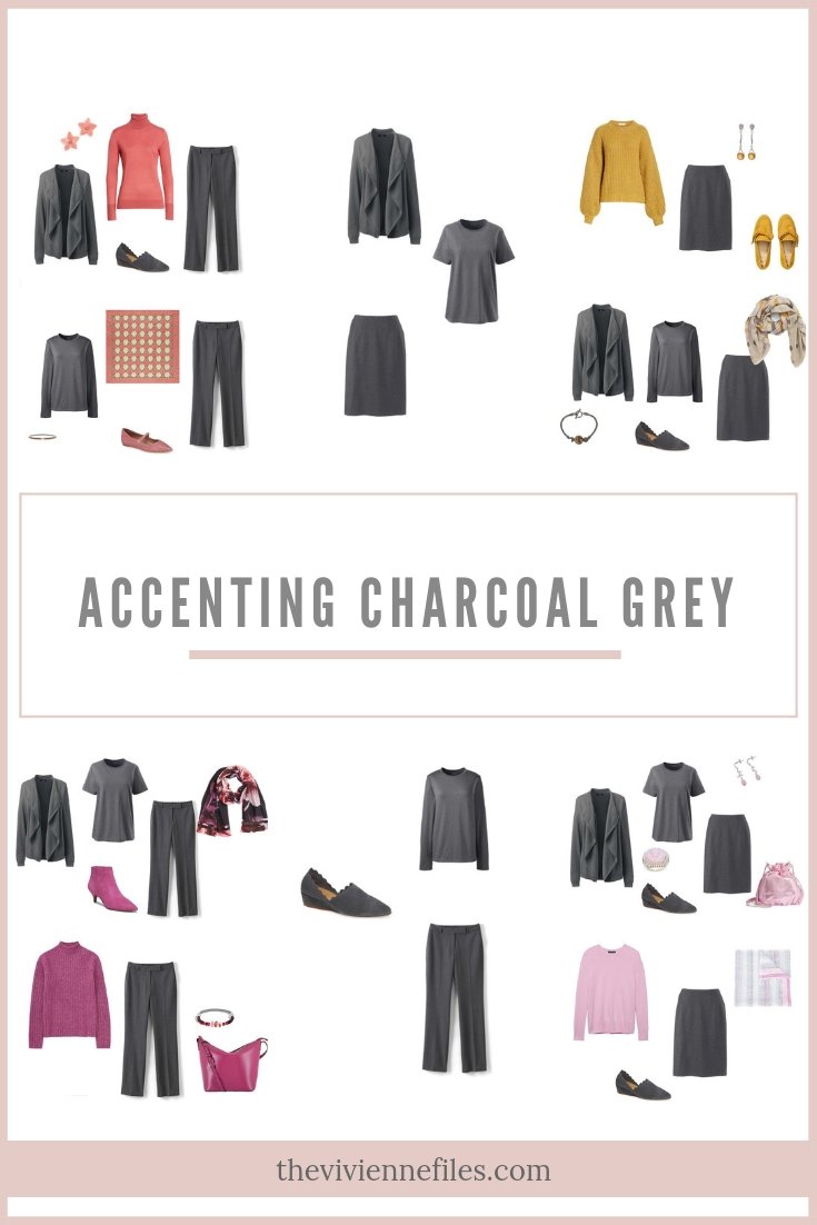
Cultivating Luxury and Depth: Metallics and Deep Jewels
For brands seeking to project ultimate luxury, exclusivity, and prestige, combining charcoal grey with metallic hues like gold, silver, bronze, or rich jewel tones such as deep emerald, amethyst, or sapphire navy is an unparalleled strategy. These combinations elevate the brand’s perception, suggesting premium quality, meticulous craftsmanship, and an aura of opulence.
Gold and bronze accents, in particular, imbue charcoal grey with a sense of regality and high value, perfect for luxury goods, fine jewelry, high-end hospitality, or premium financial services. Silver offers a sleek, modern luxury, often chosen by tech brands or automotive companies. Deep jewel tones introduce a sophisticated depth and richness, signaling exclusivity and refined taste. This palette effectively communicates that the brand is dedicated to excellence and targets a discerning clientele that values quality and sophisticated indulgence. It creates a memorable visual experience that resonates with grandeur and distinction.
Psychological Impact and Brand Messaging
The deliberate pairing of charcoal grey with complementary colors extends beyond mere aesthetics; it deeply influences the psychological perception of a brand and shapes its core messaging. Charcoal grey acts as an emotional anchor, a steady and reliable presence. The colors chosen to accompany it then steer the brand’s narrative, determining whether it feels serious and traditional, or modern and playful, approachable or exclusive.
For instance, a brand using charcoal grey with cool blues might convey trust and reliability, ideal for financial institutions or healthcare providers. Adding a vibrant orange accent, however, could shift the perception towards innovation and creativity, suited for a marketing agency. The consistency of these chosen color combinations across all brand touchpoints—from logos and websites to marketing materials, product packaging, and even physical retail spaces—is paramount. This consistency builds recognition, reinforces brand identity, and fosters a coherent brand experience that resonates deeply with the target audience. Brands that master this consistency leverage charcoal grey not just as a color, but as a strategic asset in their overall brand architecture, effectively communicating their values and personality to the world.
Practical Application: Designing with Charcoal Grey
The practical application of charcoal grey and its complementary colors is fundamental to creating a cohesive and impactful brand identity across all media.
Logo Design and Typography
In logo design, charcoal grey provides an excellent foundation for logotypes, especially when paired with a stark white or a vibrant accent color. It conveys authority and timelessness, ensuring legibility and a sophisticated appearance. For typography, charcoal grey offers a softer alternative to black, reducing visual harshness while maintaining excellent contrast for readability, making it ideal for extensive body copy on websites or in print.
Web and UI/UX Design
For web and user interface (UI/UX) design, charcoal grey is invaluable. It can be used for backgrounds, primary text, or key navigational elements to create a professional and calm user experience. Complementary colors, especially vibrant accents, are then strategically employed for call-to-action buttons, interactive elements, or progress indicators, guiding user attention and enhancing visual hierarchy without overwhelming the user.
Packaging and Product Design
In packaging, charcoal grey serves as a sophisticated base that implies premium quality and understated elegance. Paired with metallic foils or bold accent colors, it can differentiate product lines and add a luxurious tactile and visual appeal. For product design, charcoal grey offers a versatile finish that can be adapted with colored elements or materials to convey different brand personalities or product functions.

Interior and Retail Spaces
Charcoal grey in interior and retail design creates a desired brand atmosphere. It can be used for walls, furniture, or flooring to establish a sophisticated and modern environment. Complementary colors are then introduced through soft furnishings, artwork, lighting, or display elements to inject warmth, energy, or luxury, ensuring the physical space reflects and reinforces the brand’s overall visual identity and message.
aViewFromTheCave is a participant in the Amazon Services LLC Associates Program, an affiliate advertising program designed to provide a means for sites to earn advertising fees by advertising and linking to Amazon.com. Amazon, the Amazon logo, AmazonSupply, and the AmazonSupply logo are trademarks of Amazon.com, Inc. or its affiliates. As an Amazon Associate we earn affiliate commissions from qualifying purchases.