
Choosing the right color palette is a cornerstone of effective brand strategy. A brand’s colors communicate its essence, evoke specific emotions, and differentiate it in a crowded market. When a rich and evocative color like plum anchors your brand identity, the question of “what color matches with plum” isn’t merely aesthetic; it’s a strategic decision that shapes perception, drives recognition, and influences consumer behavior. Plum, with its deep roots in royalty, luxury, and creativity, offers a versatile foundation. However, its true power is unlocked when paired with complementary or harmonious hues that amplify its message and align with your brand’s overarching goals.

Understanding Plum in Brand Identity
Plum is a sophisticated color that sits between red and blue on the color wheel, often incorporating a hint of brown or grey, giving it a distinctive depth. Unlike its brighter cousin, purple, plum exudes maturity, elegance, and a sense of mystique. Incorporating plum into your brand identity means tapping into a rich psychological and historical lineage.
The Psychology of Plum
Psychologically, plum is associated with a range of powerful attributes. Historically, purple dyes were expensive and rare, making them symbols of royalty, wealth, and power. This legacy imbues plum with an inherent sense of luxury, exclusivity, and prestige. Beyond its regal connections, plum also suggests creativity, imagination, and wisdom. It can convey a sense of introspection and spirituality, making it suitable for brands that aim to inspire thought or offer transformative experiences. Furthermore, its depth often implies quality, reliability, and sophistication, lending an air of seriousness and respectability. For brands looking to position themselves as premium, innovative, or deeply thoughtful, plum provides a robust chromatic anchor.
Plum’s Versatility Across Industries
Due to its nuanced characteristics, plum is surprisingly versatile across various industries. In the fashion and beauty sectors, it speaks of elegance, luxury, and modern femininity. For technology brands, a deep plum can signify innovation, cutting-edge solutions, and forward-thinking design, especially when paired with metallic accents. In hospitality and luxury goods, plum evokes opulence, comfort, and an elevated experience. Even in more conservative fields like consulting or finance, a muted plum can introduce a touch of distinction and sophistication, suggesting wisdom and a unique perspective without sacrificing professionalism. Its adaptability lies in its ability to be both bold and understated, depending on the context and the accompanying colors.
Core Principles of Color Matching for Brands
To effectively match colors with plum, a strategic understanding of color theory is essential. This isn’t about arbitrary choices but about creating visual harmony or contrast that serves a specific brand objective.
Complementary Colors: Creating Impact
Complementary colors are those directly opposite each other on the color wheel. For plum (a variation of purple), its direct complement is yellow or certain shades of green. Using a complementary color creates a high-contrast, dynamic pairing that immediately grabs attention. For a brand, this can be incredibly powerful for call-to-action buttons, key messaging, or elements that require immediate focus. Imagine a deep plum background with vibrant golden yellow text; this pairing instantly communicates luxury and boldness. However, complementary colors should be used judiciously, often with one color dominating and the other acting as an accent, to avoid visual tension or a jarring effect in your overall branding.
Analogous Colors: Harmony and Sophistication
Analogous colors are those that sit next to each other on the color wheel. For plum, these would include shades of blue, magenta, or various purples. An analogous color scheme creates a sense of harmony, unity, and sophistication. It’s less about making a loud statement and more about building a cohesive, flowing visual narrative. Brands often use analogous palettes to convey a sense of calm, elegance, or continuity. For instance, pairing plum with a rich navy blue or a soft lavender can create a sophisticated, trustworthy, and serene brand presence, often seen in wellness, high-end fashion, or luxury service industries where subtlety and refinement are key.
Triadic and Tetradic Schemes: Dynamic Brand Palettes
For brands seeking a more dynamic and complex palette, triadic and tetradic schemes offer compelling options. A triadic scheme involves three colors equally spaced on the color wheel, creating a balanced and vibrant contrast. For plum, a triadic scheme might involve a shade of green and a shade of orange. This allows for a rich and varied brand identity that can be adapted across diverse marketing materials, providing more flexibility while maintaining visual interest.
A tetradic (or double complementary) scheme uses two pairs of complementary colors. This is the most complex of the traditional schemes, offering the richest visual variety but also requiring careful management to maintain balance. For a brand using plum, this could involve plum with its complement (yellow/green), plus another complementary pair like red-orange and blue-green. Such a scheme is ideal for brands that need to express multiple facets of their personality, perhaps playful yet sophisticated, or innovative yet reliable. When executed well, these complex palettes can make a brand memorable and distinct, providing ample room for creative expression in advertising, product design, and digital interfaces.
Strategic Plum Pairings for Distinct Brand Messages
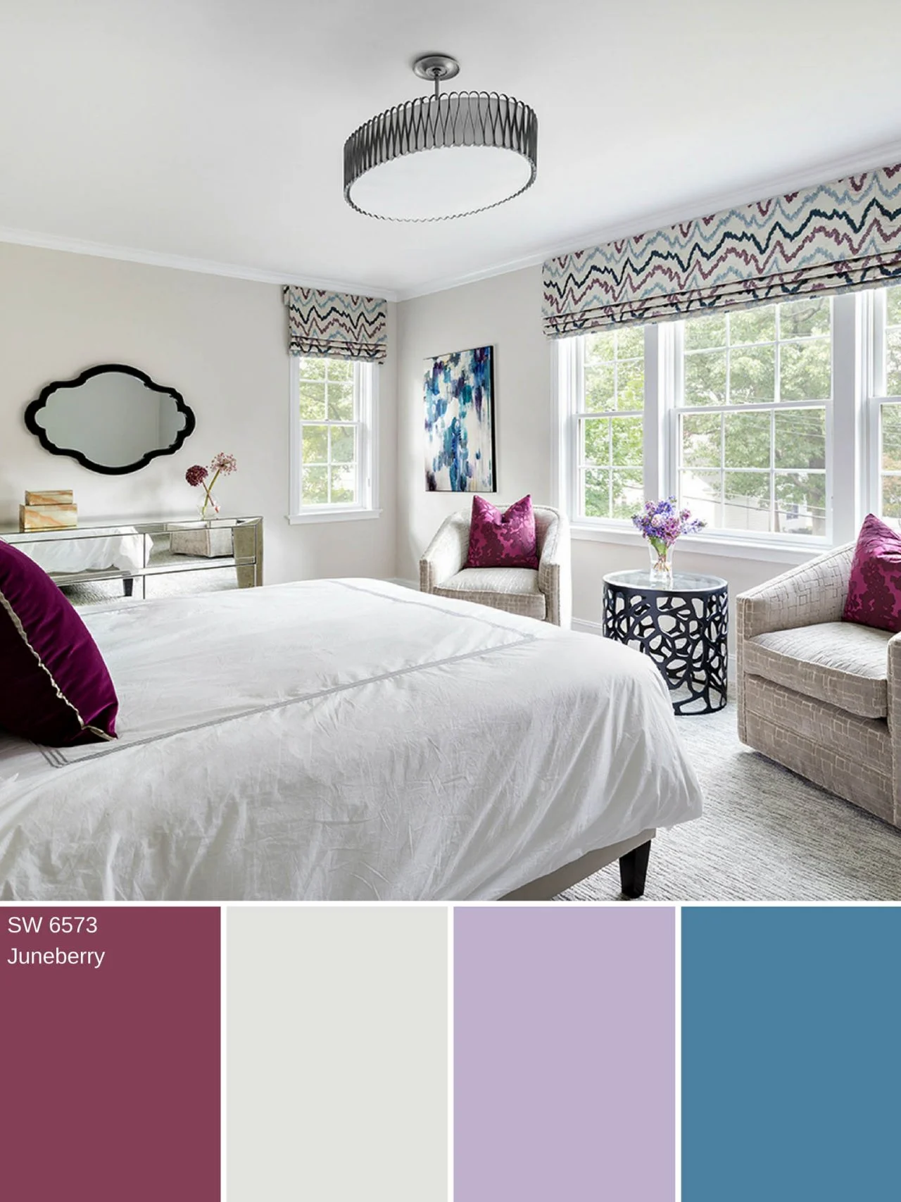
Beyond theoretical principles, specific color pairings with plum can evoke precise brand messages, helping companies connect with their target audience more effectively.
Plum & Gold: Luxury and Prestige
The pairing of plum and gold is synonymous with opulence and grandeur. Gold, whether metallic or a deep mustard, inherently speaks of value, success, and high quality. When combined with plum’s royal associations, this palette becomes irresistibly luxurious. Brands in the high-end fashion, jewelry, hospitality, or gourmet food sectors frequently leverage this combination to signal exclusivity and premium craftsmanship. It’s a classic duo that never fails to impress and communicate an elevated status.
Plum & Sage Green: Organic and Serene
For brands aiming for a more natural, organic, or wellness-oriented identity, plum and sage green create a beautiful, serene contrast. Sage green evokes nature, tranquility, and growth, while plum adds a touch of sophistication and depth without overpowering the earthy feel. This pairing works exceptionally well for eco-friendly brands, organic beauty products, health and wellness services, or artisan crafts. It communicates a sense of balance, natural purity, and thoughtful design, appealing to a conscious consumer base.
Plum & Cream/Beige: Elegant Simplicity
To achieve an aesthetic of understated elegance and classic sophistication, plum paired with cream, beige, or off-white is an excellent choice. These neutral tones allow plum to truly shine as the primary accent, providing warmth and softness without competition. This combination is highly effective for brands that prioritize timelessness, refined taste, and a minimalist approach. Think luxury home goods, high-end stationery, or traditional fashion labels seeking to convey quiet confidence and enduring style. It offers a clean, inviting, and sophisticated feel, perfect for a brand that values tradition and quality.
Plum & Grey/Silver: Modern Professionalism
When the goal is to project a modern, sophisticated, and professional image, plum and grey or silver form an impeccable alliance. Grey and silver embody professionalism, technology, and contemporary design, offering a cool, composed backdrop. Plum introduces a much-needed touch of personality, creativity, and warmth, preventing the palette from becoming too sterile. This pairing is ideal for tech companies, corporate consulting firms, architectural practices, or luxury automotive brands looking to balance innovation with reliability and a sleek aesthetic. It suggests forward-thinking ideas delivered with precision and flair.
Plum & Teal/Turquoise: Creative and Energetic
For brands that want to communicate creativity, vibrancy, and a touch of the unconventional, plum with teal or turquoise is a dynamic and engaging combination. Teal and turquoise are refreshing, optimistic colors associated with communication, clarity, and imaginative thinking. When juxtaposed with plum’s depth, the result is a lively, sophisticated, and memorable palette. This duo is particularly effective for creative agencies, innovative startups, cultural institutions, or brands targeting a younger, design-conscious audience. It speaks to originality, vibrancy, and a fresh perspective, making a brand feel both artistic and approachable.
Implementing Your Plum Palette: Design & Marketing Considerations
Once the ideal plum-centric palette is identified, its consistent and strategic application across all brand touchpoints is paramount. A beautiful palette is only effective if it’s consistently executed.
Consistency Across Touchpoints
Brand consistency dictates that your chosen color palette appears uniformly across your logo, website, social media profiles, packaging, advertising materials, and physical spaces. This consistency builds recognition, reinforces your brand’s personality, and fosters trust. Inconsistent color usage can dilute your brand message and confuse your audience. Developing a comprehensive brand style guide that specifies exact color codes (Pantone, CMYK, RGB, Hex) for all chosen hues is crucial for maintaining this uniformity.
Digital vs. Print Considerations
It’s vital to remember that colors appear differently in digital and print formats. What looks vibrant on a screen (RGB) may appear slightly different when printed (CMYK). Strategic brand managers and designers account for these variations by using specific color profiles and performing proofing to ensure color accuracy across all mediums. For a color as nuanced as plum, precise color management ensures that its intended psychological impact is maintained whether viewed on a smartphone, a billboard, or a product label.
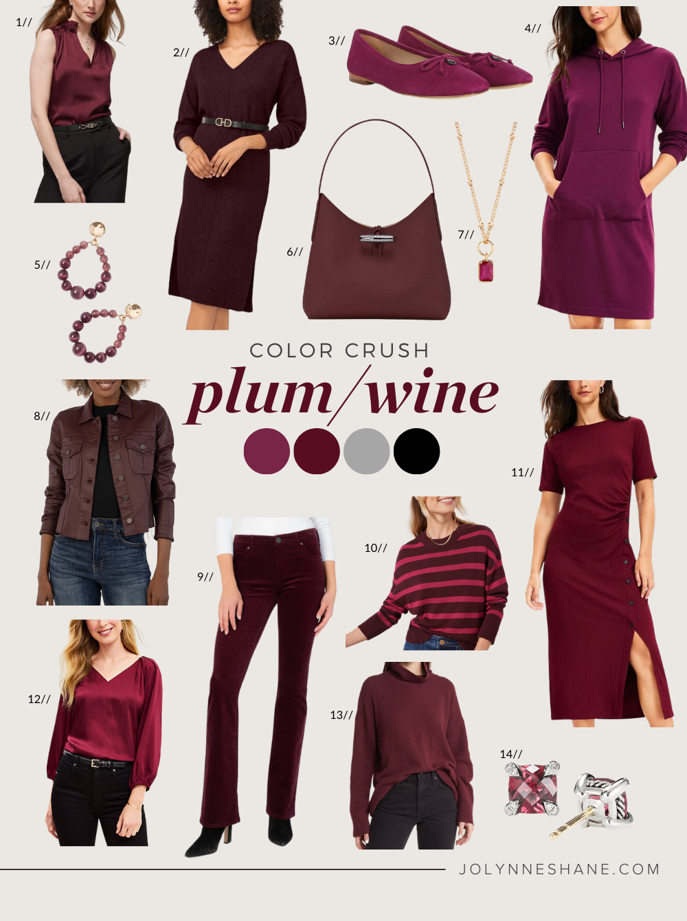
Audience Perception and Market Trends
Finally, while your chosen plum palette should be enduring, it’s wise to remain aware of audience perception and broader market trends. A brand’s color strategy isn’t static; it can subtly evolve to stay relevant. Regularly reviewing how your brand colors resonate with your target demographic and comparing them against competitive landscapes ensures your brand remains fresh, appealing, and distinct. The “right” color match for plum is ultimately the one that best serves your brand’s strategic objectives and connects most effectively with your audience.
aViewFromTheCave is a participant in the Amazon Services LLC Associates Program, an affiliate advertising program designed to provide a means for sites to earn advertising fees by advertising and linking to Amazon.com. Amazon, the Amazon logo, AmazonSupply, and the AmazonSupply logo are trademarks of Amazon.com, Inc. or its affiliates. As an Amazon Associate we earn affiliate commissions from qualifying purchases.