
In the intricate world of brand identity, color is far more than just aesthetic appeal; it’s a powerful psychological tool, a silent communicator of values, and a cornerstone of recognition. When a brand considers combining two distinct and vibrant hues like teal and purple, the question “what color does teal and purple make?” transcends a simple answer from a color wheel. Instead, it transforms into a strategic inquiry about brand perception, visual harmony, and consistent application across diverse media.
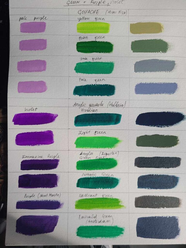
The direct answer to what color teal and purple make depends significantly on the medium and method of combination. In a subtractive color model—the realm of physical pigments like paints, inks, or dyes—mixing teal (a blue-green shade) and purple (a blend of red and blue) typically results in a desaturated, often muddy, dark brownish-grey, or a deep, somber purplish-blue. This is because combining these hues introduces a broad spectrum of pigments that absorb most light, diminishing vibrancy and clarity. Conversely, in an additive color model—the domain of light on digital screens (RGB)—the concept of “mixing” is about overlapping light. While direct overlap would technically lean towards white if all primary colors of light were perfectly combined, in practical digital design, brands are rarely mixing pixels of teal and purple to create a third primary color. Instead, they are positioning these colors adjacent to each other, leveraging their individual and synergistic impact. This distinction is critical for brand strategists who aim for precision and impact, guiding them to focus less on the resulting mixed color and more on the strategic interplay of these two compelling shades within a brand’s overall visual language.
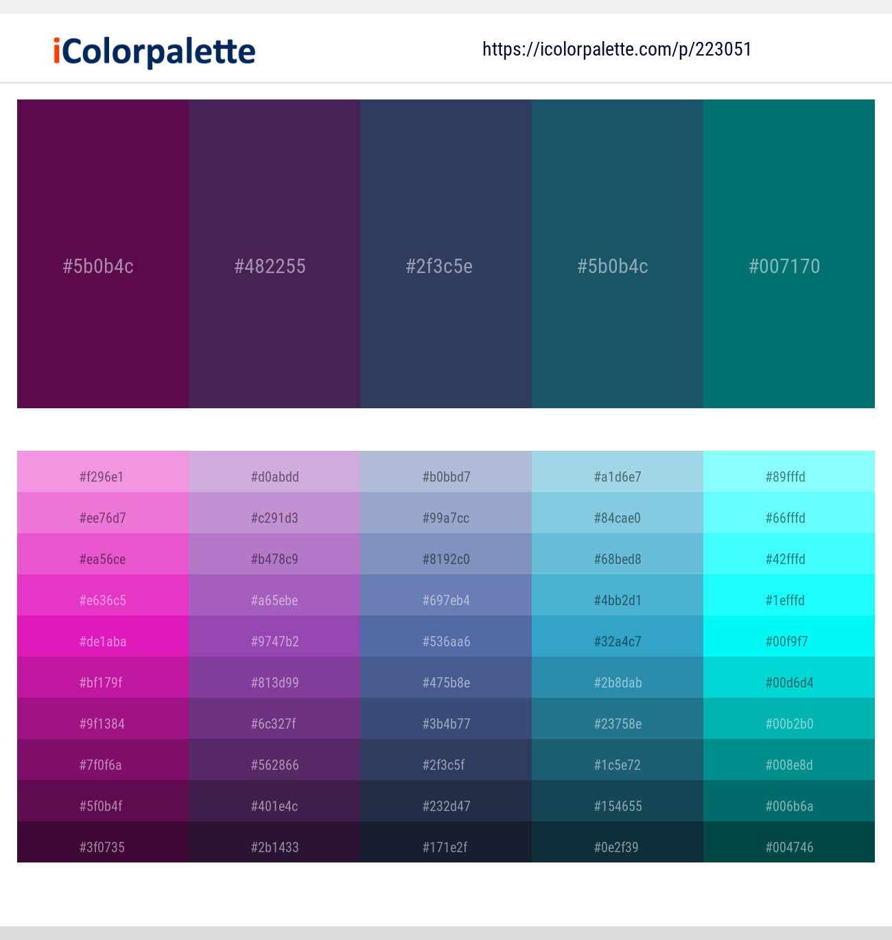
The Science and Art of Color Blending in Brand Identity
Understanding the fundamental principles of color mixing is paramount for any brand aiming for a cohesive and impactful visual identity. The way colors interact physically versus digitally dictates how a brand’s palette is perceived and reproduced across different touchpoints.
Additive Blending: Digital Screens and Light
The additive color model, primarily represented by RGB (Red, Green, Blue), governs how colors are displayed on screens—from websites and mobile apps to digital advertisements and television. When light sources of red, green, and blue are combined, they create lighter colors, eventually producing white light when all three are at full intensity. In this model, teal can be conceived as a mix of green and blue light, while purple is a mix of red and blue light.
For brands, this means that their digital assets featuring teal and purple will display with luminous intensity. The vibrancy of these colors is maximized when backlit by a screen. A brand utilizing a teal and purple palette digitally needs to optimize these colors for RGB values, ensuring they pop with clarity and maintain their intended hue and saturation across various displays, which can have different calibration settings. The focus here is on how these colors coexist and visually complement each other, rather than physically merging into a new third shade.
Subtractive Blending: Print, Paint, and Pigments
The subtractive color model, typically CMYK (Cyan, Magenta, Yellow, Black) for print, or the traditional RYB (Red, Yellow, Blue) for paints, describes how pigments absorb light. When pigments are mixed, they absorb more light, resulting in darker colors. Mixing all primary subtractive colors generally leads to black or a very dark brown.
As established, physically mixing teal and purple pigments will likely yield a muted, desaturated color lacking the vibrancy of the parent hues. This is a critical consideration for brands designing physical collateral like brochures, packaging, merchandise, or outdoor signage. What appears as a bright, crisp teal and purple on a monitor might translate to a duller, less impactful combination when printed, especially if the ink proportions are not carefully managed. Brand guidelines must account for this by specifying CMYK values that closely approximate the RGB digital experience, often requiring meticulous color proofs and the potential use of spot colors (like Pantone) for critical brand elements to ensure consistency. The goal is to prevent the “muddying” effect that can dilute a brand’s visual strength and message.
Teal and Purple: A Strategic Color Duo for Brands
Beyond the mechanics of mixing, the true power of combining teal and purple lies in their individual psychological associations and the synergistic message they convey when strategically paired. Brands select colors not by chance, but by deliberate intention to evoke specific emotions and resonate with their target audience.
The Allure of Teal: Sophistication, Trust, Innovation
Teal, a rich blend of blue and green, embodies a fascinating duality. The calming stability of blue merges with the growth and freshness of green, creating a color often associated with sophistication, tranquility, and trustworthiness. Brands that utilize teal frequently aim to convey a sense of reliability, intelligence, and modern innovation. It’s a color that speaks of clarity, open communication, and forward-thinking vision, often seen in tech, finance, and wellness industries. Its slightly exotic touch adds a layer of uniqueness without being overly aggressive.
The Majesty of Purple: Creativity, Luxury, Mystery
Purple, traditionally linked to royalty and luxury due to the historical rarity of its pigments, carries connotations of creativity, imagination, and wisdom. It’s a color that evokes spiritual depth, artistic flair, and a touch of mystery. Brands aiming for an aura of exclusivity, innovation, or a connection to magic and fantasy often gravitate towards purple. It can signify bold vision, high quality, and a willingness to stand apart. Its range from deep, contemplative shades to vibrant, electric hues offers versatility for various brand personalities.
Synergistic Messaging: What the Combination Conveys
When teal and purple are brought together in a brand’s palette, they create a compelling visual narrative that is greater than the sum of its parts. This duo exudes a modern, imaginative, and forward-thinking energy. The grounded confidence of teal balances the artistic luxury of purple, resulting in a palette that can feel both approachable and aspirational.
- Innovation & Vision: The combination suggests a brand that is on the cutting edge, merging practical intelligence with creative insight.
- Luxury & Modernity: It offers a contemporary take on sophistication, moving beyond traditional gold or silver to something more unique and vibrant.
- Spirituality & Wellness: Both colors have calming and introspective qualities, making them suitable for brands in wellness, mindfulness, or spiritual practices.
- Creativity & Uniqueness: The pairing signals a brand that is not afraid to be different, appealing to audiences who value originality and artistic expression.
This palette often resonates with younger, design-conscious demographics who appreciate brands with a distinctive voice and a blend of the digital and the ethereal.
Navigating the Blend: Practical Applications for Brand Design
Given that direct mixing of teal and purple pigments can be counterproductive for brand clarity, the strategic emphasis shifts to how these two colors are paired and applied within a brand’s ecosystem.
Accentuation and Contrast: Using the Pair Effectively
Effective brand design leverages teal and purple through intelligent placement and balance, rather than trying to blend them into a new primary color.
- Primary and Accent: One color can serve as the dominant primary hue, with the other acting as a powerful accent. For instance, a teal-heavy brand identity might use splashes of purple for call-to-action buttons, key headlines, or graphic elements to draw attention and add a touch of creative flair.
- Visual Hierarchy: The distinctiveness of teal and purple allows designers to create clear visual hierarchy. A logo might be in teal, while secondary text or graphic flourishes are in purple, guiding the user’s eye and segmenting information.
- Avoiding Visual “Mud”: The key is to maintain the individual integrity of each color. This involves careful consideration of ratios, saturation levels, and brightness. Brands typically use complementary neutrals (like whites, greys, or even light pastels) to provide breathing room and prevent the vibrant colors from clashing or becoming overwhelming.
Digital vs. Print: Ensuring Color Fidelity
Maintaining consistent color fidelity across digital and print mediums is a significant challenge for brand managers.
- CMYK vs. RGB Considerations: As discussed, digital RGB values will render differently in CMYK print. A brand’s style guide must provide precise specifications for both. Designers often use color calibration tools and soft proofing to simulate print outcomes on screen.
- Pantone Matching: For critical brand elements like a logo, many brands specify Pantone spot colors. Pantone’s standardized color matching system ensures that a specific shade of teal or purple remains consistent across different printers and materials, circumventing the inherent variations of CMYK printing.
- Consistency Across Collateral: From business cards and stationery to large-format banners and product labels, every piece of marketing collateral must adhere to the defined color palette, reinforcing brand recognition and professionalism.
Beyond the Logo: Extending the Palette
The strategic use of teal and purple extends far beyond the core logo. These colors can infuse brand personality throughout the entire customer journey.
- Website and UI/UX: Used for background elements, interactive components, navigation, and infographics to create an engaging digital experience.
- Social Media Graphics: Employed in branded templates, post designs, and promotional images to ensure instant recognition.
- Product Packaging: Conveys the brand’s premium or innovative quality, setting it apart on shelves.
- Interior Design (Retail Spaces/Offices): Creates an immersive brand experience, influencing mood and perception within physical environments.
- Uniforms and Merchandise: Reinforces brand presence and identity among employees and loyal customers.
Case Studies and Best Practices in Color Harmony
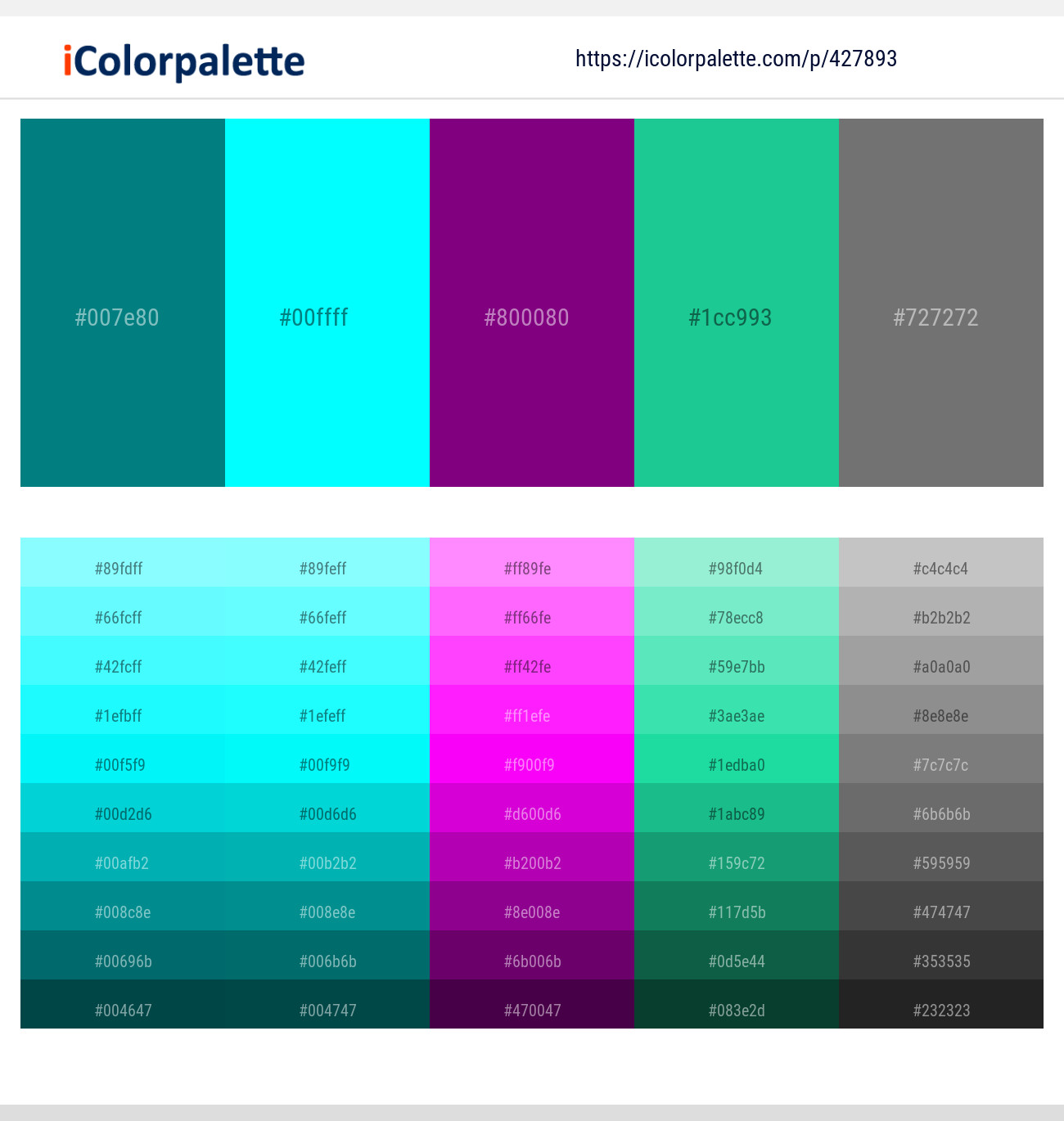
While specific brands might not explicitly state “we mix teal and purple,” observing companies that successfully utilize similar vibrant, often jewel-toned palettes provides valuable lessons. Think of brands in the tech or creative sectors that combine deep blues with vibrant purples or greens—they achieve their striking visual appeal not by literal color mixing, but by strategic juxtaposition and careful balancing.
A key best practice is the development of a comprehensive Brand Style Guide. This essential document outlines the exact hex codes (for digital), RGB, CMYK, and Pantone values for every color in the brand’s palette. It also dictates appropriate usage guidelines, including:
- Primary, secondary, and accent color definitions.
- Approved color combinations and disallowed pairings.
- Minimum contrast ratios for accessibility.
- Guidelines for color application on various backgrounds.
- Rules for iconography, typography, and imagery.
By meticulously defining these parameters, brands ensure that whether teal and purple are subtly integrated or boldly displayed, their individual integrity and collective impact are consistently delivered. The question “what color does teal and purple make?” ultimately shifts from a literal blend to a sophisticated inquiry into how these vibrant hues contribute to a brand’s narrative, perception, and enduring identity in a visually competitive world.
aViewFromTheCave is a participant in the Amazon Services LLC Associates Program, an affiliate advertising program designed to provide a means for sites to earn advertising fees by advertising and linking to Amazon.com. Amazon, the Amazon logo, AmazonSupply, and the AmazonSupply logo are trademarks of Amazon.com, Inc. or its affiliates. As an Amazon Associate we earn affiliate commissions from qualifying purchases.