
The foundational understanding of “what is contrast colour” transcends mere aesthetic appeal; it is a critical pillar in the realm of brand strategy, corporate identity, and effective marketing design. At its essence, contrast colour refers to the perceived difference between two or more colours when placed next to each other. This difference can manifest in various ways: hue (the actual colour, e.g., red vs. blue), saturation (intensity or purity of the colour), and most commonly, value (lightness or darkness). In the context of branding, mastering contrast is not just about making things stand out; it’s about crafting a deliberate visual language that guides perception, enhances usability, and reinforces a brand’s unique message. It determines everything from the legibility of a logo on various backgrounds to the emotional resonance of a marketing campaign. Without a strategic application of contrast, a brand risks appearing muddled, unprofessional, or worse, inaccessible to its target audience. Therefore, understanding this core principle is indispensable for any brand aiming to establish a strong, memorable, and impactful presence in a competitive marketplace. It is the silent workhorse behind visual communication, ensuring clarity and distinction where it matters most for brand recognition and user engagement.

The Core Concept of Contrast in Design
Understanding contrast colour begins with appreciating its fundamental role in visual perception. It’s the visual friction that prevents elements from blending indistinguishably, thereby making them discernible and effective. This principle is not solely confined to differences in hue; rather, it encompasses a broader spectrum of visual attributes that dictate how colours interact and are perceived by the human eye.
Defining Contrast Colour
In a design context, contrast colour is the visual differentiation created by juxtaposing colours with distinct properties. While often intuitively understood as light versus dark, its scope is much wider. High contrast occurs when colours are significantly different in one or more of these attributes:
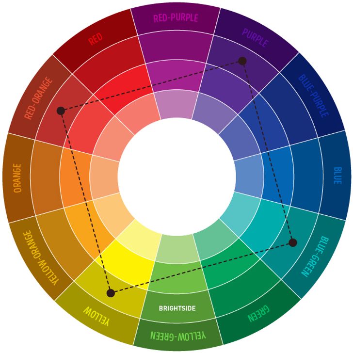
- Hue Contrast: Placing complementary colours (e.g., red and green, blue and orange) or colours far apart on the colour wheel next to each other. This creates a vibrant, energetic distinction.
- Value Contrast: The most straightforward form, involving the difference in lightness or darkness (e.g., black text on a white background, or a dark blue logo on a light grey canvas). This is paramount for readability and hierarchy.
- Saturation Contrast: The difference in the intensity or purity of colours. A highly saturated, vibrant colour next to a desaturated, muted one creates contrast, drawing attention to the former.
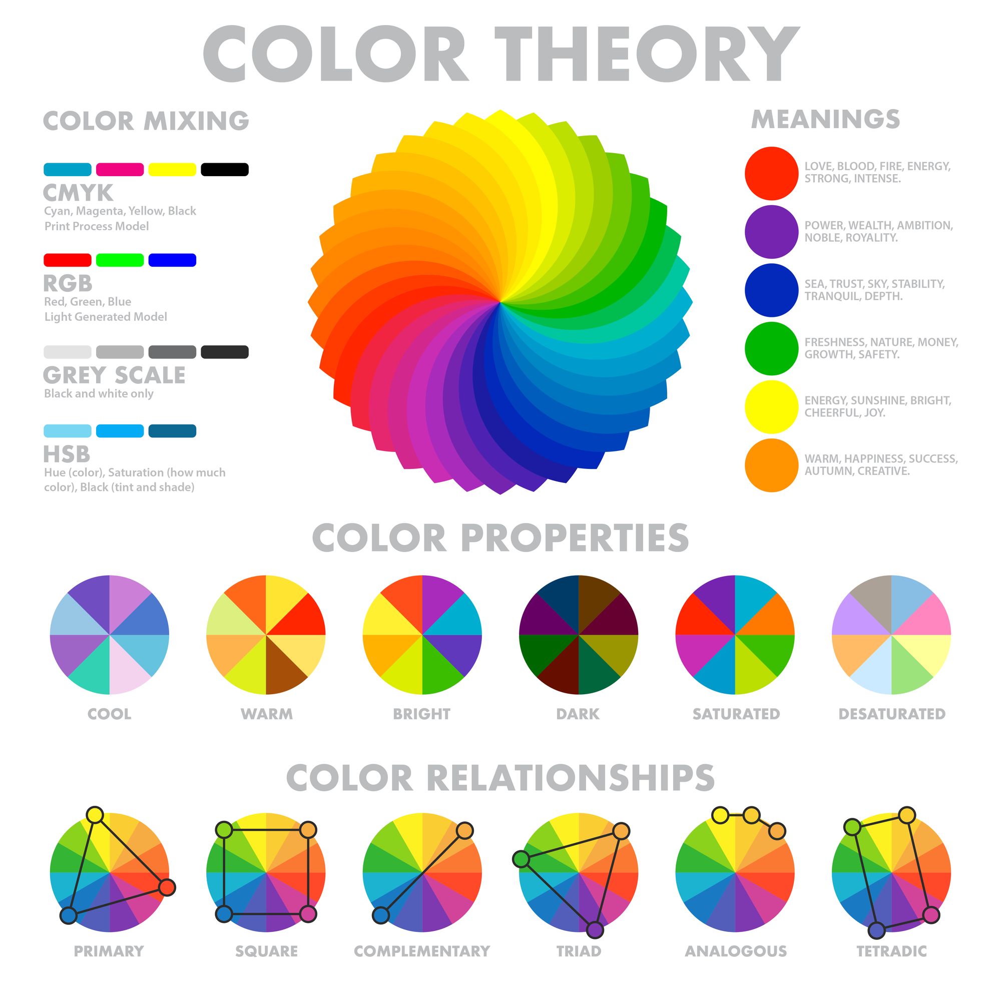
- Temperature Contrast: The difference between warm colours (reds, oranges, yellows) and cool colours (blues, greens, purples). This can evoke different moods and draw attention to specific elements.
- Simultaneous Contrast: An optical phenomenon where the perception of a colour is affected by its surrounding colours. A grey square will appear warmer when placed on a blue background and cooler on a red background. This highlights the dynamic nature of colour perception.
Strategic use of these varying types of contrast allows brands to manipulate focus, evoke specific emotions, and ensure their message is not only seen but also accurately interpreted.
The Psychology of Colour and Contrast
The impact of contrast colour on brand identity extends deep into human psychology. Colours themselves are imbued with cultural, personal, and universal associations. For instance, red often signifies passion or urgency, while blue can convey trust or tranquility. When these colours are used in contrasting ways, the psychological effects are amplified. High contrast can create a sense of urgency, excitement, or clarity, driving attention to key calls to action. Low contrast, conversely, might evoke a feeling of sophistication, calm, or subtlety, often used for luxury brands seeking a softer, more understated aesthetic. The judicious application of contrast can subconsciously influence consumer perception, guide their emotional response, and shape their interaction with a brand. A brand’s colour palette, and the way contrast is managed within it, therefore becomes a powerful non-verbal communicator, speaking volumes about its values, personality, and intended market position even before a single word is read.
Why Contrast Colour Matters for Your Brand Identity
For any brand striving for distinctiveness and effective communication, the strategic application of contrast colour is non-negotiable. It serves multiple critical functions that directly impact how a brand is perceived, interacted with, and remembered.
Enhancing Readability and Accessibility
One of the most fundamental reasons contrast colour matters is its direct correlation with readability and accessibility. For text to be legible, there must be a sufficient contrast between the text colour and its background colour. Insufficient contrast can render text difficult, if not impossible, to read, leading to user frustration and disengagement. This isn’t merely an aesthetic preference; it’s a critical component of inclusive design. Global accessibility standards, such as the Web Content Accessibility Guidelines (WCAG), provide specific ratios for colour contrast to ensure that digital content is perceivable by individuals with various visual impairments, including colour blindness and low vision. A brand that ignores these guidelines risks alienating a significant portion of its potential audience and failing to meet ethical design responsibilities. Ensuring high contrast in crucial areas like navigation, body text, and calls-to-action is paramount for a brand’s digital presence, marketing materials, and overall user experience.
Creating Visual Hierarchy and Focus
Beyond simple readability, contrast colour is an indispensable tool for establishing visual hierarchy within a brand’s assets. By strategically varying contrast, designers can guide the viewer’s eye, directing attention to the most important elements first. High-contrast elements naturally stand out, signifying importance or a primary call to action (e.g., a brightly coloured “Buy Now” button against a subdued background). Lower contrast can be used for secondary information or supporting details, allowing them to recede slightly without disappearing entirely. This deliberate arrangement helps consumers quickly process information, understand the brand’s message, and engage with content in a structured, intuitive manner. Without effective visual hierarchy, a design can appear cluttered and overwhelming, causing critical brand messages to be lost in the noise. Contrast, therefore, empowers brands to control narrative flow and ensure key information is absorbed efficiently.
Evoking Emotion and Brand Personality
The emotional impact of a brand is profoundly influenced by its visual identity, and contrast colour plays a significant role in this. Different levels and types of contrast can evoke distinct feelings and reinforce a brand’s personality. High-contrast colour palettes often convey energy, dynamism, modernity, and a bold stance, suitable for tech startups, sports brands, or companies looking to make a strong statement. Conversely, low-contrast palettes, utilizing subtle shifts in value or saturation, can communicate sophistication, luxury, tranquility, or understated elegance, often favoured by high-end fashion, wellness brands, or premium services. The interplay of contrasting colours can also be used to create specific moods—a vibrant complementary contrast might suggest creativity and playfulness, while a monochromatic scheme with subtle value shifts could imply seriousness and professionalism. By carefully curating their contrast strategy, brands can consistently communicate their core values and emotional essence, fostering deeper connections with their target audience and building a strong, resonant brand personality.
Strategic Application of Contrast Colours in Branding and Marketing
The theoretical understanding of contrast colour truly comes to life when applied strategically across various brand touchpoints. Its effective deployment is crucial for building a cohesive and impactful corporate identity that resonates across all marketing efforts.
Logo Design and Brand Marks
The logo is often the cornerstone of a brand’s visual identity, and contrast colour is fundamental to its effectiveness. A well-designed logo utilizes contrast to ensure immediate recognition and versatility across diverse applications. This means ensuring the logo maintains its integrity and impact whether it’s displayed on a website, embroidered on merchandise, printed on a business card, or scaled down for an app icon. High value contrast (e.g., dark against light) is typically critical for legibility, especially when the logo needs to be reversed or used on varying backgrounds. Strategic hue contrast can make a logo pop and differentiate it from competitors. For instance, a brand might use a primary colour for its wordmark and a contrasting accent colour for an accompanying symbol, creating visual interest without sacrificing clarity. The thoughtful application of contrast ensures the logo is not only aesthetically pleasing but also functional and adaptable, maintaining its brand recognition power in any context.
Website and Digital Presence
In the digital realm, contrast colour is paramount for user experience (UX) and engagement. A brand’s website, mobile app, and social media profiles rely heavily on contrast to guide users, facilitate navigation, and ensure content is consumable. Primary calls-to-action (CTAs) are frequently designed with high colour contrast to ensure they stand out and prompt user interaction. Navigation menus, headings, and body text require sufficient contrast against their backgrounds to be easily readable across different devices and viewing conditions. Brands must also consider the contrast between interactive elements (buttons, links) and static content to indicate functionality clearly. Beyond usability, contrast contributes to the overall aesthetic and emotional tone of the digital experience. A tech brand might use bold, high-contrast colours to convey innovation and energy, while a luxury service might opt for more subtle, lower-contrast palettes to communicate sophistication and exclusivity. Consistent application of a well-planned contrast strategy across all digital assets reinforces brand identity and optimizes the user journey.
Marketing Collateral and Advertising
From print advertisements to digital banners, brochures, and email campaigns, marketing collateral hinges on effective contrast colour to capture attention and convey messages clearly. In a crowded advertising landscape, distinct contrast helps a brand’s message cut through the noise. High contrast can draw the eye to a headline, a product image, or a promotional offer, ensuring the key selling points are immediately apparent. Consider a direct mail piece: a stark contrast between a compelling headline and its background will significantly increase the likelihood of it being read. In digital advertising, banners often use bold, contrasting colours to create a sense of urgency or excitement, driving clicks and conversions. Furthermore, contrast can be leveraged to establish thematic consistency across different campaigns, strengthening brand recognition over time. A brand might employ a specific contrast pairing (e.g., a vibrant yellow against a deep purple) that becomes synonymous with its campaigns, creating a unique visual signature that aids recall and differentiation.
Product Packaging and Physical Touchpoints
For brands with physical products, packaging is a crucial touchpoint where contrast colour plays a vital role. Effective packaging design uses contrast to make the product stand out on a crowded shelf, communicate key information quickly, and evoke the desired brand perception. A product aimed at children might use vibrant, high-contrast colours to convey playfulness and energy, while a premium organic food brand might use muted, earthy tones with subtle contrast to suggest naturalness and sophistication. Contrast also ensures critical information, such as product names, ingredients, or usage instructions, is legible and easily accessible. Beyond packaging, contrast extends to other physical brand manifestations, such as retail store interiors, employee uniforms, and event signage. A retail environment might use contrasting textures and colours to delineate different product zones or highlight promotional displays. Consistent and strategic application of contrast colour across all physical touchpoints reinforces the brand’s identity, enhances the customer experience, and contributes to memorable brand interactions.
Best Practices for Effective Contrast Colour Use
Implementing contrast colour effectively requires more than just an intuitive eye; it demands adherence to best practices that ensure consistency, accessibility, and brand alignment.
Adhering to Accessibility Standards (WCAG)
A fundamental best practice is to always design with accessibility in mind, particularly concerning WCAG (Web Content Accessibility Guidelines). These guidelines provide specific contrast ratio requirements for text and interactive elements to ensure content is perceivable by individuals with visual impairments. For example, WCAG 2.1 specifies a minimum contrast ratio of 4.5:1 for regular text and 3:1 for large text. Brands should utilize readily available online tools and browser extensions to test their colour combinations against these standards. Prioritizing accessibility not only broadens a brand’s reach and demonstrates social responsibility but also often results in designs that are clearer and more usable for everyone. It’s a proactive step that protects a brand from potential legal challenges and reinforces a positive brand image as inclusive and thoughtful.
Balancing Harmony and Impact
While high contrast is often effective for drawing attention, effective brand design requires a nuanced balance between contrast and harmony. Too much harsh contrast can lead to visual fatigue and an overwhelming aesthetic, making a brand appear aggressive or disjointed. Conversely, too little contrast can make a brand appear bland, unreadable, or indistinguishable. The goal is to create impactful designs that also feel cohesive and aesthetically pleasing. This involves understanding colour theory – using analogous colours for harmony and complementary colours for impact – and employing varying levels of contrast strategically across different elements. A brand might use high contrast for its call-to-action buttons, moderate contrast for headings, and lower contrast for subtle background patterns, all while maintaining a consistent overall brand palette. This balance ensures that the brand’s visual identity is both engaging and comfortable to interact with.
Consistency Across All Brand Assets
One of the hallmarks of a strong brand identity is consistency. The chosen contrast colour strategy must be uniformly applied across all brand assets – from the logo and website to marketing campaigns, social media graphics, and physical products. This means establishing clear brand guidelines that define primary, secondary, and accent colours, along with specific rules for their contrasting use. These guidelines should dictate how text interacts with backgrounds, how interactive elements are distinguished, and how visual hierarchy is maintained. Consistent application of contrast reinforces brand recognition, builds familiarity, and strengthens the overall corporate identity. Discrepancies in contrast use across different platforms can lead to a fragmented brand experience, undermining professionalism and confusing the target audience.
Testing and Iteration
Effective contrast colour strategy is rarely achieved in a single stroke; it often requires a process of testing and iteration. Before a brand’s visual identity is fully launched, or when new campaigns are developed, it is crucial to test how colour contrasts perform across different mediums and audiences. This might involve A/B testing different colour combinations on landing pages, conducting user experience (UX) research to gather feedback on readability and visual appeal, or simply reviewing designs on various screens and print materials. Testing helps identify potential issues with legibility, emotional resonance, or overall impact before they become widespread problems. Iteration, based on these insights, allows brands to refine their contrast strategy, ensuring it is optimized for clarity, impact, and alignment with brand objectives. This iterative approach ensures that the brand’s visual language remains dynamic, effective, and responsive to user needs and market trends.
aViewFromTheCave is a participant in the Amazon Services LLC Associates Program, an affiliate advertising program designed to provide a means for sites to earn advertising fees by advertising and linking to Amazon.com. Amazon, the Amazon logo, AmazonSupply, and the AmazonSupply logo are trademarks of Amazon.com, Inc. or its affiliates. As an Amazon Associate we earn affiliate commissions from qualifying purchases.