
In the vibrant spectrum of branding, where every color is meticulously chosen to convey a specific message, white and black stand out as paradoxes. They are not merely colors in the traditional sense, but rather the absence and presence of all light, forming the very foundation upon which visual communication is built. Far from being simplistic, their meanings are profound, multifaceted, and strategically deployed to sculpt powerful brand identities. Understanding what white and black mean in the context of branding is to grasp the essence of clarity, sophistication, and timeless appeal.

The Foundational Power of Monochrome in Branding
The reliance on white and black in branding is not a coincidence; it’s a deliberate strategic choice that taps into deep psychological associations and visual principles. When a brand opts for a monochrome palette, it’s making a statement that transcends fleeting trends and speaks to the core of its values.
Simplicity and Sophistication
One of the most immediate meanings conveyed by white and black is simplicity. In a world saturated with information and visual noise, a brand that embraces monochrome often signals a commitment to clarity and focus. This simplicity, however, is not unsophisticated. Quite the opposite: it suggests a refined aesthetic, a confidence that doesn’t need overt embellishment to make an impact. Think of luxury brands that use stark black and white photography, or tech companies with minimalist white interfaces; they communicate a polished, high-end experience through restraint. This sophistication comes from the understanding that true elegance often lies in subtraction, allowing the core message or product to shine without distraction.
Timelessness and Versatility
Unlike trend-driven color palettes that can quickly feel dated, white and black possess an inherent timelessness. They are always in style, perpetually modern, and adaptable across various eras and cultural contexts. This enduring quality makes them a safe yet impactful choice for brands aiming for longevity and universal appeal. Furthermore, their versatility is unmatched. A monochrome palette can serve as a robust framework for an entire brand system, easily integrating with other colors when needed, or standing strong on its own. They provide a stable visual anchor, ensuring brand recognition remains consistent whether applied to a logo, website, packaging, or advertising campaign.
Strategic Contrast and Focus
The inherent opposition of white and black creates the strongest possible visual contrast. This dynamic interplay is a powerful tool for guiding the viewer’s eye, establishing hierarchy, and enhancing readability. In branding, this contrast is used to draw attention to key elements, delineate different sections of content, or create a dramatic visual impact. It forces focus, stripping away distractions and directing the audience to what truly matters – the brand’s message, product, or unique selling proposition. This strategic use of contrast ensures that a brand’s communication is not just seen, but clearly understood and remembered.
White: The Canvas of Clarity and Purity
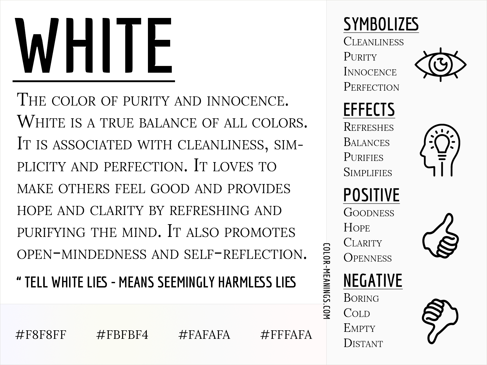
White, often perceived as a non-color, plays an indispensable role in branding as a symbol of new beginnings, openness, and pristine clarity. Its strategic deployment can profoundly influence how a brand is perceived, setting a tone of freshness and integrity.
Embracing Minimalism and Modernity
In contemporary branding, white is synonymous with minimalism and modernity. Brands aiming to project a sleek, cutting-edge, and uncluttered image frequently make white their dominant color. This isn’t merely an aesthetic choice; it communicates a brand ethos focused on efficiency, user-friendliness, and forward-thinking design. White space, often referred to as “negative space,” is crucial in this context, providing room for elements to breathe and enhancing the overall visual experience. Brands like Apple have masterfully utilized white to suggest simplicity, innovation, and a seamless user experience across their product lines and marketing.
Conveying Openness and Trust
White inherently suggests transparency, honesty, and purity. For brands that prioritize trustworthiness and ethical practices, white can be a powerful symbolic choice. It evokes a sense of cleanliness, safety, and reliability, which is particularly valuable in industries such as healthcare, finance, and wellness. A predominantly white brand environment can make customers feel at ease, fostering a sense of openness and reducing perceived complexity or hidden agendas. This perceived purity can translate directly into brand loyalty and confidence.
The Power of Negative Space
Beyond its direct meaning, white’s most potent role in design is often as negative space. It’s the silent partner that makes other elements stand out. When used effectively, white space isn’t empty; it’s an active design element that organizes information, reduces cognitive load, and enhances comprehension. It can create a sense of sophistication and spaciousness, elevating the perceived value of the brand. Brands leverage negative space to frame their core messages, create elegant layouts, and ensure that their visual assets are not just seen, but truly appreciated for their design.
Black: The Embodiment of Authority and Elegance
Black, the deepest and most profound of all hues, carries a weighty significance in branding. It is a color that commands respect, exudes power, and often signals an unspoken promise of quality and exclusivity.
Projecting Luxury and Exclusivity
Perhaps black’s most recognized meaning in branding is its association with luxury, sophistication, and exclusivity. High-end fashion houses, premium automotive brands, and exclusive lifestyle products frequently adopt black as their primary brand color. It creates an aura of desirability, suggesting premium quality, craftsmanship, and an elevated experience. The depth of black implies a certain gravitas and expense, signaling that a brand’s offerings are not for everyone, thereby enhancing their perceived value and allure. Think of the iconic black packaging of many luxury goods – it immediately communicates prestige.
Signifying Power and Strength
Beyond luxury, black also signifies power, authority, and strength. It’s a color that asserts dominance and confidence, making it a popular choice for brands that want to convey leadership, stability, and gravitas. This can be seen in corporate branding for financial institutions, law firms, or security companies, where projecting an image of unwavering competence and control is paramount. Black suggests seriousness and professionalism, implying that the brand is formidable, reliable, and capable of handling significant responsibilities.
The Allure of Mystery and Depth
Black also carries an element of mystery and depth. It can evoke a sense of the unknown, of intrigue, and sophisticated complexity. Brands that wish to hint at a rich heritage, intricate processes, or a unique, enigmatic appeal might leverage black to create this effect. This mysterious quality can draw consumers in, inviting them to explore further and discover the brand’s hidden depths. It’s a color that doesn’t reveal everything at once, fostering a sense of curiosity and intellectual engagement.
The Dynamic Duo: Synergies in Brand Messaging
While white and black each possess potent individual meanings, their combined power is often greater than the sum of their parts. Their synergy in branding creates a dynamic tension and balance that is both visually arresting and deeply meaningful.
Crafting Visual Harmony and Tension
The pairing of white and black creates an intrinsic visual harmony born from contrast. This duality can be used to represent balance, opposing forces, or a spectrum of possibilities. Brands can use this to signify clarity against complexity, tradition against modernity, or simply to create a striking, memorable visual identity. The tension between them can be resolved into a cohesive, impactful message that captures attention without overwhelming it. This balance is crucial for creating logos, website designs, and marketing materials that feel complete and well-considered.
Enhancing Readability and Accessibility
From a practical standpoint, the high contrast between white and black is foundational for readability and accessibility. Black text on a white background (or vice versa) is the most legible combination, making it the standard for print, digital interfaces, and all forms of textual communication. For brands committed to inclusivity, leveraging this fundamental contrast ensures their messaging is clear and accessible to the widest possible audience, regardless of visual impairments or screen conditions. This isn’t just good design; it’s responsible branding.
Building a Distinctive Brand Persona
The strategic combination of white and black allows brands to build a distinctive persona that is both strong and adaptable. A brand might use black for its primary logo to convey luxury and power, while utilizing generous white space across its website to suggest openness and ease of use. This thoughtful interplay helps sculpt a nuanced brand personality that communicates depth, intelligence, and refined taste, setting it apart in a crowded marketplace. It allows for a sophisticated interplay of meanings, creating a brand that is perceived as multi-dimensional and thoughtfully constructed.
Strategic Application and Common Pitfalls
Mastering the use of white and black in branding requires not just an understanding of their meanings, but also strategic foresight in their application.
When to Leverage Monochrome
Brands should consider a white and black palette when their core values align with clarity, sophistication, luxury, authority, or timelessness. It is particularly effective for brands aiming for a high-end positioning, those requiring a clean and modern aesthetic, or those needing robust visual consistency across diverse applications. It can also be a powerful choice for brands wanting to emphasize content, product form, or photography, allowing these elements to take center stage without color competition. When starting a personal brand, a minimalist black and white approach can immediately convey professionalism and seriousness, establishing a strong, no-nonsense presence.

Avoiding Sterility or Overwhelm
While powerful, an exclusive reliance on white and black can sometimes lead to a perception of sterility, coldness, or even an absence of personality if not handled carefully. Brands must ensure that sufficient texture, imagery, or thoughtful design elements are present to prevent the aesthetic from feeling stark or uninviting. Conversely, an excessive use of black can feel oppressive or overly serious. The art lies in balance: understanding the nuances of how much white space to incorporate, when to allow a splash of color as an accent, or how to use typography and imagery to add warmth and character, ensures that the brand’s monochrome identity remains engaging and reflects its unique spirit, rather than becoming a bland void. For corporate identity, achieving this balance means that while the core elements remain pristine, marketing collateral can still resonate with emotion where appropriate.
Ultimately, white and black are far more than just colors in branding; they are potent communicators of identity, values, and aspiration. By meticulously understanding what white and black mean, brands can forge an identity that is not only visually striking but deeply resonant, enduring, and impactful.
aViewFromTheCave is a participant in the Amazon Services LLC Associates Program, an affiliate advertising program designed to provide a means for sites to earn advertising fees by advertising and linking to Amazon.com. Amazon, the Amazon logo, AmazonSupply, and the AmazonSupply logo are trademarks of Amazon.com, Inc. or its affiliates. As an Amazon Associate we earn affiliate commissions from qualifying purchases.