
The red poppy, far more than a simple flower, stands as one of the most potent and universally recognized brand symbols in England. Its significance transcends mere botanical representation, acting as a profound emblem of national identity, collective memory, and a sophisticated exercise in public relations and brand management for a cause. When analyzed through the lens of branding, the poppy exemplifies how a symbol can be meticulously curated, communicated, and embedded within a nation’s cultural fabric, building unparalleled brand equity that resonates across generations.
The Poppy as a Cornerstone of National Identity and Heritage Branding
At its core, the red poppy functions as a cornerstone of England’s heritage branding, articulating values of remembrance, sacrifice, and community. Its journey from a battlefield sight to a national emblem is a case study in how a symbol can be imbued with profound meaning and strategically positioned as an indispensable element of corporate (or national) identity.
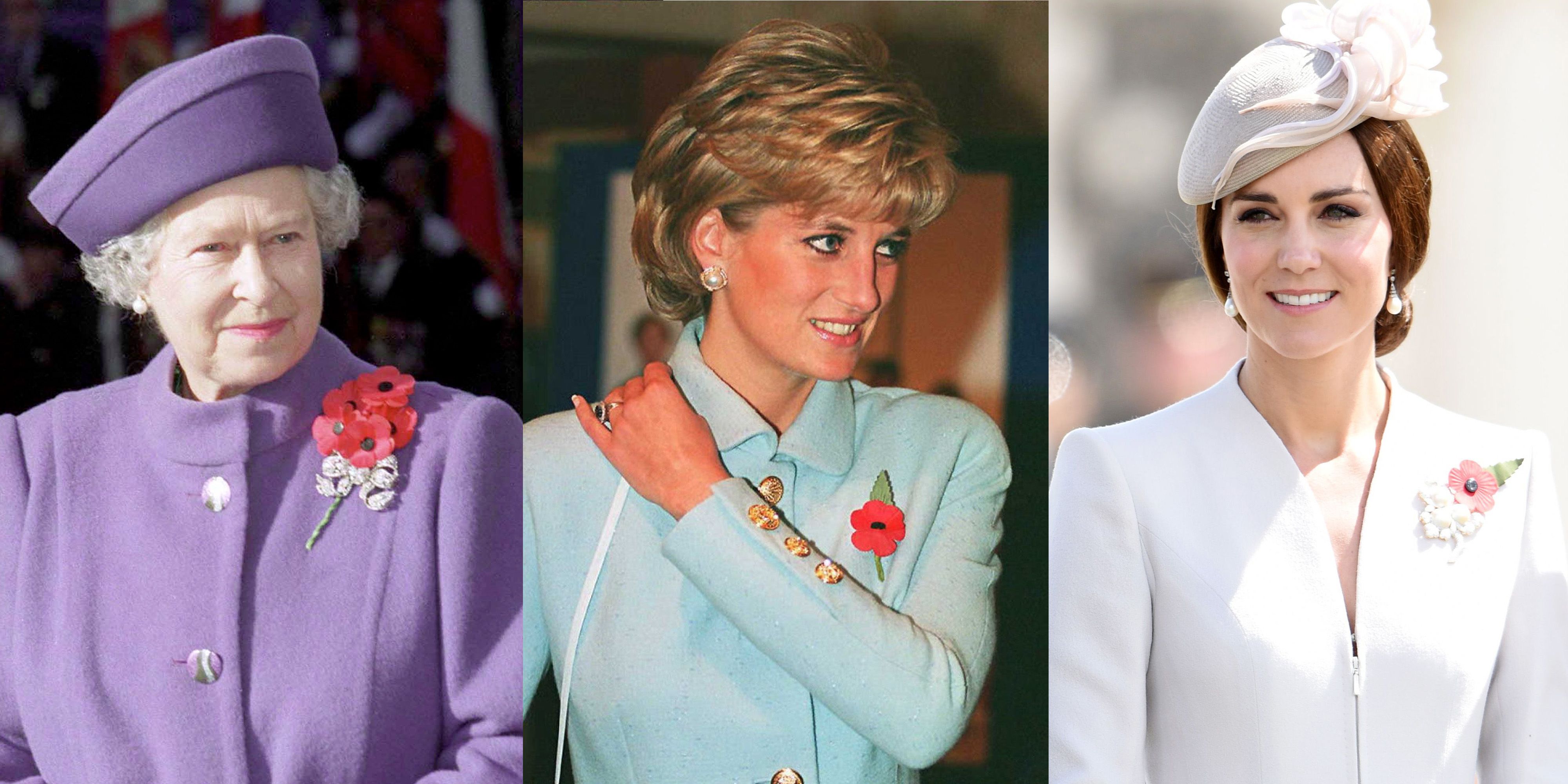
From Battlefield to National Emblem: The Genesis of a Brand Symbol
The genesis of the poppy’s powerful brand story traces back to the desolate battlefields of World War I, particularly in Flanders. The striking sight of vibrant red poppies flourishing in the churned-up soil, fertilized by the conflict, inspired Canadian doctor Lieutenant-Colonel John McCrae’s poignant poem, “In Flanders Fields.” This initial artistic association was the first step in creating a narrative that would define the poppy’s brand.
The crucial move towards its institutionalization came through the efforts of American academic Moina Michael and later, Frenchwoman Anna Guérin, who championed the poppy as a symbol of remembrance. Guérin’s vision to sell fabric poppies to aid devastated regions of France and Belgium laid the groundwork for a tangible, marketable product tied to the symbol. It was Field Marshal Douglas Haig, a founder of The Royal British Legion (RBL), who brought this concept to the UK. The RBL, established in 1921, formally adopted the poppy as its emblem for the inaugural Poppy Appeal, strategically positioning it as the symbol of remembrance for those who died in conflict and a means to support surviving veterans and their families. This adoption was a pivotal moment in establishing the poppy’s brand identity, giving it an organizational home and a clear mission.
Crafting a Collective Narrative: The Poppy’s Role in National Storytelling
The poppy’s success as a national brand symbol lies in its ability to craft and communicate a compelling collective narrative. It transcends individual memory, becoming a shared story of national sacrifice, resilience, and gratitude. The symbol communicates core values: sacrifice in the defence of freedom, the imperative of remembering those lost, the solace of peace, and the collective duty to support veterans.
Through annual campaigns and widespread public participation, the poppy’s brand voice is one of solemn reflection, dignified commemoration, and unwavering support. It is seamlessly integrated into national ceremonies, public discourse, and educational curricula, ensuring its message of remembrance is consistently reinforced. This deliberate embedding within the national consciousness elevates the poppy from a mere symbol to a cultural artifact, essential to England’s unique brand story and identity.
Strategic Communication and Brand Management of the Poppy
The enduring power and resonance of the red poppy are not accidental; they are the result of meticulous strategic communication and diligent brand management, primarily orchestrated by The Royal British Legion. The RBL acts as the primary custodian of the poppy’s brand, ensuring its meaning remains clear, its integrity protected, and its relevance sustained.
The Royal British Legion: Custodians of the Poppy Brand
The Royal British Legion’s role in safeguarding the poppy’s brand is paramount. They operate as brand guardians, vigilantly protecting the symbol’s meaning from dilution or misappropriation. This involves strict guidelines on its use, challenging attempts to commercialize it inappropriately, and addressing evolving interpretations that might stray from its core message of remembrance and support for the Armed Forces community.
Their public relations efforts are continuous, ensuring that the origins, purpose, and significance of the poppy are regularly communicated to the public. Through media campaigns, educational initiatives, and community engagement, the RBL reinforces the brand’s authenticity and emotional weight. They manage public perception, navigate complex social discussions around war and memory, and ensure the poppy remains a unifying symbol, adeptly handling any challenges to its established brand identity.
Marketing Remembrance: Engaging the Public and Sustaining Brand Value
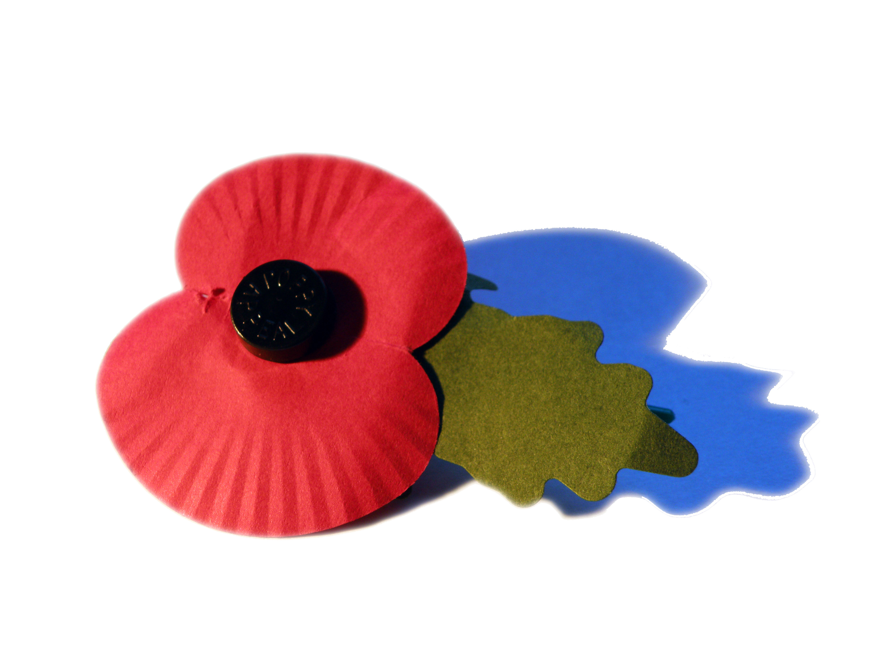
The annual Poppy Appeal is a masterclass in non-profit marketing and community engagement. It is arguably one of the most successful fundraising campaigns globally, leveraging the emotional brand equity of the poppy to encourage widespread participation. The campaign strategically utilizes a multi-channel approach: from physical collection tins and volunteer engagement in public spaces to digital campaigns across social media, websites, and traditional media advertisements.
The power of visual repetition and widespread distribution is central to its marketing success. Seeing millions of people across the country wearing the poppy creates a powerful sense of collective identity and shared purpose, reinforcing the brand’s visibility and cultural significance. This pervasive presence during the period leading up to Remembrance Day acts as an annual ‘brand refresh,’ reaffirming its message and ensuring its enduring value to the public. The success of the Poppy Appeal demonstrates how a strong brand, effectively marketed, can mobilize vast public support and financial contributions for a cause.
Design, Recognition, and Emotional Brand Equity
Beyond its historical roots and strategic management, the poppy’s inherent design and the emotional resonance it evokes are critical components of its brand success. Its visual impact and the deep feelings it stirs contribute significantly to its brand equity.
The Enduring Design: Simplicity and Impact
The poppy’s visual design is deceptively simple yet profoundly impactful. Its distinct red petals, often with a black centre, are instantly recognizable. This simplicity is a key strength, making it easily reproducible across various mediums – from fabric pins and wreaths to digital graphics and artistic representations. The bold red colour is inherently associated with sacrifice, passion, and vitality, subtly communicating the themes of bloodshed and life lost, yet also the enduring spirit of remembrance. The contrast with the black centre adds depth and focus, grounding the vibrant red. This effective visual branding ensures high recognition and immediate association with its intended meaning, requiring no complex interpretation.
Building Emotional Resonance: The Brand’s Deep Connection
The poppy is not merely a logo; it’s a powerful emotional trigger. Its brand equity is built on decades of collective memory, personal stories, and shared national experiences. For many, wearing the poppy is an act of personal commitment, a silent pledge to remember. This emotional attachment drives engagement, from volunteering for the appeal to making donations and participating in ceremonies.
The poppy’s brand success can be measured not just in fundraising totals, but in its ability to consistently evoke feelings of gratitude, solemnity, and respect across a diverse population. It fosters a sense of unity and shared responsibility, making it an indispensable part of the national emotional landscape. This deep emotional connection is the ultimate testament to its brand strength, transforming a simple flower into a powerful symbol of collective identity and enduring values.
Evolving Interpretations and Brand Adaptation
Like any enduring brand, the poppy has faced the challenge of evolving interpretations and the necessity of adaptation to remain relevant across changing societal contexts. Managing these nuances is crucial for sustaining its long-term brand equity.
Navigating Modernity: Addressing Nuance and Controversy
Over the decades, the poppy’s symbolism has sometimes been subject to various interpretations or even controversy. Discussions around its perceived political implications, the emergence of alternative symbols like the white poppy (for peace) or the black poppy (for commemorating Commonwealth soldiers of colour), challenge the singular narrative. For the poppy brand, navigating these discussions requires careful communication and a commitment to its core message.
The Royal British Legion often reiterates that the red poppy represents remembrance and hope for a peaceful future, is non-political, and honors all who have fallen, regardless of conflict. This consistent brand messaging is vital in retaining broad appeal and preventing the symbol from becoming divisive. It’s an ongoing exercise in maintaining brand focus while acknowledging a more complex, nuanced public discourse.
Future-Proofing the Poppy Brand: Sustaining Relevance for New Generations
To ensure the poppy brand continues to resonate with future generations, strategies must include engaging younger audiences through contemporary communication channels. This involves a strong digital presence, utilizing social media, interactive educational content, and partnerships with youth organizations. The narrative must evolve to connect historical events with contemporary understanding, making the lessons of remembrance relevant to a world vastly different from the one that gave birth to the symbol.
By balancing its rich tradition with modern relevance, the Royal British Legion works to future-proof the poppy brand, ensuring its powerful message of remembrance, sacrifice, and community support remains a vital part of England’s national identity for centuries to come. The red poppy thus stands as a testament to the enduring power of a well-managed symbol to shape national consciousness and rally collective action.
aViewFromTheCave is a participant in the Amazon Services LLC Associates Program, an affiliate advertising program designed to provide a means for sites to earn advertising fees by advertising and linking to Amazon.com. Amazon, the Amazon logo, AmazonSupply, and the AmazonSupply logo are trademarks of Amazon.com, Inc. or its affiliates. As an Amazon Associate we earn affiliate commissions from qualifying purchases.