
Emerald green is more than just a shade; it is a declaration. Within the intricate world of branding and design, understanding the visual nuances and psychological impact of a specific color like emerald green is paramount. It is a hue that commands attention, evoking a rich tapestry of associations that can profoundly influence a brand’s identity, perception, and market positioning. To truly grasp “what emerald green looks like” from a strategic branding perspective, one must delve beyond its surface appearance into its technical characteristics, symbolic resonance, and tactical applications.
Defining Emerald Green: A Visual and Technical Deconstruction
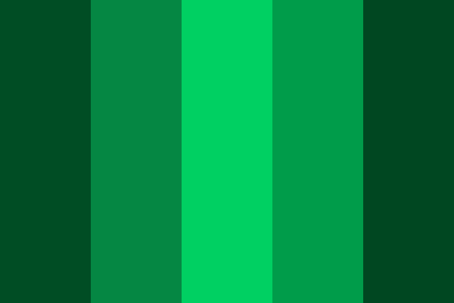
At its core, emerald green is a vivid, deep green, characterized by a distinct blueish undertone. Its namesake, the precious gemstone emerald, perfectly encapsulates its defining qualities: richness, clarity, and an almost luminous depth. Unlike a forest green, which might be earthier and more muted, or a lime green, which is brighter and yellower, emerald green possesses a refined intensity that sets it apart.

The Hue, Saturation, and Brightness Spectrum
Technically, emerald green occupies a specific position on the color wheel. Its primary hue is unequivocally green, but with a significant shift towards blue. This blue component is crucial; it lends the color its cool sophistication, preventing it from appearing overly naturalistic or rustic. When describing its appearance, consider its spectral composition:
- Hue: A pure, vibrant green with a clear blue bias. It’s not a yellow-green or a warm green, but rather a cool, crisp green.
- Saturation: Typically high. Emerald green is not a pastel or desaturated color; it boasts a powerful, concentrated pigment that demands attention. This high saturation contributes to its jewel-like quality and visual strength.
- Brightness (or Value): Medium to dark. While vibrant, emerald green is rarely light or airy. Its depth is a key characteristic, often appearing rich and substantial rather than frivolous. It holds its own against darker tones and offers a compelling contrast with lighter elements.
This combination of a cool-leaning hue, high saturation, and medium-to-dark brightness creates a color that is simultaneously vibrant and sophisticated, natural and luxurious. Its clarity makes it feel clean and precise, while its depth provides a sense of gravitas.
Distinguishing Emerald from Other Greens
To truly appreciate emerald green’s distinctiveness, it helps to compare it to other prominent green shades often used in branding:
- Forest Green: Tends to be darker, often with warmer, yellowish-brown undertones, mimicking dense foliage. Emerald green is brighter and cooler.
- Lime Green: Much lighter, brighter, and significantly yellower, evoking fresh citrus or spring growth. It has a more energetic, almost playful feel compared to emerald’s gravitas.
- Mint Green: A very pale, desaturated green, often with a hint of blue, characterized by its softness and airy quality. Emerald green is robust and saturated.
- Teal: While also a blue-green, teal typically leans much more heavily into the blue spectrum and is often darker and deeper, sometimes approaching a dark cyan. Emerald green maintains a stronger, more direct green identity with just a blue influence.
Emerald green strikes a unique balance, sitting in a space that is both refreshing and profound, making it a highly versatile and impactful choice for designers seeking a green that speaks volumes.
The Brand Psychology of Emerald Green: Perceptions and Associations
The visual characteristics of emerald green directly translate into powerful psychological and symbolic associations, making it a strategic asset in brand communication. Colors are not merely decorative; they are non-verbal cues that shape perceptions, evoke emotions, and communicate brand values. Emerald green, with its specific visual makeup, carries a rich lexicon of meanings.
Conveying Luxury, Sophistication, and Exclusivity
The most immediate association with emerald green, due to its gemstone namesake, is one of luxury and high value. This isn’t just about the jewel; it’s about the inherent richness and depth of the color itself.
- Richness: Its high saturation and deep tone give it a ‘full’ and substantial appearance, often linked to quality craftsmanship and premium materials.
- Sophistication: The blue undertone cools the green, moving it away from raw nature and towards a more refined, elegant aesthetic. It suggests discerning taste and a commitment to excellence.
- Exclusivity: Due to its association with precious stones, emerald green can imply scarcity and uniqueness. Brands using this color often aim to position themselves as premium, offering products or services that are not for the mass market but for an elite or discerning clientele. This makes it a popular choice for high-end fashion, jewelry, automotive, and hospitality brands.
Evoking Nature, Growth, and Serenity
Beyond luxury, emerald green firmly anchors itself in associations with nature. It is the color of lush, verdant landscapes, deep forests, and abundant flora. This connection brings forth a different set of powerful brand messages:
- Nature and Ecology: For brands focused on sustainability, organic products, environmental conservation, or outdoor recreation, emerald green communicates a deep commitment to the natural world. It can signify freshness, purity, and a harmonious relationship with the environment.
- Growth and Vitality: Green is inherently linked to growth, renewal, and life. Emerald green, with its vibrancy, amplifies this message. It suggests progress, development, and a forward-moving energy, making it suitable for brands in wellness, agriculture, and even tech startups focused on innovation.
- Serenity and Balance: The cool blue undertone contributes to a sense of calm and balance. While vibrant, emerald green isn’t aggressively energetic; it offers a settled, reassuring presence. This can be beneficial for brands in healthcare, spa services, or any industry aiming to project stability and trustworthiness.
Symbolism of Prosperity and Renewal
Historically, green has been associated with money and wealth, a symbolism that emerald green readily inherits and often amplifies due to its luxurious connotations.
- Prosperity: In many cultures, green is the color of good fortune, abundance, and financial growth. Emerald green, with its inherent richness, subtly communicates success and affluence. This makes it a compelling choice for financial institutions, wealth management services, and high-value investment brands.
- Renewal: The natural associations of growth and vitality also extend to concepts of renewal, regeneration, and fresh starts. Brands undergoing a rebranding, launching an innovative product, or simply wishing to project a sense of enduring relevance can leverage emerald green to signify continuous evolution and strength.
Strategic Integration: Leveraging Emerald Green in Brand Design
Understanding what emerald green looks like and what it represents is only half the equation; the true art lies in its strategic application within a brand’s visual language. Its versatility means it can serve various roles, from being a brand’s primary identifier to a sophisticated accent color.
Applications in Logo and Corporate Identity
As a primary brand color, emerald green in a logo immediately sets a sophisticated and often eco-conscious or luxurious tone.
- Impact and Memorability: Its distinctiveness ensures a logo stands out. The vibrancy catches the eye, while the depth creates a lasting impression.
- Brand Personality: A brand using emerald green communicates an identity that is refined, trustworthy, progressive, and often high-quality. It suggests a brand that is established yet forward-thinking.
- Versatility with Shapes: Whether in sleek minimalist designs or more ornate emblems, emerald green adapts well. Its strong presence can carry simple geometric shapes or bring gravitas to more complex illustrations.
- Consistency: Maintaining a consistent shade of emerald green across all touchpoints – from business cards to digital banners – is crucial for reinforcing brand recognition and professionalism.
Enhancing Digital and Physical Marketing Collateral
Beyond the logo, emerald green can dramatically elevate marketing materials.
- Website and UI/UX: Used as an accent color for calls to action, important headings, or navigational elements, emerald green can guide the user’s eye and add a touch of elegance. In larger blocks, it can establish a calm or luxurious background. Its readability is generally good against white or light grey text.
- Packaging: For products, particularly in the beauty, food, or luxury sectors, emerald green packaging signifies premium quality, natural ingredients, or environmental responsibility. It creates an immediate visual cue of value on the shelf.
- Print Materials: Brochures, advertisements, and annual reports benefit from emerald green’s ability to convey professionalism and authority. It can highlight key statistics, section breaks, or provide a sophisticated backdrop for compelling imagery.
- Social Media Graphics: Its high contrast and visual appeal make it effective in digital campaigns, helping posts stand out in crowded feeds.
Considerations for Industry and Target Audience
The effectiveness of emerald green is amplified when aligned with the specific industry and the target audience’s expectations.
- Luxury Goods: Obvious fit for jewelry, high fashion, premium spirits, or exclusive travel services.
- Eco-Friendly/Sustainable Brands: Directly communicates environmental commitment and natural purity.
- Wellness and Healthcare: Evokes calm, healing, natural remedies, and growth.
- Financial Services: Can project stability, prosperity, and sophisticated wealth management.
- Technology/Innovation: Especially for “green tech” or companies focused on sustainable innovation, it combines modernity with responsibility.
- Creative Industries: For design agencies, art studios, or publishing houses, it can signal creativity, originality, and a refined aesthetic.
Crafting Harmonious Palettes: Pairing Emerald Green for Maximum Impact
Emerald green, while powerful on its own, truly shines when integrated into a well-conceived color palette. The colors it’s paired with can alter its perception, amplify specific messages, and contribute to the overall visual harmony and hierarchy of a brand’s design.
Complementary and Analogous Color Schemes
- Complementary Pairings (Red/Magenta): Directly opposite green on the color wheel, red (or shades of magenta/fuchsia) offers a high-contrast, energetic pairing. While visually striking, this combination must be used judiciously to avoid overwhelming the viewer, often with emerald green as the dominant and the complement as a subtle accent. This can create a bold, dynamic, and luxurious feel, especially with muted or deep reds.
- Analogous Pairings (Blues and Yellow-Greens): Colors adjacent to emerald green on the color wheel, such as deep blues (like navy or sapphire) or even some teal variations, create a harmonious and serene palette. This often feels natural and sophisticated, as the colors share similar undertones. A palette of emerald, deep blue, and perhaps a subtle lighter blue or even a very dark green can convey depth, trust, and calm.
The Power of Metallics and Neutrals with Emerald
These combinations are particularly effective for conveying luxury and sophistication.
- Gold and Brass: The ultimate pairing for opulence. Gold’s warmth and reflective quality beautifully complement emerald green’s cool depth, creating an undeniably luxurious and regal aesthetic. This combination is a staple for high-end brands seeking to exude classic elegance and premium quality.
- Silver and Chrome: For a more modern, sleek, and high-tech luxury feel, silver or chrome accents work exceptionally well. They provide a cool metallic contrast that emphasizes emerald green’s sophisticated edge, without the traditional warmth of gold. This is often seen in automotive, tech, and contemporary jewelry branding.
- Neutrals (Cream, Beige, Gray): To allow emerald green to truly stand out, pairing it with neutral tones is highly effective. Cream or off-white can soften the palette, adding an organic, sophisticated touch. Various shades of gray (from light silver-gray to charcoal) provide a modern, stable backdrop that lets emerald green pop as an accent or primary color without competition. Black offers a dramatic, intense contrast, suitable for luxury brands desiring high impact and exclusivity.
Achieving Balance and Visual Hierarchy
When building a brand’s color system, emerald green can be the dominant color, a secondary accent, or a tertiary highlight.
- Dominant: When emerald green is the most prominent color, it immediately defines the brand’s core values—luxury, nature, growth. Supporting colors should be carefully chosen to complement without overpowering.
- Accent: Used sparingly, perhaps only for calls to action or key graphical elements, emerald green can add a sophisticated touch or draw attention to critical information without dictating the entire brand personality.
- Hierarchy: Use lighter shades for backgrounds, deeper emerald for headings, and perhaps a metallic for key accents to create a clear visual flow and emphasize important information or brand elements.
Ultimately, emerald green is a compelling and multifaceted color. Its precise blend of vibrancy, depth, and cool blue undertones provides a rich palette of associations for any brand. Understanding its visual anatomy, psychological impact, and strategic pairing allows designers and marketers to wield its power effectively, crafting identities that resonate deeply and enduringly with their target audiences.
aViewFromTheCave is a participant in the Amazon Services LLC Associates Program, an affiliate advertising program designed to provide a means for sites to earn advertising fees by advertising and linking to Amazon.com. Amazon, the Amazon logo, AmazonSupply, and the AmazonSupply logo are trademarks of Amazon.com, Inc. or its affiliates. As an Amazon Associate we earn affiliate commissions from qualifying purchases.