A Timeless Symbol of Identity and Trust
The barber shop pole stands as one of the most universally recognized and enduring brand symbols in history. Far more than a mere decorative object, this distinctive rotating cylinder, typically striped with red, white, and blue, serves as an immediate and powerful visual shorthand for an entire profession. In the realm of brand strategy, its longevity and instant recognizability offer profound insights into effective identity creation and communication. For centuries, this iconic symbol has transcended language barriers and cultural divides, signaling to passersby precisely what services are offered within, thereby establishing trust, setting expectations, and fostering a deep sense of tradition and professionalism. It is a masterclass in non-verbal branding, distilling a complex history and a skilled trade into a single, compelling visual. Its very presence on a street corner or integrated into a modern logo communicates heritage, craftsmanship, and a commitment to grooming.

The Pole’s Ancient Roots: Branding Before Brands
To fully appreciate the barber pole’s brand significance, one must delve into its origins, tracing its lineage back to a time when branding was less about corporate identity and more about essential communication.
From Bloodletting to Barbering
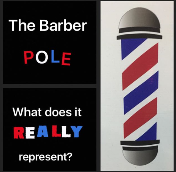
The striking colors of the barber pole are not arbitrary; they are deeply rooted in the medical practices of medieval Europe. During this era, barbers were not just responsible for haircuts and shaves; they were also “barber-surgeons,” performing a range of medical procedures, including bloodletting, teeth extractions, and minor surgeries. Bloodletting was a common medical treatment, believed to cure various ailments by removing “bad” blood.
The red stripe on the pole historically represented the blood shed during these procedures. The white symbolized the clean bandages used to staunch the flow and dress wounds. In some interpretations, the blue stripe, particularly prominent in America, is said to represent veins, arterial blood, or even patriotism, a later addition that cemented its visual identity. Before widespread literacy, these vivid and symbolic colors served as a crucial visual cue, communicating the specific — and often grisly — services offered by the barber-surgeon. This early form of visual branding was essential for public identification, clearly distinguishing a barber-surgeon’s establishment from other trades.
Crafting a Visual Narrative
In a world without sophisticated marketing campaigns or extensive print advertising, the barber pole was a marvel of visual storytelling. It communicated a specialized set of skills and services through a simple, yet potent, design. The pole itself is thought to have originated from the staff held by the patient during bloodletting to encourage blood flow, or a pole from which basins of bloodied bandages were hung to dry outside the barber-surgeon’s shop. The rotating motion, added later, further enhanced its visibility and allure, acting as an early form of dynamic signage.
This historical context highlights a fundamental branding principle: the power of a compelling narrative. Even without conscious effort, the barber pole’s design inherently told a story of health, hygiene, and skilled hands. This narrative, passed down through generations, imbues the symbol with a gravitas and authenticity that modern brands often strive to emulate, emphasizing the enduring value of a brand story that resonates deeply with its audience.
The Enduring Power of a Simple Design
The sustained relevance of the barber pole for hundreds of years is a testament to the potency of simple, consistent design in branding. Its ability to communicate complex ideas with minimal fuss offers invaluable lessons for contemporary brand builders.
Simplicity as a Branding Strength
One of the pole’s greatest strengths lies in its simplicity. The helical stripes are instantly recognizable, even from a distance or in varying light conditions. This straightforward design allows for easy reproduction across various mediums – from physical poles to two-dimensional logos, digital icons, and even stylized tattoos. In branding, simplicity fosters memorability and reduces cognitive load, making it easier for an audience to identify and recall a brand. The barber pole demonstrates that a truly effective brand mark doesn’t need to be intricate; it needs to be distinctive and clear in its message.
Consistency in a Changing World
The barber pole has maintained a remarkably consistent brand image for the barbering industry across centuries and diverse cultures. While individual shop signs and interior designs have evolved dramatically, the core symbol has remained largely unchanged. This consistency has built a collective brand equity for the entire profession, fostering a universal understanding and expectation of service quality. For businesses today, this underscores the critical importance of maintaining a consistent visual identity across all touchpoints – from physical storefronts to digital platforms – to build enduring brand recognition and trust. Deviations from core brand elements can dilute impact and confuse an audience.
Differentiating Through Tradition

In an increasingly crowded marketplace, modern barbershops often leverage the traditional barber pole to differentiate themselves. Its presence immediately evokes a sense of heritage, classic craftsmanship, and a timeless grooming experience. This connection to tradition allows shops to appeal to a demographic seeking authenticity and a link to the past, setting them apart from generic salons or trendy hair studios. It’s a powerful tool for niche branding, signaling a specific style, ethos, and level of service, effectively communicating a value proposition rooted in history and skill.
Modern Interpretations and Brand Evolution
While its historical roots are profound, the barber pole is not merely a relic of the past. It continues to evolve and adapt, demonstrating how a foundational brand symbol can remain relevant in the digital age.
Beyond the Physical Pole
Today, the barber pole’s influence extends far beyond the physical rotating sign outside a shop. Its iconic striped pattern and distinct shape are frequently incorporated into digital branding assets: logos for barbering academies, websites for upscale grooming product lines, social media profiles for celebrity barbers, and even app icons. This demonstrates the versatility of a strong visual identity. The motif can be abstracted, stylized, or integrated into more complex designs while still retaining its core communicative power. It has become a potent digital brand asset, capable of conveying instant recognition in a world of endless scrolling and visual clutter.
Adapting Without Losing Identity
Contemporary barbershops, while honoring tradition, often seek to inject modern flair into their brand. This might involve using a barber pole with a minimalist design, a unique color palette (while still nodding to the traditional red, white, and blue), or incorporating it into a larger, more intricate logo that reflects a specific brand aesthetic—be it vintage, edgy, or luxury. This adaptation is crucial for brand evolution, allowing businesses to appeal to new generations without abandoning their historical roots. It’s a delicate balance: innovate enough to stay fresh, but retain core elements that ensure brand recognition. The barber pole serves as a flexible template, proving that a strong identity can be stretched and reinterpreted without losing its fundamental meaning.
Subculture and Niche Branding
The barber pole has also become a signifier within various subcultures related to men’s grooming. From the resurgence of classic wet shaves and intricate fades to the burgeoning beard care industry, the barber pole motif is often adopted by brands targeting these specific niches. Its use reinforces an authentic connection to the craft and tradition of barbering, appealing to consumers who value these aspects. For example, a high-end men’s grooming product line might use a sleek, metallic barber pole logo to suggest premium quality and a heritage of expertise, effectively communicating its brand positioning to a discerning audience.
Lessons for Contemporary Branding
The enduring legacy of the barber shop pole offers invaluable lessons for any business seeking to build a strong, recognizable, and lasting brand.
The Importance of Story
Every powerful brand has a story, and the barber pole’s narrative of medieval medicine, skilled craftsmanship, and community service is rich and compelling. Modern brands can learn from this by consciously crafting and communicating their own origin stories, their mission, and their values. A brand with a compelling story resonates more deeply with consumers, fostering emotional connections that transcend mere product features.
Visual Communication Prowess
The barber pole underscores the universal power of visual symbols. It communicates instantly, transcending language and cultural barriers. For contemporary brands, this means prioritizing clear, distinctive, and consistent visual branding—from logos and color palettes to packaging and website design. A strong visual identity ensures immediate recognition and conveys brand essence efficiently in a fast-paced world.
Longevity Through Authenticity
The barber pole has endured because its symbol is authentic to its origins and the services it represents. Brands that are genuine, transparent, and true to their core values tend to build stronger, more loyal customer bases and achieve greater longevity. Consumers today are increasingly savvy; authenticity is a key differentiator that builds lasting trust and brand equity.
Establishing Trust and Expectation
Ultimately, the barber pole’s greatest branding achievement is its ability to build trust and set clear expectations. It tells you exactly what you can expect inside, assuring a certain level of skill and care associated with the barbering profession. For any business, clearly defining and consistently delivering on brand promises is paramount. A strong brand symbol, like the barber pole, acts as a beacon, guiding customers and assuring them of a consistent, quality experience.
aViewFromTheCave is a participant in the Amazon Services LLC Associates Program, an affiliate advertising program designed to provide a means for sites to earn advertising fees by advertising and linking to Amazon.com. Amazon, the Amazon logo, AmazonSupply, and the AmazonSupply logo are trademarks of Amazon.com, Inc. or its affiliates. As an Amazon Associate we earn affiliate commissions from qualifying purchases.