
The seemingly straightforward question, “what colour does red and green make?”, unravels a fundamental distinction in color theory that is absolutely critical for brand strategists, designers, and marketers. The answer isn’t singular but depends entirely on the context: are we mixing light or pigments? Understanding this difference—additive versus subtractive color models—is paramount for crafting a cohesive and impactful brand identity across diverse mediums, from digital screens to printed materials. A brand’s visual language is its most immediate communicator, and mastering the nuances of color mixing ensures that message is clear, consistent, and compelling, regardless of where it’s encountered.
The Fundamentals of Color Mixing: Additive vs. Subtractive Models in Branding
The world of color is governed by two primary models of mixing, each with distinct rules and outcomes. For brand professionals, recognizing which model applies to a given medium is not merely academic; it’s a strategic imperative that dictates how a brand’s colors are perceived and reproduced. Misunderstanding these foundational principles can lead to significant inconsistencies, diluted brand recognition, and ultimately, a less effective visual strategy.
Additive Color Mixing: The World of Light and Digital Displays
Additive color mixing is primarily concerned with light. This model operates on the principle that colors are created by combining different wavelengths of light. The primary colors in this system are Red, Green, and Blue (RGB). When these three colors of light are projected onto a surface and mixed in varying intensities, they create a vast spectrum of visible colors. Crucially, when red, green, and blue light are combined at full intensity, they produce white light. When no light is present, the result is black.
For branding, the RGB model is the undisputed standard for all digital media. Websites, mobile applications, social media graphics, digital advertisements, video content, and even presentation slides rely on additive color mixing. A brand’s digital palette, therefore, must be meticulously designed within the RGB framework to ensure vibrant, accurate, and consistent representation across screens. The perceived brightness and saturation of a brand’s digital assets are directly influenced by how these primary light colors are combined. Marketers leverage RGB’s capacity for luminosity and contrast to create engaging digital experiences that capture attention and reinforce brand recall in the online space.
Subtractive Color Mixing: Pigments, Print, and Physical Products
In contrast, subtractive color mixing deals with pigments, dyes, and inks—physical substances that absorb (subtract) certain wavelengths of light and reflect others. The primary colors in this model are Cyan, Magenta, Yellow, and Key (black), known as CMYK. These primaries, when combined, absorb light, with the mixture becoming progressively darker. When CMY are mixed in equal parts, they theoretically produce black, but in practice, due to pigment impurities, they create a muddy brown; hence, black (K) ink is added to achieve true blacks and greater color depth. When no pigments are present, the result is white (the color of the paper or surface).
The CMYK model is the backbone of all print production and physical branding. This includes business cards, brochures, product packaging, billboards, merchandise, uniforms, and corporate stationery. For brands, translating their digital identity into print requires a careful conversion from RGB to CMYK. Colors that appear bright and vibrant on screen might look dull or different in print due to the fundamental difference in how light is created versus absorbed. Brand guidelines often include both RGB and CMYK specifications for all brand colors, ensuring that designers can faithfully reproduce the brand’s palette across both digital and physical touchpoints, maintaining visual integrity and recognition.
Red and Green: A Study in Contrasts and Combinations
Now, returning to the core question of “what colour does red and green make,” the answer sharply diverges depending on the color model in play. This divergence is not just a scientific curiosity; it’s a pivotal piece of information that directly impacts a brand’s aesthetic and strategic execution.
The Digital Fusion: Red + Green = Yellow in RGB
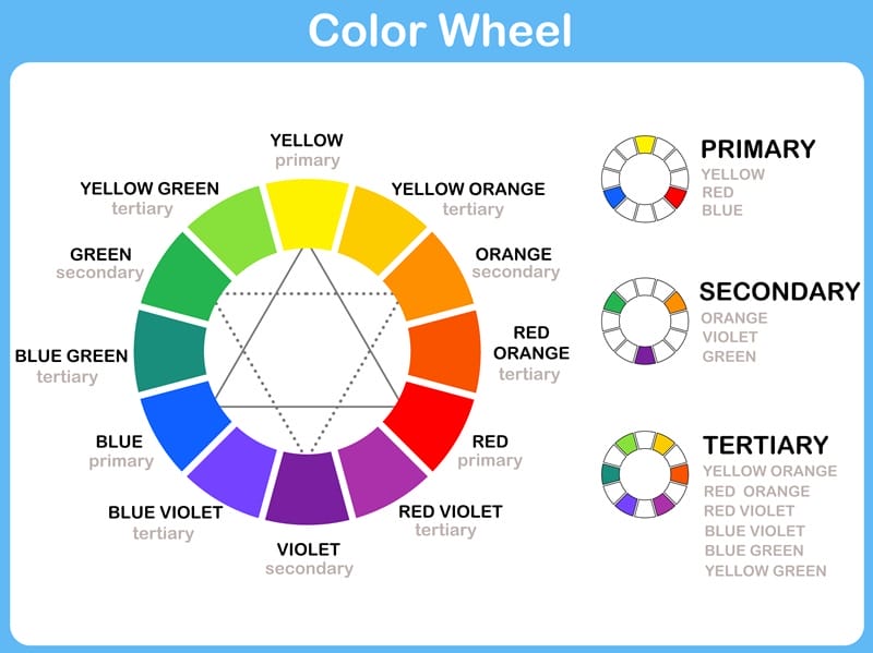
In the additive color model (RGB), when red light and green light are combined at equal intensity, they produce yellow light. This phenomenon is easily observable on digital screens. Each pixel on a screen contains red, green, and blue sub-pixels. When the red and green sub-pixels are illuminated simultaneously, the viewer perceives yellow.
For brands operating primarily in the digital sphere, this interaction is vital. Consider a digital interface where elements shift or merge; if a brand uses red and green heavily, their combination points should be carefully managed if yellow is not an intended part of the brand’s secondary palette. Conversely, designers can strategically leverage this property to create visual effects, gradients, or even transitional branding elements that naturally flow into yellow, adding depth and dynamism to digital assets. Understanding this specific additive mix allows for precise control over digital color representation and user experience, ensuring that dynamic elements consistently reflect the brand’s intended aesthetic.
The Pigment Blend: Red + Green = Brown (or Muted Tones) in CMYK
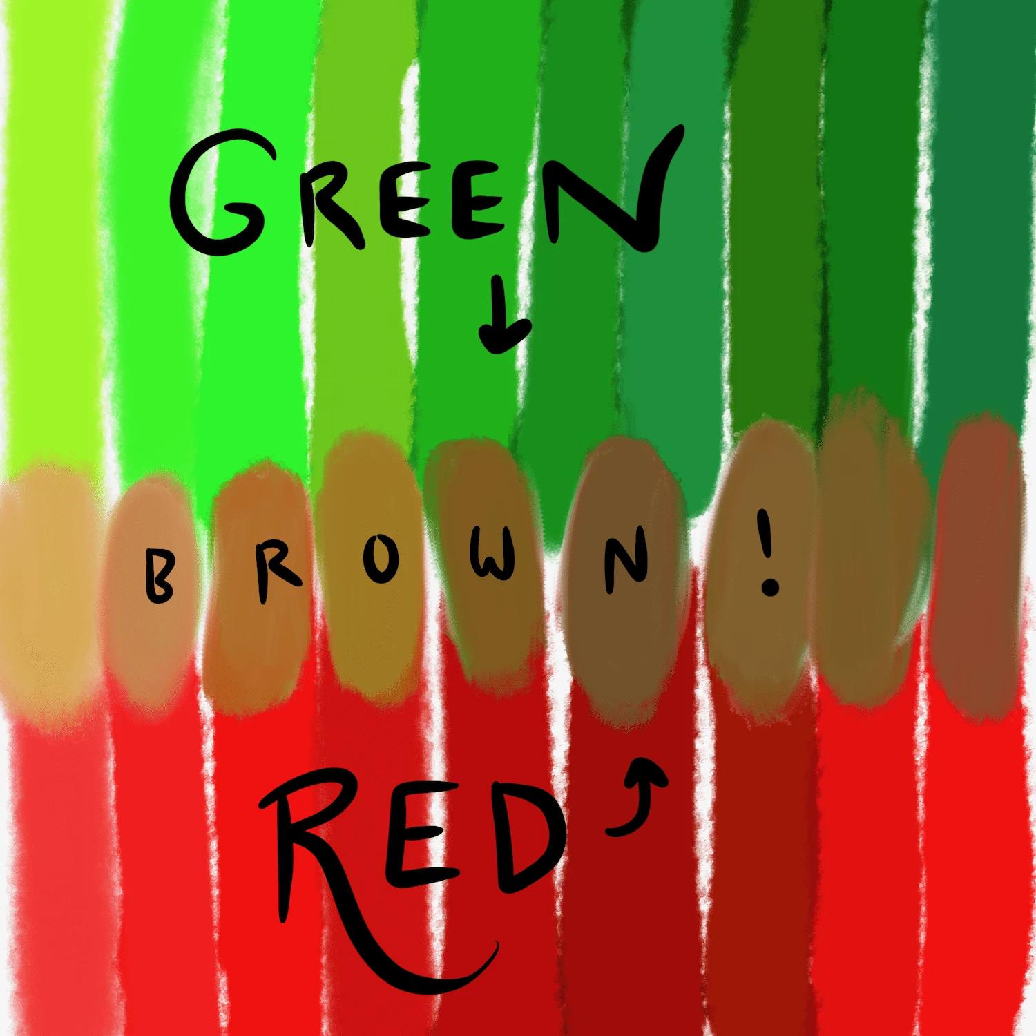
In the subtractive color model (CMYK), when red pigment and green pigment are mixed, they typically yield a shade of brown or a deep, muted, desaturated tone. This is because red pigment absorbs cyan and green light, while green pigment absorbs magenta and blue light. When mixed, they collectively absorb a wide spectrum of light, leaving only the darker, less vibrant wavelengths to be reflected, resulting in a brownish hue. The exact shade of brown will depend on the specific pigments used and their ratios.
This outcome has profound implications for print and physical product design. If a brand’s logo or key visual element contains areas where red and green pigments naturally overlap or are intended to blend, the designer must anticipate this brown outcome. It means that attempting to achieve a vibrant yellow by mixing red and green inks is futile. Instead, separate yellow ink (Y in CMYK) must be used. For brands, this mandates precise color separation and adherence to CMYK values for print. Relying on an RGB design to directly translate into print without CMYK conversion and proofing is a common pitfall that can result in disappointing, off-brand physical outputs. A brand using red and green for a holiday campaign, for example, must be acutely aware that overlapping these colors in print will create a muted brown, not a festive yellow, fundamentally altering the intended mood and message.
Strategic Implications for Brand Identity and Marketing
The stark difference in outcomes when mixing red and green across additive and subtractive models underscores the strategic importance of color management in branding. A sophisticated brand identity acknowledges these distinctions and plans for them, ensuring consistency and impact across all touchpoints.
Harnessing Additive Mixes for Digital Engagement
For brands whose primary engagement is digital, the RGB model offers incredible flexibility and vibrancy. Designers can craft dynamic gradients, illuminated effects, and animated logos where colors seamlessly transition, knowing that red and green will produce yellow, opening up an extended digital palette. This knowledge allows for the creation of visually rich online experiences that leverage the full spectrum of light. Digital marketing campaigns, social media content, and interactive web elements can be optimized for screen display, ensuring maximum visual punch. Brand guidelines for digital assets should explicitly state RGB values, hex codes, and potentially HSL (Hue, Saturation, Lightness) values to ensure precision and consistency across all digital platforms. This ensures that the brand maintains a cutting-edge and consistent appearance in the fast-evolving digital landscape.
Mastering Subtractive Blends for Tangible Assets
Conversely, for print and physical branding, the CMYK model demands meticulous planning. Brands must understand that achieving specific colors in print often requires careful ink selection and calibration, rather than relying on color mixing intuition derived from digital experiences. When red and green are part of a brand’s palette, designers must pre-emptively address how these colors will interact in print. This might involve using specific Pantone spot colors for absolute consistency, or carefully managing CMYK builds to prevent unintended brown outcomes. Product packaging, physical advertisements, and branded merchandise all necessitate a deep understanding of subtractive color behavior to prevent costly errors and maintain brand integrity in the tangible world. Ensuring that physical assets perfectly mirror the digital brand reinforces professionalism and attention to detail.
Psychological Impact and Cultural Nuances of Red and Green
Beyond the technicalities of color mixing, red and green carry significant psychological and cultural weight that brand strategists must consider. Red often symbolizes energy, passion, urgency, and power, but also danger or aggression. Green commonly evokes nature, growth, freshness, and tranquility, but can also represent envy or money. When these colors are juxtaposed, as in a brand’s palette, their interaction creates a specific emotional resonance.
For instance, the combination of red and green is universally associated with holidays, particularly Christmas in Western cultures. A brand might strategically use this combination to evoke warmth, tradition, and festivity during specific seasons. However, outside of these contexts, the strong contrast can be jarring or even create an unintended visual tension. Understanding how a mixed color (e.g., yellow from red+green light, or brown from red+green pigment) will interact with these innate associations is crucial for consistent brand messaging. A brown outcome from mixing red and green pigments might evoke earthiness or organic qualities, which could be beneficial for an eco-conscious brand, or detrimental for a brand aiming for vibrancy. The strategic choice of whether to allow red and green to combine (and what the resulting color implies) or to keep them distinct is a powerful branding decision.
Case Studies and Practical Applications in Branding
The real-world application of additive and subtractive color theory for red and green mixing is evident in myriad branding scenarios. Successful brands meticulously manage their color assets to ensure a harmonious and consistent presence.
Digital Branding: Websites, Apps, and Social Media
Consider a tech brand that uses a vibrant red for its call-to-action buttons and a fresh green for its “success” messages. On a website or app, if these two elements were to ever visually overlap or transition (e.g., a red button changing to green on hover, or an animation), the intermediate yellow created by the additive mix would need to be intentionally managed. A brand might embrace this yellow as a dynamic accent color, or carefully design transitions to avoid its appearance if it clashes with their extended palette. For example, Google’s logo, while not directly mixing red and green to create yellow, uses all four primary RGB and CMYK colors, demonstrating mastery of color interaction across platforms. Understanding the red+green=yellow outcome in RGB allows for sophisticated gradient designs and dynamic visual effects in digital advertising that are both engaging and on-brand.

Physical Branding: Logos, Packaging, and Merchandise
For physical branding, the lesson of red and green creating brown in print is a vital safeguard against brand dilution. Imagine a food brand whose logo features interlocking red and green elements. If a designer were unaware of subtractive mixing, the printed logo might appear with muddy, brownish sections where red and green meet, rather than distinct, vibrant hues. This could inadvertently convey a sense of staleness or lack of quality. To counteract this, brands often use specific spot colors (like Pantone colors) that are pre-mixed inks, ensuring precise color reproduction regardless of the underlying CMYK principles. For example, Coca-Cola’s iconic red is a meticulously guarded spot color, ensuring its consistency globally across all packaging and advertising. When red and green are used on merchandise, like t-shirts, the designer must ensure the colors are applied distinctly or that any overlap is intended to create a specific, approved brown shade, maintaining the brand’s visual integrity in every tangible product.
In conclusion, the simple question “what colour does red and green make” unlocks a complex and indispensable facet of brand strategy. By deeply understanding the additive and subtractive color models, brand professionals can meticulously craft and manage their visual identity, ensuring consistency, impact, and precise communication across every medium, ultimately strengthening brand recognition and market presence.
aViewFromTheCave is a participant in the Amazon Services LLC Associates Program, an affiliate advertising program designed to provide a means for sites to earn advertising fees by advertising and linking to Amazon.com. Amazon, the Amazon logo, AmazonSupply, and the AmazonSupply logo are trademarks of Amazon.com, Inc. or its affiliates. As an Amazon Associate we earn affiliate commissions from qualifying purchases.