The strategic deployment of color is paramount in crafting a compelling brand identity. Beyond mere aesthetics, color evokes emotions, communicates values, and establishes an instant, memorable connection with an audience. Mint green, with its unique blend of coolness and freshness, has emerged as a favored hue for brands seeking to convey specific attributes. Understanding its intrinsic qualities and, more importantly, which colors enhance its message, is crucial for effective brand design and marketing.
The Strategic Role of Color in Brand Building
Color is often the first element an audience perceives, making it a cornerstone of brand recognition and differentiation. It transcends language barriers, directly influencing consumer perception and purchasing decisions. For a brand, a well-chosen color palette is not merely decorative; it’s a powerful psychological tool. It shapes the brand’s personality, conveys its core message, and sets the emotional tone for all interactions. Consider the immediate associations conjured by the vibrant red of a prominent beverage brand or the calming blue of a leading social media platform. These are not arbitrary choices but carefully curated decisions designed to elicit specific responses and reinforce brand values.
A robust brand strategy recognizes that color choices must align with the brand’s mission, vision, and target audience. Mint green, for instance, naturally leans towards associations with nature, purity, health, and tranquility. However, its full potential is unleashed when paired with complementary colors that either amplify these existing associations or introduce new dimensions to the brand’s narrative. The right combination can elevate a brand from being merely identifiable to being deeply resonant, creating an emotional bond that fosters loyalty and trust. This thoughtful approach to color is an investment in long-term brand equity, ensuring that every visual touchpoint consistently reinforces the desired brand image.
Unpacking Mint Green’s Brand Persona
Mint green occupies a fascinating position on the color spectrum, blending the rejuvenating qualities of green with the serene coolness of blue. This unique confluence gives mint green a distinctive brand persona that can be leveraged across various industries and market segments. At its core, mint green communicates freshness, vitality, and a sense of cleanliness. It evokes images of natural landscapes, spring growth, and invigoration, making it an excellent choice for brands associated with health, wellness, organic products, and environmental consciousness.
Beyond its natural connotations, mint green also carries undertones of calm and sophistication. It’s less aggressive than a true green and more approachable than a deep blue, offering a soothing presence that can be highly effective in reducing visual clutter and creating a harmonious user experience. Brands aiming for a minimalist, modern, or even slightly retro aesthetic often find mint green to be an ideal base. It suggests innovation and forward-thinking, especially when paired with contemporary design elements, yet retains an inherent timelessness. For a brand, selecting mint green as a primary or secondary color sends a subtle, yet powerful, message: “We are fresh, we are clean, we are mindful, and we are effortlessly chic.” Understanding these inherent qualities is the first step in strategically pairing it with other colors to build a comprehensive and impactful brand identity.
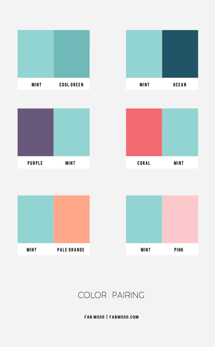
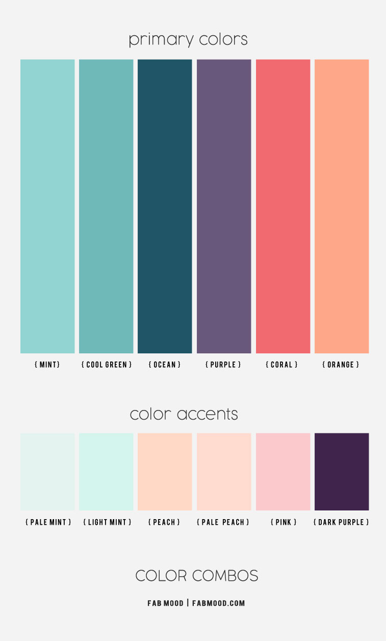
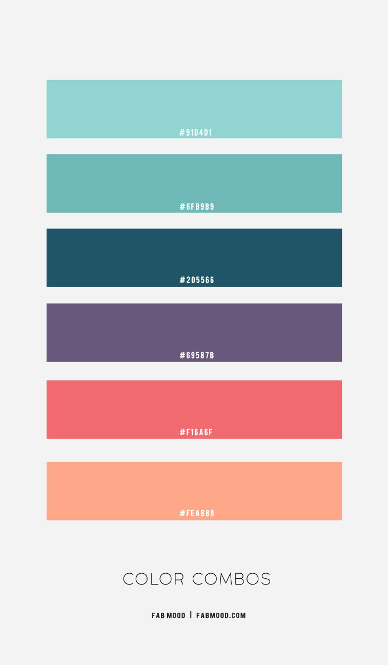
Harmonious Pairings: Elevating Mint Green for Brand Impact
The true power of mint green in branding emerges when it is strategically combined with other hues. These pairings can enhance its existing qualities, introduce new dimensions to a brand’s personality, or create distinct visual hierarchies that guide the audience’s perception.
Earth Tones: Organic Authenticity
Pairing mint green with various earth tones—such as warm browns, terracotta, dusty rose, or muted sage—creates a deeply organic and authentic brand aesthetic. This combination speaks volumes about natural origins, sustainability, and craftsmanship.
- Terracotta & Clay: Introduces a rustic, grounded feel. Ideal for artisan brands, eco-friendly products, or home goods that emphasize natural materials and handmade quality. The warmth of terracotta provides a beautiful contrast to mint’s coolness, making the palette feel balanced and inviting.
- Beige & Sand: Offers a minimalist, understated elegance. This pairing is excellent for wellness brands, sustainable fashion, or natural beauty products that want to convey purity, simplicity, and a gentle approach. It creates a serene and approachable brand image.
- Deep Forest Green & Olive: Reinforces the natural connection, adding depth and maturity. This palette can signify a brand with a strong commitment to environmental stewardship, outdoor adventure, or products derived directly from nature, such as herbal remedies or organic produce.
Neutrals: Refined Modernity
The inherent freshness of mint green is beautifully accentuated by classic neutrals, creating a sophisticated and clean brand identity. These pairings are versatile and project professionalism, clarity, and understated elegance.
- Crisp White: A timeless combination that exudes cleanliness, simplicity, and modernity. Brands in healthcare, tech startups, or minimalist design sectors often leverage this pairing to convey transparency, efficiency, and a fresh perspective. White allows mint green to pop, making it a focal point without overwhelming the senses.
- Soft Grey & Charcoal: Introduces a contemporary edge and a sense of calm reliability. This palette works exceptionally well for technology brands, consulting services, or luxury goods that aim for a sophisticated, sleek, and intelligent image. Light grey adds airiness, while charcoal grounds the palette with a touch of gravitas.
- Cream & Ivory: Provides a warmer, softer alternative to stark white, lending an approachable yet elegant feel. This combination is ideal for lifestyle brands, bakeries, or interior design companies seeking to evoke comfort, warmth, and a touch of vintage charm alongside modern freshness.
Metallics: Luxe Innovation
Integrating metallic accents with mint green elevates a brand to a realm of luxury, sophistication, and cutting-edge design. This combination signals high quality, exclusivity, and a forward-thinking aesthetic.
- Gold & Rose Gold: These warm metallics add opulence and a touch of glamour. Ideal for high-end fashion, luxury beauty products, bespoke services, or event planning, this pairing conveys exclusivity, celebration, and premium craftsmanship. Rose gold, in particular, adds a softer, more contemporary femininity.
- Silver & Chrome: Imparts a sleek, futuristic, and refined feel. This combination is well-suited for technology brands, automotive, or industrial design companies looking to project precision, innovation, and high-tech elegance. It creates a clean, polished, and sophisticated look.
Vibrant Accents: Dynamic Contrast
While mint green often conveys calm, pairing it with select vibrant colors can infuse a brand with energy, playfulness, and a distinct personality. These combinations are designed to capture attention and communicate dynamism.
- Coral & Peach: Adds a lively, energetic, and playful contrast. This warm pairing is excellent for brands targeting younger demographics, fashion, children’s products, or creative services. It evokes joy, optimism, and approachability.
- Navy Blue & Deep Teal: Creates a rich, sophisticated, and authoritative contrast. Navy provides a grounding force, suggesting trustworthiness and stability, while deep teal enhances the aquatic and serene aspects of mint green. This combination is powerful for corporate branding, financial services, or established luxury brands seeking a balanced blend of freshness and gravitas.
- Lavender & Pale Pink: Leans into a softer, dreamier, and more whimsical aesthetic. Ideal for beauty brands, spas, wedding planning, or creative ventures that aim to evoke gentleness, elegance, and a touch of ethereal charm.
Application Across Brand Touchpoints
The strategic color palette involving mint green must be consistently applied across all brand touchpoints to build a cohesive and recognizable identity. From digital interfaces to physical products, consistency reinforces the brand message and solidifies its presence in the market.
Digital Presence
For websites and social media, mint green can serve as a primary background, an accent color for calls to action, or a thematic element in iconography. When combined with crisp whites or soft greys, it creates an inviting, clean user experience, projecting trustworthiness and modernity for tech platforms or digital services. For lifestyle blogs or e-commerce sites, pairing it with warm earth tones or pastels can evoke a sense of calm and aspiration. Social media templates leveraging mint green with pops of coral or lavender can convey a playful, engaging, and fresh brand voice.
Product & Packaging Design
In packaging, mint green naturally suggests freshness, organic quality, and health. For food and beverage brands, combining it with kraft paper textures or brown tones reinforces natural ingredients. For beauty or skincare, its pairing with metallics like rose gold or silver elevates the product to a luxury status, communicating purity and efficacy. The visual appeal on the shelf is dramatically improved when the packaging color scheme aligns with the brand’s core values—a mint green box for organic teas or a mint green bottle for a calming essential oil instantly communicates its benefits.
Corporate Identity & Marketing Collateral
For corporate branding, mint green, especially when paired with navy or charcoal, can convey an innovative yet reliable image. This is effective for consulting firms, sustainable businesses, or professional services that wish to appear approachable yet professional. Business cards, letterheads, and brochures using these palettes project a consistent brand story. In marketing campaigns, the chosen mint green palette dictates the mood and message—a campaign for a new health supplement using mint and white will feel different from a travel promotion using mint and coral, each eliciting a distinct emotional response from the target audience.
Crafting Your Brand’s Mint Green Palette
Developing a brand’s color palette with mint green as a central element requires a deliberate and analytical approach. It extends beyond personal preference, focusing instead on strategic alignment with the brand’s overarching goals and its connection with the target demographic.
Understanding Your Brand’s Core Message
Before selecting any complementary colors, articulate your brand’s core values, mission, and the unique selling proposition. Is your brand about innovation and technology, or is it about natural wellness and sustainability? Mint green can support both, but the supporting colors will dictate the specific nuance. For example, a tech brand might lean into mint green with silver and charcoal to convey sleekness and efficiency, while a wellness brand might opt for mint green with terracotta and beige to emphasize earthiness and comfort.
Identifying Your Target Audience
Different color combinations resonate with different demographics. A youthful audience might be drawn to mint green paired with vibrant corals or playful lavenders, reflecting energy and creativity. A more mature or affluent audience might prefer mint green alongside deep navies, golds, or sophisticated greys, signaling luxury, stability, and refinement. Conduct market research to understand the aesthetic preferences and psychological responses of your specific audience segment.
Considering Industry Standards and Differentiation
While adhering to certain industry color conventions can build trust, strategic differentiation is key. Examine your competitors’ color palettes. How can your mint green combination stand out while still communicating relevance within your industry? If all competitors use dark, serious tones, a fresh mint green palette could be a powerful way to position your brand as innovative and approachable. Conversely, if your industry is saturated with bright colors, a sophisticated mint green with muted neutrals could convey exclusivity and calm.
Testing and Iteration
Once a preliminary palette is developed, it is crucial to test it across various applications. This includes mock-ups of logos, website interfaces, social media graphics, and packaging. Gather feedback from diverse groups, including target customers and internal stakeholders. A color palette that looks good in isolation might not translate effectively across all brand touchpoints. Be prepared to iterate and refine the chosen colors based on this feedback, ensuring that the final mint green palette effectively communicates your brand’s essence, resonates with your audience, and achieves your strategic objectives. The right blend of colors with mint green is a powerful asset, building a brand identity that is both memorable and deeply impactful.
aViewFromTheCave is a participant in the Amazon Services LLC Associates Program, an affiliate advertising program designed to provide a means for sites to earn advertising fees by advertising and linking to Amazon.com. Amazon, the Amazon logo, AmazonSupply, and the AmazonSupply logo are trademarks of Amazon.com, Inc. or its affiliates. As an Amazon Associate we earn affiliate commissions from qualifying purchases.