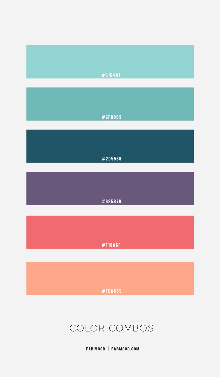
Color is a cornerstone of brand identity, a silent language that communicates values, evokes emotions, and fosters recognition. For brands seeking to convey freshness, tranquility, and understated elegance, mint green offers a unique palette starting point. This refreshing hue, reminiscent of nature and clarity, holds significant potential in crafting a distinctive visual presence. Understanding its optimal color companions is not merely an aesthetic choice but a strategic decision that shapes perception, strengthens marketing efforts, and resonates with target audiences.
The Strategic Role of Color in Brand Identity
In the realm of branding, color is far more than decorative; it’s a critical component of corporate identity and marketing strategy. A thoughtfully chosen color palette can distinguish a brand in a crowded market, influence consumer behavior, and build emotional connections. Mint green, with its cool undertones and soft vibrancy, carries inherent psychological associations that can be leveraged to define a brand’s character. It often speaks to eco-friendliness, health, wellness, innovation, and a sense of calm. The art of pairing mint green lies in amplifying these inherent qualities or introducing complementary traits to create a nuanced and compelling brand narrative.
Mint Green’s Intrinsic Brand Associations
Mint green itself communicates a specific set of messages. Its connection to nature often evokes freshness, growth, and natural purity, making it a popular choice for organic products, wellness brands, and environmental initiatives. The color also possesses a soothing quality, indicative of serenity, balance, and health, which appeals to healthcare providers, spas, and personal care brands. Furthermore, its light and airy nature can suggest modernity, cleanliness, and innovation, suitable for tech startups or minimalist lifestyle brands. The challenge and opportunity for designers and marketers is to pair mint green with colors that either reinforce these core associations or introduce contrasting elements that broaden its expressive range, ensuring the brand’s message is clear, consistent, and impactful across all touchpoints.
Classic Pairings: Timeless Elegance and Professionalism
For brands aiming for a sophisticated, professional, and timeless appeal, certain color pairings with mint green stand out. These combinations leverage the calming influence of mint green while grounding it with hues that exude stability and refined taste.
Neutrals: The Foundation of Sophistication
Pairing mint green with various neutral tones creates an effortlessly elegant and highly versatile palette. White and off-white shades, such as cream or ivory, enhance mint green’s freshness, lending an airy, clean, and minimalist aesthetic. This combination is superb for brands that prioritize clarity, purity, and a sophisticated simplicity, often seen in high-end skincare, interior design, or luxury linen brands.
Grey, from light silver to deep charcoal, provides a mature and grounding contrast to mint green. A light grey can maintain a soft, modern feel, while a darker grey introduces a sense of seriousness and corporate professionalism without being overtly stark. This pairing is excellent for tech companies, consulting firms, or professional services that want to convey trustworthiness, innovation, and understated style. The coolness of both colors creates a harmonious, balanced visual that is both calming and authoritative.
Beige and tan shades offer a warmer, more approachable neutral alternative. These earthy tones bring out the organic, natural side of mint green, suggesting comfort, authenticity, and handcrafted quality. Brands in sustainable fashion, artisanal foods, or home goods often utilize this combination to project a wholesome, earthy, and inviting image. The interplay of cool mint and warm beige creates a balanced visual that is both fresh and comforting.
Metallics: A Touch of Luxe
To infuse a sense of luxury, prestige, and contemporary glamour, incorporating metallic accents with mint green is a highly effective strategy. Gold, in particular, offers a striking contrast, its warmth and richness beautifully complementing mint green’s cool serenity. This combination speaks volumes about opulence, quality, and a premium brand experience, making it ideal for high-end jewelry, gourmet food packaging, or exclusive event branding. The contrast between the organic freshness of mint green and the sophisticated shimmer of gold creates a dynamic yet elegant visual appeal.
Silver and rose gold also work wonderfully, albeit with different undertones. Silver maintains a sleek, modern, and cool aesthetic when paired with mint green, suitable for technology brands or contemporary design firms seeking a clean, futuristic look. Rose gold, with its warm, blush undertones, introduces a softer, romantic, and slightly more feminine touch, perfect for beauty brands, confectioneries, or fashion labels aiming for gentle sophistication and approachability. The judicious use of metallics elevates mint green from merely fresh to distinctively luxurious.
Vibrant Combinations: Energy, Creativity, and Impact
While mint green excels in creating serene and elegant palettes, it also possesses the versatility to form dynamic and memorable combinations that radiate energy, creativity, and a modern impact. These pairings are often leveraged by brands looking to make a bolder statement or appeal to a younger, more vibrant demographic.
Complementary Hues: Bold Statements
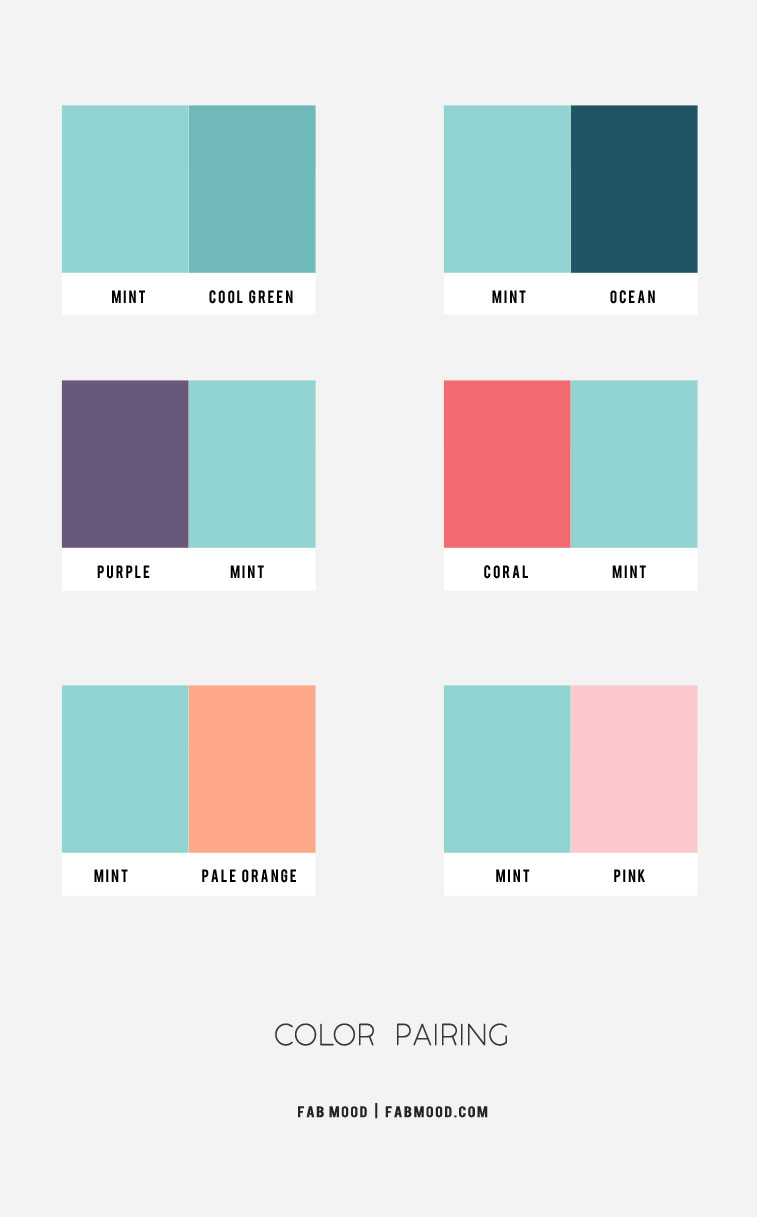
Exploring complementary colors on the color wheel can lead to striking and energetic palettes. While a true complementary color to green is red, pairing mint green with softer, less saturated versions of its complements can yield compelling results. Consider shades of coral or peach; these warm, inviting tones create a lively contrast with mint green’s coolness without being overly jarring. This combination suggests playfulness, vitality, and creative expression, making it suitable for children’s brands, lifestyle products, or consumer-facing apps that aim for a cheerful and approachable image. The warmth of coral breathes life into the calm of mint green, creating a harmonious yet dynamic tension.
Similarly, rich magenta or deep plum, while not directly complementary, offer a sophisticated contrast. The deep, jewel-toned richness of these purples provides a luxurious backdrop that allows mint green to pop, conveying an artistic, imaginative, and upscale feel. This pairing can be powerful for creative agencies, artisanal brands, or fashion labels that want to signify innovation and a distinctive aesthetic. The balance between the serene mint and the opulent purple creates a brand identity that is both sophisticated and intriguing.
Analogous Harmony: Subtle Transitions
Analogous color schemes involve using colors that are next to each other on the color wheel, resulting in a cohesive, visually pleasing, and harmonious effect. For mint green, analogous colors would include shades of blue and yellow-green.
Pairing mint green with various shades of blue, from sky blue to navy, creates a wonderfully serene and trustworthy palette. This combination emphasizes the fresh, aquatic qualities of mint green, reinforcing themes of reliability, depth, and innovation. Light blues enhance the airy feel, perfect for wellness apps or environmental initiatives, while deeper navies provide a serious, corporate grounding, suitable for financial institutions or established tech companies. This harmonious blend evokes a sense of calm professionalism and unwavering dependability, making it excellent for brands that want to inspire confidence and peace of mind.
Incorporating yellow-green hues alongside mint green enriches the natural and organic associations. This subtle transition suggests growth, vitality, and a deeper connection to nature. Brands focused on sustainability, health foods, or outdoor lifestyle products can effectively use this gradient to communicate authenticity, freshness, and a vibrant, healthy ethos. The analogous relationship ensures a smooth visual flow that is inherently pleasing and reinforces the brand’s commitment to natural elements.
Contextualizing Mint Green: Applications Across Brand Touchpoints
The effective deployment of a mint green color palette extends beyond theoretical pairings; it must be consistently applied across all brand touchpoints to build a cohesive and memorable identity. From digital interfaces to physical products, each application reinforces the brand’s chosen message.
Digital Presence and UI/UX
For a brand’s digital presence, including websites, apps, and social media, mint green can be a powerful choice for backgrounds, accents, or interactive elements. When paired with crisp whites or light greys, it creates a clean, inviting, and user-friendly interface that feels modern and spacious. Utilizing mint green for call-to-action buttons or highlighted text can draw attention without being aggressive, offering a gentle yet effective prompt. Its calming properties contribute to a positive user experience, reducing eye strain and fostering a sense of ease, which is crucial for engagement and retention, particularly for wellness, finance, or productivity apps.
Packaging and Product Design
In packaging and product design, mint green can immediately signal freshness, natural ingredients, or a gentle approach. For food and beverage brands, it evokes a sense of organic purity and refreshing taste. In cosmetics or personal care products, mint green packaging, especially when paired with elegant metallics or soft neutrals, communicates gentle efficacy and a luxurious feel. The tactile experience of the product, combined with its visual presentation, plays a significant role in consumer perception. A mint green product can subtly convey innovation and eco-consciousness, appealing to a discerning market segment valuing both aesthetics and ethics.
Marketing Collateral and Advertising
Marketing collateral, such as brochures, business cards, and advertisements, provides a tangible representation of the brand. Using mint green strategically in these materials can differentiate a brand and enhance its message. In advertising, a mint green dominant palette can create a distinctive visual style that stands out against competitors, especially if they lean on more traditional or aggressive color schemes. Paired with contrasting colors for headlines or key visuals, mint green can effectively communicate core messages of growth, serenity, or innovation. Consistency in its application across all campaigns reinforces brand recognition and builds a strong, unified narrative in the minds of consumers.

Mastering Your Mint Green Palette: A Brand Design Checklist
Developing a successful brand palette with mint green requires careful consideration and strategic planning. To truly leverage this versatile hue, consider the following:
- Define Your Brand Personality: Before choosing companion colors, articulate what your brand stands for. Is it tranquil and luxurious, or vibrant and innovative? Mint green can support various personalities, but its pairings will determine the exact tone.
- Understand Your Target Audience: Different demographics respond to colors in varying ways. Research your audience’s preferences and cultural associations with your chosen palette.
- Ensure Readability and Accessibility: Especially in digital contexts, ensure that text and interactive elements have sufficient contrast against mint green backgrounds for optimal readability and compliance with accessibility standards.
- Test Across All Mediums: A color that looks great on screen might appear differently in print. Test your palette across various materials, from digital displays to packaging prototypes, to ensure consistent brand representation.
- Maintain Consistency: Once established, adhere to your defined color guidelines across all brand assets. This unwavering consistency is paramount for building strong brand recognition and trust.
By thoughtfully integrating mint green with its ideal color companions, brands can craft a visual identity that is not only aesthetically pleasing but also strategically powerful, effectively communicating their values and resonating deeply with their audience.
aViewFromTheCave is a participant in the Amazon Services LLC Associates Program, an affiliate advertising program designed to provide a means for sites to earn advertising fees by advertising and linking to Amazon.com. Amazon, the Amazon logo, AmazonSupply, and the AmazonSupply logo are trademarks of Amazon.com, Inc. or its affiliates. As an Amazon Associate we earn affiliate commissions from qualifying purchases.