
Brown, often underestimated in the vibrant spectrum of brand colors, possesses an innate ability to convey reliability, authenticity, and warmth. Its grounding presence in nature makes it a powerful choice for brands aiming to resonate with trustworthiness and an organic feel. However, the true strategic impact of brown in a brand’s visual identity is unlocked not in isolation, but through its intelligent pairing with complementary, analogous, or contrasting hues. Understanding these chromatic relationships is paramount for designers and strategists seeking to craft a sophisticated, memorable, and effective brand presence.
The Foundational Role of Brown in Brand Strategy
Brown’s psychological associations are deeply rooted, linking it to the earth, wood, and natural elements. This intrinsic connection imbues brands utilizing brown with a sense of stability, honesty, and enduring quality. It’s a color that suggests substance over superficiality, tradition over fleeting trends, and comfort over cold sterility.
Associative Meanings of Brown in Branding
When brown is employed in branding, it often communicates:
- Reliability and Trust: Its earthy tones evoke a sense of groundedness and dependability, crucial for brands in finance, legal, or long-term service sectors.
- Warmth and Comfort: Brown creates an inviting and approachable atmosphere, making it ideal for hospitality, food and beverage, or home goods brands.
- Authenticity and Naturalness: Brands focused on organic products, sustainability, or artisanal craftsmanship benefit from brown’s genuine, unpretentious character.
- Luxury and Sophistication (Darker Tones): Rich, deep browns, often reminiscent of dark wood or leather, exude an air of refined elegance and premium quality.
- Simplicity and Practicality: Brown can also convey straightforwardness and utility, appealing to brands that emphasize functionality and ease of use.
The Versatility of Brown Across Industries
While some colors are pigeonholed to specific sectors, brown demonstrates remarkable versatility. From the rustic charm of a craft brewery to the distinguished elegance of a luxury watchmaker, or the robust reliability of an outdoor gear company, brown adapts its message based on its shade and surrounding palette. This adaptability makes it a compelling choice for brands looking to establish a unique yet universally understood visual language that crosses cultural and demographic divides.
Strategic Color Pairings: Unlocking Brown’s Potential
The art of pairing colors with brown lies in balancing its inherent stability with hues that either reinforce its message or provide a strategic counterpoint. The goal is to create a cohesive and appealing visual narrative that strengthens the brand’s identity.
Complementary Hues for Stability and Trust
Complementary colors provide a strong contrast, making each color appear more vibrant. When brown is the dominant color, introducing specific complementary hues can elevate its message and broaden its appeal.
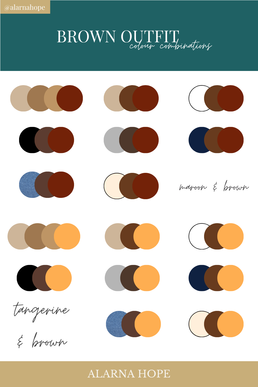
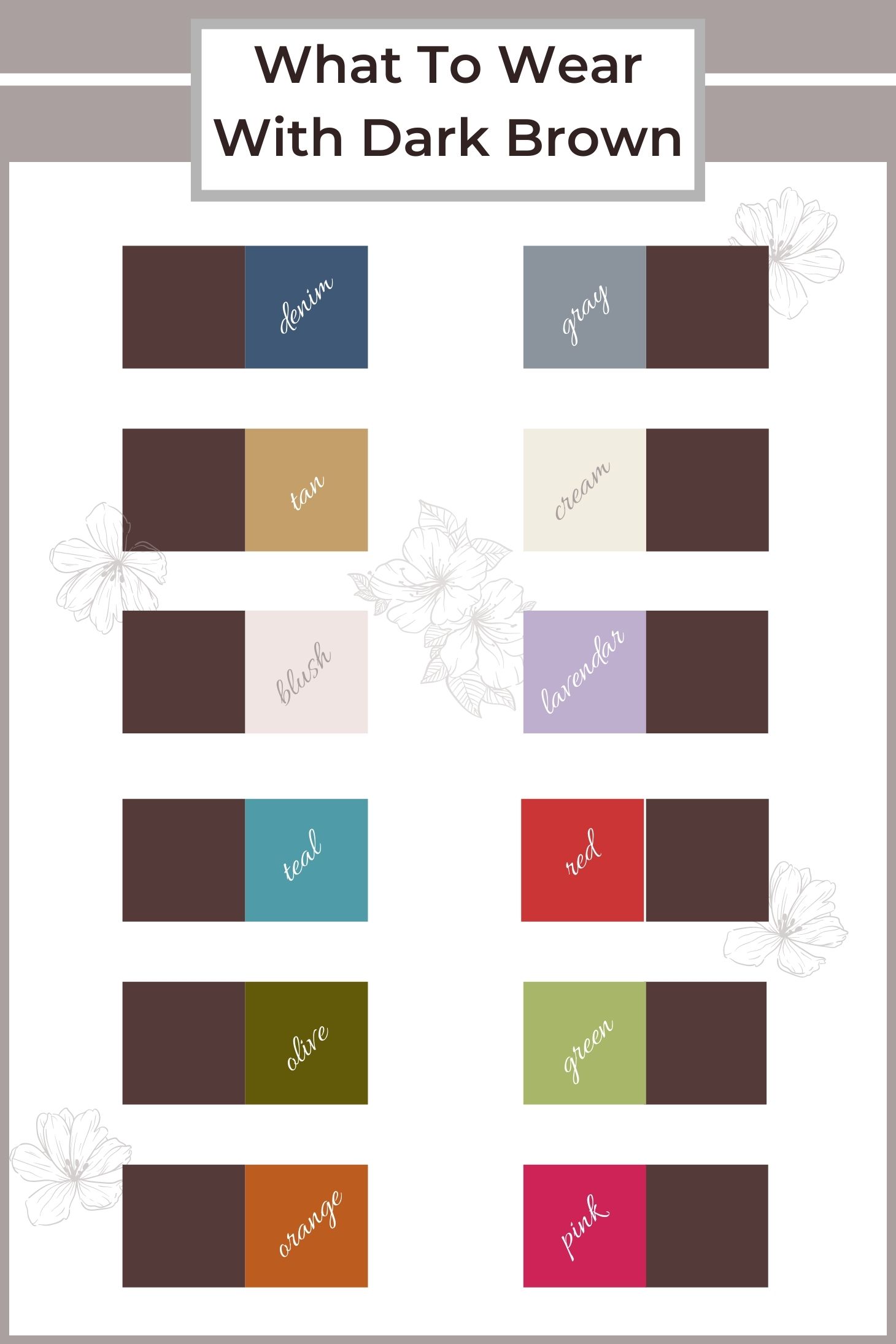
- Blues (Especially Teal and Sky Blue): Blue, particularly lighter and brighter shades, offers a refreshing contrast to brown’s warmth. This pairing speaks to reliability (brown) and professionalism/freshness (blue). Think of a coffee shop (brown) with a clean, modern aesthetic (blue accents). It suggests stability with a touch of innovation or tranquility. Teal, a blue-green, adds a sophisticated, slightly artistic edge while maintaining approachability.
- Greens (Sage, Olive, Forest Green): Given brown’s natural associations, greens are an intuitive and powerful partner. This combination reinforces themes of nature, growth, sustainability, and health. A brand in the organic food sector, gardening, or eco-friendly products would find this pairing exceptionally harmonious and credible. Sage green with a medium brown can evoke calm and serenity, while a deep forest green with espresso brown speaks to luxury and natural richness.
Analogous Schemes for Harmony and Sophistication
Analogous colors are next to each other on the color wheel, creating a serene and comfortable design. When paired with brown, they extend its natural warmth and earthiness.
- Oranges (Terracotta, Burnt Orange, Peach): Orange shades, from vibrant terracotta to soft peach, share brown’s warm undertones. This creates an inviting, energetic, yet grounded palette. It can evoke feelings of creativity, comfort, and optimism. A brand focused on culinary experiences, artisanal goods, or cozy home decor might leverage this combination effectively.
- Yellows (Cream, Gold, Mustard): Yellows bring light and cheerfulness to brown’s solid foundation. Cream and beige offer a sophisticated, minimalist look that enhances brown’s elegance without overpowering it. Gold adds a touch of luxury and prestige, perfect for high-end products or services. Mustard yellow provides a vintage, rustic feel that can be very appealing for bespoke brands or those with a heritage story.
Triadic and Tetradic Approaches for Dynamic Visuals
While complementary and analogous schemes provide strong foundational palettes, triadic and tetradic approaches introduce more complexity and dynamism. Here, brown often serves as the grounding neutral, allowing more vibrant colors to pop.
- Brown + Yellow + Blue/Green: Using brown as a base, incorporating a warm accent like yellow and a cool accent like blue or green can create a balanced yet visually stimulating brand identity. For instance, a medium brown for trustworthiness, a golden yellow for optimism, and a soft blue for calm can convey a well-rounded and approachable brand.
- Brown + Cream + (Accent Color: Red/Orange/Turquoise): Cream or off-white provides a clean backdrop, allowing brown to stand out, while a carefully chosen accent color adds personality. A deep brown with cream and a vibrant turquoise, for example, can create an exotic or modern feel, suggesting innovation while maintaining stability. A splash of crimson or burnt orange can inject passion and energy into a sophisticated brown and cream palette.
Nuances of Brown: From Sepia to Espresso

Brown is not a monolithic color; its vast range of shades profoundly impacts its perception and the emotions it evokes. Strategic use involves selecting the right shade of brown to match the brand’s specific values and target audience.
Light Browns and Tans: Accessibility and Modernity
- Beige, Taupe, Tan, Sand: These lighter browns are inherently softer, more approachable, and often associated with minimalism and modern aesthetics. They convey a sense of calm, naturalness, and understated elegance. Brands aiming for a clean, sophisticated, and accessible look often gravitate towards these shades, pairing them effectively with whites, creams, or even pastel accents to maintain a light, airy feel. They are excellent for brands wanting to appear non-intimidating and versatile.
Mid-Tones: Earthiness and Approachability
- Camel, Caramel, Sepia, Umber: Mid-range browns strike a balance between lightness and depth. They often evoke a stronger sense of earthiness, warmth, and traditional craftsmanship. These shades are highly versatile and can be paired with both brighter and deeper colors. They communicate comfort, authenticity, and reliability. They work wonderfully for food brands, artisanal products, or those emphasizing heritage and quality ingredients.
Dark Browns: Luxury, Authority, and Richness
- Espresso, Chocolate, Walnut, Mahogany: The deepest browns exude a profound sense of luxury, authority, and sophistication. Reminiscent of rich coffee, dark wood, or fine leather, these shades signify quality, established tradition, and seriousness. Brands looking to project an upscale, premium, or highly professional image often use dark browns as a primary or foundational color. When paired with gold, cream, or deep greens, they create an undeniably opulent and distinguished visual identity.
Implementing Brown Effectively in Brand Design
Beyond mere color selection, the successful integration of brown into a brand’s visual identity requires careful consideration across all touchpoints, ensuring consistency and reinforcing the intended message.
Logo and Primary Color Palettes
For a logo, brown can be a primary color, conveying the brand’s core values directly. For instance, a dark brown logo with a cream or gold accent signifies luxury and tradition. Alternatively, brown can serve as a strong secondary color, grounding a more vibrant primary hue. The key is to ensure the brown shade chosen aligns perfectly with the brand’s personality and the emotions it seeks to evoke, while its pairings enhance readability and recall.
Website and Digital Presence
On digital platforms, brown can be used for backgrounds, typography, or as an accent color. A warm, mid-tone brown background can make a website feel inviting and comfortable, especially when paired with crisp white text and natural imagery. Darker browns can provide a sophisticated backdrop for luxury products, with light typography for contrast. The judicious use of brown in UI elements can subtly communicate stability and professionalism, particularly in professional services or e-commerce.
Packaging and Merchandise
Brown excels in packaging design, immediately conveying a sense of naturalness, eco-friendliness, or artisanal quality. Kraft paper brown, for example, is synonymous with sustainability and handmade goods. Paired with minimalist black typography or a single vibrant accent color, it creates a powerful statement. For premium products, a deep, matte brown package with embossed gold or silver lettering elevates the perceived value and sophistication of the item.
Environmental Design and Experiential Branding
In physical spaces, brown fosters a welcoming and authentic atmosphere. Wooden furniture, exposed brick, or earth-toned walls create an immersive brand experience. For hospitality brands, retail spaces, or corporate offices, using brown in interior design elements helps establish a comfortable, reliable, and grounded environment. This tactile engagement with brown enhances brand perception, creating a memorable and pleasant experience for customers.
Case Studies and Best Practices
Consider established brands like UPS, whose iconic brown uniforms and trucks symbolize reliability, delivery, and a robust global network. Or Hershey’s, whose rich chocolate brown packaging instantly communicates indulgence and classic confectionery. Luxury brands like Louis Vuitton leverage deep browns with gold accents to signify heritage, quality, and exclusivity. These examples demonstrate how brown, when strategically paired and consistently applied, becomes an indelible part of a brand’s identity.
To effectively harness brown’s power:
- Define your brand’s core values: Let these guide your choice of brown shade and complementary colors.
- Consider your target audience: Do they resonate with earthy tones, luxury palettes, or minimalist aesthetics?
- Test pairings: Experiment with different shades and combinations across various brand touchpoints to ensure harmony and impact.
- Maintain consistency: Once established, adhere to your chosen brown palette across all brand communications to build strong recognition and trust.
By thoughtfully selecting and pairing brown, brands can cultivate a visual identity that is not only aesthetically pleasing but also deeply resonant, communicating reliability, warmth, and authenticity to their audience.
aViewFromTheCave is a participant in the Amazon Services LLC Associates Program, an affiliate advertising program designed to provide a means for sites to earn advertising fees by advertising and linking to Amazon.com. Amazon, the Amazon logo, AmazonSupply, and the AmazonSupply logo are trademarks of Amazon.com, Inc. or its affiliates. As an Amazon Associate we earn affiliate commissions from qualifying purchases.