
In the intricate world of brand strategy and corporate identity, color is far more than a mere aesthetic choice; it is a fundamental pillar of communication, evoking emotion, conveying values, and shaping perception. Understanding the nuances of color theory, including how colors interact and mix, is therefore indispensable for designers, marketers, and brand strategists alike. When delving into the question “what colors do purple and orange make,” we uncover not just a technical answer, but profound insights into strategic color application within branding.
The Chromatic Intersection: Understanding Purple and Orange in Color Theory
To truly grasp the outcome of mixing purple and orange, we must first establish their place within the broader spectrum of color theory, specifically focusing on subtractive color mixing – the process relevant to pigments used in design, print, and physical mediums.
Primary, Secondary, and Tertiary Hues: Where Purple and Orange Stand
The foundation of subtractive color theory lies with the three primary colors: red, yellow, and blue (RYB). These are the elemental hues from which all other colors can theoretically be mixed.
- Secondary Colors: Created by mixing two primary colors.
- Red + Yellow = Orange
- Yellow + Blue = Green
- Red + Blue = Purple (or Violet)
From this, we immediately understand that both purple and orange are secondary colors, each derived from a unique combination of two primaries. Orange is a warm hue, typically associated with energy, enthusiasm, and warmth, born from the fiery red and sunny yellow. Purple, conversely, is a cool hue often linked to luxury, creativity, wisdom, and royalty, stemming from the passionate red and serene blue.
Predicting the Blend: What Happens When Red, Yellow, and Blue Converge
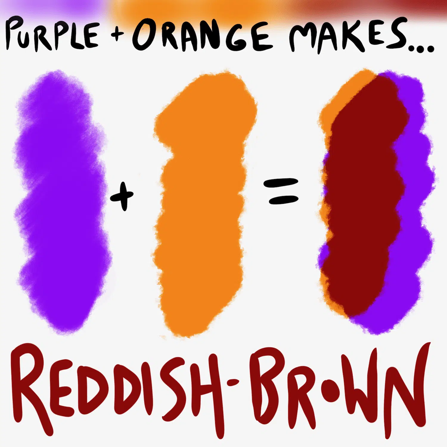
When we mix purple and orange pigments, we are essentially combining their constituent primary colors.
- Purple is composed of Red + Blue.
- Orange is composed of Red + Yellow.
Therefore, mixing purple and orange means combining (Red + Blue) with (Red + Yellow). This equates to: Red + Red + Blue + Yellow.
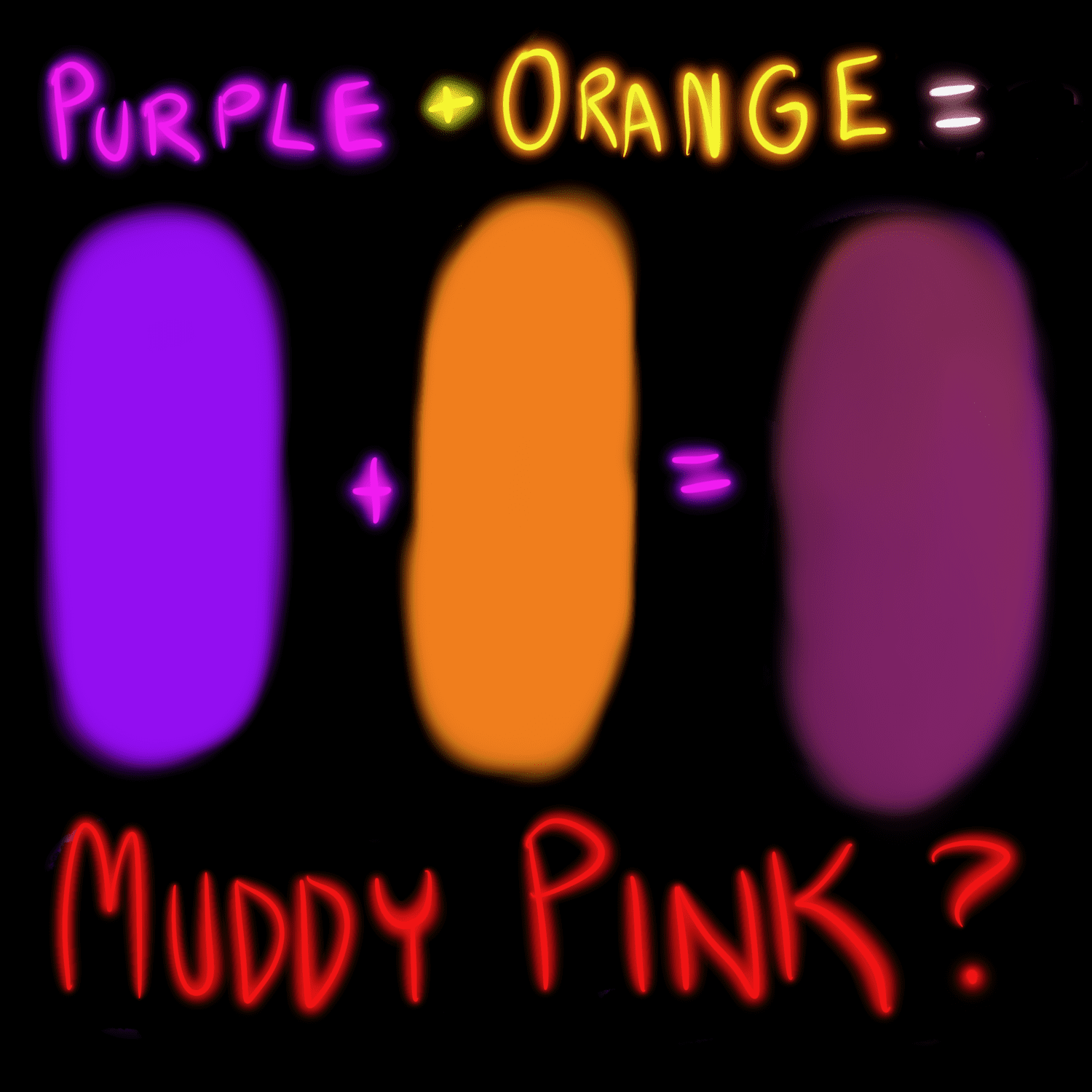
The outcome of this combination is a desaturated, often murky, reddish-brown. The prominence of red, coupled with the presence of all three primary colors (red, yellow, and blue), tends to neutralize the vibrancy and clarity of the individual hues. When all three primary colors are mixed in roughly equal proportions in subtractive color theory, the result is typically a muddy brown or black. In this case, the double dose of red nudges the resulting brown towards a reddish tint, yielding a dull rust, a muted mahogany, or a deep, unsaturated taupe depending on the exact shades, saturation, and lightness of the initial purple and orange.
This result stands in stark contrast to the individual brilliance and distinct character of purple and orange. While both are powerful and evocative on their own, their direct pigmentary mixture rarely yields a color that a brand would intentionally seek as a primary identifier.
The Psychological and Brand Implications of the Resultant Hue
Understanding the technical outcome is one thing; appreciating its implications for brand identity and marketing is another. The “muddy brown” resulting from mixing purple and orange carries significant psychological weight for brand perception.
The Undesired Outcome: Why “Muddy Brown” Can Be Problematic for Brands
Brands meticulously select their color palettes to communicate specific messages and evoke desired emotional responses. Each color possesses an established psychological profile:
- Purple: Often signifies luxury, sophistication, creativity, spirituality, and wisdom. It can also be mysterious or magical.
- Orange: Typically represents enthusiasm, warmth, energy, friendliness, affordability, and youthfulness.
When these two vibrant, distinct colors combine to form a desaturated reddish-brown, the resulting hue often loses the positive attributes of its predecessors. Psychologically, dull browns can be perceived as:
- Drab or Uninspiring: Lacking the vibrancy and clarity that modern brands often strive for.
- Old or Stagnant: While some heritage brands use deep, rich browns intentionally, a muddy brown can suggest a lack of dynamism or modernity.
- Lack of Clarity or Purpose: A color that doesn’t “pop” or clearly communicate can undermine a brand’s message.
- Unappetizing: Especially critical for food and beverage brands, where clarity and vibrancy are key to appealing to consumers.
For most brands, the goal is to create a memorable, clear, and positive visual identity. A color that results from a mixed bag of primaries, stripped of its original luster, rarely aligns with these objectives. It fails to stand out in a competitive marketplace and can inadvertently convey negative attributes that are contrary to the brand’s intended persona.

Strategic Avoidance vs. Intentional Application
While directly mixing purple and orange pigments is generally avoided for primary branding elements, it’s crucial to distinguish between a “muddy result” and an “intentional brown.” Brands that wish to convey earthiness, naturalness, or a rustic feel will often opt for carefully formulated, clean brown pigments rather than accidentally stumbling upon one through unfortunate mixing.
There might be niche applications where a desaturated, complex brown could be used as a secondary or tertiary accent color, perhaps to ground a highly eclectic palette or for specific textural elements. However, even in these instances, the color would likely be specified directly rather than being the product of an unguided mix. The key takeaway for brand strategists is to control every aspect of their color palette, ensuring each hue serves a deliberate purpose and contributes positively to the brand narrative.
Beyond Direct Blending: Harnessing Purple and Orange in Brand Palettes
The fact that purple and orange don’t mix into a desirable color doesn’t diminish their individual power or their potential to work together in a brand’s visual identity. The strategic juxtaposition of these colors can create compelling and dynamic effects.
Creating Dynamic Contrast and Visual Interest
Instead of mixing them, brands can leverage purple and orange for their contrasting and complementary qualities, creating visual interest and energy.
- Complementary Relationships: While purple and orange aren’t direct complements (purple’s complement is yellow-green, and orange’s is blue), their primary components often create strong contrasts within a broader palette. For instance, yellow is a complement to purple, and red is a key component of orange, while blue is a key component of purple. This underlying relationship can be exploited.
- Bold Statements: A deep, rich purple paired with a vibrant, energetic orange can make a very bold and contemporary statement. This combination can convey creativity, innovation, and a youthful dynamism. Think of a purple background with orange call-to-action buttons or highlights in a digital interface – the orange “pops” against the depth of the purple, guiding the user’s eye.
- Vibrancy and Energy: When used side-by-side, without blending, purple and orange retain their individual intensity. This pairing is often seen in brands aiming for high energy, playfulness, or even a sense of the unconventional. Consider entertainment brands, sports teams, or creative agencies that seek to break from traditional corporate aesthetics.
The power lies in the strategic use of space, proportion, and hierarchy. One color might dominate as a primary, with the other serving as a powerful accent. Alternatively, they can be balanced for a more intricate, layered look, often mediated by neutral tones like whites, grays, or blacks to provide visual relief and sophistication.
Exploring Tints, Tones, and Shades
The terms “purple” and “orange” encompass a vast spectrum of hues.
- Tints: Adding white to a color (e.g., lavender, peach).
- Tones: Adding gray to a color (e.g., dusty mauve, burnt orange).
- Shades: Adding black to a color (e.g., deep plum, rust).
By exploring tints, tones, and shades, brands can create sophisticated palettes where a soft lavender meets a warm terracotta, or a deep eggplant partners with a vivid tangerine. These variations offer greater flexibility and allow for a more nuanced expression of brand personality, often mitigating the harshness that can arise from pairing pure, highly saturated versions of purple and orange. This careful calibration ensures that the individual strengths of both colors are amplified, rather than diluted.
Case Studies and Tactical Brand Design
While examples of brands directly mixing purple and orange into a primary brand color are scarce and usually unintentional, there are numerous instances of brands effectively using purple and orange together in their visual ecosystem.
Brands That Successfully Navigate Complex Palettes
Consider the vibrancy often associated with events or sectors where creativity and energy are paramount.
- Sports Teams: Many athletic teams strategically combine bold, high-contrast colors like purple and orange to evoke passion, power, and team spirit. The energy of orange can symbolize aggressiveness and speed, while purple can represent leadership and uniqueness. These colors are used in uniforms, logos, and marketing materials, always distinctly separated, never mixed.
- Entertainment and Arts: Brands within the entertainment industry, particularly those targeting a younger demographic, frequently use unconventional and energetic color combinations. A purple and orange palette can convey excitement, imagination, and a cutting-edge sensibility for film festivals, music events, or digital content platforms.
- Creative Agencies: Design studios or marketing agencies often leverage daring color combinations to demonstrate their creativity and willingness to innovate. A bold purple and orange palette can immediately signal a forward-thinking and unconventional approach to their clients.
- Holiday Branding (e.g., Halloween): This seasonal theme famously pairs black, orange, and often purple. The purple and orange, though not mixed, are essential for creating the distinct spooky yet playful mood, relying on their individual vibrancy and the traditional associations with these colors for the holiday.
The success in these cases lies in disciplined application: using solid blocks of each color, allowing them to interact visually without bleeding into one another, and often employing neutral colors (like white or black) as buffers or backgrounds to provide structure and prevent visual chaos.
Practical Takeaways for Brand Identity Designers
For brand identity designers, the lesson from purple and orange is clear:
- Understand Primary Components: Always be aware of the primary colors that constitute your chosen hues. This knowledge is crucial for predicting how they will interact when mixed or even when placed in close proximity.
- Prioritize Clarity Over Unintended Blending: If your brand requires a specific shade of brown, source it cleanly. Do not rely on mixing two vibrant secondary colors, as the outcome is almost certainly a dull, uninspired hue.
- Leverage Juxtaposition for Impact: Instead of mixing, use purple and orange for powerful visual contrast. Design elements, typography, or backgrounds can effectively utilize these colors to create energy, guide the eye, and evoke specific emotional responses.
- Experiment with Variation: Don’t limit yourself to pure hues. Explore tints, tones, and shades of purple and orange to build a more sophisticated and flexible palette. A pastel lavender and a muted terracotta, for example, can create a softer, more approachable feel than their highly saturated counterparts.
- Consider the Medium: Color perception varies across digital screens, print, and physical materials. Always test your brand colors in their intended applications to ensure consistency and desired impact.
- Context is King: The psychological impact of any color, or color combination, is heavily influenced by its context. A purple and orange palette for a children’s toy brand will be interpreted differently than for a luxury fashion brand. Align your color choices with your brand’s unique narrative and target audience.
In brand strategy, every color choice is an opportunity to communicate. While directly mixing purple and orange yields a color that rarely serves a brand’s strategic goals, understanding why this happens provides invaluable insight into the power of precise color theory application. By strategically leveraging these colors in juxtaposition rather than blending, brands can create vibrant, memorable, and impactful visual identities that truly resonate with their audience.
aViewFromTheCave is a participant in the Amazon Services LLC Associates Program, an affiliate advertising program designed to provide a means for sites to earn advertising fees by advertising and linking to Amazon.com. Amazon, the Amazon logo, AmazonSupply, and the AmazonSupply logo are trademarks of Amazon.com, Inc. or its affiliates. As an Amazon Associate we earn affiliate commissions from qualifying purchases.