
The Strategic Power of Navy Blue in Branding
Navy blue is more than just a shade; it’s a foundational pillar in the lexicon of corporate identity and personal branding, carrying a profound weight of associations that resonate across diverse industries. Its inherent qualities position it as a strategic choice for brands aiming to convey stability, professionalism, and trustworthiness. Understanding navy blue’s psychological impact is the first step in leveraging its power and selecting complementary colors that amplify a brand’s message.
Navy Blue’s Intrinsic Brand Associations
Culturally and psychologically, navy blue is consistently linked to concepts of authority, reliability, and intelligence. It evokes a sense of tradition and stability, often seen in the uniforms of professionals ranging from pilots to police officers, fostering immediate associations with competence and steadfastness. In the corporate world, this translates into a perception of credibility and seriousness, making it a favored choice for financial institutions, legal firms, and technology companies that need to project an image of dependable innovation. Brands adopting navy blue tap into a universal understanding of professionalism, signaling a commitment to quality and enduring value. Its gravitas offers a reassuring presence, a silent promise of expertise and discretion. For personal branding, incorporating navy blue in professional attire or digital profiles communicates a sophisticated and serious approach to one’s craft.
Versatility as a Foundation Color
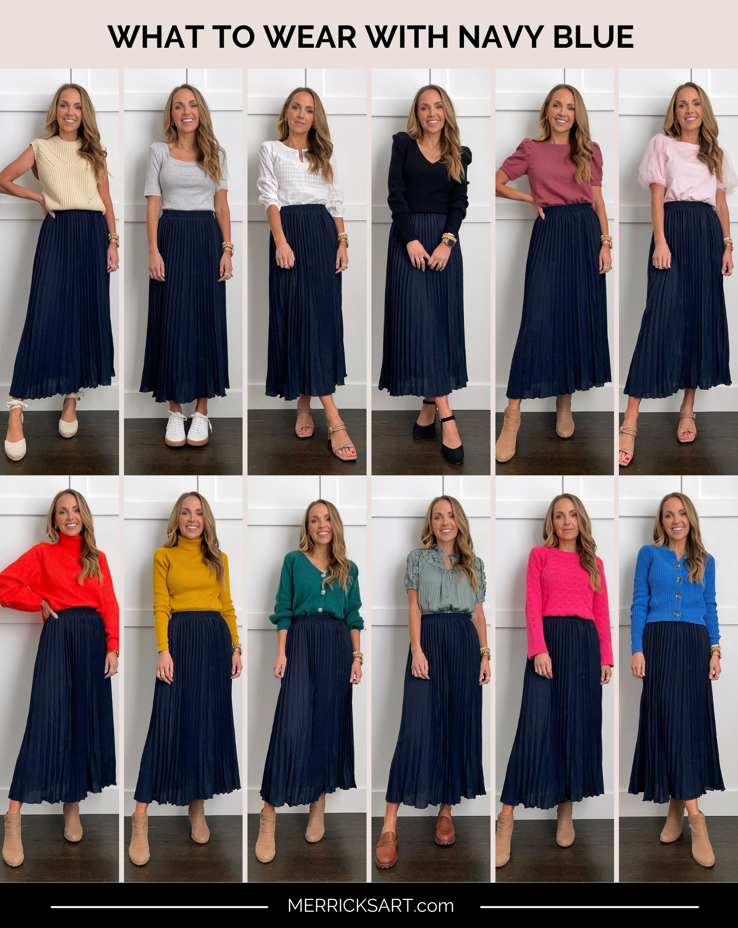
Beyond its strong associations, navy blue’s true strategic value lies in its remarkable versatility. Unlike more vibrant hues that can dominate or dictate a brand’s entire palette, navy blue acts as a sophisticated neutral, capable of anchoring a design without overwhelming it. This makes it an ideal primary color, allowing secondary and accent colors to shine while providing a consistent, elegant backdrop. Its depth allows it to pair equally well with both warm and cool tones, bright and muted shades, offering an expansive range of design possibilities. This adaptability is crucial for brands that need to evolve their messaging or expand into new markets without undergoing a complete visual overhaul. It offers a timeless appeal, ensuring brand longevity and preventing visual fatigue, making it a prudent investment in a brand’s long-term identity.
Harmonious Pairings for Corporate Identity & Marketing
When constructing a brand’s visual identity, the goal is often to create a sense of harmony, professionalism, and understated elegance. Pairing navy blue with certain colors can reinforce these attributes, creating a cohesive and compelling aesthetic that resonates with target audiences who value tradition, quality, and refinement. These pairings are particularly effective for corporate identity systems, investor relations materials, and luxury marketing campaigns.
Classic & Professional: White, Grey, and Beige
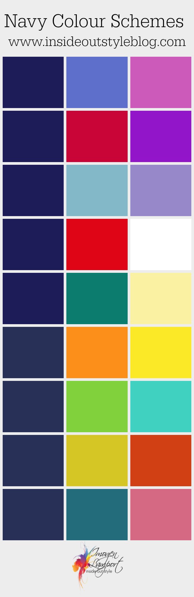
The combination of navy blue with classic neutrals like white, various shades of grey, and beige is a cornerstone of professional branding. White offers crisp contrast, enhancing readability and providing a clean, minimalist aesthetic often associated with high-end technology or modern luxury. Grey, from light silver to charcoal, introduces sophistication and balance, conveying wisdom and calm without diminishing navy blue’s authority. This trio is excellent for corporate reports, minimalist websites, and professional stationery where clarity and gravitas are paramount. Beige and cream tones, while also neutral, introduce a warmer, more approachable softness compared to stark white, suggesting a comforting luxury or a more organic, human touch. They soften navy blue’s intensity, creating a welcoming yet distinguished brand presence suitable for hospitality or lifestyle brands aiming for understated elegance.
Sophisticated Depth: Gold, Silver, and Copper
For brands aiming to exude luxury, exclusivity, and premium quality, pairing navy blue with metallic hues like gold, silver, or copper is an unparalleled strategy. Gold, in particular, creates a regal and opulent contrast, instantly elevating a brand’s perceived value and associating it with prestige and success. This combination is a staple for high-end fashion, jewelry, and luxury real estate. Silver offers a cooler, more modern sophistication, evoking precision, innovation, and technological advancement, ideal for fintech or high-tech manufacturing. Copper, with its warmer, earthy undertones, provides a unique blend of heritage and contemporary flair, suggesting craftsmanship, authenticity, and enduring value, often seen in artisanal brands or bespoke services. These metallic accents, when used sparingly and thoughtfully, transform navy blue into a canvas for aspirational messaging, communicating exclusivity and superior quality without needing explicit statements.
Trustworthy & Calming: Lighter Blues and Greens
To reinforce themes of trust, tranquility, and natural balance, navy blue pairs beautifully with lighter shades of blue and various greens. A monochromatic palette with lighter blues (sky blue, powder blue) creates a seamless, cohesive, and incredibly trustworthy brand identity, often employed by healthcare providers, financial advisors, or environmental organizations. It speaks to transparency and reliability. Greens, from serene sage to vibrant teal, introduce elements of growth, sustainability, and harmony. Sage green, for instance, combined with navy, creates an organic yet sophisticated feel, perfect for wellness brands, sustainable products, or brands focused on natural ingredients. Teal offers a more vibrant, modern edge, combining blue’s stability with green’s invigoration, ideal for creative agencies or brands that want to convey innovation with a touch of calm. These combinations foster a sense of security and well-being, enhancing customer confidence and engagement.
Dynamic Combinations for Modern Brands & Impact
While classic pairings offer stability, modern branding often demands combinations that capture attention, convey dynamism, and differentiate a brand in a crowded marketplace. Navy blue’s depth allows it to serve as a grounding force for more energetic or unconventional color partners, creating visual impact without sacrificing its inherent professionalism. These pairings are excellent for campaigns requiring high visibility, targeting younger demographics, or brands striving for an innovative, forward-thinking image.
Energetic Accents: Coral, Orange, and Yellow
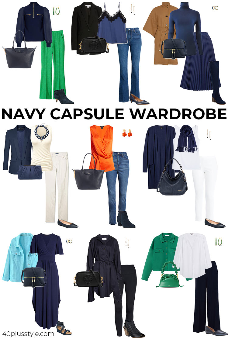
To inject vitality and a contemporary edge, navy blue acts as a perfect counterpoint to vibrant warm colors like coral, orange, and yellow. Coral, with its blend of pink and orange, provides a fresh, optimistic, and approachable feel, softening navy blue’s formality while adding a modern zest. This combination is popular in lifestyle brands, startups aiming for a friendly yet professional image, and consumer tech. Bright orange offers high contrast and conveys enthusiasm, creativity, and urgency, making a brand instantly noticeable. It’s an excellent choice for calls to action or for brands in the entertainment or innovation sectors that want to project energy and excitement. Yellow, particularly a sunny or golden hue, brings optimism, happiness, and clarity. Paired with navy, it strikes a balance between serious intent and cheerful approachability, ideal for educational platforms, creative services, or brands looking to highlight user-friendliness and positive experiences. These accent colors should be used strategically to highlight key messages or visual elements, ensuring they enhance rather than overwhelm the navy base.
Bold Statements: Fuchsia, Chartreuse, and Electric Blue
For brands that aim to make an unapologetic statement and stand out from the competition, navy blue can be paired with truly daring and high-impact colors. Fuchsia, a vivid magenta-pink, creates a powerful, confident, and fashion-forward combination with navy. It speaks to boldness, creativity, and a willingness to challenge norms, often seen in luxury fashion, artistic brands, or those targeting a demographic that appreciates audacious design. Chartreuse, a striking yellow-green, is inherently distinctive and modern. When juxtaposed with navy, it creates an electric energy, signaling innovation, unconventional thinking, and a fresh perspective. This pairing is ideal for disruptive startups, cutting-edge design agencies, or brands that want to position themselves as leaders in novelty. Electric blue, while still in the blue family, offers a powerful, futuristic contrast to navy’s classic depth. It evokes digital sophistication, speed, and advanced technology, perfect for cyber security firms, gaming companies, or brands focused on digital transformation, providing a dynamic and tech-savvy identity. These combinations are designed to be memorable and distinctive, establishing a strong brand personality.
Earthy & Organic: Browns, Terracotta, and Sage Green
While some dynamic pairings aim for high energy, others seek a different kind of impact: one rooted in authenticity, nature, and craftsmanship. Navy blue provides a sophisticated backdrop for a palette of earthy and organic tones, lending gravitas to brands focused on sustainability, natural products, or handcrafted goods. Various shades of brown, from rich chocolate to lighter tan, evoke a sense of grounding, durability, and tradition when paired with navy. This combination is excellent for heritage brands, sustainable fashion, or businesses emphasizing natural materials. Terracotta, with its warm, rustic appeal, introduces an artisanal, handcrafted feel, linking navy blue to human endeavor and authentic creation, often seen in home goods, pottery, or eco-conscious brands. Sage green, as mentioned before, but in this context, highlights its organic and calming qualities. Paired with navy and perhaps some natural browns, it constructs a brand identity that is both sophisticated and deeply connected to nature, promoting a sense of well-being and environmental responsibility. This palette speaks to consumers who value authenticity, sustainable practices, and a return to natural simplicity.
Applying Color Theory to Brand Touchpoints
The theoretical understanding of color pairings is only truly valuable when effectively translated across all visual touchpoints of a brand. Consistent application is crucial for building recognition and reinforcing brand messaging. Every element, from a logo to an employee’s uniform, contributes to the overarching brand narrative.
Logo and Website Design
The logo is the cornerstone of brand identity. When navy blue forms its base, complementary colors should be chosen to ensure immediate recognition and alignment with brand values. A gold accent might signify luxury, while a bright orange could denote innovation. For website design, navy blue often serves as a primary background or text color, providing a professional and legible foundation. Accent colors are then used for calls-to-action, interactive elements, or key headlines to guide user attention and enhance engagement. For instance, a navy website with a clear, vibrant coral “Learn More” button creates a distinct visual hierarchy that is both professional and inviting. The balance between navy’s seriousness and an accent color’s vibrancy is key to maintaining an engaging yet credible online presence.
Marketing Collateral and Packaging
In brochures, advertisements, and packaging, color combinations tell a story. Navy blue can establish the premium nature of a product or service, with complementary colors highlighting specific features or emotional benefits. Consider a high-end skincare brand using navy packaging with silver lettering to convey scientific precision and luxury, contrasted with a subtle rose gold accent for a gentle, nurturing appeal. For digital marketing, navy blue banners paired with bright, contrasting text or imagery can capture attention effectively in busy feeds, ensuring brand messages cut through the noise while maintaining a polished aesthetic. The selected palette must evoke the desired emotional response and reinforce the product’s value proposition directly to the consumer.
Personal Branding and Professional Attire
Beyond corporate entities, personal branding also benefits significantly from strategic color choices. For professionals, navy blue attire (suits, blazers, dresses) projects authority and trustworthiness. The selection of complementary colors in accessories—a vibrant yellow tie, an emerald green scarf, or a subtle silver pin—can communicate personality, creativity, or specific industry alignment without undermining professionalism. For consultants, lawyers, or executives, a navy suit paired with a crisp white shirt and a deep red tie signals power and confidence. In contrast, for a creative professional, a navy jacket with a coral blouse might suggest approachability and artistic flair. These choices, deliberate and informed by color theory, contribute directly to how an individual is perceived in professional settings, building a consistent and impactful personal brand image.
The Importance of Context and Target Audience
While the aesthetic appeal of navy blue and its pairings is undeniable, successful brand strategy dictates that color choices are never arbitrary. They must be deeply informed by the specific context in which the brand operates and, critically, by the cultural and psychological nuances of its target audience.
Industry Standards and Competitor Analysis
Every industry often has unwritten color codes that influence customer expectations. The financial sector, for instance, frequently leans on navy blue, grey, and white to convey stability and security. Diverging too wildly from these norms without strategic intent can confuse or alienate the target audience. Therefore, a thorough competitor analysis is essential. If all competitors use shades of blue, a brand might choose a navy base but pair it with a distinctive, energetic accent color to stand out while still operating within recognizable industry visual cues. Alternatively, a radical departure might be strategic if the goal is to disrupt the market and challenge existing perceptions, but this requires careful consideration of potential risks and rewards. Understanding these industry aesthetics ensures that color choices are both effective and appropriate.
Cultural Nuances in Color Perception
Color perception is not universal; it is heavily influenced by culture, history, and individual experiences. While navy blue generally connotes trust and stability in Western cultures, its specific interpretations or the impact of its complementary colors can vary significantly across different global markets. For example, red can symbolize luck and prosperity in some Asian cultures but danger or aggression in others. Gold might universally signify luxury, but its combination with navy could be perceived differently depending on regional aesthetics and cultural symbolism. Brands operating internationally must conduct thorough research to ensure their chosen color palette translates effectively and appropriately, avoiding unintended messages or negative associations. A brand’s visual identity, particularly its color scheme, is a powerful non-verbal communicator, and ensuring its message is universally understood and positively received is paramount for global brand success. This meticulous attention to detail underscores the strategic importance of every color choice in building a resonant and successful brand.
aViewFromTheCave is a participant in the Amazon Services LLC Associates Program, an affiliate advertising program designed to provide a means for sites to earn advertising fees by advertising and linking to Amazon.com. Amazon, the Amazon logo, AmazonSupply, and the AmazonSupply logo are trademarks of Amazon.com, Inc. or its affiliates. As an Amazon Associate we earn affiliate commissions from qualifying purchases.