
In the intricate tapestry of brand building, understanding the interplay of opposing yet complementary forces is paramount. Much like the ancient Chinese philosophical concept of Yin and Yang, successful brands master the art of balancing contrasts to create a holistic, resonant, and enduring identity. While traditional interpretations associate Yin with black and Yang with white, these aren’t merely literal colors in branding but rather potent metaphors for the dualities a brand must navigate in its visual identity, messaging, and strategic positioning.
The Philosophical Roots: Yin, Yang, and Complementary Opposites in Branding
At its core, the Yin and Yang symbol illustrates how two seemingly contrary elements can be interconnected, interdependent, and even give rise to each other, forming a dynamic equilibrium. Yin represents aspects such as darkness, passivity, intuition, stability, the internal, and tradition. Yang, conversely, embodies lightness, activity, logic, dynamism, the external, and innovation. For a brand, these aren’t mutually exclusive choices but rather a spectrum of attributes that must be artfully blended to forge a compelling narrative and visual presence.

Beyond Black and White: Understanding the Spectrum of Brand Attributes
While the iconic symbol uses black for Yin and white for Yang, a brand’s identity often operates across a much broader chromatic and conceptual spectrum. Consider a luxury brand: its exclusivity, heritage, and depth might align with the introspective, stable qualities of Yin, often conveyed through darker, richer palettes, intricate details, and a sense of timelessness. Yet, it must also embody a forward-looking vision, aspirational quality, and market presence—the dynamic, outward-facing Yang—which might manifest in sleek designs, innovative campaigns, and a vibrant public image.
Similarly, a disruptive tech startup might primarily project Yang qualities: innovation, speed, agility, and a bright, modern aesthetic. However, to build trust and achieve longevity, it must also cultivate Yin attributes like reliability, security, deep understanding of user needs, and a foundational stability that assures its customers. The “colors” here are not just literal hues but the very essence of a brand’s personality, its value proposition, and how it chooses to present itself to the world. A brand that leans too heavily into one side risks becoming one-dimensional—either stagnant and traditional (all Yin) or fleeting and untrustworthy (all Yang). The true mastery lies in the harmonious integration of both.
Visual Harmony: Leveraging Color Duality in Corporate Identity
The deliberate application of color and contrast is one of the most immediate ways a brand communicates its Yin-Yang balance. The visual language of a brand—its logo, website, marketing materials, and product design—is a critical touchpoint where these dualities can either clash or coalesce into a powerful statement.
Strategic Contrast: How Brands Use Light and Dark (and Everything In Between)
Many iconic brands instinctively leverage the power of contrast, mirroring the black and white of Yin and Yang, to create memorable and impactful corporate identities. Consider brands like Chanel, whose timeless elegance is often articulated through stark black and white, conveying both heritage (Yin) and modern sophistication (Yang). The contrast isn’t just aesthetic; it’s strategic. Black implies luxury, depth, and classicism, while white provides clarity, modernity, and a canvas for aspiration.
Beyond literal black and white, brands use contrasting color pairings to achieve a similar effect. A vibrant, energetic primary color (Yang) might be paired with a calming, grounding secondary color (Yin) to create a visual balance that caters to different emotional responses and brand touchpoints. Think of a financial institution that uses a strong, confident blue (Yang, professionalism, trust) alongside a softer, more approachable green or grey (Yin, stability, growth, reliability). This duality ensures the brand feels both authoritative and approachable, secure and forward-thinking.
The Psychology of Balanced Palettes
Color psychology plays a significant role in how a brand’s dualities are perceived. Warm colors (reds, oranges, yellows) are often associated with energy, passion, and action (Yang), while cool colors (blues, greens, purples) evoke calm, stability, and contemplation (Yin). A balanced brand palette doesn’t necessarily avoid one for the other but seeks a complementary relationship. A tech brand might use a bright, energetic orange in its logo to symbolize innovation and dynamism, while employing cooler blues and greys in its UI design to convey user-friendliness and stability.
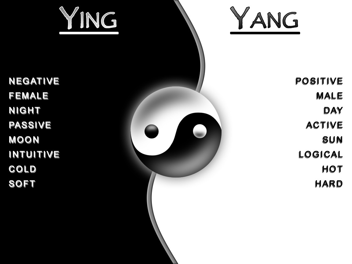
Moreover, the use of negative space in design is a quintessential example of Yin-Yang in action. The empty space around a logo or within an advertisement (Yin) is just as crucial as the designed elements (Yang). It allows the eye to rest, emphasizes key messages, and prevents visual clutter, creating a sense of balance and sophistication that enhances the brand’s overall perception. Without sufficient “Yin” space, the “Yang” elements become overwhelming and lose their impact.
Strategic Balance: Integrating Yin-Yang Principles into Brand Strategy
The Yin-Yang philosophy extends far beyond visual aesthetics, deeply influencing a brand’s overarching strategy, market positioning, and core messaging. It’s about how a brand consciously manages its internal and external dynamics to achieve sustainable growth and resonance.
Balancing Heritage and Innovation
A common challenge for established brands is how to honor their legacy (Yin) while remaining relevant and forward-looking (Yang). Brands that successfully navigate this duality often communicate their history as a foundation for future innovation. Think of an automotive brand that emphasizes decades of engineering excellence (Yin) as the bedrock for its latest electric vehicle technology (Yang). Their marketing strategy might feature nostalgic imagery alongside futuristic concepts, demonstrating continuity and progress. This balance reassures loyal customers while attracting new demographics.
The Art of Consistency and Agility
In a rapidly evolving market, brands face the perpetual tension between maintaining a consistent identity (Yin) and adapting to new trends and consumer behaviors (Yang). A brand with a strong, consistent core identity provides reassurance and builds trust. However, rigid adherence to outdated practices can lead to irrelevance. The Yin-Yang approach advocates for a consistent core purpose and values (Yin) while remaining agile in execution, messaging, and channels (Yang). This means a brand’s fundamental promise remains steadfast, but its expression can evolve, much like a tree whose roots are firmly planted (Yin) but whose branches sway with the wind and grow towards the light (Yang).
Crafting a Holistic Brand: When Opposites Attract and Elevate
The most compelling brands are those that don’t just exist but thrive by embracing and integrating their dualities. They understand that strength comes not from singularity but from the dynamic tension and resolution of complementary forces.
Case Studies in Duality: Brands That Master the Balance
Consider Apple, a brand often associated with innovation, sleek design, and cutting-edge technology (Yang). Yet, a significant part of its appeal lies in its intuitive user experience, reliability, and the sense of community it fosters (Yin). Its minimalist aesthetic, often featuring white and silver (Yang) against deep black screens or product packaging (Yin), embodies this balance visually. The brand communicates a future-forward vision while simultaneously making technology feel accessible and comforting.
Another example is Nike. Its “Just Do It” slogan and association with peak athletic performance, competition, and victory perfectly embody Yang qualities of dynamism and action. However, the brand also cultivates a strong sense of personal empowerment, individual journey, and the internal struggle and discipline required to achieve goals (Yin). Its campaigns often balance epic, action-packed visuals with intimate stories of personal triumph and resilience. This duality makes Nike aspirational yet relatable, powerful yet personal.

The Enduring Appeal of Integrated Brand Identities
Ultimately, the question of “what color is Yin and what color is Yang” in branding transcends simple chromatic choices. It’s a profound inquiry into how a brand achieves completeness by recognizing and harmonizing its inherent dualities. By strategically integrating the “darker” elements of tradition, stability, and introspection with the “lighter” elements of innovation, dynamism, and external engagement, brands can forge an identity that is not only visually appealing but also strategically robust, emotionally resonant, and enduringly relevant. This holistic approach ensures that a brand doesn’t just present a single facet of its personality but offers a rich, balanced experience that speaks to the entirety of its audience.
aViewFromTheCave is a participant in the Amazon Services LLC Associates Program, an affiliate advertising program designed to provide a means for sites to earn advertising fees by advertising and linking to Amazon.com. Amazon, the Amazon logo, AmazonSupply, and the AmazonSupply logo are trademarks of Amazon.com, Inc. or its affiliates. As an Amazon Associate we earn affiliate commissions from qualifying purchases.