
The humble colored pencil, a ubiquitous tool in both art studios and school classrooms, might seem simple on the surface. Yet, its composition is a sophisticated blend of materials, each chosen meticulously to define performance, user experience, and ultimately, a brand’s identity and market position. For brands in the art supply sector, the specific “recipe” of a colored pencil is far more than a manufacturing detail; it is a strategic decision that underpins their quality promise, marketing narrative, and corporate identity. Understanding what a colored pencil is made of is, therefore, an insightful dive into the strategic choices that differentiate market leaders from their competitors.
The Foundation of Brand Identity: Core Composition
At its heart, a colored pencil consists of three primary components: the pigment, the binder, and the casing. These elements, when combined, create the core that defines a pencil’s color, texture, lightfastness, and durability. Each ingredient’s selection reflects a brand’s commitment to specific attributes, directly influencing its perceived value and target audience. Premium brands invest heavily in research and development to source and combine these components in ways that deliver superior performance, thereby reinforcing their high-end positioning. Conversely, mass-market brands might prioritize cost-effectiveness, leading to different material choices that cater to broader accessibility. The material composition is not merely functional; it is the physical manifestation of a brand’s promise to its consumers.
Pigments: The Soul of Color and Brand Differentiation
The most critical component defining a colored pencil’s output, and thus a significant brand differentiator, is its pigment. Pigments are the finely ground particles that give the pencil its color.
Quality and Lightfastness: Premium vs. Economy Brands
The quality of pigments directly correlates with a colored pencil’s vibrancy, saturation, and longevity. Premium art brands, such as Prismacolor, Faber-Castell Polychromos, or Caran d’Ache Luminance, distinguish themselves by using high-grade pigments, often artist-grade organic or inorganic compounds, known for their purity and brilliance. These brands often highlight the specific chemical makeup of their pigments, emphasizing their archival quality. A crucial attribute for professional artists is lightfastness—the pigment’s resistance to fading when exposed to light over time. Brands that achieve high lightfastness ratings (often tested and certified by international standards like ASTM D-6901) can market their pencils to professionals who require their artwork to endure for decades. This promise of permanence becomes a cornerstone of their brand reputation and a key selling point.
In contrast, economy brands may use lower-grade pigments or a higher proportion of fillers, resulting in less vibrant colors, lower lightfastness, and a chalkier texture. While these pencils are more affordable and suitable for casual use or student artists, their brand identity is built on accessibility rather than archival quality or professional performance. The explicit communication of pigment quality and lightfastness ratings in marketing materials directly influences consumer perception and brand loyalty within specific market segments.
Color Range and Saturation: Expanding Creative Possibilities
Beyond individual pigment quality, the breadth and depth of a brand’s color palette are significant factors in its market appeal and identity. Brands known for their extensive range—often hundreds of unique colors—empower artists with unparalleled creative freedom. This wide selection is not just about quantity; it reflects a brand’s investment in diverse pigment sourcing and precise color formulation. The saturation of these colors, meaning their intensity and richness, is also a critical performance indicator. Highly saturated pencils allow for fewer layers to achieve vibrant results, saving artists time and material, thus enhancing the user experience and reinforcing the brand’s commitment to efficiency and quality. Brands like Derwent, with their specialized color sets, build niches around unique palettes, further solidifying their distinct market position.
Binders and Fillers: Engineering Performance and User Experience
While pigments provide the color, the binder is the glue that holds the pigment particles together and allows them to adhere to the paper. The type and proportion of binders and fillers are crucial in defining a pencil’s texture, blending capabilities, and strength, directly influencing the user’s drawing experience and a brand’s distinct feel.
Wax-Based vs. Oil-Based: Defining Feel and Application
The most significant distinction in colored pencil binders is between wax-based and oil-based formulations. This choice fundamentally shapes a brand’s product line and targets different artistic preferences.
- Wax-based pencils (e.g., Prismacolor Premier) typically feature a softer, creamier core due to their wax binder. This composition allows for smooth application, excellent blending, and rich layering, often referred to as “wax bloom” when layers build up. Brands emphasizing blendability and vibrant, opaque coverage often opt for wax formulations. Their marketing highlights the ease of layering and the creation of seamless color transitions, appealing to artists who prioritize a painterly effect. However, a drawback can be breakage if not handled carefully, and the wax bloom may require fixatives. Brands manage this by reinforcing cores and educating users, positioning these characteristics as part of the unique artistic experience their products offer.
- Oil-based pencils (e.g., Faber-Castell Polychromos, Caran d’Ache Pablo) tend to be harder and more resistant to breakage. They offer fine point retention, allowing for intricate detail work and precise lines. Oil-based pencils typically create less wax bloom and can withstand more pressure, appealing to artists who prefer crisp lines, controlled layering, and a durable finish. Brands championing precision, longevity, and versatility often choose oil-based formulas, marketing them as robust tools for detailed illustration and mixed-media applications.
The strategic decision to offer wax-based, oil-based, or even a mix (hybrid formulations are emerging) dictates a brand’s competitive advantage in different segments of the art market. It’s a clear statement about the intended application and artistic style their products best support.
Consistency and Breakage Resistance: A Mark of Quality Control
The precise ratio of pigments, binders, and fillers also impacts the core’s consistency and resistance to breakage. A poorly formulated core might crumble easily when sharpened or pressed, leading to frustration for the artist and a damaged brand reputation. Premium brands invest in rigorous quality control and advanced manufacturing processes to ensure that their pencil cores are uniformly mixed, centered within the casing, and engineered for optimal strength. This commitment to durability and consistency is a hallmark of quality and is often subtly communicated through product longevity claims and user reviews, reinforcing trust and brand loyalty. The ability to maintain a sharp point without constant breakage is a significant aspect of user satisfaction, directly reflecting on the perceived quality of the brand.
Casing and Aesthetics: The Tangible Brand Touchpoint
Beyond the core, the external casing and overall aesthetic design of a colored pencil are critical elements of brand identity. These visible components are often the first point of interaction and contribute significantly to the user’s tactile and visual experience.
Wood Type and Ergonomics: Crafting the User’s Hand Experience
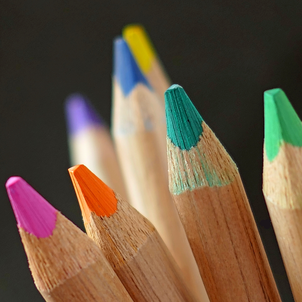
The choice of wood for the casing is not purely aesthetic; it affects sharpening, durability, and the pencil’s feel in hand. High-quality colored pencils typically use fine-grained woods like Californian incense-cedar or basswood. These woods sharpen smoothly, without splintering, and provide a pleasant aroma. The tactile experience of holding and using a pencil is paramount for artists. Brands often consider the ergonomic design, offering hexagonal, round, or triangular barrels, each catering to different preferences for grip and comfort during extended drawing sessions. These seemingly minor details are part of a holistic design strategy aimed at enhancing user experience, which in turn strengthens brand perception as thoughtful and user-centric. A pencil that feels balanced and comfortable becomes an extension of the artist, fostering a deeper connection with the brand.
Finishes and Packaging: Visual Cues of Brand Excellence
The exterior finish of the pencil—lacquer, matte, or natural wood—along with the printing of the brand name, color code, and lightfastness ratings, are all vital visual cues. These elements contribute to the overall aesthetic and communicate the brand’s style and values. A sleek, high-gloss finish might convey luxury, while a natural, unlacquered wood might suggest sustainability or an artisan feel. Packaging, from simple cardboard boxes to elaborate metal tins or wooden cases, also plays a crucial role in presentation and protection, reinforcing the perceived value of the product. Brands meticulously design their packaging to be both functional and attractive, serving as a silent salesperson on retail shelves and a statement piece for the consumer. Consistent branding across product lines and packaging builds strong recognition and reinforces corporate identity.
Material Innovation and Sustainability: Evolving Brand Narratives
In an increasingly environmentally conscious market, the materials chosen for colored pencils are also becoming a part of a brand’s sustainability narrative and corporate social responsibility (CSR) strategy. Brands are exploring innovations in materials and sourcing to appeal to a new generation of consumers who value ecological impact. This includes using sustainably harvested wood (FSC-certified), recycled materials for casings or packaging, or developing plant-based binders and pigments.
Brands that actively pursue sustainable material sourcing and manufacturing processes can differentiate themselves as ethical and forward-thinking. Marketing these initiatives becomes a powerful tool to enhance their corporate identity, attract environmentally conscious consumers, and build a positive brand image. This strategic integration of material innovation and sustainability into the brand’s core offering showcases how “what a colored pencil is made of” extends beyond purely functional considerations to encompass broader ethical and market-driven imperatives. It illustrates a dynamic approach to brand building, where material choices are continuously evaluated against evolving consumer values and industry standards.
aViewFromTheCave is a participant in the Amazon Services LLC Associates Program, an affiliate advertising program designed to provide a means for sites to earn advertising fees by advertising and linking to Amazon.com. Amazon, the Amazon logo, AmazonSupply, and the AmazonSupply logo are trademarks of Amazon.com, Inc. or its affiliates. As an Amazon Associate we earn affiliate commissions from qualifying purchases.