
In the intricate tapestry of brand strategy, color is far more than a mere aesthetic choice; it is a potent psychological tool, a silent language that communicates values, evokes emotions, and forges deep connections with an audience. Among the myriad emotions brands strive to cultivate, hope stands out as a particularly powerful and enduring aspiration. It’s the promise of a better future, a sense of optimism that resonates deeply, influencing consumer perception, loyalty, and engagement. Identifying “the color for hope” is not about pinpointing a single, definitive hue, but rather understanding a spectrum of colors and their strategic application in building a brand narrative that inspires and uplifts.

The Psychology of Color in Brand Identity
Color psychology is a foundational pillar of effective brand identity. Every shade, tone, and saturation carries inherent meanings and cultural associations that can subtly yet profoundly influence how a brand is perceived. For businesses aiming to communicate a message of hope, optimism, or future-readiness, the choice of a color palette is a critical strategic decision, impacting everything from logo design to marketing campaigns and product packaging.
Beyond Aesthetics: Color as a Communication Tool
Brands don’t just exist; they tell stories. And color is a vital storyteller in this narrative. It’s the first impression, often registered subconsciously, that sets the tone for a brand’s personality and purpose. When a brand seeks to embody hope, it’s tapping into a universal human desire for progress, security, and positive change. The right colors can convey innovation, sustainability, wellness, or resilience—all facets of a hopeful outlook. For instance, a tech startup aiming to revolutionize an industry might use colors associated with new beginnings and foresight, while a non-profit focused on environmental recovery would lean towards hues that symbolize growth and renewal. The deliberate selection and consistent application of these colors transform them from simple visual elements into powerful conduits of the brand’s core message.
Cultural Nuances and Universal Associations
While certain color associations are broadly universal (e.g., red for passion, black for sophistication), others can be deeply rooted in cultural context. A color that signifies purity and celebration in one region might denote mourning or caution in another. Brands operating on a global scale must navigate these nuances carefully, often opting for color strategies that leverage more universal positive associations or adapting palettes for specific markets. However, the emotional resonance of hope—the desire for positive outcomes and a brighter future—tends to transcend many cultural boundaries, allowing certain colors to serve as widely recognized beacons of optimism across diverse demographics. Understanding this interplay between universal and cultural significance is crucial for crafting a hopeful brand identity that truly resonates.
Decoding Hope: Universal Hues and Their Branding Implications
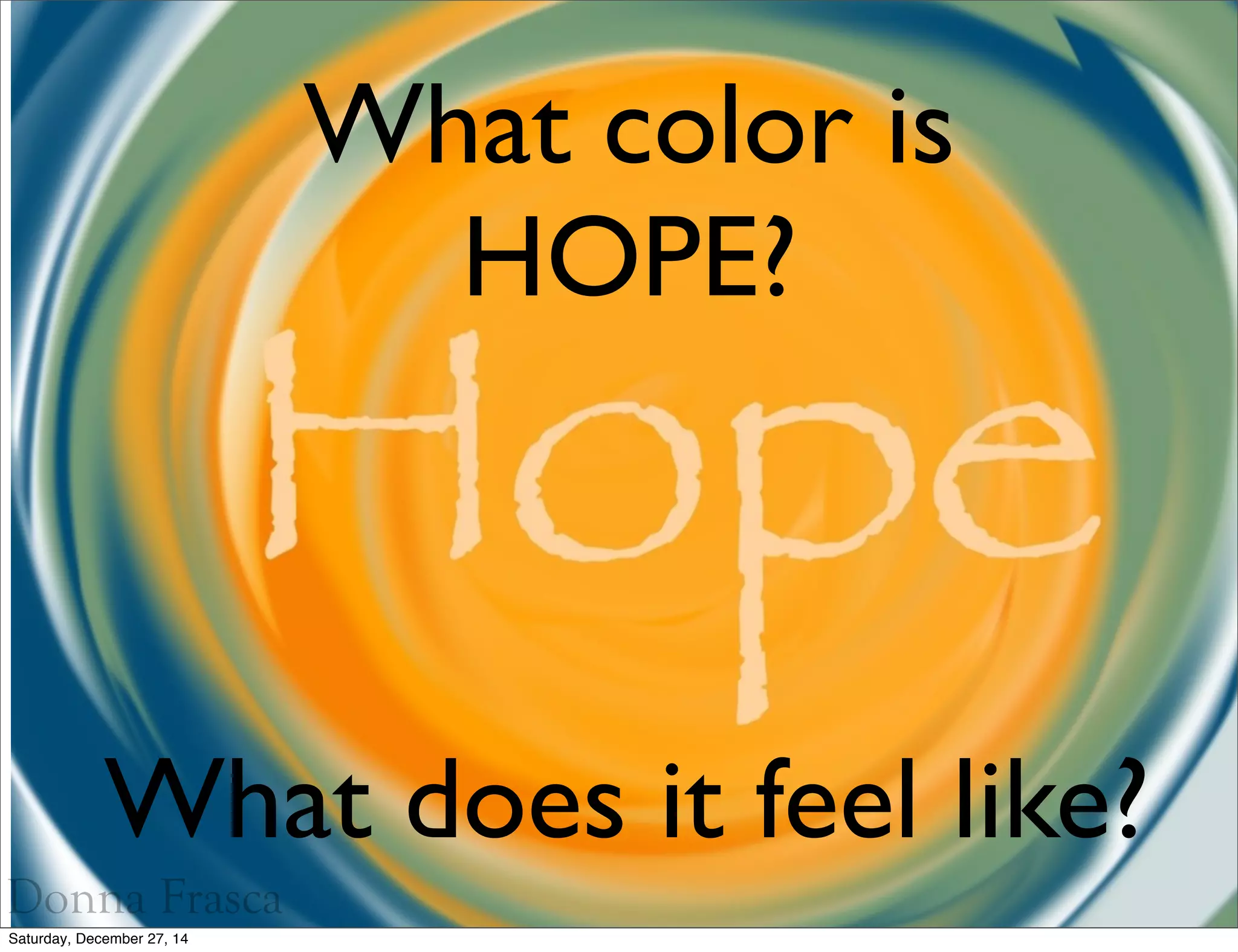
While no single color unilaterally owns the concept of hope, several colors are consistently associated with its various facets: growth, optimism, new beginnings, trust, and serenity. Brands strategically employ these hues to evoke these specific feelings.
Green: Growth, Freshness, and a Brighter Tomorrow
Green is perhaps the most direct and universally recognized color for hope. It’s the color of nature, new life, growth, and renewal. When winter recedes and spring emerges, it’s green that signals life’s return and the promise of abundance. In branding, green is powerfully leveraged by companies emphasizing sustainability, environmental responsibility, health, and vitality.
- Branding Implications: A brand using green often aims to convey a sense of ethical responsibility, a commitment to natural solutions, or the idea of positive progress and expansion. It suggests a future that is sustainable, healthy, and thriving, aligning perfectly with a hopeful outlook on the world and individual well-being. Financial institutions might use softer greens to imply growth and stability, while wellness brands lean into vibrant greens for freshness and vitality.
Blue: Trust, Stability, and Serene Optimism
Blue, particularly lighter and medium shades, is deeply associated with tranquility, trust, stability, and intelligence. It’s the color of the sky and the ocean, vast and enduring, inspiring a sense of calm and reliability. In the context of hope, blue offers a serene, dependable optimism, a belief in a stable future.
- Branding Implications: Brands seeking to build trust and convey a sense of calm confidence often gravitate towards blue. This is why it’s a staple in corporate branding, finance, and healthcare. For hope, blue suggests a steady hand, a reliable path forward, and the quiet assurance that things will be alright. It’s a comforting hope, grounded in predictability and integrity, often used by brands offering long-term solutions or essential services that support a stable future.

Yellow & Orange: Warmth, Joy, and Energetic Potential
Yellow and orange are colors that radiate warmth, energy, and happiness. Yellow is the color of sunshine, often linked to joy, intellect, and creativity. Orange combines yellow’s brightness with red’s energy, signifying enthusiasm, success, and determination.
- Branding Implications: These vibrant colors infuse a brand with a spirited and active form of hope. Yellow often evokes a bright, optimistic future and a sense of enlightenment, making it suitable for educational or innovative brands. Orange suggests excitement, accessibility, and positive momentum—a more dynamic and proactive form of hope. Brands using these colors aim to inspire an energetic belief in possibility, encouraging action and celebrating progress. They are excellent choices for brands focused on innovation, community building, or youth-oriented products, where a vibrant and engaging outlook is key.
White: Purity, New Beginnings, and Clean Slates
White, though often considered the absence of color, is profoundly significant in conveying purity, simplicity, cleanliness, and new beginnings. It’s the blank canvas upon which new ideas are formed, symbolizing a fresh start and unblemished potential.
- Branding Implications: For brands communicating hope, white offers a powerful message of renewal and clarity. It can signify transparency, honesty, and a departure from complexity or past negativity. Brands in healthcare, technology, or those offering minimalist solutions often use white to project an image of pristine excellence and a clear path forward. It represents the hope for a fresh outlook, unburdened by past limitations, inviting the audience to imagine a clean, bright future.
Crafting a Brand Message of Hope
The strategic deployment of colors associated with hope requires more than just picking a favorite hue. It demands a holistic approach that integrates color into every facet of a brand’s visual and experiential identity, ensuring consistency, authenticity, and resonance.
Consistency Across Touchpoints
For a brand to effectively communicate hope, its chosen color palette must be consistently applied across all brand touchpoints—from the logo and website to marketing materials, product packaging, physical spaces, and even customer service interactions. Inconsistency dilutes the message, creating confusion and weakening the emotional association. A unified visual identity reinforces the brand’s promise and builds a recognizable, trusted presence that reliably evokes the intended feeling of hope. This consistency builds mental shortcuts for consumers, instantly associating the visual identity with the positive emotional outcome the brand wishes to convey.
Balancing Aspiration with Authenticity
While aspirational messaging is key to hope, it must be grounded in authenticity. A brand that uses hopeful colors but fails to deliver on its promises will quickly lose credibility. The colors chosen to represent hope must align with the brand’s actual mission, values, and actions. For example, an environmentally conscious brand using green to symbolize hope for the planet must genuinely implement sustainable practices. Authenticity ensures that the visual promise of hope is backed by real substance, fostering genuine trust and long-term loyalty. Consumers are increasingly discerning, and a superficial application of hopeful imagery without corresponding action can backfire, eroding brand equity.
Case Studies: Brands That Inspire Hope Through Color
Consider organizations that champion progress or recovery. Brands in the health and wellness sector frequently use variations of green and blue to convey healing, calm, and a hopeful future. Technology companies focused on innovation might leverage vibrant blues and yellows to symbolize forward-thinking solutions and a bright new era. Non-profits dedicated to social change often combine earthy greens with optimistic yellows, symbolizing growth, community, and the promise of a better tomorrow. Even financial service providers, traditionally associated with conservative blues, might incorporate brighter greens or subtle yellows to signify growth potential and a hopeful financial future for their clients. The strategic blend and emphasis of these colors can subtly shift the brand’s narrative, always pointing towards a positive outlook.
The Future of Hopeful Branding: Adapting to Evolving Perceptions
As global challenges and societal aspirations evolve, so too do the ways brands articulate hope. The “color for hope” isn’t static; it adapts to reflect contemporary needs and desires. In times of uncertainty, brands might lean into colors that convey resilience and stability (like deep blues), while periods of innovation might see a surge in bright, energetic hues (yellows, oranges). The future of hopeful branding will increasingly involve a dynamic and responsive approach to color, leveraging data and cultural insights to refine palettes that truly resonate with an audience’s current emotional landscape. Brands that can fluidly adapt their visual language to mirror the public’s hopes and dreams will continue to build powerful, lasting connections. Ultimately, the color for hope is not a fixed pigment, but a strategic choice, a dynamic visual language employed to inspire, reassure, and guide audiences toward a brighter tomorrow.
aViewFromTheCave is a participant in the Amazon Services LLC Associates Program, an affiliate advertising program designed to provide a means for sites to earn advertising fees by advertising and linking to Amazon.com. Amazon, the Amazon logo, AmazonSupply, and the AmazonSupply logo are trademarks of Amazon.com, Inc. or its affiliates. As an Amazon Associate we earn affiliate commissions from qualifying purchases.