
Paragraph formatting is a fundamental aspect of digital document creation, a core feature within virtually all text-based software applications that dictates how blocks of text are presented on a page or screen. It refers to the set of attributes applied to an entire paragraph, rather than individual characters, influencing its layout, spacing, and overall visual relationship with surrounding content. Unlike character formatting, which deals with individual letters (e.g., font style, size, color, bolding, italics), paragraph formatting manages the structural and aesthetic properties of text blocks, profoundly impacting readability, professionalism, and the user experience in digital environments.
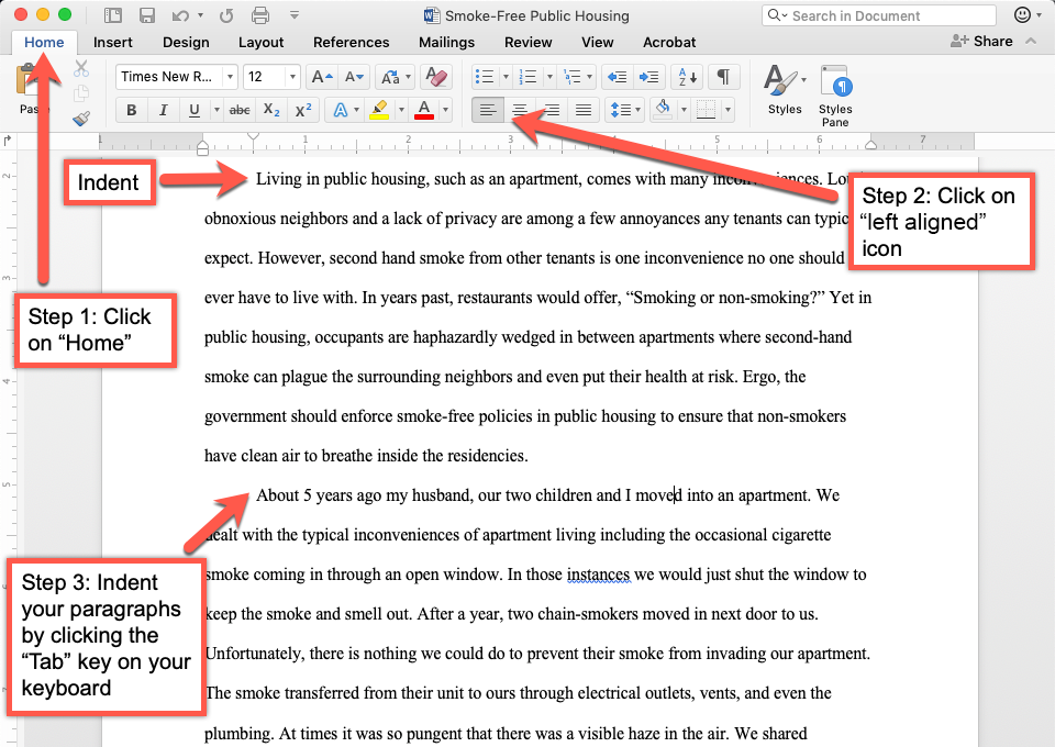
Understanding and effectively utilizing paragraph formatting is crucial for anyone creating content, from a simple email to a complex technical report, a blog post, or a presentation. It enables authors to organize information logically, guide the reader’s eye, and maintain a consistent, polished look across various digital platforms and documents.
The Foundations of Readable Digital Content
At its core, paragraph formatting is about making digital text easier to read and comprehend. Without proper formatting, even the most insightful content can appear as a dense, intimidating block, deterring readers and hindering information absorption. Modern software, from word processors to content management systems, provides a robust suite of tools to manipulate paragraph properties, ensuring that text not only conveys information but also presents it in an organized and visually appealing manner.
The purpose extends beyond mere aesthetics; it’s a functional imperative. Clear formatting delineates ideas, emphasizes key points, and establishes a hierarchical structure that helps readers navigate complex information. In the digital realm, where attention spans can be fleeting, the initial visual impression of a document often determines whether a user will engage with its content. Proper paragraph formatting ensures that this first impression is one of clarity, organization, and professionalism.
Core Components of Paragraph Formatting
The suite of tools available for paragraph formatting might seem extensive, but they are built upon several key components that work in tandem to shape the visual presentation of text blocks.
Alignment
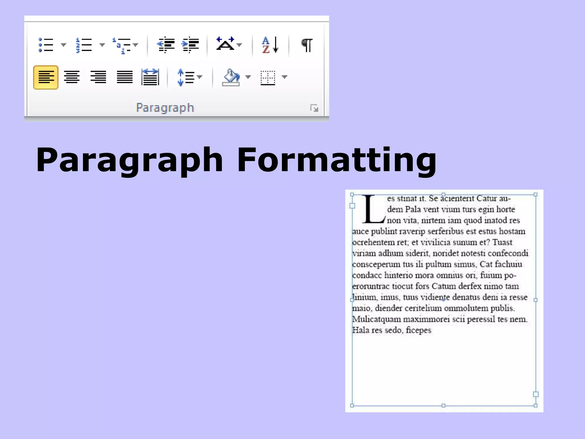
Alignment defines how the lines of text within a paragraph are positioned relative to the left and right margins of the document or text box.
- Left Alignment (Ragged Right): This is the most common and often preferred alignment for body text, especially in English and other left-to-right languages. Text aligns neatly to the left margin, while the right margin remains uneven or “ragged.” This natural reading flow reduces eye strain.
- Right Alignment (Ragged Left): Text aligns to the right margin, leaving the left margin ragged. Primarily used for specific elements like dates in letters, captions under images, or small blocks of artistic text. It’s generally not recommended for large bodies of text due to potential readability issues.
- Center Alignment: All lines of text are centered between the left and right margins, resulting in both margins being ragged. Frequently used for titles, headings, short announcements, or invitations. Overuse in body text can make reading difficult as the eye lacks a consistent starting point.
- Justify Alignment: Text aligns to both the left and right margins by adjusting the spacing between words. This creates clean, block-like paragraphs often found in newspapers, magazines, and academic journals. While aesthetically uniform, it can sometimes lead to uneven word spacing (“rivers” of white space) if not handled well by the software, especially with narrow columns.
Indentation
Indentation controls the spacing between the paragraph and the page margins, allowing for visual offsets.
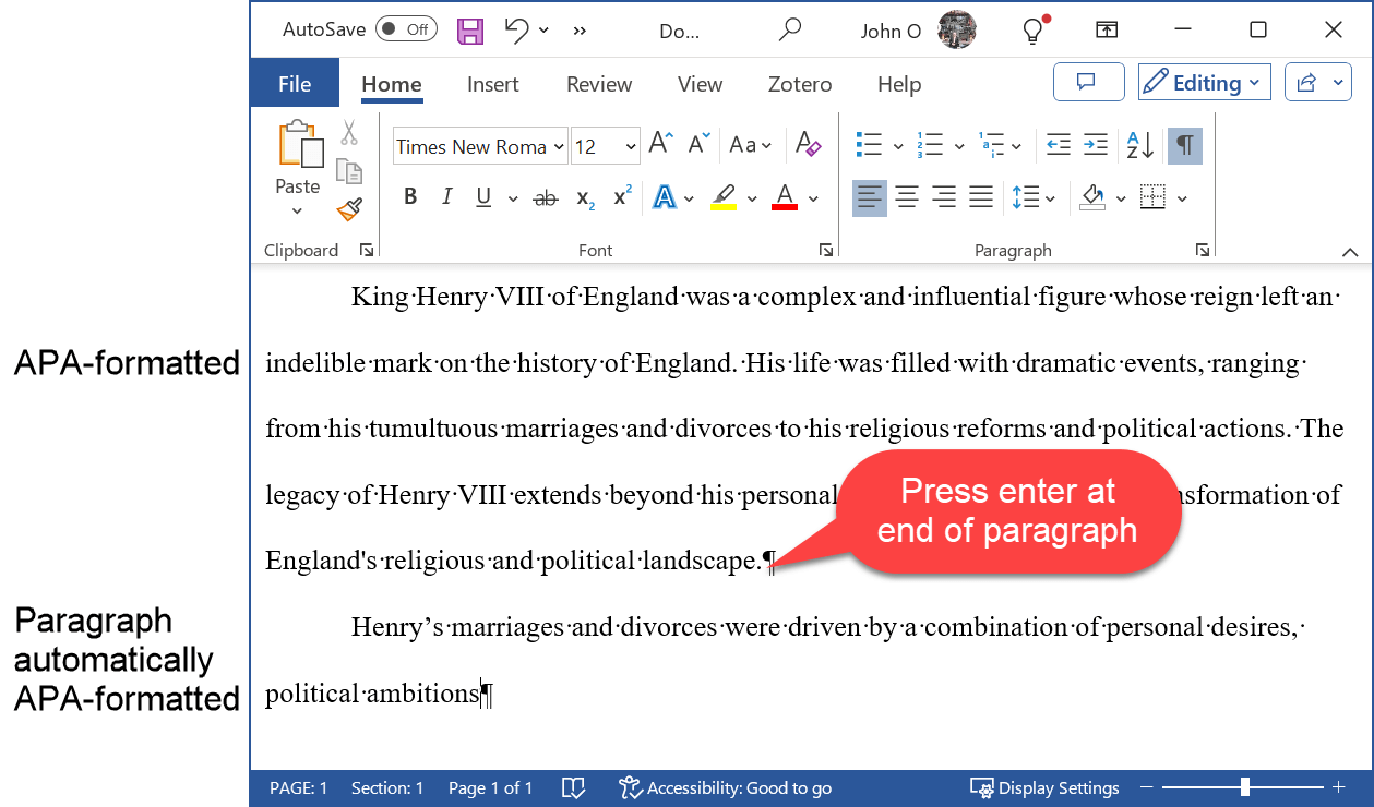
- First-Line Indent: Only the first line of a paragraph is indented from the left margin. This is a traditional method to signal the start of a new paragraph, often used in books and formal documents to avoid extra line breaks between paragraphs.
- Hanging Indent: All lines of a paragraph except the first are indented. This is commonly used for bulleted or numbered lists (where the bullet/number hangs outside the main block of text), bibliographies, and glossaries.
- Left Indent: The entire paragraph is indented from the left margin. Useful for block quotes, side notes, or differentiating specific sections of text.
- Right Indent: The entire paragraph is indented from the right margin, effectively narrowing the text block. Often used in conjunction with a left indent to create a smaller, centered text block.
Line Spacing
Line spacing (or leading) refers to the vertical distance between consecutive lines of text within a paragraph.
- Single, 1.5 Lines, Double: These standard options increase the space between lines proportionally. Single spacing is compact, double spacing is often required for academic papers (allowing for annotations), and 1.5 lines offers a good balance for readability in many contexts.
- Multiple/Exact: Advanced options allow users to specify precise line spacing in points or as a multiple of the current font size, offering granular control for specific design needs. Adequate line spacing is crucial for readability, reducing the visual density of text.
Paragraph Spacing (Before/After)
This defines the amount of vertical space added before or after an entire paragraph. Unlike pressing Enter multiple times, which inserts empty paragraphs, paragraph spacing is an attribute of the paragraph itself. It’s essential for creating clear visual breaks between paragraphs, headings, and other elements, contributing to a cleaner, more professional look without the inconsistencies of manual line breaks. This feature is particularly powerful when used with document styles.
Tab Stops
While not exclusively for paragraphs, tab stops are a paragraph-level setting that allows for precise horizontal alignment of text. Users can define custom tab positions (left, center, right, decimal) within a paragraph, providing a more reliable and professional alternative to using multiple spacebar presses for alignment.
Advanced Paragraph Formatting Techniques for Enhanced Structure
Beyond the basic attributes, modern software offers sophisticated paragraph formatting controls that ensure professional document structure and flow.
Keep with Next / Keep Lines Together
These features prevent undesirable page breaks. “Keep with next” ensures that a heading (e.g., H2 or H3) always stays on the same page as the first line of the paragraph that follows it. “Keep lines together” prevents a single paragraph from being split across two pages, ensuring all its lines remain contiguous. These are vital for maintaining logical flow and presentation in reports and academic papers.
Page Break Before
This setting forces a paragraph (typically a major heading) to start on a new page. It’s invaluable for structuring chapters, main sections, or major divisions within large documents, ensuring each new section begins cleanly on a fresh page.
Widow/Orphan Control
This automatic feature, often enabled by default in word processors, prevents “widows” (the last line of a paragraph appearing by itself at the top of a new page/column) and “orphans” (the first line of a paragraph appearing by itself at the bottom of a page/column). These single lines can look unprofessional and disrupt reading flow, so their automatic control significantly enhances document aesthetics.
Borders and Shading
While applicable to individual cells or objects, borders and shading can also be applied to entire paragraphs. This is used to draw attention to specific text, create call-out boxes, highlight warnings, or visually separate distinct content blocks within a document.
Practical Applications Across Tech Platforms
Paragraph formatting is not confined to a single type of software; its principles are universal across various digital content creation tools.
Word Processors (Microsoft Word, Google Docs, LibreOffice Writer)
These are the most robust environments for paragraph formatting. Users access settings through dedicated ribbon tabs, menus, or context-sensitive panels. The concept of “Styles” is paramount here, allowing users to define and apply consistent sets of paragraph (and character) formatting to headings, body text, quotes, and lists. Using styles ensures consistency, facilitates quick global changes, and improves document navigability for both humans and screen readers.
Web Content Management Systems (CMS) like WordPress
While web pages are ultimately rendered by HTML and CSS, CMS platforms provide visual editors (WYSIWYG – What You See Is What You Get) that abstract these complexities. Users can typically apply basic paragraph formatting like alignment, indentation (often through blockquotes or list items), and paragraph spacing (often controlled by theme CSS but sometimes adjustable via block settings) using simple toolbar buttons. Modern block editors (like WordPress’s Gutenberg) represent paragraphs as distinct “blocks,” offering specific controls for each block’s layout and spacing, bridging the gap between direct HTML manipulation and user-friendly visual editing.
Email Clients (Outlook, Gmail)
Email clients offer a more limited but essential set of paragraph formatting options. Users can typically control alignment, basic indentation for bulleted/numbered lists, and line breaks. While full control over paragraph spacing or advanced features is rare, intelligent use of what’s available ensures professional and readable email communication, preventing messages from appearing as an unformatted wall of text.
Presentation Software (PowerPoint, Google Slides)
In presentation tools, paragraph formatting is crucial for text within text boxes, titles, and bullet points. Clear line spacing, appropriate alignment (often centered or left-aligned for titles, left for body text), and sensible indentation for bulleted lists are key to creating visually impactful and easy-to-digest slides that support spoken content without overwhelming the audience.
The Impact of Good Paragraph Formatting in the Digital Age
In an era saturated with digital content, the quality of presentation is as critical as the quality of information.
Readability and User Experience
Well-formatted paragraphs significantly reduce cognitive load. Readers can quickly scan, find relevant information, and absorb content without struggling with a jumbled layout. Proper line spacing and paragraph breaks create “white space,” which is vital for visual comfort and allows the eyes to rest and refocus. This directly translates to a better user experience, encouraging longer engagement with the content.
Professionalism and Credibility
A document or web page with consistent, thoughtful paragraph formatting signals attention to detail and professionalism. Whether it’s a job application, a business proposal, a research paper, or a company’s blog, immaculate formatting builds trust and credibility. Conversely, poor formatting can undermine an otherwise strong message.
Accessibility
Effective paragraph formatting is a cornerstone of digital accessibility. Logical structure created by headings and paragraph breaks, adequate line spacing, and consistent indentation aids users relying on screen readers or those with visual impairments or cognitive disabilities. Clear visual cues help assistive technologies interpret and convey content correctly, ensuring inclusivity.
Efficiency and Consistency via Styles
For creators of extensive documents or numerous web pages, utilizing paragraph styles is a technological superpower. Styles ensure unwavering consistency across an entire project, saving immense amounts of time. A single change to a style definition (e.g., increasing the spacing after all body paragraphs) can instantly update every instance in the document, eliminating tedious manual adjustments and potential errors.
Avoiding Common Formatting Pitfalls
Even with powerful tools, missteps in paragraph formatting can undermine its benefits.
- Over-formatting: Excessive use of different alignments, bolding, italics, and colors within a single document can create a chaotic, unprofessional appearance that distracts from the content.
- Inconsistent Formatting: Manually applying formatting rather than using styles often leads to slight variations in paragraph spacing, indentation, or line height, resulting in a visually inconsistent and unprofessional document.
- Using Spaces/Returns for Indentation/Spacing: Relying on the spacebar for indentation or pressing Enter multiple times for paragraph spacing is inefficient, imprecise, and creates layout nightmares when content needs to be edited or moved. Always use the dedicated paragraph formatting settings.
- Ignoring Platform Differences: How a document looks in one word processor or browser might differ slightly in another. While challenging to control perfectly, awareness helps in testing content across common platforms, especially for web publication.
In conclusion, paragraph formatting is far more than a stylistic embellishment; it’s an indispensable technological feature for structuring, clarifying, and enhancing digital text. Mastering its components and applications is a fundamental skill for anyone involved in content creation, ensuring that information is not only conveyed but also consumed effectively and professionally in the modern digital landscape.
aViewFromTheCave is a participant in the Amazon Services LLC Associates Program, an affiliate advertising program designed to provide a means for sites to earn advertising fees by advertising and linking to Amazon.com. Amazon, the Amazon logo, AmazonSupply, and the AmazonSupply logo are trademarks of Amazon.com, Inc. or its affiliates. As an Amazon Associate we earn affiliate commissions from qualifying purchases.