In the intricate world of branding, every element serves a purpose, and perhaps none is as immediately impactful or subtly influential as color. It’s the silent language that communicates values, evokes emotions, and etches a brand into the consumer’s mind. Understanding the fundamental principles of color theory, such as identifying complementary colors, is not merely an aesthetic exercise; it’s a strategic imperative for brand designers, marketers, and business owners alike. The question, “what is opposite of green on the color wheel?” might seem simple, but its answer unlocks a powerful tool for visual differentiation, message reinforcement, and market positioning.

The Foundational Role of Color Theory in Branding
Color theory is the bedrock upon which effective visual branding is built. It’s not just about picking “pretty” colors; it’s a science and an art that profoundly influences how an audience perceives a brand. For a brand to truly resonate, its color palette must be deliberate, coherent, and aligned with its core identity and objectives.
Understanding the Color Wheel’s Impact
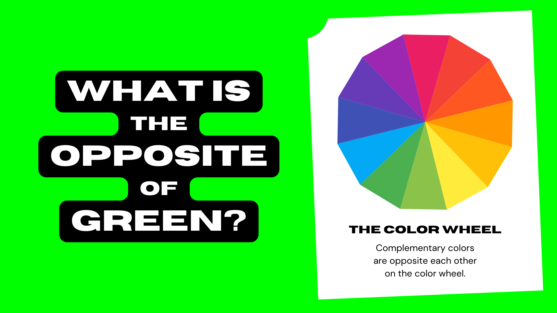
The color wheel, a visual representation of colors arranged according to their chromatic relationships, is the primary tool for understanding how colors interact. It organizes colors into primary (red, yellow, blue), secondary (green, orange, purple – created by mixing primaries), and tertiary categories. Crucially, the color wheel reveals complementary colors: those directly opposite each other. These pairings—like red and green, blue and orange, yellow and purple—create the strongest visual contrast, making them invaluable for creating focus, energy, and visual hierarchy in branding materials. Knowing these relationships allows brands to construct palettes that are harmonious, dynamic, or deliberately disruptive, depending on their strategic goals.
Beyond Aesthetics: Color Psychology in Brand Perception
The psychological impact of color is immense. Colors evoke specific emotions, associations, and even cultural meanings that can make or break a brand’s connection with its audience. Green, for instance, is widely associated with nature, growth, freshness, sustainability, tranquility, and health. Brands in sectors like organic food, environmental initiatives, finance (money, prosperity), and health and wellness frequently leverage green to communicate these values.
The strategic choice of green can instill trust, signal eco-consciousness, or convey a sense of calm and well-being. However, like all colors, green also has potential downsides. Too much can become monotonous or even signify inexperience. This is where understanding its complement becomes critical, as it provides a counterpoint that can balance, energize, or highlight specific aspects of a green-dominant brand identity. Brands must navigate these psychological landscapes carefully, ensuring their color choices align perfectly with their desired brand personality and messaging.
Unveiling Green’s Complement: Magenta and Its Nuances
While a casual answer might sometimes suggest red as green’s opposite, particularly in older color models (like the RYB model used in art), the modern and scientifically accurate answer based on the subtractive CMYK color model (used in printing) and the additive RGB model (used in digital displays) points to magenta as green’s direct complement.
The Science of Opposites: Why Magenta?
In the realm of light (RGB model), green is one of the three additive primary colors. When you remove green light, what remains is magenta. Similarly, in the realm of pigments (CMYK model), magenta is a primary color. Green and magenta are considered complements because when mixed, they essentially cancel each other out, producing a neutral gray or black. More importantly for branding, when placed side-by-side, they create a vibrant, high-contrast effect where each color appears more saturated and vivid. This phenomenon is known as simultaneous contrast and is a powerful tool for visual impact.
Understanding this scientific basis is crucial for designers, as it ensures consistency across digital and print applications, preventing unwanted shifts in brand perception. Relying on an outdated understanding of the color wheel can lead to muddy, ineffective palettes that fail to achieve the desired brand impact.
Distinguishing Magenta from Red and Purple
It’s important to clarify the distinction. Magenta is often mistakenly conflated with red or purple. While it shares characteristics with both, it occupies its own unique position on the color spectrum. Red is a primary color, bold and energetic, often associated with passion, urgency, and power. Purple, a secondary color, mixes red and blue, bringing associations of royalty, luxury, and creativity. Magenta, however, is a vibrant, purplish-red hue—a tertiary color that sits between red and blue-violet on the color wheel. It combines the warmth of red with the coolness of blue, giving it a unique character often associated with creativity, innovation, sophistication, and femininity. For a brand, this nuance is vital. Choosing magenta over a true red or purple offers a different psychological resonance and a distinct visual dynamic when paired with green.
Strategic Applications of Green and Magenta in Brand Design
The deliberate pairing of green and magenta transcends mere aesthetics; it becomes a strategic decision that can significantly amplify a brand’s message and presence. The inherent contrast between these two hues creates a visual tension that can be harnessed for various branding objectives.
Leveraging Contrast for Visual Impact
The high contrast between green and magenta is a designer’s goldmine for creating visual impact. When used together, they make elements pop, draw attention to key features, and prevent designs from appearing flat or monotonous. For a brand, this means:
- Highlighting Key Information: A call-to-action button in vibrant magenta against a green background (or vice-versa) immediately grabs attention, guiding the user’s eye to conversion points.
- Creating Differentiation: In a crowded market, a unique and impactful color palette can make a brand stand out. A brand that expertly wields green and magenta can forge a memorable identity that separates it from competitors using more conventional palettes.
- Establishing Visual Hierarchy: By using one color as dominant and its complement as an accent, designers can create a clear hierarchy of information, directing the audience’s focus through website layouts, advertisements, or packaging.
Crafting Brand Messaging with Complementary Hues
Beyond pure visual impact, the psychological associations of green and magenta can be combined to craft richer, more nuanced brand narratives:
- Green (Nature, Growth, Calm) + Magenta (Creativity, Innovation, Sophistication): This pairing can position a brand as an innovative leader in sustainable technology, a creative agency with an eco-conscious ethos, or a wellness brand that offers luxurious, cutting-edge solutions. The balance communicates both grounded reliability and forward-thinking dynamism.
- Balancing Brand Personality: A brand might be primarily associated with green (e.g., an organic food delivery service). Introducing magenta as an accent can prevent the brand from appearing too serious or purely utilitarian. A touch of magenta can inject a sense of playfulness, premium quality, or unexpected flair, broadening the brand’s appeal without diluting its core message.
- Targeting Specific Demographics: Magenta, with its often feminine and creative connotations, can help green-dominant brands connect with different audience segments, expanding market reach. Conversely, green can ground a more whimsical magenta-heavy brand.
Case Studies and Practical Implementations
Understanding the theory is one thing; seeing its application is another. The strategic use of green and magenta, or other complementary pairs, is evident across various brand touchpoints.
Logo and Identity Design
A logo is the cornerstone of brand identity, and its colors are critical. While direct green-magenta complementary logos are less common as primary palettes due to their high intensity, the principle of complementary contrast is often applied in more subdued or sophisticated ways. Consider brands that use a dominant green (e.g., an environmental non-profit) but incorporate a vibrant, almost magenta-like secondary color in their brand guidelines for specific campaigns, calls to action, or merchandise to inject energy and draw attention. The judicious use of a magenta-leaning accent in a logo that is predominantly green can communicate a blend of organic origins with a creative, modern edge, signaling innovation within a natural space. For instance, a tech startup focusing on sustainable solutions might use a primary green logo with a subtle, electric magenta highlight to convey both eco-friendliness and futuristic vision.
Web and Digital Marketing
In digital spaces, the immediacy of color’s impact is paramount. Websites and digital ads are often where green and magenta’s complementary power shines brightest:
- Website Design: Imagine a website for an eco-friendly tech gadget. The primary color scheme might be various shades of green to convey sustainability and tech. Calls-to-action (e.g., “Buy Now,” “Learn More”) in a striking magenta would immediately stand out, guiding user interaction and improving conversion rates. The magenta provides an energetic pop against the calming green, creating visual interest without being overwhelming.
- Social Media Campaigns: Visually driven platforms like Instagram are ideal for experimenting with high-contrast palettes. A brand promoting a new organic product might use a campaign where images feature lush greens, but key textual overlays or interactive elements are presented in a bold magenta to capture scrolling attention.
- Email Marketing: In an inbox full of monotone messages, an email with a well-designed green-and-magenta header or button can significantly increase open rates and click-throughs, simply by virtue of its visual appeal and clarity.
Packaging and Retail Environments
The physical manifestation of a brand’s color strategy is crucial for products on shelves and in store environments:
- Product Packaging: For a brand selling organic beauty products, packaging might feature a serene green base. Using magenta for key product details, a “new” sticker, or a premium seal not only highlights that information but also elevates the perceived value and modernity of the product, moving it beyond purely natural to naturally innovative or luxurious.
- Retail Store Displays: In a brick-and-mortar store, green backdrops or furniture can create a calming, natural atmosphere. Introducing magenta through accent lighting, promotional signage, or specific product display elements can create dynamic focal points, drawing customers to new collections or special offers. This contrast creates a lively energy that encourages exploration within the calming ambiance.
Mastering Color Harmony for Lasting Brand Resonance
The power of complementary colors, specifically green and magenta, lies in their ability to create visual tension and impact. However, effective branding requires more than just high contrast; it demands a nuanced understanding of color harmony to build lasting resonance.
When to Use Complements, Analogous, or Monochromatic Palettes
- Complementary (Green + Magenta): Ideal for creating high impact, drawing attention, and conveying dynamism or an unexpected blend of values. Best used strategically as accents rather than dominant colors, unless the brand’s identity is inherently bold and energetic. Excellent for calls to action, highlights, or products needing to stand out.
- Analogous (e.g., various shades of green, yellow-green, blue-green): Creates a harmonious, serene, and sophisticated feel. Brands seeking to convey tranquility, natural themes, or a unified message often lean on analogous palettes. Think luxury eco-brands or wellness spas.
- Monochromatic (e.g., different tints, tones, and shades of green): Offers elegance, simplicity, and a strong sense of unity. It can be very calming and professional, allowing texture and form to take precedence. Effective for minimalist brands or those prioritizing clarity and focus.
Often, the most compelling brand palettes combine these strategies, using a monochromatic or analogous base for overall harmony, then introducing a complementary accent (like magenta to green) to add vibrancy, emphasis, and a distinctive edge.

The Evolving Landscape of Brand Color Trends
While fundamental color theory remains constant, the application and interpretation of color in branding evolve with cultural shifts, technological advancements, and consumer tastes. Brands must stay abreast of these trends while remaining true to their core identity. Today’s market often favors authenticity, transparency, and a strong sense of purpose. For brands utilizing green, this means an emphasis on natural, earthy greens or vibrant, energetic greens that communicate vitality. When paired with magenta, there’s a trend towards more sophisticated, muted magentas or electric, almost neon magentas that signal digital innovation or bold creativity. The key is adaptability: understanding why certain colors resonate at a given time and how to integrate them in a way that feels fresh yet enduring.
Ultimately, knowing that magenta is opposite green on the color wheel is more than a trivial fact. It’s a gateway to understanding a profound principle of visual communication that, when mastered, can significantly elevate a brand’s design, marketing, and overall strategic impact in a competitive marketplace.
aViewFromTheCave is a participant in the Amazon Services LLC Associates Program, an affiliate advertising program designed to provide a means for sites to earn advertising fees by advertising and linking to Amazon.com. Amazon, the Amazon logo, AmazonSupply, and the AmazonSupply logo are trademarks of Amazon.com, Inc. or its affiliates. As an Amazon Associate we earn affiliate commissions from qualifying purchases.