
Chrome is more than just a shiny surface; it is a fundamental element of industrial design, aesthetic branding, and high-end manufacturing. When we discuss “chrome color,” we are referring to a specific visual language characterized by high reflectivity, cool blue-toned undertones, and a mirror-like finish that suggests both durability and modernity. In the world of design, chrome serves as a powerful tool to communicate precision, luxury, and technological advancement.
The Science and Visual Mechanics of Chrome
To understand chrome as a color, one must first look at its physical properties. True chrome is the result of chromium plating—the process of applying a thin layer of chromium onto a metal object. However, in design and digital art, “chrome color” is a representation of how light interacts with a perfectly smooth, metallic surface.

The Spectrum of Reflection
Unlike pigments or paints that rely on the absorption and scattering of light to create color, chrome is essentially “colorless” in its purest form. Its identity is derived entirely from its environment. Because it is highly reflective, the “color” of chrome is dictated by the surrounding light temperature and the objects it mirrors. In a clean, white-light studio, chrome appears as a brilliant, icy silver. In a warm, sunset-lit environment, it takes on golden and orange hues. This chameleon-like quality is what makes it a staple in premium product design; it bridges the gap between the object and its context.
Light Gradients and Specular Highlights
In digital design—whether in UI/UX or 3D rendering—achieving the “chrome look” requires a mastery of gradient mapping. Designers simulate chrome by utilizing sharp, high-contrast transitions. The “color” of chrome is defined by the sudden jump from deep, dark values (representing the reflection of shadow) to pure white (the specular highlight). This high-contrast interplay creates the illusion of depth and extreme smoothness that defines the chrome aesthetic.
Chrome in Brand Strategy and Visual Identity
From a branding perspective, chrome has always been synonymous with the future. It is a color palette rooted in the industrial revolution’s peak, the mid-century modern obsession with space-age technology, and the current resurgence of Y2K-inspired digital aesthetics.
Communicating Durability and Prestige
When a brand chooses chrome as a core visual element, it sends a clear signal of permanence and quality. In the automotive industry, chrome trim is a signifier of a higher-tier trim level. It suggests that the materials underneath are solid and that the manufacturer has invested in the finishing process. For tech companies, chrome accents often serve to differentiate professional-grade hardware from entry-level consumer plastics.
The Psychology of Cold Metallics
Chrome operates within the “cool” color temperature spectrum. Psychologically, these tones are associated with logic, cleanliness, and innovation. While warm colors like gold or copper evoke tradition, warmth, and organic luxury, chrome evokes precision engineering and artificial perfection. Brands that want to position themselves as cutting-edge, minimalist, or highly efficient often leverage the chrome aesthetic to strip away “clutter” and focus the viewer’s eye on clean, geometric lines.
The Evolution of Chrome in Design Trends
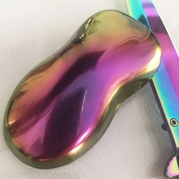
The way we perceive chrome has shifted dramatically over the past few decades. Once reserved for hardware and automotive exteriors, chrome has migrated into the digital realm, becoming a dominant force in visual culture.
From Retro-Futurism to Digital Surrealism
In the 1980s and 90s, chrome was the bedrock of “cyber” aesthetics—think metallic typography, glowing grids, and the chrome-plated logos of sci-fi films. This era treated chrome as a symbol of the unattainable future. Today, we have moved into an era of “Digital Surrealism,” where chrome is used as a fluid, gravity-defying texture. In contemporary branding, chrome is no longer just a static finish; it is a liquid, molten substance. Designers use 3D software to create chrome objects that ripple and deform, pushing the material beyond the constraints of its physical reality.
The Role of Chrome in UI/UX Design
In the digital product space, the use of “chrome-like” gradients has become a hallmark of luxury software interfaces. We see this in the resurgence of “Glassmorphism” and “Neo-Brutalism.” By applying metallic textures to icons and interface elements, brands add a tactile sense of weight and importance to otherwise flat digital assets. When an app icon or a website header uses chrome effects, it signals to the user that the product is a high-performance tool—a “polished” experience that functions as smoothly as the reflection on the screen.
Strategic Implementation of Metallic Finishes
Implementing chrome into a brand identity or product design requires a delicate touch. Because chrome is such a high-contrast and high-attention element, it acts as a visual anchor. If used incorrectly, it can look cheap or gaudy; when executed with intent, it is the height of sophistication.
Minimalism and “Less Is More”
The most effective way to use chrome is as an accent rather than a primary field. Because chrome reflects everything around it, a large surface area of chrome can become visually overwhelming, causing “noise” in a design. High-end brands often use chrome for subtle details: a logo etched into a matte black surface, a thin metallic bezel around a display, or a high-gloss finish on a specific navigational element. This creates a focal point that draws the user’s eye without sacrificing readability or brand clarity.
Materiality and Texture Contrast
The true power of chrome lies in its contrast with other materials. In interior and product design, chrome is most effective when paired with matte textures. The juxtaposition of a non-reflective, soft-touch matte surface against a sharp, high-reflection chrome creates a sophisticated sensory experience. This strategy is widely used in luxury tech packaging and high-end interior hardware. It tells the user that the product has been designed with an attention to texture that goes beyond the basics.
The Future of Chrome: Sustainability and Digital Synthesis
As we look toward the future of design, the role of chrome is evolving. While traditional chrome plating has faced environmental scrutiny due to the chemical processes involved in manufacturing, digital design has decoupled the “look” of chrome from the physical reality of toxic production.
Virtual Chrome and Sustainability
We are currently entering a phase where the “chrome experience” is being moved entirely into the virtual space. As brands build presence in augmented reality (AR) and virtual environments, chrome becomes an essential material property. In these digital spaces, chrome is infinitely sustainable; it requires no mining, no chemical baths, and no waste. It exists purely as light and math. Brands are now focusing on creating “digital material kits” where chrome textures define the weight and luxury of virtual goods, digital storefronts, and web-based interactive experiences.

The Continued Dominance of High-Reflectivity
The appetite for high-reflectivity in design is not waning; rather, it is becoming more refined. The shift is moving away from the “clunky” chrome of the past toward “liquid metal” aesthetics that feel soft, malleable, and organic. This represents a reconciliation between the hard, cold world of technology and the need for fluid, human-centric design. Chrome is no longer just the color of a machine; it is becoming the color of a sophisticated, highly digitized lifestyle.
In conclusion, chrome remains one of the most versatile and powerful tools in the designer’s arsenal. It is a color of extremes—defined by the environment it occupies, the light it captures, and the psychological weight it carries. Whether applied to a physical product or rendered in a virtual space, its ability to signal precision, luxury, and the future ensures that it will remain a cornerstone of visual branding for years to come. By understanding the intersection of its physical properties and its metaphorical power, brands can leverage the “chrome effect” to create products and identities that feel timeless, high-performing, and undeniably modern.
aViewFromTheCave is a participant in the Amazon Services LLC Associates Program, an affiliate advertising program designed to provide a means for sites to earn advertising fees by advertising and linking to Amazon.com. Amazon, the Amazon logo, AmazonSupply, and the AmazonSupply logo are trademarks of Amazon.com, Inc. or its affiliates. As an Amazon Associate we earn affiliate commissions from qualifying purchases.