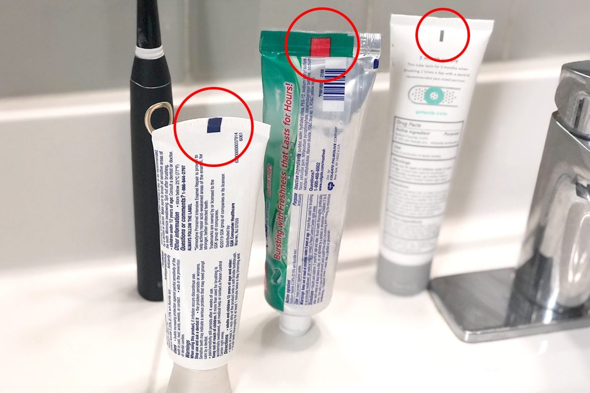
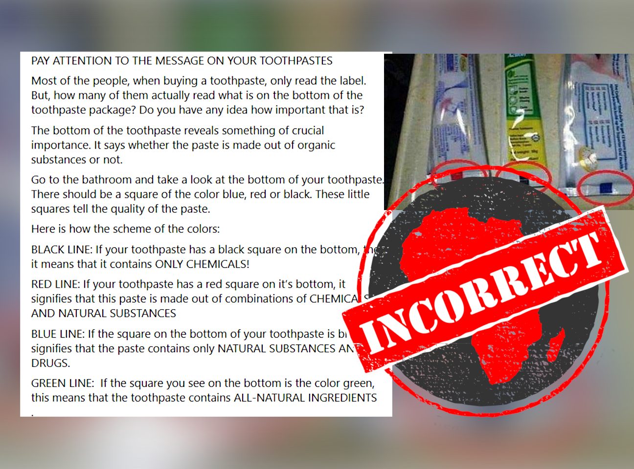
When you reach for a tube of toothpaste, you might notice a small, colored rectangular mark at the crimped end of the packaging. Over the years, urban legends and viral social media posts have suggested that these squares—often called “color marks” or “eye marks”—serve as a secret code indicating the chemical composition of the paste. According to these persistent myths, a green square signals all-natural ingredients, a blue square indicates a mix of natural and medicinal ingredients, a red square suggests natural and chemical ingredients, and a black square signifies pure chemicals.

From a marketing and manufacturing perspective, these claims are entirely unfounded. The colored squares have nothing to do with the health benefits or the ingredient profile of the toothpaste. Instead, they are a vital component of industrial packaging technology—a prime example of how design and manufacturing processes interact in the world of consumer goods.
The Manufacturing Reality: Packaging Automation and Registration Marks
To understand why these squares exist, one must step inside a high-speed manufacturing facility. The production of toothpaste tubes is a feat of engineering, where speed, precision, and efficiency are paramount. These tubes are not filled individually by hand; they are processed as part of a continuous, high-speed automated line.
The Role of Light Sensors
The colored squares are officially known as “eye marks” or “registration marks.” Their primary purpose is to provide a visual cue for high-speed automated machinery. As a continuous roll of packaging material (the laminate that eventually becomes the tube) moves through the production line, the machine needs to know exactly where to fold, cut, and seal the tube to ensure the branding is centered and the tube is shaped correctly.
The packaging machine uses a light sensor (a photoelectric cell) that scans the tube as it passes by. When the sensor detects the edge of the eye mark, it triggers the machinery to perform specific actions: cutting the laminate to the correct length or sealing the bottom of the tube. Without these registration marks, the machinery would be unable to align the design correctly, resulting in tubes that might be cut mid-sentence, folded off-center, or sealed at inconsistent heights.
Why Do the Colors Vary?
If these marks are purely functional, why are they different colors? The choice of color is dictated by the contrast required for the light sensor. Manufacturers select a color that provides the highest possible contrast against the background packaging design. For example, if the packaging is predominantly light-colored, a dark green or black mark is used to ensure the sensor registers the presence of the mark immediately. If the packaging uses a darker color scheme, the manufacturer might opt for a lighter eye mark. The color is chosen for the benefit of the sensor’s “eyes,” not for the benefit of the consumer’s health.
The Branding and Design Aesthetic
While the eye mark serves a utilitarian purpose, its integration into the product design speaks volumes about modern brand strategy. In the competitive landscape of retail, every square inch of packaging real estate is considered valuable.
Strategic Design Integration
Designers often work with engineers to ensure that registration marks do not detract from the brand’s visual identity. While the eye mark is technically a functional requirement, brands have become adept at hiding them or blending them into the overall aesthetic. Sometimes the mark is placed within a decorative element, a logo, or a border, minimizing its presence while maintaining its high-contrast necessity for the sensor.
The existence of these marks proves that brand identity is not just about the logo on the front of the box; it is about the physical integrity of the product. If a tube is poorly sealed or the crimped end is misaligned, it reflects poorly on the brand’s quality control. Therefore, the humble eye mark is actually a silent guardian of brand consistency, ensuring that every product on the shelf looks uniform and professional.
Busting the Ingredient Myth
The persistence of the “ingredient code” myth is a fascinating case study in consumer psychology and the gap between complex industrial processes and consumer knowledge. Consumers are increasingly health-conscious and naturally look for shortcuts to identify “safe” or “natural” products. When a simplified, albeit incorrect, explanation for a cryptic symbol appears on the internet, it spreads rapidly because it fulfills a psychological need for transparency in an opaque market.
Brands have had to spend considerable effort clarifying that these marks do not indicate ingredient safety. Official statements from major oral care companies reiterate that ingredient lists are provided in full on the back of the packaging, as required by regulatory bodies like the FDA. The eye mark is strictly an industrial tool, and placing any significance on its color is a misunderstanding of the sophisticated logistics behind mass-market consumer goods.
The Future of Packaging Technology
As manufacturing technology evolves, the role of the eye mark may also change. We are moving toward a future where sensors are becoming more sensitive and software-driven optical recognition is replacing simple photoelectric sensors.
Advanced Optical Recognition
Modern high-speed lines are beginning to utilize advanced cameras and vision systems that can recognize subtle patterns rather than just high-contrast blocks of color. This allows for more aesthetic flexibility, as manufacturers are no longer restricted to a single block of color for calibration. We may see registration marks become smaller, more discrete, or even integrated into digital watermarks that are invisible to the naked eye but perfectly readable by automated machines.
Sustainability and Streamlining
Sustainability is another major driver in modern packaging strategy. Manufacturers are looking for ways to reduce the amount of laminate used, minimize ink usage, and streamline the sealing process. As packaging materials shift toward fully recyclable or biodegradable alternatives, the machinery must also adapt. Each change in material—such as moving from standard plastic laminates to monomaterial plastics—requires recalibration of the optical sensors.
Even as materials change, the registration mark will likely remain a fixture of the assembly line until a superior, non-contact method of positioning is adopted on a global scale. The lesson here for businesses is that even the most “invisible” parts of a product’s design are often the result of complex logistics and high-stakes engineering.
Closing the Gap Between Industry and Consumer
The story of the toothpaste color square is ultimately a story about the disconnect between the manufacturing floor and the store aisle. For the manufacturing team, the mark is a simple, effective solution to a high-speed production problem. For the consumer, the absence of clear information about these marks left a vacuum that was filled by misinformation.
This illustrates a critical point in brand communication: when a brand uses a technical element that the public does not understand, it is responsible for providing clarity. When companies leave these questions unanswered, they inadvertently allow myths to take root, which can occasionally lead to consumer distrust.
Moving forward, transparency remains the best strategy. By understanding the mechanical origins of these marks—and by recognizing that quality and safety are determined by clinical testing and regulatory oversight rather than colored squares on a tube—consumers can make more informed choices. The “mystery” of the toothpaste square reminds us that behind every consumer product is a sophisticated ecosystem of design, engineering, and automation, all working in concert to deliver a consistent product to the bathroom cabinet every single morning. The next time you pick up a tube of toothpaste, you can look past the industrial sensor mark and appreciate the precision engineering that brought it to your home.
aViewFromTheCave is a participant in the Amazon Services LLC Associates Program, an affiliate advertising program designed to provide a means for sites to earn advertising fees by advertising and linking to Amazon.com. Amazon, the Amazon logo, AmazonSupply, and the AmazonSupply logo are trademarks of Amazon.com, Inc. or its affiliates. As an Amazon Associate we earn affiliate commissions from qualifying purchases.